Bootstrap is a popular responsive framework that adjusts the size of HTML elements to the size of your screen -- emphasizing the concept of responsive design.
With responsive design, you don't need to design a mobile version of your website. It will look good on any size screen.
Commonly used APIs
- Introduce
<link rel="stylesheet" href="//maxcdn.bootstrapcdn.com/bootstrap/3.3.1/css/bootstrap.min.css"/>

<div class="container-fluid">
...
</div>-
Using Bootstrap to Adapt Pictures to Mobile Display
- Add the img-responsive class attribute to the image, and the width of the image will match the width of your page perfectly.
- <img class="img-responsive" src="/images/running-cat.jpg">
-
Centralize text through Bootstrap
- You can distinguish between spaces and existing class es
- <h2 class="red-text text-center">your text</h2>
-
Add a button through Bootstrap
- <button class="btn">Like</button>
- The style is really different from the original one. It looks smoother.
-
Add a Bootstrap block-level element (block) button
- It can be understood as a button that matches the parent container.
- <button class="btn btn-block">Like</button>
-
Try adding color to a Bootstrap button
- Bootstarp itself predefines some colors
- (Dark blue)<button class="btn btn-block btn-primary">Like</button>
- (Light blue)<button class="btn btn-block btn-info">Info</button>
-
Add a Bootstrap warning button
- It's actually a red button. It's also a predefined color. Its name is danger.
- <button class="btn btn-block btn-danger">Delete</button>
Page layout using Bootstrap
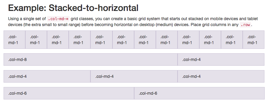
Bootstrap uses a responsive grid layout that makes it easy to put multiple elements in one row and specify the relative width of each element. Most class attributes in Bootstrap can be set in div elements.
The class attribute used in the following figure is col-md-*, 12-column grid layout
- md is medium (medium), not markdown
-* It is a number, representing the column width that each element should occupy in a row.
Mobile phone can try col-xs-*
- xs is an abbreviation for extra small (for smaller screens, such as mobile screens)
-* The number you need to fill in represents the column width of each element in a row.
  <div class="row">

    <div class="col-xs-4"><button class="btn btn-block btn-primary">Like</button></div>

    <div class="col-xs-4"><button class="btn btn-block btn-info">Info</button></div>

    <div class="col-xs-4"><button class="btn btn-block btn-danger">Delete</button></div>

  </div>
Use Font Awesome icon font on buttons
-
You can be there. Font Awesome official website Find the latest and all the icon s or whatever
Font Awesome is a very convenient icon library. These icons are vector graphics and are stored in. svg file format. You can specify their size in pixel units, which will inherit the font size of their parent HTML elements.
Introduce <link rel="stylesheet" href="//maxcdn.bootstrapcdn.com/font-awesome/4.5.0/css/font-awesome.min.css"/>
i is italic in the original, and icon in this case
-
Usage (link to the official website above to find what you need)
- The name on the official website is icon-thumbs-up. When you use it, change it to fa-thumbs-up. Fa should be Font Awesome, I guess.
<i class="fa fa-thumbs-up"></i>
<button class="btn btn-block btn-primary"><i class="fa fa-thumbs-up">Like</i></button>
//Not necessarily packages, but prefixes
<button class="btn btn-block btn-primary"><i class="fa fa-thumbs-up"></i>Like</button>
- The name on the official website is icon-thumbs-up. When you use it, change it to fa-thumbs-up. Fa should be Font Awesome, I guess.
-
Use the Bootstrap span tag to create in-line elements
- span tags can be used as in-line elements
- Several elements can be put together by span
<p>Hello World!</p>
//At this time of the World! It should be red.
<p> Hello <span class="text-danger"> World!</span></p>
-
Designing a Head Navigation Using Bootstrap
<div class="row"> <div class="col-xs-4"><img class="img-responsive thick-green-border" src="/statics/codecamp/images/relaxing-cat.jpg"></div> <div class="col-xs-8"><h2 class="text-primary text-center">CatPhotoApp</h2></div> </div> -
Use Bootstrap Responsive Radio Button
- Use Bootstrap's col-xs - * in the form element. In this way, our radio buttons can be spread out evenly on the page without knowing how wide the screen resolution is.
<form action="/submit-cat-photo">
    <div class="row">
        <div class="col-xs-6"><label><input type="radio" name="indoor-outdoor"> Indoor</label></div>
        <div class="col-xs-6"><label><input type="radio" name="indoor-outdoor"> Outdoor</label></div>
    </div>
<form>
- Use Bootstrap's col-xs - * in the form element. In this way, our radio buttons can be spread out evenly on the page without knowing how wide the screen resolution is.
-
Use Bootstrap Responsive Checkbox
<div class="row"> <div class="col-xs-4"><label><input type="checkbox" name="personality"> Loving</label></div> <div class="col-xs-4"><label><input type="checkbox" name="personality"> Lazy</label></div> <div class="col-xs-4"><label><input type="checkbox" name="personality"> Crazy</label></div> </div> -
Use Form Controls to set input box and button styles
<input class="form-control" type="text" placeholder="input your text" required> <button class="btn btn-primary" type="submit" style="margin-top:10px"><i class="fa fa-paper-plane"></i>Submit</button> -
Forms arranged horizontally using Bootstrap
- There's nothing to say about this. Just the same as before.
  <div class="row">
<div class="col-xs-7"><input type="text" class="form-control" placeholder="cat photo URL" required></div>
<div class="col-xs-5"><button type="submit" class="btn btn-primary"><i class="fa fa-paper-plane"></i> Submit</button></div>
</div>
- There's nothing to say about this. Just the same as before.
-
Setting up div containers using Bootstrap
-
Responsive container
- <div class="container-fluid">...</div>
-
Row container
- <div class="row">...</div>
-
Split Bootstrap row containers
<div class="row">
    <div class="col-xs-6">...</div>
    <div class="col-xs-6">...</div>
</div>`
-
-
Bootstrap well container
- Bootstrap has a class attribute called well
-
The purpose is to create a visual sense of depth for the set columns.
- <div class="well">...</div>
-
Add a button to the Bootstrap well container
//Default style
<div class="well">
    <button class="btn btn-default"></button>
</div>
-
ID attribute of Bootstrap element
- Not every class attribute is used for CSS. Sometimes we create classes just to make it easier to select these elements in jQuery.
- The id of each element is unique.
- Adding id is the same as adding class
- <div id="target">...</div>
-
Use comment tags to illustrate code
- This is actually negligible, and everyone who has coding experience knows it, but as a beginner, you still need to remind me that, well, it's purple sauce!
- HTML,XML<!-- -->
- JS //