Multi level drop-down menu
In many cases, we may need multi-level pull-down menus. In one pull-down menu item, create another pull-down menu to realize multi-level pull-down menu.
Just add a. Dropdown submenu class to any < li > element of the pull-down menu, and add a list of. Dropdown submenu classes under the < li > element, you can add a sub pull-down menu to the menu item. Such as:
<div class="dropdown"><ul class="dropdown-menu"><li><a tabindex="-1" href="#">Action</a></li><li><a tabindex="-1" href="#">Another action</a></li><li><a tabindex="-1" href="#">Something else here</a></li><li class="divider"></li><li class="dropdown-submenu"><a tabindex="-1" href="#">More options</a><ul class="dropdown-menu"><li><a tabindex="-1" href="#">Second level link</a></li><li><a tabindex="-1" href="#">Second level link</a></li><li><a tabindex="-1" href="#">Second level link</a></li><li><a tabindex="-1" href="#">Second level link</a></li><li><a tabindex="-1" href="#">Second level link</a></li></ul></li></ul></div>The effect is shown in Figure 4‑6 It is shown that:
Figure 4-6 Bootstrap Multi level pull-down menu component
By default, submenus pop up on the right side of the parent menu. If you want it to pop up on the left side of the parent menu, just give the corresponding <li> Element addition .pull-left Class can be:
- <li class="dropdown-submenu pull-left">
- ...
- </li>
The effect is shown in Figure 4-7:
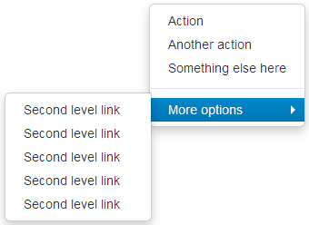 Figure 4-7 the Bootstrap pull-down menu component pops up on the left
In addition, the submenu will pop up in the following form by default. If you want the above pull form to pop up, just wrap the entire pull-down menu in the. dropup container:
- <div class="dropup">
- ...
- </div>
The effect is shown in Figure 4-8:
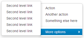 Figure 4-8 bootstrap pull-up menu component
Copyright notice: from Crooked Web " Bootstrap tutorial >Welcome to read it online and give your valuable comments.