Bootstrap Grid System
Bootstrap includes a responsive, mobile device first, and non fixed grid system, which can be appropriately expanded to 12 columns as the device or viewport size increases. It contains predefined classes for simple layout options, as well as powerful hybrid classes for generating more semantic layouts.
Operation example
Bootstrap's grid system uses a series of containers, rows, and columns to layout and align content. It is built with flexbox and has full responsiveness. Here's an example and an in-depth look at how grids come together.
| One of the three columns | One of the three columns | One of the three columns |
|---|
<div class="container">
  <div class="row">
    <div class="col-sm">
      One of three columns
    </div>
    <div class="col-sm">
      One of three columns
    </div>
    <div class="col-sm">
      One of three columns
    </div>
  </div>
</div>
The above example uses predefined grid classes to create three equal width columns on small, medium, large, and very large devices. These columns, along with the parent, are in the center. container of the page.
Working principle
- Rows must be placed in. container class to get proper alignment and padding;
- Use rows to create horizontal groups of columns;
- The content should be placed in the column, and only the column can be the direct child element of the row;
- Predefined grid classes, such as. row and. col-xs-4, can be used to quickly create grid layouts. LESS mixed class can be used for more semantic layout;
- Columns create gaps between column contents through padding. The inner margin is negative through the outer margin on. rows, indicating the row offsets of the first and last columns;
- The grid system is created by specifying the twelve available columns that you want to span. For example, to create three equal columns, use three. col-xs-4;
Grid options
The following table summarizes how a Bootstrap grid system works across multiple devices: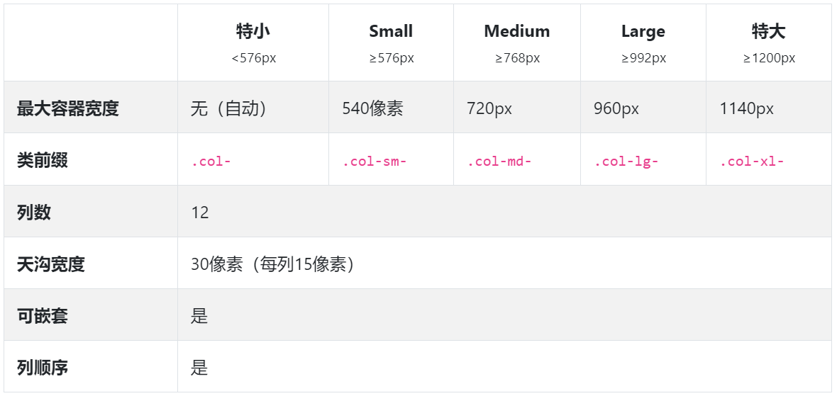
Auto layout columns
Use breakpoint specific column classes to simplify column sizes without using similar explicit numbering classes. col-sm-6.
Equal width
For example, here are two grid layouts, from xs to xl for each device and viewport respectively. Add any number of cell free classes for each breakpoint you want, and the width of each column will be the same.
| 1 of 2 | 2 of 2 |
|---|
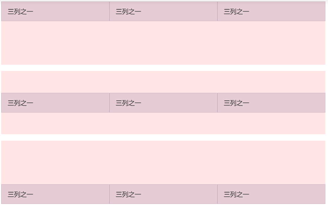
| 1 of 3 | 2 of 3 | 3 of 3 |
|---|
<div class="container">
  <div class="row">
    <div class="col">
      1 of 2
    </div>
    <div class="col">
      2 of 2
    </div>
  </div>
  <div class="row">
    <div class="col">
      1 of 3
    </div>
    <div class="col">
      2 of 3
    </div>
    <div class="col">
      3 of 3
    </div>
  </div>
</div>
Equal width and multiple rows
By inserting a. w-100 to implement column wrapping, we can create equal width columns across multiple rows. Using. w-100 with some responsive display utilities makes the response responsive.
| with | with |
|---|---|
| with | with |
<div class="container">
  <div class="row">
    <div class="col">col</div>
    <div class="col">col</div>
    <div class="w-100"></div>
    <!--
    Force next columns to break to new line at md breakpoint and up
    <div class="w-100 d-none d-md-block"></div>
    -->
    <div class="col">col</div>
    <div class="col">col</div>
  </div>
</div>
Set a column width
The automatic layout of Flexbox grid columns also means that you can set the width of a column and make the sibling column automatically resize around it. You can use predefined mesh classes (as shown below), mesh blending or inline width. Notice that the other columns resize regardless of the width of the middle column.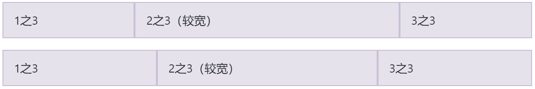
<div class="container">
  <div class="row">
    <div class="col">
      1 of 3
    </div>
    <div class="col-6">
      2 of 3 (wider)
    </div>
    <div class="col">
      3 of 3
    </div>
  </div>
  <div class="row">
    <div class="col">
      1 of 3
    </div>
    <div class="col-5">
      2 of 3 (wider)
    </div>
    <div class="col">
      3 of 3
    </div>
  </div>
</div>
Variable width content
Use the col-{breakpoint}-auto class to resize columns based on the natural width of their contents.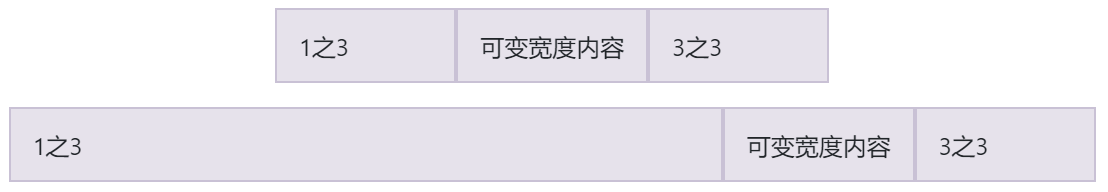
<div class="container">
  <div class="row justify-content-md-center">
    <div class="col col-lg-2">
      1 of 3
    </div>
    <div class="col-md-auto">
      Variable width content
    </div>
    <div class="col col-lg-2">
      3 of 3
    </div>
  </div>
  <div class="row">
    <div class="col">
      1 of 3
    </div>
    <div class="col-md-auto">
      Variable width content
    </div>
    <div class="col col-lg-2">
      3 of 3
    </div>
  </div>
</div>
Responsive classes
Ranks
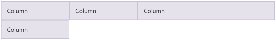
Use the responsive. Row cols - * class to quickly set the number of columns that best present content and layout. The normal. col - * class is applicable to each column (for example,. col-md-4), while the row column class sets. Row as the shortcut on the parent.
Use these row and column classes to quickly create basic grid layouts or control your card layout.
| Column | Column |
|---|---|
| Column | Column |
<div class="container">
  <div class="row row-cols-2">
    <div class="col">Column</div>
    <div class="col">Column</div>
    <div class="col">Column</div>
    <div class="col">Column</div>
  </div>
</div>
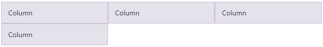
<div class="container">
  <div class="row row-cols-3">
    <div class="col">Column</div>
    <div class="col">Column</div>
    <div class="col">Column</div>
    <div class="col">Column</div>
  </div>
</div>
| Column | Column | Column | Column |
|---|
<div class="container">
  <div class="row row-cols-4">
    <div class="col">Column</div>
    <div class="col">Column</div>
    <div class="col">Column</div>
    <div class="col">Column</div>
  </div>
</div>
<div class="container">
  <div class="row row-cols-4">
    <div class="col">Column</div>
    <div class="col">Column</div>
    <div class="col-6">Column</div>
    <div class="col">Column</div>
  </div>
</div>
You can also use the attached sass mixin row cols():
.element {
  // Three columns to start
  @include row-cols(3);

  // Five columns from medium breakpoint up
  @include media-breakpoint-up(md) {
    @include row-cols(5);
  }
}
Aim
Vertical alignment
<div class="container">
  <div class="row align-items-start">
    <div class="col">
      One of three columns
    </div>
    <div class="col">
      One of three columns
    </div>
    <div class="col">
      One of three columns
    </div>
  </div>
  <div class="row align-items-center">
    <div class="col">
      One of three columns
    </div>
    <div class="col">
      One of three columns
    </div>
    <div class="col">
      One of three columns
    </div>
  </div>
  <div class="row align-items-end">
    <div class="col">
      One of three columns
    </div>
    <div class="col">
      One of three columns
    </div>
    <div class="col">
      One of three columns
    </div>
  </div>
</div>
Horizontal alignment
<div class="container">
  <div class="row justify-content-start">
    <div class="col-4">
      One of two columns
    </div>
    <div class="col-4">
      One of two columns
    </div>
  </div>
  <div class="row justify-content-center">
    <div class="col-4">
      One of two columns
    </div>
    <div class="col-4">
      One of two columns
    </div>
  </div>
  <div class="row justify-content-end">
    <div class="col-4">
      One of two columns
    </div>
    <div class="col-4">
      One of two columns
    </div>
  </div>
  <div class="row justify-content-around">
    <div class="col-4">
      One of two columns
    </div>
    <div class="col-4">
      One of two columns
    </div>
  </div>
  <div class="row justify-content-between">
    <div class="col-4">
      One of two columns
    </div>
    <div class="col-4">
      One of two columns
    </div>
  </div>
</div>
No-gutters
You can use to remove the spacing between columns in a predefined Grid category. No gutters. This removes the negative numbers margins. Row from all direct child columns and padding removes the horizontal numbers from all direct child columns.
This is the source code for creating these styles. Note that column overrides apply only to the first child column and are located through the property selector. Although this produces more specific selectors, you can use the interval utility to further customize the column population.
.no-gutters {
  margin-right: 0;
  margin-left: 0;

  > .col,
  > [class*="col-"] {
    padding-right: 0;
    padding-left: 0;
  }
}
In fact, this is what it looks like. Note that you can continue to use it with all other predefined grid classes, including column width, response layer, reorder, and so on.
<div class="row no-gutters">
  <div class="col-sm-6 col-md-8">.col-sm-6 .col-md-8</div>
  <div class="col-6 col-md-4">.col-6 .col-md-4</div>
</div>
Column Wrapping
If more than 12 columns are placed in a row, each additional group of columns is wrapped as a unit on the new row.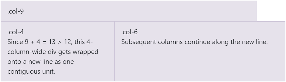
<div class="container"> <div class="row"> <div class="col-9">.col-9</div> <div class="col-4">.col-4<br>Since 9 + 4 = 13 > 12, this 4-column-wide div gets wrapped onto a new line as one contiguous unit.</div> <div class="col-6">.col-6<br>Subsequent columns continue along the new line.</div> </div> </div>
Reordering
Order classes
Use the. Order class to control the visual order of content. These classes are reactive, so you can set the order by breakpoint (for example. order-1.order-md-2). Including support for 1 through 12 all five grid layers.
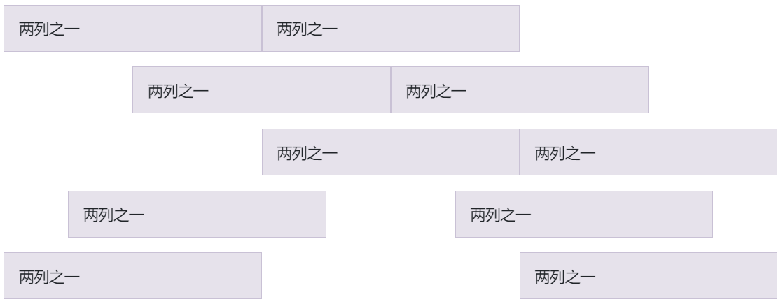
| First in DOM, no order applied | Third in DOM, with an order of 1 | Second in DOM, with a larger order |
|---|
<div class="container">
  <div class="row">
    <div class="col">
      First in DOM, no order applied
    </div>
    <div class="col order-12">
      Second in DOM, with a larger order
    </div>
    <div class="col order-1">
      Third in DOM, with an order of 1
    </div>
  </div>
</div>
There are also responsive. Order first and. Order last classes that change elements by applying order: -1 and order: 13 (order: $columns + 1), respectively. These classes can also be. Order - * mixed with numbered classes as needed.
| Third in DOM, ordered first | Second in DOM, unordered | First in DOM, ordered last |
|---|
<div class="container">
  <div class="row">
    <div class="col order-last">
      First in DOM, ordered last
    </div>
    <div class="col">
      Second in DOM, unordered
    </div>
    <div class="col order-first">
      Third in DOM, ordered first
    </div>
  </div>
</div>
Offsetting columns
You can offset grid columns in two ways: our response. Offset - grid class and profit tool. The size of the mesh class matches the columns, while margins are more useful for quick layouts with variable offset widths.
Offset classes
Use the. Offset MD class to move the column to the right. These classes add a column by column left margin. For example,. offset-md-4 moves to the. col-md-4 four columns.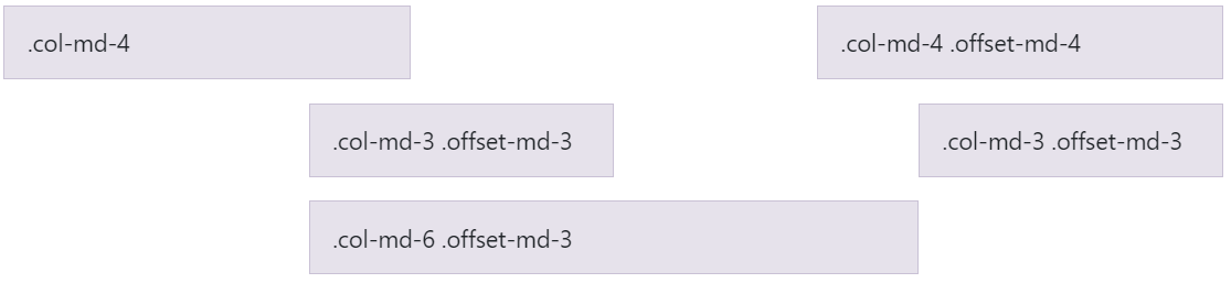
<div class="container">
  <div class="row">
    <div class="col-md-4">.col-md-4</div>
    <div class="col-md-4 offset-md-4">.col-md-4 .offset-md-4</div>
  </div>
  <div class="row">
    <div class="col-md-3 offset-md-3">.col-md-3 .offset-md-3</div>
    <div class="col-md-3 offset-md-3">.col-md-3 .offset-md-3</div>
  </div>
  <div class="row">
    <div class="col-md-6 offset-md-3">.col-md-6 .offset-md-3</div>
  </div>
</div>
In addition to clearing the column at the response breakpoint, you may need to reset the offset. See the actual operation in the mesh example.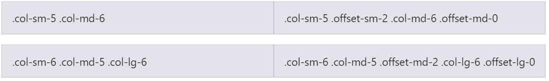
<div class="container">
  <div class="row">
    <div class="col-sm-5 col-md-6">.col-sm-5 .col-md-6</div>
    <div class="col-sm-5 offset-sm-2 col-md-6 offset-md-0">.col-sm-5 .offset-sm-2 .col-md-6 .offset-md-0</div>
  </div>
  <div class="row">
    <div class="col-sm-6 col-md-5 col-lg-6">.col-sm-6 .col-md-5 .col-lg-6</div>
    <div class="col-sm-6 col-md-5 offset-md-2 col-lg-6 offset-lg-0">.col-sm-6 .col-md-5 .offset-md-2 .col-lg-6 .offset-lg-0</div>
  </div>
</div>
Margin utilities
With the migration to flexbox in v4, you can use the margin utility, for example,. Mr auto, to force siblings apart from each other.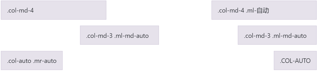
<div class="container">
  <div class="row">
    <div class="col-md-4">.col-md-4</div>
    <div class="col-md-4 ml-auto">.col-md-4 .ml-auto</div>
  </div>
  <div class="row">
    <div class="col-md-3 ml-md-auto">.col-md-3 .ml-md-auto</div>
    <div class="col-md-3 ml-md-auto">.col-md-3 .ml-md-auto</div>
  </div>
  <div class="row">
    <div class="col-auto mr-auto">.col-auto .mr-auto</div>
    <div class="col-auto">.col-auto</div>
  </div>
</div>
Nesting
To nest content with the default grid, add a new column. row and a set of columns to the existing column. Nested rows should consist of a set of no more than 12 or fewer columns in total (all 12 available columns are not required). .col-sm-* .col-sm-*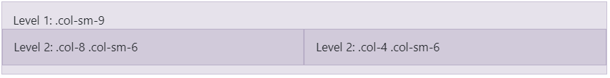
<div class="container">
  <div class="row">
    <div class="col-sm-9">
      Level 1: .col-sm-9
      <div class="row">
        <div class="col-8 col-sm-6">
          Level 2: .col-8 .col-sm-6
        </div>
        <div class="col-4 col-sm-6">
          Level 2: .col-4 .col-sm-6
        </div>
      </div>
    </div>
  </div>
</div>
Variables
Variables and mappings determine the number of columns, the width of the binding line, and the media query point at which the floating column begins. We use them to generate the predefined grid classes recorded above, as well as the custom hybrid classes listed below.
$grid-columns:      12;
$grid-gutter-width: 30px;

$grid-breakpoints: (
  // Extra small screen / phone
  xs: 0,
  // Small screen / phone
  sm: 576px,
  // Medium screen / tablet
  md: 768px,
  // Large screen / desktop
  lg: 992px,
  // Extra large screen / wide desktop
  xl: 1200px
);

$container-max-widths: (
  sm: 540px,
  md: 720px,
  lg: 960px,
  xl: 1140px
);
reference:
https://www.runoob.com/bootstrap/bootstrap-grid-system.html
https://v4.bootcss.com/docs/layout/grid/#responsive-classes

