
Bootstrap beginner's introductory course
Bootstrap, from Twitter, is currently the most popular front-end framework. Bootstrap is based on HTML, CSS, JAVASCRIPT. It is concise and flexible, which makes Web development faster.
The working principle of the grid system:
- "row" must be included in. container (fixed width) or. container-fluid (100% width) in order to give it appropriate alignment and padding.
- Create a set of column s horizontally by "row".
- Your content should be placed in "column" and only "column" can be used as a direct child of row.
- Predefined classes like. row and. col-xs-4 can be used to quickly create grid layouts. The mixin s defined in the Bootstrap source code can also be used to create semantic layouts.
- Create a gutter between columns by setting the padding attribute for column. By setting a negative margin for the. row element to cancel out the padding for the. container element, padding is indirectly cancelled out for the column contained in the row.
- Negative margin s are the reason why the following examples stand out. The contents in the grid are lined up.
- Columns in a grid system represent their span by specifying values from 1 to 12. For example, three columns of equal width can be created using three. col-xs-4.
- If the column contained in a row is greater than 12, the elements of the redundant column will be arranged in a separate row as a whole.
- The raster class is suitable for devices whose screen width is greater than or equal to the size of the demarcation point, and it covers the raster class for small screen devices. Therefore, the application of any. col-md-* raster class on elements is applicable to devices whose screen width is greater than or equal to the size of the dividing point, and the raster class is covered for small screen devices. Therefore, the application of any. col-lg-* on elements does not exist, and also affects large screen devices.
Media inquiries:
- Media queries are very unique "conditional CSS rules". It only applies to some CSS based on certain prescribed conditions. If those conditions are met, the corresponding style is applied.
- Media queries in Bootstrap allow you to move, display and hide content based on the size of the viewport. The following media query is used in the LESS file to create critical boundary thresholds in the Bootstrap grid system.
/* Ultra-small screen (mobile phone, less than 768px) */
/* There is no code associated with media queries, because this is the default in Bootstrap (remember that Bootstrap is mobile device priority?) */

/* Small screen (flat panel, greater than or equal to 768px) */
@media (min-width: @screen-sm-min) { ... }

/* Medium screen (desktop display, greater than or equal to 992px) */
@media (min-width: @screen-md-min) { ... }

/* Large screen (large desktop display, greater than or equal to 1200px) */
@media (min-width: @screen-lg-min) { ... }
- Sometimes it also includes max-width in the media query code, which limits the impact of CSS to a smaller screen size.
@media (max-width: @screen-xs-max) { ... }
@media (min-width: @screen-sm-min) and (max-width: @screen-sm-max) { ... }
@media (min-width: @screen-md-min) and (max-width: @screen-md-max) { ... }
@media (min-width: @screen-lg-min) { ... }
- Media query has two parts, one is device specification, and the other is size rule. In the above case, the following rules are set up:
@media (min-width: @screen-sm-min) and (max-width: @screen-sm-max) { ... }
- For all devices with min-width: @screen-sm-min, if the screen width is less than @screen-sm-max, some processing is performed.
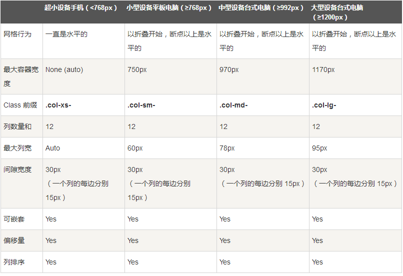
Grid Params
The following table shows how Bootstrap's grid system works on a variety of screen devices in detail.
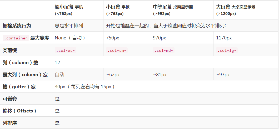
The following table summarizes how the Bootstrap grid system works across multiple devices:
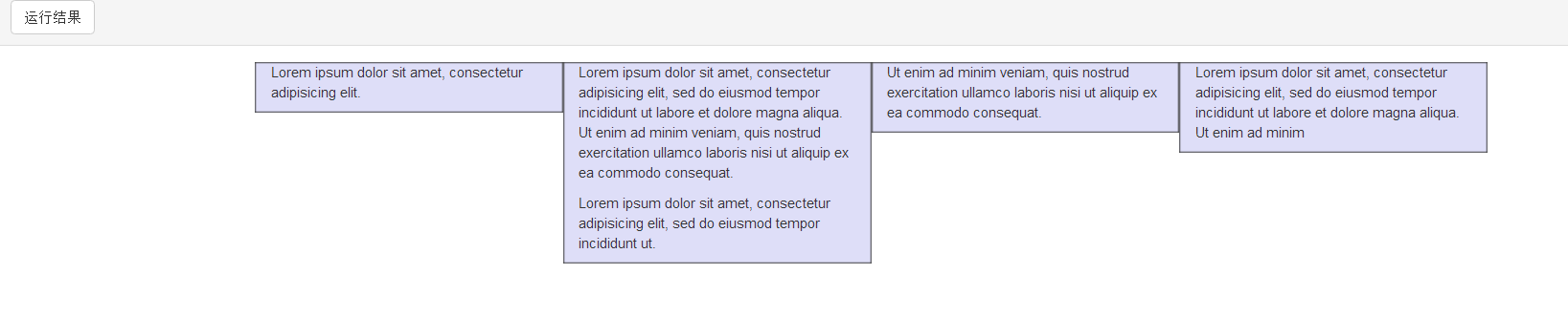
Column Reset of Response Formula
The following example contains four grids, but we can't locate the grid display when browsing on small devices.
To solve this problem, you can use.clearfix class and responsive tools, as shown in the following example:
<div class="container">
    <div class="row" >
        <div class="col-xs-6 col-sm-3"
            style="background-color: #dedef8;
            box-shadow: inset 1px -1px 1px #444, inset -1px 1px 1px #444;">
            <p>Lorem ipsum dolor sit amet, consectetur adipisicing elit.</p>
        </div>
        <div class="col-xs-6 col-sm-3"
        style="background-color: #dedef8;box-shadow:
        inset 1px -1px 1px #444, inset -1px 1px 1px #444;">
            <p>Lorem ipsum dolor sit amet, consectetur adipisicing elit, sed do
            eiusmod tempor incididunt ut labore et dolore magna aliqua. Ut
            enim ad minim veniam, quis nostrud exercitation ullamco laboris
            nisi ut aliquip ex ea commodo consequat.
            </p>
            <p>Lorem ipsum dolor sit amet, consectetur adipisicing elit, sed do
            eiusmod tempor incididunt ut.
            </p>
        </div>

        <div class="clearfix visible-xs"></div>

        <div class="col-xs-6 col-sm-3"
        style="background-color: #dedef8;
        box-shadow:inset 1px -1px 1px #444, inset -1px 1px 1px #444;">
            <p>Ut enim ad minim veniam, quis nostrud exercitation ullamco
            laboris nisi ut aliquip ex ea commodo consequat.
            </p>
        </div>
        <div class="col-xs-6 col-sm-3"
        style="background-color: #dedef8;box-shadow:
        inset 1px -1px 1px #444, inset -1px 1px 1px #444;">
            <p>Lorem ipsum dolor sit amet, consectetur adipisicing elit, sed do
            eiusmod tempor incididunt ut labore et dolore magna aliqua. Ut
            enim ad minim
            </p>
        </div>
    </div>
</div>
Offset column
Migration is a useful function for a more professional layout. They can be used to make more room for columns. For example, the. col-xs-* class does not support migration, but they can simply achieve this effect by using an empty cell.
To use offsets on large screen displays, use the.col-md-offset-* class. These classes add * columns to the left margin of a column, where * ranges from 1 to 11.
In the following example, we have <div class="col-md-6">. </div>, and we will use. col-md-offset-3 class to center the Div.
<div class="container">
    <h1>Hello, world!</h1>
    <div class="row" >
        <div class="col-xs-6 col-md-offset-3"
        style="background-color: #dedef8;box-shadow:
        inset 1px -1px 1px #444, inset -1px 1px 1px #444;">
            <p>Lorem ipsum dolor sit amet, consectetur adipisicing
            elit.
            </p>
        </div>
    </div>
</div>

Nested columns
To nest the default grid in the content, add a new. row and a set of. col-md-* columns in an existing. col-md-* column. Nested rows should contain a set of columns that cannot exceed 12 (in fact, you are not required to fill 12 columns).
In the following example, the layout has two columns, and the second column is divided into two rows and four boxes.
<div class="container">
    <h1>Hello, world!</h1>
    <div class="row">
        <div class="col-md-3" style="background-color: #dedef8;box-shadow: inset 1px -1px 1px #444, inset -1px 1px 1px #444;">
            <h4>First column</h4>
            <p>
                Lorem ipsum dolor sit amet, consectetur adipisicing elit.
            </p>
        </div>
        <div class="col-md-9" style="background-color: #dedef8;box-shadow: inset 1px -1px 1px #444, inset -1px 1px 1px #444;">
            <h4>The second column - Divided into four boxes</h4>
            <div class="row">
                <div class="col-md-6" style="background-color: #B18904; box-shadow: inset 1px -1px 1px #444, inset -1px 1px 1px #444;">
                    <p>
                        Consectetur art party Tonx culpa semiotics. Pinterest
        assumenda minim organic quis.
                    </p>
                </div>
                <div class="col-md-6" style="background-color: #B18904; box-shadow: inset 1px -1px 1px #444, inset -1px 1px 1px #444;">
                    <p>
                         sed do eiusmod tempor incididunt ut labore et dolore magna
        aliqua. Ut enim ad minim veniam, quis nostrud exercitation
        ullamco laboris nisi ut aliquip ex ea commodo consequat.
                    </p>
                </div>
            </div>
            <div class="row">
                <div class="col-md-6" style="background-color: #B18904; box-shadow: inset 1px -1px 1px #444, inset -1px 1px 1px #444;">
                    <p>
                        quis nostrud exercitation ullamco laboris nisi ut
        aliquip ex ea commodo consequat.
                    </p>
                </div>
                <div class="col-md-6" style="background-color: #B18904; box-shadow: inset 1px -1px 1px #444, inset -1px 1px 1px #444;">
                    <p>
                        Lorem ipsum dolor sit amet, consectetur adipisicing elit,
        sed do eiusmod tempor incididunt ut labore et dolore magna
        aliqua. Ut enim ad minim.
                    </p>
                </div>
            </div>
        </div>
    </div>
</div>

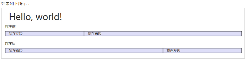
Column sorting
Another perfect feature of the Bootstrap grid system is that you can easily write columns in one order and then display them in another.
You can easily change the order of built-in grid columns with. col-md-push-* and. col-md-pull-* classes, where * ranges from 1 to 11.
In the following example, we have two columns of layout, the left column is very narrow, as the sidebar. We will use the. col-md-push-* and. col-md-pull-* classes to exchange the order of the two columns.
<div class="container">
    <h1>Hello, world!</h1>
    <div class="row">
        <p>
            Before sorting
        </p>
        <div class="col-md-4" style="background-color: #dedef8; box-shadow: inset 1px -1px 1px #444, inset -1px 1px 1px #444;">
         I am on the left.
        </div>
        <div class="col-md-8" style="background-color: #dedef8; box-shadow: inset 1px -1px 1px #444, inset -1px 1px 1px #444;">
         I am on the right.
        </div>
    </div>
    <br>
    <div class="row">
        <p>
            After sorting
        </p>
        <div class="col-md-4 col-md-push-8" style="background-color: #dedef8; box-shadow: inset 1px -1px 1px #444, inset -1px 1px 1px #444;">
         I am on the left.
        </div>
        <div class="col-md-8 col-md-pull-4" style="background-color: #dedef8; box-shadow: inset 1px -1px 1px #444, inset -1px 1px 1px #444;">
         I am on the right.
        </div>
    </div>
</div>
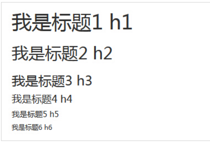
- All title tags in HTML can be used from <h1> to <h6>. In addition, classes from.H1 to.H6 are provided to give the text of inline attributes a header style.
<h1> I'm Heading 1 h1.</h1>
<h2> I'm heading 2h2.</h2>
<h3> I'm heading 3h3.</h3>
<h4> I'm titled 4h4</h4>.
<h5> I'm titled 5h5</h5>.
<h6> I'm titled 6h6</h6>.
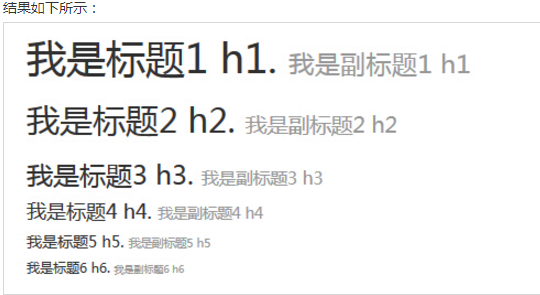
- The title can also contain <small> labels or elements assigned to the. small class, which can be used to mark subheadings.
If you need to add an inline subheading to any heading, simply add <small> or.Small class on both sides of the element so that you can get a lighter text with a smaller font size, as shown in the following example:
<h1> I'm Heading 1 h1. <small> I'm subheading 1 H1 </small>.</h1>
<h2> I'm heading 2h2. <small> I'm subheading 2h2</small>.</h2>
<h3> I'm heading 3h3. <small> I'm subheading 3h3</small>.</h3>
< H4 > I'm heading 4 h4. < small > I'm subheading 4 H4 < / small > < / H4 >
< H5 > I'm heading 5h5. < small > I'm subheading 5h5 </small > </h5 >
< H6 > I'm heading 6h6. < small > I'm subheading 6h6 < / small > < / H6 >
-
Page body: Bootstrap sets global font-size to 14px and line-height to 1.428. These attributes are directly assigned to <body> elements and all paragraph elements. In addition, the < p > (paragraph) element is set to a bottom margin equal to 1/2 line height (that is, 10px).
<h2> Boot principal replica</h2>
<p class="lead"> This is an example of how to use a copy of the boot principal. This is an example that demonstrates the usage of boot principal replicas. This is an example that demonstrates the usage of boot principal replicas. This is an example that demonstrates the usage of boot principal replicas. This is an example that demonstrates the usage of boot principal replicas. This is an example that demonstrates the usage of boot principal replicas. This is an example that demonstrates the usage of boot principal replicas. This is an example that demonstrates the usage of boot principal replicas. </p>

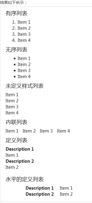
List:
Bootstrap supports ordered lists, unordered lists, and defined lists.
- Ordered list: An ordered list is a list that begins with a number or other ordered character.
- Unordered list: Unordered list refers to a list without a specific order, which begins with a traditional emphasis sign. If you don't want to display these emphasis marks, you can use class. list-unstyled to remove styles. You can also use class. list-inline to put all list items on the same line.
- Define lists: In this type of list, each list item can contain < DT > and < DD > elements. <dt> stands for defining terms, like dictionaries, which are defined as belonging (or phrases). Next, <dd> is the description of <dt>. You can use class dl-horizontal to display the belongings and descriptions in < DL > rows side by side.
The following examples illustrate these types of lists:
<h4>Ordered list</h4>
<ol>
  <li>Item 1</li>
  <li>Item 2</li>
  <li>Item 3</li>
  <li>Item 4</li>
</ol>
<h4>Unordered list</h4>
<ul>
  <li>Item 1</li>
  <li>Item 2</li>
  <li>Item 3</li>
  <li>Item 4</li>
</ul>
<h4>Undefined style list</h4>
<ul class="list-unstyled">
  <li>Item 1</li>
  <li>Item 2</li>
  <li>Item 3</li>
  <li>Item 4</li>
</ul>
<h4>Inline list</h4>
<ul class="list-inline">
  <li>Item 1</li>
  <li>Item 2</li>
  <li>Item 3</li>
  <li>Item 4</li>
</ul>
<h4>Definition list</h4>
<dl>
  <dt>Description 1</dt>
  <dd>Item 1</dd>
  <dt>Description 2</dt>
  <dd>Item 2</dd>
</dl>
<h4>Definition list of levels</h4>
<dl class="dl-horizontal">
  <dt>Description 1</dt>
  <dd>Item 1</dd>
  <dt>Description 2</dt>
  <dd>Item 2</dd>
</dl>
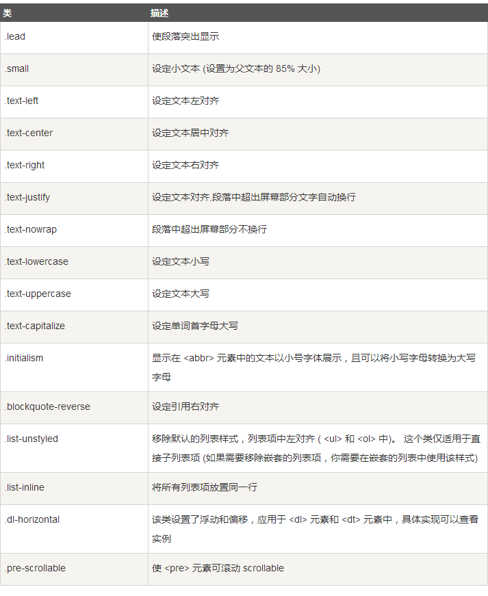
The following table provides examples of more typesetting classes for Bootstrap:
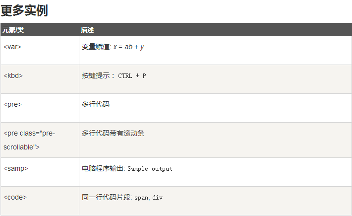
Bootstrap allows you to display code in two ways:
- The first is the < code > tag. If you want to inline display code, you should use the < code > tag.
For example, <code><section></code> should be wrapped as inline.

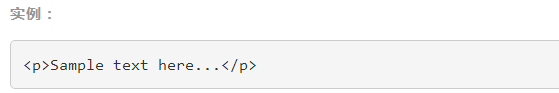
- The second is the < pre > tag. If the code needs to be displayed as a separate block element or if the code has multiple lines, you should use the < pre > tag.
<pre><p>Sample text here...</p></pre>
The.pre-scrollable class can also be used to set max-height to 350 PX and display scrollbars vertically.
- Some table elements supported by Bootstrap:
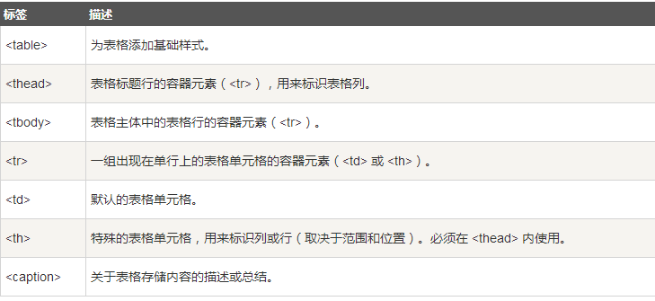
- Styles for tables
- Rows or cells for tables
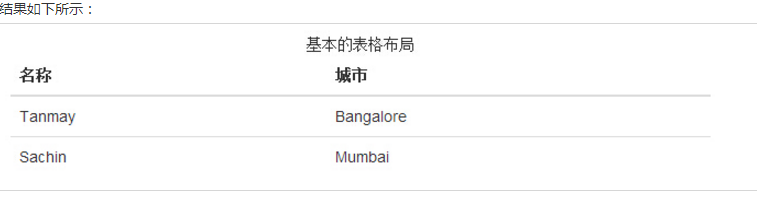
Basic example
- Adding. table classes to any <table> tag can give it a basic style -- a small amount of padding and horizontal dividers. This way looks like a lot of superfluous!? But we think that table elements are widely used, and if we give them a default style, it may affect plug-ins such as calendar and date selection, so we choose to separate this style.
<table class="table">
  <caption>Basic table layout</caption>
  <thead>
    <tr>
      <th>Name</th>
      <th>City</th>
    </tr>
  </thead>
  <tbody>
    <tr>
      <td>Tanmay</td>
      <td>Bangalore</td>
    </tr>
    <tr>
      <td>Sachin</td>
      <td>Mumbai</td>
    </tr>
  </tbody>
</table>
-
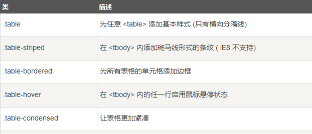
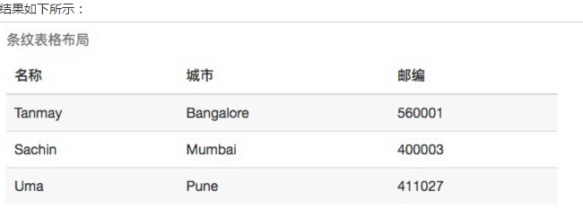
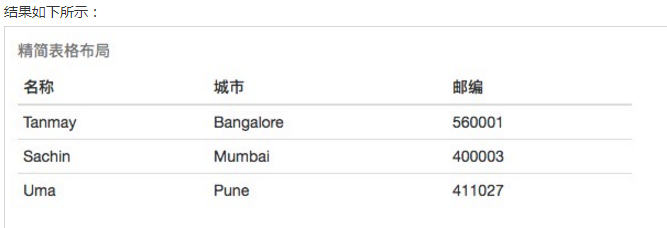
Fringe pattern
By adding. table-striped class, you will see the stripes on the lines in <tbody>, as shown in the following example:
<table class="table table-striped">
  <caption>Stripe table layout</caption>
  <thead>
    <tr>
      <th>Name</th>
      <th>City</th>
      <th>Zip code</th>
    </tr>
  </thead>
  <tbody>
    <tr>
      <td>Tanmay</td>
      <td>Bangalore</td>
      <td>560001</td>
    </tr>
    <tr>
      <td>Sachin</td>
      <td>Mumbai</td>
      <td>400003</td>
    </tr>
    <tr>
      <td>Uma</td>
      <td>Pune</td>
      <td>411027</td>
    </tr>
  </tbody>
</table>
-
Bordered tables
By adding. table-bordered class, you will see that each element has borders around it, and the entire table is rounded, as shown in the following example:
<table class="table table-bordered">
  <caption>Border Table Layout</caption>
  <thead>
    <tr>
      <th>Name</th>
      <th>City</th>
      <th>Zip code</th>
    </tr>
  </thead>
  <tbody>
    <tr>
      <td>Tanmay</td>
      <td>Bangalore</td>
      <td>560001</td>
    </tr>
    <tr>
      <td>Sachin</td>
      <td>Mumbai</td>
      <td>400003</td>
    </tr>
    <tr>
      <td>Uma</td>
      <td>Pune</td>
      <td>411027</td>
    </tr>
  </tbody>
</table>

-
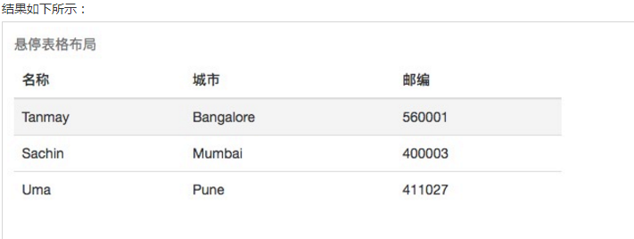
Hover table
By adding. table-hover class, a light grey background appears when the pointer hovers over the row, as shown in the following example:
<table class="table table-hover">
  <caption>Hovering table layout</caption>
  <thead>
    <tr>
      <th>Name</th>
      <th>City</th>
      <th>Zip code</th>
    </tr>
  </thead>
  <tbody>
    <tr>
      <td>Tanmay</td>
      <td>Bangalore</td>
      <td>560001</td>
    </tr>
    <tr>
      <td>Sachin</td>
      <td>Mumbai</td>
      <td>400003</td>
    </tr>
    <tr>
      <td>Uma</td>
      <td>Pune</td>
      <td>411027</td>
    </tr>
  </tbody>
</table>
-
Streamlined forms
By adding. table-condensed class, the padding is cut in half to make the table look more compact, as shown in the example below. This is very useful when you want information to look more compact.
<table class="table table-condensed">
  <caption>Streamlining table layout</caption>
  <thead>
    <tr>
      <th>Name</th>
      <th>City</th>
      <th>Zip code</th></tr>
  </thead>
  <tbody>
    <tr>
      <td>Tanmay</td>
      <td>Bangalore</td>
      <td>560001</td></tr>
    <tr>
      <td>Sachin</td>
      <td>Mumbai</td>
      <td>400003</td></tr>
    <tr>
      <td>Uma</td>
      <td>Pune</td>
      <td>411027</td></tr>
  </tbody>
</table>
-
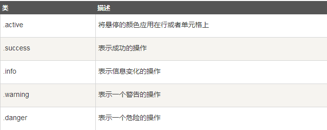
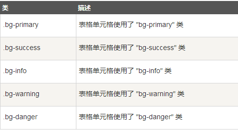
Context class
The context classes listed in the table below allow you to change the background color of a table row or a single cell.

<table class="table">
  <caption>Context table layout</caption>
  <thead>
    <tr>
      <th>product</th>
      <th>Date of payment</th>
      <th>state</th></tr>
  </thead>
  <tbody>
    <tr class="active">
      <td>Product 1</td>
      <td>23/11/2013</td>
      <td>To be shipped</td></tr>
    <tr class="success">
      <td>Product 2</td>
      <td>10/11/2013</td>
      <td>Delivery</td></tr>
    <tr class="warning">
      <td>Product 3</td>
      <td>20/10/2013</td>
      <td>To be confirmed</td></tr>
    <tr class="danger">
      <td>Product 4</td>
      <td>20/10/2013</td>
      <td>Returned goods</td></tr>
  </tbody>
</table>

-
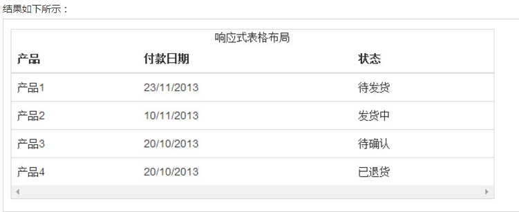
Response Form
By wrapping any. table in. table-responsive class, you can scroll the table horizontally to accommodate small devices (less than 768px). When viewed on a large device larger than 768 px, you will not see any difference.
<div class="table-responsive">
  <table class="table">
    <caption>Responsive table layout</caption>
    <thead>
      <tr>
        <th>product</th>
        <th>Date of payment</th>
        <th>state</th></tr>
    </thead>
    <tbody>
      <tr>
        <td>Product 1</td>
        <td>23/11/2013</td>
        <td>To be shipped</td></tr>
      <tr>
        <td>Product 2</td>
        <td>10/11/2013</td>
        <td>Delivery</td></tr>
      <tr>
        <td>Product 3</td>
        <td>20/10/2013</td>
        <td>To be confirmed</td></tr>
      <tr>
        <td>Product 4</td>
        <td>20/10/2013</td>
        <td>Returned goods</td></tr>
    </tbody>
  </table>
</div>
-
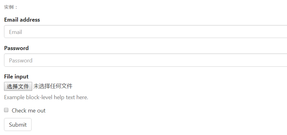
The basic form structure comes with Bootstrap, and individual form controls automatically receive some global styles. The steps to create the basic form are listed below:
- Add role="form" to the parent < form > element.
- Place labels and controls in a <div> with class. form-group. This is necessary to get the best spacing.
- Add class = form-control to all text elements < input >, < textarea > and < select >.
<form>
  <div class="form-group">
    <label for="exampleInputEmail1">Email address</label>
    <input type="email" class="form-control" id="exampleInputEmail1" placeholder="Email">
  </div>
  <div class="form-group">
    <label for="exampleInputPassword1">Password</label>
    <input type="password" class="form-control" id="exampleInputPassword1" placeholder="Password">
  </div>
  <div class="form-group">
    <label for="exampleInputFile">File input</label>
    <input type="file" id="exampleInputFile">
    <p class="help-block">Example block-level help text here.</p>
  </div>
  <div class="checkbox">
    <label>
      <input type="checkbox"> Check me out
    </label>
  </div>
  <button type="submit" class="btn btn-default">Submit</button>
</form>
-
Inline form
Adding a. form-inline class to the <form> element enables its content to be left-aligned and represented as an inline-block level control. It only applies to viewport at least 768 PX width (the smaller the viewport width, the more folded the form).

<form class="form-inline" role="form">
  <div class="form-group">
    <label class="sr-only" for="name">Name</label>
    <input type="text" class="form-control" id="name" placeholder="Please enter a name">
  </div>
  <div class="form-group">
    <label class="sr-only" for="inputfile">File input</label>
    <input type="file" id="inputfile">
  </div>
  <div class="checkbox">
    <label>
      <input type="checkbox">Please Tick
    </label>
  </div>
  <button type="submit" class="btn btn-default">Submission</button>
</form>

-
Horizontal form
Horizontal forms differ from other forms not only in the number of tags, but also in the form presentation. To create a horizontal layout form, follow the following steps:
- Add class. form-horizontal to the parent < form > element.
- Place labels and controls in a <div> with class. form-group.
- Add class. control-label to the label.
<form class="form-horizontal" role="form">
  <div class="form-group">
    <label for="firstname" class="col-sm-2 control-label">Name</label>
    <div class="col-sm-10">
      <input type="text" class="form-control" id="firstname" placeholder="Please enter your name.">
    </div>
  </div>
  <div class="form-group">
    <label for="lastname" class="col-sm-2 control-label">surname</label>
    <div class="col-sm-10">
      <input type="text" class="form-control" id="lastname" placeholder="Please input your last name.">
    </div>
  </div>
  <div class="form-group">
    <div class="col-sm-offset-2 col-sm-10">
      <div class="checkbox">
        <label>
          <input type="checkbox">Please remember me.
        </label>
      </div>
    </div>
  </div>
  <div class="form-group">
    <div class="col-sm-offset-2 col-sm-10">
      <button type="submit" class="btn btn-default">Sign in</button>
    </div>
  </div>
</form>

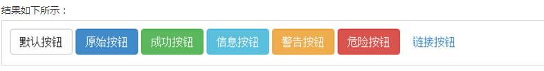
Labels or elements that can be used as buttons
Add a button class for < a >, < button > or < input > elements to use the style provided by Bootstrap.
The following styles can be used on <a>, <button>, or <input> elements:


<! - Standard button - >
<button type="button" class="btn btn-default">default button</button>
<! - Provides additional visual effects, identifying the original action in a set of buttons - >.
<button type="button" class="btn btn-primary">original button</button>
<! - indicates a successful or positive action - >
<button type="button" class="btn btn-success">success button</button>
<! - Context Button for Information Warning Message - >
<button type="button" class="btn btn-info">information button</button>
<! - Indicates that cautious action should be taken - >
<button type="button" class="btn btn-warning">warning button</button>
<! - Indicates a dangerous or potential negative action - >
<button type="button" class="btn btn-danger">dangerous button</button>
<! - It doesn't emphasize that it's a button. It looks like a link, but keeps the button in action at the same time.
<button type="button" class="btn btn-link">link button</button>
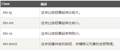
Button size
Buttons of different sizes can be obtained by using.btn-lg,.btn-sm or.btn-xs.
The following table lists the class es for obtaining buttons of various sizes:
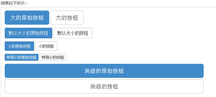
<p>
  <button type="button" class="btn btn-primary btn-lg">Big original button</button>
  <button type="button" class="btn btn-default btn-lg">Big button</button>
</p>
<p>
  <button type="button" class="btn btn-primary">The default size of the original button</button>
  <button type="button" class="btn btn-default">Buttons of default size</button>
</p>
<p>
  <button type="button" class="btn btn-primary btn-sm">Small original button</button>
  <button type="button" class="btn btn-default btn-sm">Small buttons</button>
</p>
<p>
  <button type="button" class="btn btn-primary btn-xs">Extremely small original button</button>
  <button type="button" class="btn btn-default btn-xs">Extremely small buttons</button>
</p>
<p>
  <button type="button" class="btn btn-primary btn-lg btn-block">Block-level raw buttons</button>
  <button type="button" class="btn btn-default btn-lg btn-block">Block-level buttons</button>
</p>
Button state
Bootstrap provides a class of button states such as activation, disablement, etc., which will be explained in detail below.
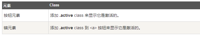
Activation state
When the button is activated, it will appear as the pressed appearance (dark background, dark border, shadow).
The following table lists the class es that activate the button and anchor elements:
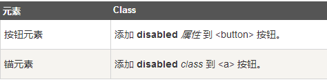
Forbidden state
When you disable a button, it fades by 50% and loses its gradient.
The following table lists the class es that disable button and anchor elements:
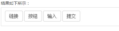
Button label
You can use the button class on < a >, < button > or < input > elements. But it is recommended that you use button class on <button> elements to avoid cross-browser inconsistencies.
The following example illustrates this:
<a class="btn btn-default" href="#" role="button">link</a>
<button class="btn btn-default" type="submit">Button</button>
<input class="btn btn-default" type="button" value="input">
<input class="btn btn-default" type="submit" value="Submission">
- In Bootstrap version 3, images can support responsive layout by adding. img-response classes to images. Its essence is to set max-width: 100%; height: auto; and display: block; attributes for the picture, so that the picture can be better zoomed in its parent element.
- If you need to keep the picture using the.Img-response class in the middle, use the.center-block class instead of the.text-center class.
<img src="cinqueterre.jpg" class="img-responsive" alt="Cinque Terre">
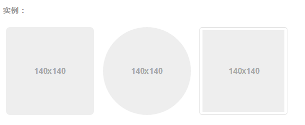
Picture shape
By adding the following corresponding classes for <img> elements, you can make pictures take on different shapes.

<img src="..." alt="..." class="img-rounded">
<img src="..." alt="..." class="img-circle">
<img src="..." alt="..." class="img-thumbnail">
text
The following different classes show different text colors. If the text is a link, the mouse will darken when it moves over the text:

background
The following different classes show different background colors. If the text is a link, the mouse will darken when it moves over the text:
Other

Some examples:
Close icon
Use the general closing icon to close the modal box and warning box. Use class close to get the closing icon.
<p>Close icon instance <button type="button" class="close" aria-hidden="true"> × </button> </p>
Triangle symbol
By using triangular symbols, you can indicate that an element has the function of a drop-down menu. Be careful, Up pop-up menu The triangle symbols are in the opposite direction.
<span class="caret"></span>
Keep content in the middle
Set the display: block attribute for any element and center the content through the margin attribute. The classes listed below can also be used as mixin s.
<div class="center-block">...</div>
// Class
.center-block {
  display: block;
  margin-left: auto;
  margin-right: auto;
}

// Usage as a mixin
.element {
  .center-block();
}
Display or hide content
The. show and. hidden classes can force any element to be displayed or hidden (which also works for screen readers). These classes avoid CSS style prioritization through! important, like ____________ quick floats Same approach. Note that these classes only work on block-level elements and can also be used as mixin s.
The. hide class is still available, but it does not work on screen readers and is not recommended since version v3.0.1. Use. hidden or. sr-only.
In addition, the. invisible class can be used to affect only the visibility of the element, that is, the display attribute of the element is unchanged, and the element can still affect the layout of the document flow.
<div class="show">...</div>
<div class="hidden">...</div>
// Classes
.show {
  display: block !important;
}
.hidden {
  display: none !important;
}
.invisible {
  visibility: hidden;
}

// Usage as mixins
.element {
  .show();
}
.another-element {
  .hidden();
}
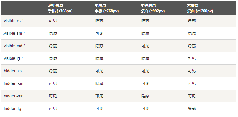
Bootstrap provides some auxiliary classes for faster mobile device-friendly development. These can be combined with large, small and medium-sized devices through media queries to achieve content display and hiding of devices.
Careful use of these tools is needed to avoid creating completely different versions on the same site. Responsive utilities are currently only available for block and table switching.
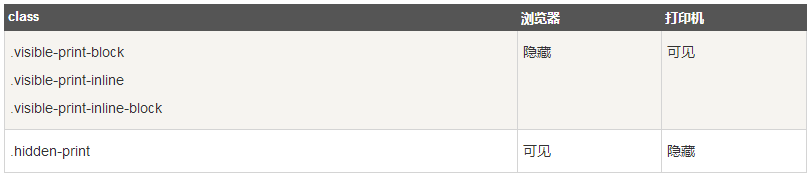
Printing class
The following table lists the print classes. Use these toggles to print content.
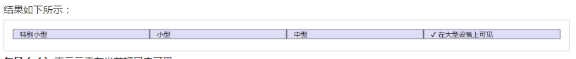
<div class="container" style="padding: 40px;">
    <div class="row visible-on">
        <div class="col-xs-6 col-sm-3" style="background-color: #dedef8;
        box-shadow: inset 1px -1px 1px #444, inset -1px 1px 1px #444;">
            <span class="hidden-xs">Special small</span>
            <span class="visible-xs">✔ Visible on special small devices</span>
        </div>
        <div class="col-xs-6 col-sm-3" style="background-color: #dedef8;
        box-shadow: inset 1px -1px 1px #444, inset -1px 1px 1px #444;">
            <span class="hidden-sm">small-scale</span>
            <span class="visible-sm">✔ Visible on small devices</span>
        </div>
        <div class="clearfix visible-xs"></div>
        <div class="col-xs-6 col-sm-3" style="background-color: #dedef8;
        box-shadow: inset 1px -1px 1px #444, inset -1px 1px 1px #444;">
            <span class="hidden-md">Medium-sized</span>
            <span class="visible-md">✔ Visible on medium-sized equipment</span>
        </div>
        <div class="col-xs-6 col-sm-3" style="background-color: #dedef8;
        box-shadow: inset 1px -1px 1px #444, inset -1px 1px 1px #444;">
            <span class="hidden-lg">large</span>
            <span class="visible-lg">✔ Visible on large equipment</span>
        </div>
    </div>
</div>
I hope everyone can learn how to use Bootstrap