BFC(Block Formatting Context)
1, Definition of BFC
In MDN, it is said that Block Formatting Context (BFC) is a part of visual CSS rendering of Web pages, the area where the layout process of block boxes occurs, and the area where floating elements interact with other elements
In other words: BFC is to provide an independent container for elements, in which elements are arranged according to certain rules. The elements in the container will not affect the external elements, and the external elements will not affect the internal elements
2, Layout rules of BFC
- The inner boxes are placed vertically one by one.
- The distance in the vertical direction of the Box is determined by margin. Margins of two adjacent boxes belonging to the same BFC will overlap.
- The left outer border of each box is next to the left border of the containing block, even for floating elements.
- The area of the BFC does not overlap the float box.
- BFC is an isolated independent container on the page. The child elements in the container will not affect the external elements, and vice versa.
- When calculating the height of BFC, floating sub elements also participate in the calculation.
3, Common methods for opening BFC
1. float is left or right
2. position is absolute or fixed
3. overflow is hidden, scroll and auto
4. display is inline block
4, BFC related cases
1. Clear float
<!DOCTYPE html>
<html lang="en">
<head>
    <meta charset="UTF-8">
    <meta http-equiv="X-UA-Compatible" content="IE=edge">
    <meta name="viewport" content="width=device-width, initial-scale=1.0">
    <title>Document</title>
    <style>
        .parent{
            width: 350px;
            background-color: red;
            //Clear float 	 Start BFC for parent element
            //overflow:hidden;
        }
        .parent div{
            width: 100px;
            height: 100px;
            text-align: center;
            background-color:blue;
            float: left;
        }
    </style>
</head>
<body>
    <div class="parent">
        <div class="child1">1</div>
        <div class="child2">2</div>
        <div class="child3">3</div>
        <div class="child4">4</div>
    </div>
</body>
</html>
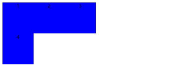
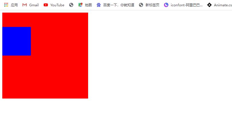
What we want to see is
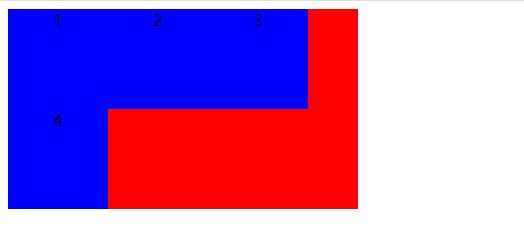
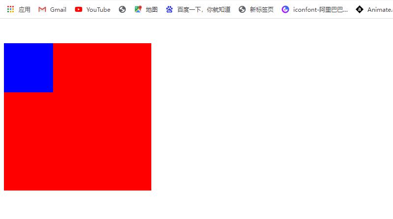
But the code runs like this
There are two reasons for this result: 1. The parent element does not have height set; 2. The child element is set with float, which is separated from the document flow
Because the child element is separated from the document flow, the parent element cannot count the size of the child element, so the child element cannot spread the parent element, so we need to clear the floating. So how to clear the floating? The most common is to add the style overflow:hidden; to the parent element;, In fact, this method turns on BFC. Of course, the above method of turning on BFC is also applicable
Is there any other way to clear the float besides turning on BFC for the parent element?
(1) Set a height for the parent element
(2) Add an empty element after the last child element and give the style clear:both;
2. Margin top collapse
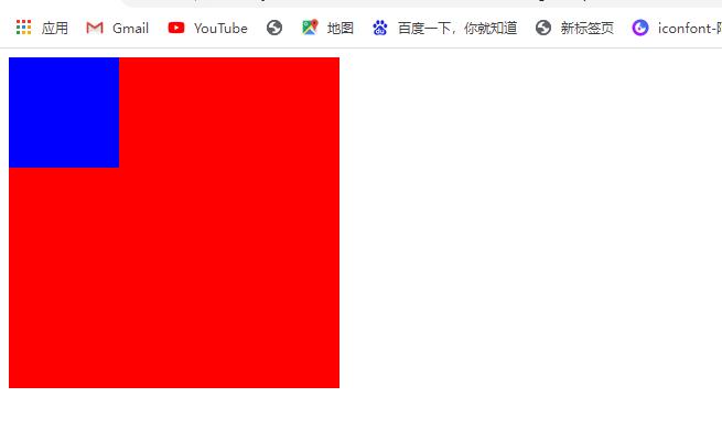
The current child element is in the parent element box and is close to the upper edge of the parent element. At this time, we want to make the upper edge of the child element a distance away from the upper edge of the parent element to achieve the effect shown in the following figure
Therefore, our first thought is to add margin top to the child element, but the result is not satisfactory. The effect is shown in the figure below
The parent element as a whole is a distance away from the previous element. This is because the layout of child elements affects the layout of external elements. Therefore, you can turn on BFC for the parent element to form an independent container, so that the layout of external elements of the parent element will not be affected. For margin top collapse, you can also set a border or padding for the parent element, which can also solve the problem
<!DOCTYPE html>
<html lang="en">
<head>
    <meta charset="UTF-8">
    <meta http-equiv="X-UA-Compatible" content="IE=edge">
    <meta name="viewport" content="width=device-width, initial-scale=1.0">
    <title>Document</title>
    <style>
        .parent{
            width: 300px;
            height: 300px;
            background-color:red;
            /* Turn on BFC for parent element */
            overflow: hidden;
        }
        .child{
            width: 100px;
            height: 100px;
            background-color: blue;
            margin-top: 50px;

        }
    </style>
</head>
<body>
    <div class="parent">
        <div class="child"></div>
    </div>
</body>
</html>
3. margin overlap in vertical direction
<!DOCTYPE html>
<html lang="en">
<head>
    <meta charset="UTF-8">
    <meta http-equiv="X-UA-Compatible" content="IE=edge">
    <meta name="viewport" content="width=device-width, initial-scale=1.0">
    <title>Document</title>
    <style>
        .parent{
            width: 200px;
            height: 500px;
            background-color: red;
        }
        .child{
            width: 100px;
            height: 100px;
            margin: 0 auto;
            line-height: 100px;
            text-align: center;
        }
        .child1{
            margin-bottom: 20px;
            background-color: lightblue;
        }
        .child2{
            margin-top: 50px;
            margin-bottom: 70px;
            background-color: lightcoral;
        }
        .child3{
            margin-top: 50px;
            background-color: lightgreen;
        }
    </style>
</head>
<body>
    <div class="parent">
        <div class="child child1">1</div>
        <div class="child child2">2</div>
        <div class="child child3">3</div>
    </div>
</body>
</html>
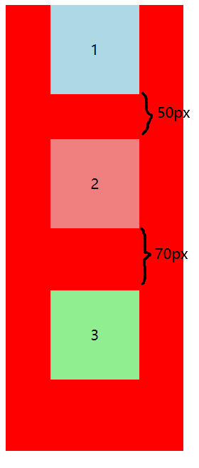
What we want is that the pixels between 1 and 2 are 70px, and the pixels between 2 and 3 are 120px, as shown in the figure above. This is because the margins of two elements overlap in the vertical direction. Whoever has a large margin depends on who. If we want to solve the problem of margin overlap in the vertical direction, we can nest a parent element outside each element and turn on BFC for the parent element
<!DOCTYPE html>
<html lang="en">
<head>
    <meta charset="UTF-8">
    <meta http-equiv="X-UA-Compatible" content="IE=edge">
    <meta name="viewport" content="width=device-width, initial-scale=1.0">
    <title>Document</title>
    <style>
        .parent{
            width: 200px;
            height: 500px;
            background-color: red;
        }
        .child{
            width: 100px;
            height: 100px;
            margin: 0 auto;
            line-height: 100px;
            text-align: center;
        }
        .child1{
            margin-bottom: 20px;
            background-color: lightblue;
        }
        .child2{
            margin-top: 50px;
            margin-bottom: 70px;
            background-color: lightcoral;
        }
        .child3{
            margin-top: 50px;
            background-color: lightgreen;
        }
        .container{
            overflow: hidden;
        }
    </style>
</head>
<body>
    <div class="parent">
        <div class="container">
            <div class="child child1">1</div>
        </div>
        <div class="container">
            <div class="child child2">2</div>
        </div>
        <div class="container">
            <div class="child child3">3</div>
        </div>
    </div>
</body>
</html>
The effect is as follows
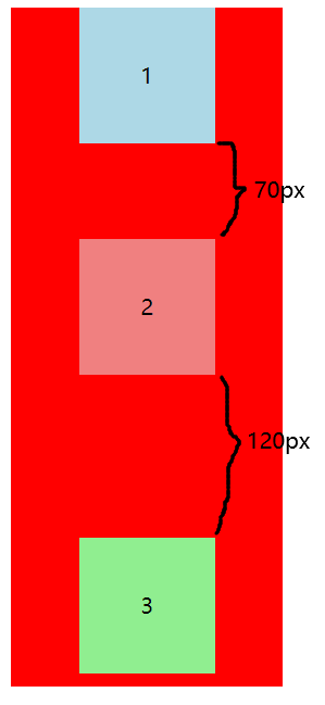
In this case, we set a div on each child element and trigger BFC to avoid merge overlap, that is, we create multiple BFCs to achieve this effect. However, if there are still multiple child elements in the same BFC environment, the vertical margin of these child elements will still overlap
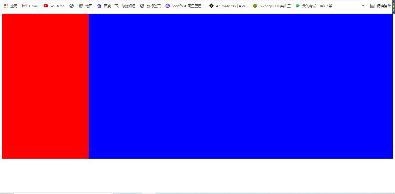
4. Adaptive layout
Left fixed width, right adaptive
<!DOCTYPE html>
<html lang="en">
<head>
    <meta charset="UTF-8">
    <meta http-equiv="X-UA-Compatible" content="IE=edge">
    <meta name="viewport" content="width=device-width, initial-scale=1.0">
    <title>Document</title>
    <style>
        .left{
            width: 300px;
            height: 500px;
            background-color: red;
            float: left;
        }
        .right{
            height: 500px;
            background-color:blue;
            overflow: hidden;
        }
    </style>
</head>
<body>
    <div class="main">
        <div class="left"></div>
        <div class="right"></div>
    </div>
</body>
</html>