I. histogram
-
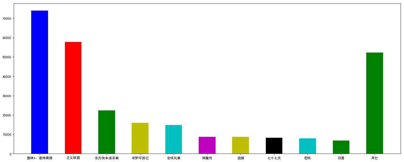
Box office histogram 1
     import matplotlib.pyplot as plt
     import numpy as np

     # Set matplotlib to display Chinese and minus sign normally
     matplotlib.rcParams['font.sans-serif']=['SimHei']
     matplotlib.rcParams['axes.unicode_minus']=False

     # Create canvas
     plt.figure(figsize=(20, 8), dpi=80)
     # Abscissa movie name
     movie_name = ['Raytheon 3: dusk of gods','Justice League: Injustice for All','Murder of Orient Express','Journey to dream seeking circle','Global Storm','Demon biography','Chase','Seventy-seven days','Secret War','Mad beast','Other']
     # Box office in ordinate
     y=[73853,57767,22354,15969,14839,8725,8716,8318,7916,6764,52222]
     x=range(len(movie_name))

     plt.bar(x,y,width=0.5, color=['b','r','g','y','c','m','y','k','c','g','g'])
     plt.xticks(x, movie_name)

     plt.show()
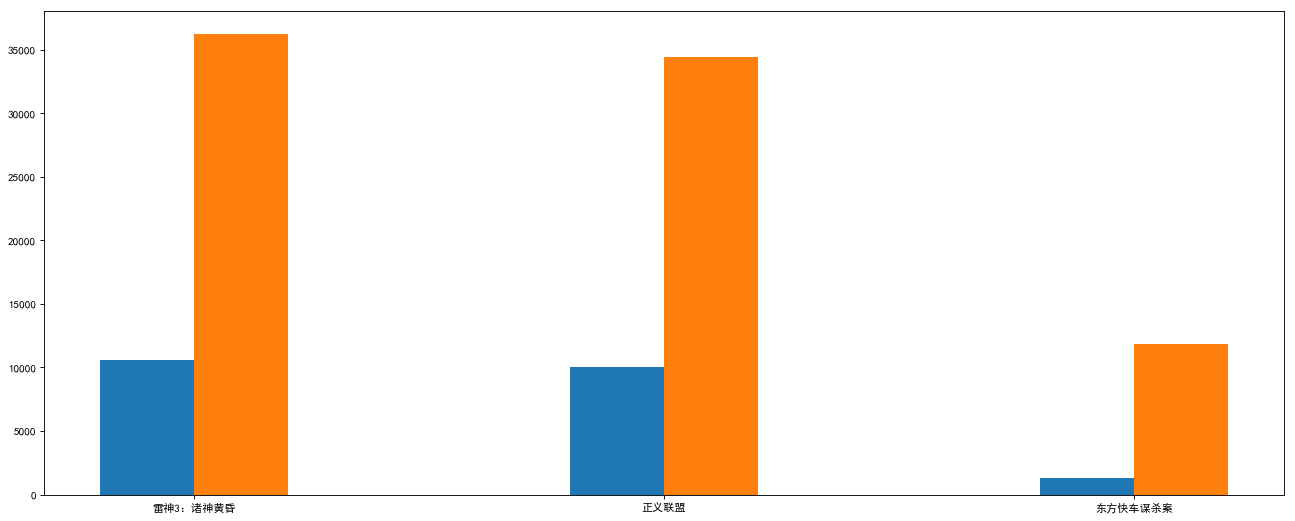
2. Box office histogram 2
plt.figure(figsize=(20, 8), dpi=80)

movie_name = ['Raytheon 3: dusk of gods','Justice League: Injustice for All','Murder of Orient Express']
first_day = [10587.6, 10062.5, 1275.7]
first_weekend = [36224.9, 34479.6, 11830]

# Get the length of movie name first, and then get the subscript composition list
x = range(len(movie_name))

plt.bar(x, first_day, width=0.2)
# Move 0.2 to the right, column width 0.2
plt.bar([i + 0.2 for i in x], first_weekend, width=0.2)

# The bottom Chinese character moves to the middle of the two bars (originally, the Chinese character moved 0.1 to the right under the blue bar on the left)
plt.xticks([i + 0.1 for i in x], movie_name)
plt.show()
II. Histogram
-
Let's start with the histogram
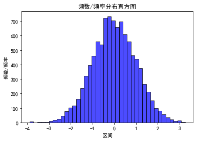
Similar to the figure below, the horizontal axis represents human height, and the vertical axis represents the number of times for each height. If the width of a column is multiplied by the height of the vertical axis, the result is the total number of people of this height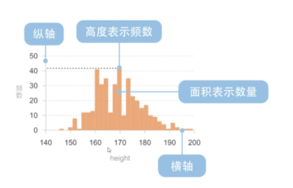
-
Simple histogram 1
 import matplotlib.pyplot as plt
 import numpy as np

 # Set matplotlib to display Chinese and minus sign normally
 matplotlib.rcParams['font.sans-serif']=['SimHei']   # Show Chinese in bold
 matplotlib.rcParams['axes.unicode_minus']=False     # Normal display of minus sign

 # Randomly generated (10000,) data subject to normal distribution
 data = np.random.randn(10000)

 """
 //Draw histogram
 data:Required parameters, drawing data
 bins:Number of long bars of histogram, optional, default is 10
 normed:Whether to normalize the histogram vector is optional. The default value is 0, which represents the non normalization and display frequency. normed=1,Indicates normalization and display frequency.
 facecolor:The color of the long strip
 edgecolor:Color of the long bar border
 alpha:transparency
 """

 plt.hist(data, bins=40, normed=0, facecolor="blue", edgecolor="black", alpha=0.7)
 # Show horizontal axis labels
 plt.xlabel("Section")
 # Show vertical labels
 plt.ylabel("frequency/frequency")
 # Display diagram title
 plt.title("frequency/Frequency distribution histogram")

 plt.show()
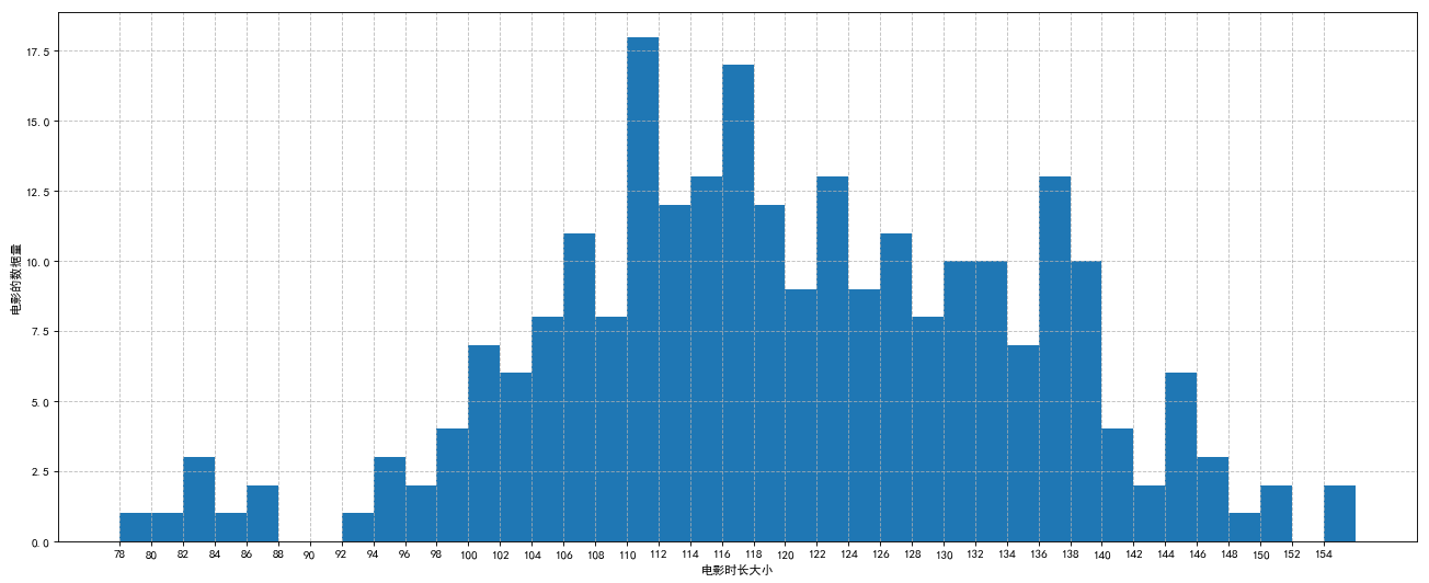
3. Simple histogram 2
# histogram

plt.figure(figsize=(20, 8), dpi=80)

time =[131,  98, 125, 131, 124, 139, 131, 117, 128, 108, 135, 138, 131, 102, 107, 114, 119, 128, 121, 142, 127, 130, 124, 101, 110, 116, 117, 110, 128, 128, 115,  99, 136, 126, 134,  95, 138, 117, 111,78, 132, 124, 113, 150, 110, 117,  86,  95, 144, 105, 126, 130,126, 130, 126, 116, 123, 106, 112, 138, 123,  86, 101,  99, 136,123, 117, 119, 105, 137, 123, 128, 125, 104, 109, 134, 125, 127,105, 120, 107, 129, 116, 108, 132, 103, 136, 118, 102, 120, 114,105, 115, 132, 145, 119, 121, 112, 139, 125, 138, 109, 132, 134,156, 106, 117, 127, 144, 139, 139, 119, 140,  83, 110, 102,123,107, 143, 115, 136, 118, 139, 123, 112, 118, 125, 109, 119, 133,112, 114, 122, 109, 106, 123, 116, 131, 127, 115, 118, 112, 135,115, 146, 137, 116, 103, 144,  83, 123, 111, 110, 111, 100, 154,136, 100, 118, 119, 133, 134, 106, 129, 126, 110, 111, 109, 141,120, 117, 106, 149, 122, 122, 110, 118, 127, 121, 114, 125, 126,114, 140, 103, 130, 141, 117, 106, 114, 121, 114, 133, 137,  92,121, 112, 146,  97, 137, 105,  98, 117, 112,  81,  97, 139, 113,134, 106, 144, 110, 137, 137, 111, 104, 117, 100, 111, 101, 110,105, 129, 137, 112, 120, 113, 133, 112,  83,  94, 146, 133, 101,131, 116, 111,  84, 137, 115, 122, 106, 144, 109, 123, 116, 111,111, 133, 150]

bins = 2

group = int((max(time) - min(time)) / bins)

# plt.hist(time, group, normed=1)
plt.hist(time, group)

# Specify the scale range and duration
plt.xticks(list(range(min(time), max(time)))[::2])

plt.xlabel("Movie duration size")
plt.ylabel("The amount of data in a movie")

# Gridlines in tables
plt.grid(True, linestyle='--', alpha=0.8)

plt.show()
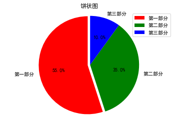
3. Pie chart
import matplotlib.pyplot as plt
import matplotlib

matplotlib.rcParams['font.sans-serif'] = ['SimHei']
matplotlib.rcParams['axes.unicode_minus'] = False

label_list = ["The first part", "The second part", "The third part"]    # Label of each part
size = [55, 35, 10]    # Size of each part
color = ["r", "g", "b"]     # Color of each part
explode = [0.05, 0, 0]   # Outstanding value of each part

"""
//Pie chart
explode: Set each part to be highlighted
label:Label each part
labeldistance:Set label text to center, 1.1 Express 1.1 Double radius
autopct: Set text inside circle
shadow: Set whether there is shadow
startangle: Start angle, default to turn counterclockwise from 0
pctdistance: Set the distance between the text in the circle and the center of the circle
//Return value
l_text: Text inside the circle, matplotlib.text.Text object
p_text: Text outside circle
"""

patches, l_text, p_text = plt.pie(size, explode=explode, colors=color, labels=label_list, labeldistance=1.1, autopct="%1.1f%%", shadow=False, startangle=90, pctdistance=0.6)
plt.axis("equal")    # Set the size of the horizontal and vertical axes to be equal, so that the pie is round
plt.title("Pie chart")
plt.legend()
plt.show()