1, Preliminary understanding of Matplotlib
1. What is Matplotlib?
- It is specially used to develop 2D charts (including 3D charts)
- Realize data visualization in a progressive and interactive way
2. Matplotlib three-tier structure
(1) Container layer
Canvas: a tool for placing a canvas (Figure), which acts as a sketchpad
Figure: act as canvas
Axes: drawing area of data
(2) Auxiliary display layer:
It is mainly modified on the basis of Axes, including axis appearance, spines, axis, axis label, tick label, grid line (grld), legend, title, etc. The setting of this layer can make the image display more intuitive and easier for users to understand, but it will not have a substantial impact on the image.
(3) Image layer
It refers to drawing images according to data through functions such as plot, scatter, bar, histogram and pie in Axes.
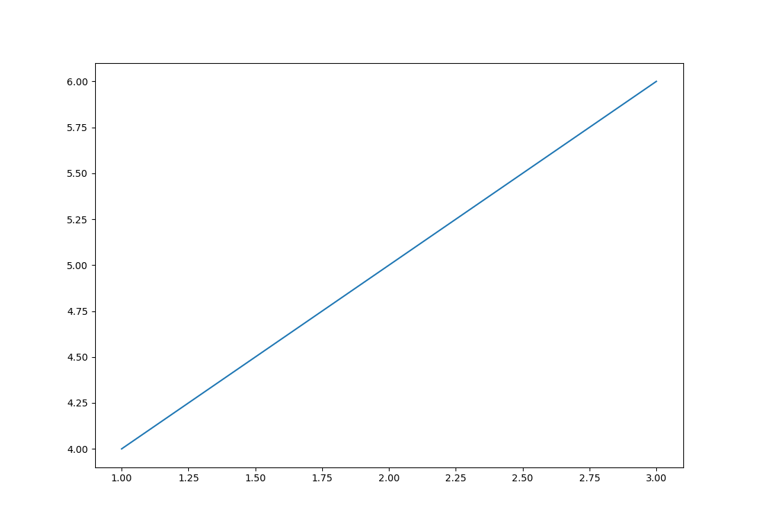
2, Drawing process
The code is as follows (example):
import matplotlib.pyplot as plt
#1. Create canvas
plt.figure(figsize=(20,8),dpi=100)
#2. Draw image
x=[1,2,3]
y=[4,5,6]
plt.plot(x,y)
#3. Display image
plt.show()
Operation results:
3, Typical cases
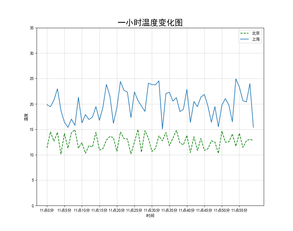
1. Case: display temperature change (display image in a coordinate system)
The code is as follows (example):
import matplotlib.pyplot as plt
import random

#0. Generate data
x=range(60)
y_beijing=[random.uniform(10, 15) for i in x]
y_shanghai=[random.uniform(15, 25) for i in x]

#1. Create canvas
plt.figure(figsize=(20, 8), dpi=100)

#2. Drawing
plt.plot(x, y_beijing,label="Beijing",color='g',linestyle='--')
plt.plot(x, y_shanghai,label="Shanghai")

#2.1 add x,y axis scale
y_ticks=range(40)
x_ticks_labels=["11 spot{}branch".format(i) for i in x]
plt.yticks(y_ticks[::5])
plt.xticks(x[::5], x_ticks_labels[::5])
#Note: the first parameter must be a number. If it is not a number, it needs to be replaced by a value

#2.2 adding grids
plt.grid(True, linestyle="-", alpha=0.5)

#2.3 add description information
plt.xlabel("time")
plt.ylabel("temperature")
plt.title("One hour temperature variation diagram", fontsize=20)

#2.4 display legend
plt.legend(loc='best')
#Note: you need to declare the specific value of label in plot before displaying

#3. Image display
plt.rcParams['font.sans-serif']=['SimHei']  #Garbled Chinese coordinate values
plt.show()
Operation results:
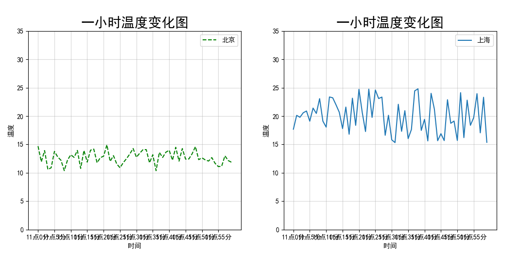
2. Case: display temperature changes (multiple coordinate systems display images)
The code is as follows (example):
import matplotlib.pyplot as plt
import random

#0. Generate data
x = range(60)
y_beijing = [random.uniform(10, 15) for i in x]
y_shanghai = [random.uniform(15, 25) for i in x]

#1. Create canvas
#plt.figure(figsize=(20, 8), dpi=100)
fig, axes= plt.subplots(nrows=1, ncols=2, figsize=(20, 8), dpi=100)
#nrows -- rows ncols -- columns

#2. Drawing
#Plot.plot (x, y_beijing, label = "Beijing", color='g',linestyle =' -- ')
#Plot.plot (x, y_shanghai, label = "Shanghai")
axes[0].plot(x, y_beijing, label="Beijing", color='g', linestyle='--')
axes[1].plot(x, y_shanghai, label="Shanghai")

#2.1 add x,y axis scale
y_ticks=range(40)
x_ticks_labels=["11 spot{}branch".format(i) for i in x]
#plt.yticks(y_ticks[::5])
#plt.xticks(x[::5], x_ticks_labels[::5])
#Note: the first parameter must be a number. If it is not a number, it needs to be replaced by a value

axes[0].set_xticks(x[::5])
axes[0].set_yticks(y_ticks[::5])
axes[0].set_xticklabels(x_ticks_labels[::5])
axes[1].set_xticks(x[::5])
axes[1].set_yticks(y_ticks[::5])
axes[1].set_xticklabels(x_ticks_labels[::5])

#2.2 adding grids
#plt.grid(True, linestyle="-", alpha=0.5)
axes[0].grid(True, linestyle="-", alpha=0.5)
axes[1].grid(True, linestyle="-", alpha=0.5)

#2.3 add description information
#plt.xlabel("time")
#plt.ylabel("temperature")
#plt.title("one hour temperature change diagram", fontsize=20)
axes[0].set_xlabel("time")
axes[0].set_ylabel("temperature")
axes[0].set_title("One hour temperature variation diagram", fontsize=20)
axes[1].set_xlabel("time")
axes[1].set_ylabel("temperature")
axes[1].set_title("One hour temperature variation diagram", fontsize=20)

#2.4 display legend
#plt.legend(loc='best')
axes[0].legend(loc='best')
axes[1].legend(loc='best')
#Note: you need to declare the specific value of label in plot before displaying

#3. Image display
plt.rcParams['font.sans-serif']=['SimHei']  #Garbled Chinese coordinate values
plt.show()
Operation results:
be careful:
(1) Save image
#Save the picture to the specified path
plt.savefig("test.png")
(2) Set graphic style
| Color character | Style character |
|---|---|
| r red | -Solid line |
| g green | – dashed line |
| b blue | -. dotted line |
| w White | : dotted line |
| c cyan | ’’Leave blank, blank |
| m magenta | |
| y yellow | |
| k black red |
(3) Display legend
| Location String | Location Code |
|---|---|
| 'best' | 0 |
| 'upper right' | 1 |
| 'upper left' | 2 |
| 'lower left' | 3 |
| 'lower right' | 4 |
| 'right' | 5 |
| 'center left' | 6 |
| 'center right' | 7 |
| 'lower center' | 8 |
| 'upper center' | 9 |
| 'center' | 10 |
(4) Garbled code problem
#Set display Chinese font
plt.rcParams["font.sans-serif"] = ["SimHei"]
#Set normal display symbol
plt.rcParams["axes.unicode_minus"] = False
4, Common graphics drawing
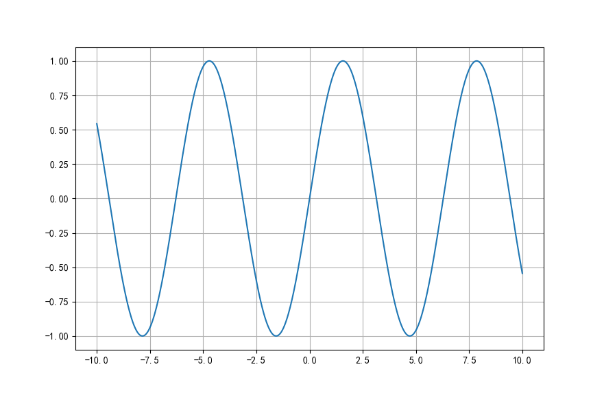
1. Draw mathematical function image
Take drawing sinx image as an example:
#plot drawing mathematical image
import numpy as np

# 0. Generate data
x=np.linspace(-10, 10, 1000)
y=np.sin(x)

# 1. Create canvas
plt.figure(figsize=(20, 8), dpi=100)

# 2. Draw image
plt.plot(x, y)
plt.grid()

# 3. Display image
plt.rcParams['axes.unicode_minus']=False  #Used to display negative signs normally
plt.show()
Operation results:
2. Draw common graphics
Matplotlib can draw line chart, scatter chart, histogram, pie chart.
- Line chart: a statistical chart showing the increase or decrease of statistical quantity with the rise or fall of line.
Features: it can display the change trend of data and reflect the change of things.
api: plt.plot(x, y)
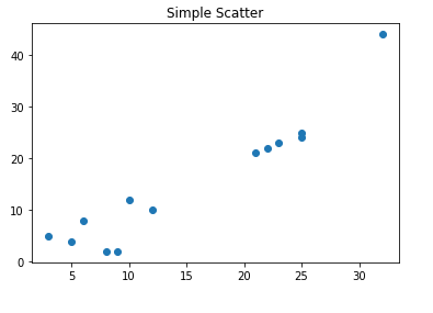
- Scatter diagram: use two groups of data to form multiple coordinate points, investigate the distribution of coordinate points, judge whether there is some correlation between the two variables, or summarize the distribution mode of coordinate points.
Features: judge whether there is quantitative correlation trend between variables and display outliers (distribution law).
api: plt.scatter(x, y)
- Bar chart (bar chart): the data arranged in the columns or rows of the worksheet can be drawn into the bar chart.
Features: draw continuous discrete data, be able to see the size of each data at a glance, and compare the differences between the data (Statistics / comparison).
api: plt.bar(x, width, align='center', **kwargs)
Parameters:
x: data to be transferred
Width: the width of the histogram
align: the position alignment of each histogram
{'center', 'edge'}, optional, default: 'center'
**kwargs :
Color: select the color of the histogram

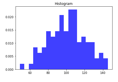
- Histogram: a series of longitudinal stripes or line segments with different heights represent the data distribution. Generally, the horizontal axis represents the data range and the vertical axis represents the distribution.
Features: draw continuous data to show the distribution of one or more groups of data (Statistics).
api: plt.hist(x, bins=None)
Parameters:
x: data to be transferred
bins: Group spacing
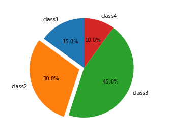
- Pie chart: used to show the proportion of different classifications, and compare various classifications by radian size.
Features: proportion of classified data.
api: plt.pie(x, labels=,autopct=,colors)
Parameters:
x: Quantity, auto calculate percentage
labels: name of each part
autopct: proportion display specified% 1.2f%%
colors: color of each part