Since the widget document was updated, automatic authorization has ceased to exist.
Current authorization is achieved through button. Specific knowledge points can refer to the official documentation of the applet. Here is a small demo I made (enter the home page, pop-up boxes, pop-up boxes are a UI component written by myself), nonsense, directly on the code.
UI Component Part (modal)
modal.wxml
<view class='modal-mask' wx:if='{{show}}' bindtap='clickMask'>
  <view class='modal-content'>
    <scroll-view scroll-y class='main-content'>
      <slot></slot>
    </scroll-view>
  </view>
</view>
modal.wxss
n: fixed;
  left: 0;
  right: 0;
  top: 0;
  bottom: 0;
  background-color: rgba(0,0,0,0.5);
  z-index: 999;
}
/*Mask content*/
.modal-content{
  display: flex;
  flex-direction: column;
  width: 65%;
  background-color: #fff;
  border-radius: 10rpx;
  padding: 20rpx;
  text-align: center;
}
/*Intermediate content*/
.main-content{
  flex: 1;
  height: 100%;
  overflow-y: hidden;
  max-height: 80vh; /* Content height up to 80vh to avoid content overflow*/
}
.bottom {
    border-radius: 80rpx;
    margin: 70rpx 50rpx;
    font-size: 35rpx;
}
modal.js
Component({
  /**
   * List of properties of components
   */
  properties: {
    //Whether to display modal Popup
    show: {
      type: Boolean,
      value: false
    },
    //Control bottom is a button or two buttons, default two
    single: {
      type: Boolean,
      value: false
    }
  },

  /**
   * Initial data of components
   */
  data: {

  },

  /**
   * Method List of Components
   */
  methods: {
    // click modal Callback function
    clickMask() {
      // click modal Close the mask layer in the background, if you don't need to comment it out.
      this.setData({ show: false })
    },
    // Click the callback function of the Cancel button
    cancel() {
      this.setData({ show: false })
      this.triggerEvent('cancel')  //triggerEvent Trigger event
    },
    // Click on the callback function of the confirmation button
    confirm() {
      this.setData({ show: false })
      this.triggerEvent('confirm')
    }
  }
})
modal.json
{
  "component": true,
  "usingComponents": {}
}
pages page
home.wxml (this is a bullet-box, the content of the home page is added directly below a < View > here to write the content of the home page </view>)
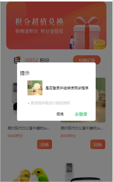
<!-- modal Popup-->
  <modalView show="{{showModal}}" bindcancel="modalCancel" bindconfirm='modalConfirm' single='{{single}}'>
    <view class='modal-content'>
      <scroll-view scroll-y class='main-content'>
    <view wx:if="{{canIUse}}" >
    <view class='header'>
            <text>Tips</text>
        </view>
        <view class='content'>
          <image src="/images/goods_img2.png"></image>
          <text>Whether to log in and continue using the program</text>
        </view>
        <view class="header_title">
          <text class="dian">•</text>
          <text>The login program needs to be authorized by Wechat</text>
        </view>
        <view class="modal_footer">
        <view class="bottom">
          <button class='bottom_a'>
            refuse
          </button>
          <button class='bottom_b' open-type="getUserInfo" lang="zh_CN" bindgetuserinfo="bindGetUserInfo">
              Login
          </button>
        </view>
        </view>
</view>
      </scroll-view>
    </view>
  </modalView>
home.wxss
.header {
    text-align: start;
    height: 100rpx;
    line-height: 100rpx;
}

.header image {
    width: 200rpx;
    height: 200rpx;
}

.content {
  display: flex;
  margin-left: 50rpx;
  height: 100rpx;
  line-height: 100rpx;
}

.content image{
  width: 100rpx;
  height: 100rpx;
}

.content text {
  font-size: 24rpx;
  margin-left: 20rpx;
}

.header_title{
  margin-left: 50rpx;
  text-align: start;
  font-size: 24rpx;
  color: #ccc;
  line-height: 100rpx;
  display: flex;
}

.dian{
  margin-right: 6rpx;
  font-size: 36rpx;
}

.modal_footer{
    display: flex;
    justify-content: flex-end;
}
.bottom {
  display: flex;
   color: #ccc;
  font-size: 24rpx;
  width: 280rpx;
}

button::after {
  border: none;
}

.bottom button{
  background-color: #fff;
  height: 50rpx;
  line-height: 50rpx;
}

.bottom_a{
  font-size: 24rpx;
}
.bottom_b{
  font-size: 28rpx;
  color: #0db95a;
}
home.js
//home.js
//Get application instance
const app = getApp()

Page({
  data: {
    canIUse: wx.canIUse('button.open-type.getUserInfo'),
    showModal: true,
    single: false
  },
  onLoad:function(){
    var that = this;
    // Check for authorization
    wx.getSetting({
      success: function (res) {
        if (res.authSetting['scope.userInfo']) {
          wx.getUserInfo({
            success: function (res) {
              wx.login({
                success: res => {
                  console.log("User code:" + res.code);
                }
              });
            }
          });
        } else {
          that.setData({
            showModal: true
          });
        }
      }
    });
  },
  bindGetUserInfo: function (e) {
    if (e.detail.userInfo) {
      //The user pressed the Allow Authorization button
      var that = this;
      // Get the user's information and print it to the console to see it.
      console.log("The user's information is as follows:");
      console.log(e.detail.userInfo);
      //After successful authorization,By changing showModal Value, let the implementation page display, hide the authorization page
      that.setData({
        showModal: false
      });
    } else {
      var that = this;
      //The user pressed the rejection button
      wx.showModal({
        title: 'warning',
        content: 'If you click on Deny Authorization, you will not be able to access your information.!!!',
        showCancel: false,
        confirmText: 'Return authorization',
        success: function (res) {
          // Users are not authorized successfully and do not need to change isHide Value
          if (res.confirm) {
            that.setData({
              showModal: true
            });
          }
        }
      });
    }
  }
})
home.json
{
  "usingComponents": {
    "modalView": "../../components/modal/modal"
  }
}
Okay ~This is all the code. The effect is as follows. (Click on login to authorize)