@ keyframes rule
Before introducing the animation attribute, let's take a look at the @keyframes rule.
Through the @keyframes rule, animation can be created. Creating animation is realized by changing one CSS style to another CSS style step by step. CSS style can be set up to implement the animation process, specify the use of animation when changing, or use keywords from "to" to "to", which is the same effect as starting from "0%" to "100%".
In order to obtain stable browser support, it is recommended to use% to achieve.
Writing: @keyframes my_animation_name {0% {css_styles;} 50% {css_styles;} 100% {css_styles;}
Or @keyframes my_animation_name {from {css_styles;} to {css_styles;}}
<!DOCTYPE html>
<html lang="zh">
  <head>
    <meta charset="utf-8">
	<title>Frame animation(animation)attribute</title>
	<style>

	  @keyframes myanimation { /* Start creating animated frames */
	    % {
		  width: 100px;
		  background-color: red;
		}
		20% {
		  width: 160px;
		  background-color: blue;
		}
		40% {
		  width: 220px;
		  background-color: blue;
		}
		60% {
		  width: 280px;
		  background-color: yellow;
		}
		80% {
		  width: 340px;
		  background-color: yellow;
		}
		100% {
		  width: 400px;
		  background-color: orange;
		}
	  }

	  div {
	    width: 100px;
		height: 100px;
		background-color: red;

		/* Setting Frame Animation Effect */

		-webkit-animation-name: myanimation;
		-webkit-animation-duration: 5s;
		-webkit-animation-timing-function: linear;
		-webkit-animation-delay: .5s;
		-webkit-animation-iteration-count: infinite; /* Set the number of times the animation is played */
		/*-webkit-animation-direction: reverse; Whether the animation is played back or not */
		-webkit-animation-state: runing; /* Specifies whether the animation is playing or pausing */

		animation-name: myanimation;
		animation-duration: 5s;
		animation-timing-function: linear;
		animation-delay: .5s;
		animation-iteration-count: infinite;
		/*animation-direction: reverse; Whether the animation is played back or not */
		animation-state: runing;
	  }

	</style>
  </head>
  <body>

    <div><div>

  </body>
</html>
The results are as follows:
animation attribute
animation-name, animation-duration, animation-timing-function attributes
@keyframes my_animation_name {}- duratin, which represents the time required to complete the animation.
animation-delay attribute
animation-delay indicates how long the animation is delayed before execution begins.
animation-iteration-count
animation-iteration-count indicates the number of times an animation is executed.
animation-direction
animation-direction indicates whether the animation is played back in the loop.
- Normal, normal playback
- Reverse, reverse playback.
- alternate, odd number of normal play, even number of reverse play.
- alternate-reverse, odd number of reverse play, even number of normal play.
animation-direction: normal;The results are as follows:
animation-direction: reverse;The results are as follows:

animation-play-state
animation-play-state specifies whether the animation runs or pauses.
- Running, animation running
- Paused, animation paused
animation-fill-mode attribute
- forwards
- backwards
- both, follow the above two at the same time
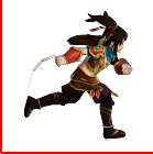
Next, animation is used to achieve a frame-by-frame animation effect:
First, take the animation realized by the keywords "from" and "to" as an example.
<!DOCTYPE html>
<html lang="zh">
  <head>
    <meta charset="utf-8">
	<title>Frame animation(animation)attribute</title>
	<style>

	  @keyframes myanimation { /* Start creating animated frames */
	    from {
		  background-position: 0 0;
		}
		to {
		  background-position: -1540px 0;
		}
	  }


	  div {
	    width: 140px;
		height: 140px;
		border: 1px solid red;
		background-image: url('run.png');

		/* Setting Frame Animation Effect */
		 -webkit-animation-name: myanimation;
		 -webkit-animation-duration: 5s;
		 -webkit-animation-timing-function: linear
-webkit-animation-iteration-count: infinite;
}
</style>
</head>
<body>
<div><div>
</body>
</html>The results are as follows:
We can see that animation is sliding, not the effect we want. Why?
It turns out that animation is transitional by default of ease. It inserts interpolation animation between each key frame, so it is coherent.
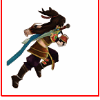
@keyframes myanimation {
    0%, 8%{  /*Action 1*/  }
    9.2%, 17.2%{  /*Action two*/  }
    ...
}
Step 1: Stay 8 frames between actions, 0% set action one, action one end at 8%.
Step 2: Transition 1.2 frames between actions, 9.2% set action 2, action 2 ends at 17.2%.
<!DOCTYPE html>
<html lang="zh">
  <head>
    <meta charset="utf-8">
	<title>Frame animation(animation)attribute</title>
	<style>

	  @keyframes myanimation { /* Start creating animated frames */
	    0%, 8% {  background-position: 0 0;  }
        9.2%, 17.2% {  background-position: -140px 0;  }
        18.4%, 26.4% {  background-position: -280px 0 ;  }
        27.6%, 35.6% {  background-position: -420px 0 ;  }
        36.8%, 44.8% {  background-position: -560px 0 ;  }
        46%, 54% {  background-position: -700px 0 ;  }
        55.2%, 63.2% {  background-position: -840px 0 ;  }
        64.4%, 72.4% {  background-position: -980px 0 ;  }
        73.6%, 81.6% {  background-position: -1120px 0 ;  }
        82.8%, 90.8% {  background-position: -1400px 0 ;  }
        92%, 100% {  background-position: -1540px 0 ;  }
	  }


	  div {
	    width: 140px;
		height: 140px;
		border: 1px solid red;
		background-image: url('run.png');

		/* Setting Frame Animation Effect */
		 -webkit-animation-name: myanimation;
		 -webkit-animation-duration: 1s;
		 -webkit-animation-timing-function: linear;
		 -webkit-animation-iteration-count: infinite;
		 -webkit-animation-fill-mode: backwards;

	  }

	</style>
  </head>
  <body>

    <div><div>

  </body>
</html>
The results are as follows: