Recently in the company's official website, the general official website project data interaction is very little animation more.
On the animation of the official website, the animation of a line is more complex and difficult to achieve.
The animation effect in the following picture is that three circles gradually emerge from left to right in order and then the line is drawn from left to right.

The way of realization is as follows:
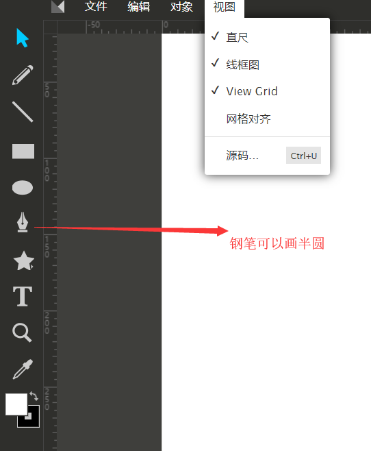
1. Use svg online drawing tool to draw lines by size


2. After drawing, you can save the picture in svg format by ctrl+s. Then the picture can be opened by an editor. The code is as follows: the patn in it is the key point to generate the line.
The patn inside is the most critical number, which is the point where the line is generated. We copy the code below to our page and we will see the line we want.
        <svg width="1200" height="400.00000000000006">
        <!-- Created with Method Draw - http://github.com/duopixel/Method-Draw/ -->
        <g>
         <title>background</title>
         <rect fill="transparent" id="canvas_background" height="402" width="1202" y="-1" x="-1"/>
         <g display="none" overflow="visible" y="0" x="0" height="100%" width="100%" id="canvasGrid">
          <rect fill="url(#gridpattern)" stroke-width="0" y="0" x="0" height="100%" width="100%"/>
         </g>
        </g>
        <g>
         <path class="path-loop1" d="M 3.603 200.087 C 3.603 200.087 0.858 2.056 200.184 2.056 C 399.51 2.056 401.073 199.037 400.291 199.818 C 399.509 200.599 400.291 396.799 600.399 396.799 C 800.507 396.799 800.506 199.818 800.506 199.818 C 800.506 199.818 802.851 2.056 1000.614 2.056 C 1198.377 2.056 1197.595 199.818 1197.595 199.818" opacity="0.5" fill-opacity="null" stroke-opacity="null" stroke-width="1.5" stroke="url('#orange_red')" fill="transparent"/>
        </g>
        </svg>
3. But the whole line is black. It needs to change one part of the color to orange. At this time, it can be done by line gradient. Add the following code in the svg tag.
Detailed principles can be found in this article (https://www.cnblogs.com/lovesong/p/5971781.html).
        <defs>
            <linearGradient id="orange_red" x1="0%" y1="55.1%" x2="100%" y2="0%">
                 <stop offset="0%" stop-color=" #45474A;"/>
                 <stop offset="52.99%" stop-color=" #45474A;"/>
                 <stop offset="53%" stop-color="#FC6D0B"/>
                 <stop offset="100%" stop-color="#FC6D0B"/>
            </linearGradient>
       </defs>
4. The implementation of css animation refers to animejs (http://www.animejs.cc), in which specific animation can be implemented by imitating this block (http://www.animejs.cc/demo/).
5. Finally, the realization of animation. When the scrollbar slides this page and the animation of three circles is finished, the animation of line is executed. This can also write JS or quote wow.js by itself.
Source code can be used for reference (https://github.com/matthieua/WOW)

This is probably the whole process of the animation.