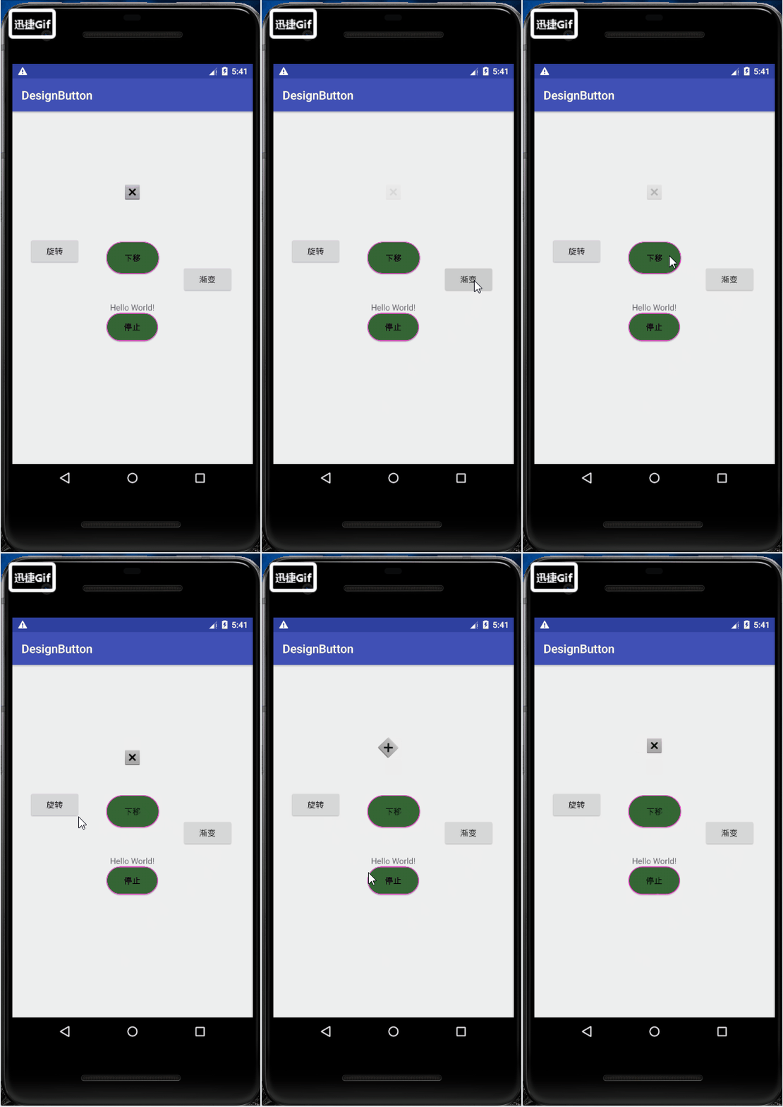
Design sketch: 
This time it mainly records how to change the shape of the button.
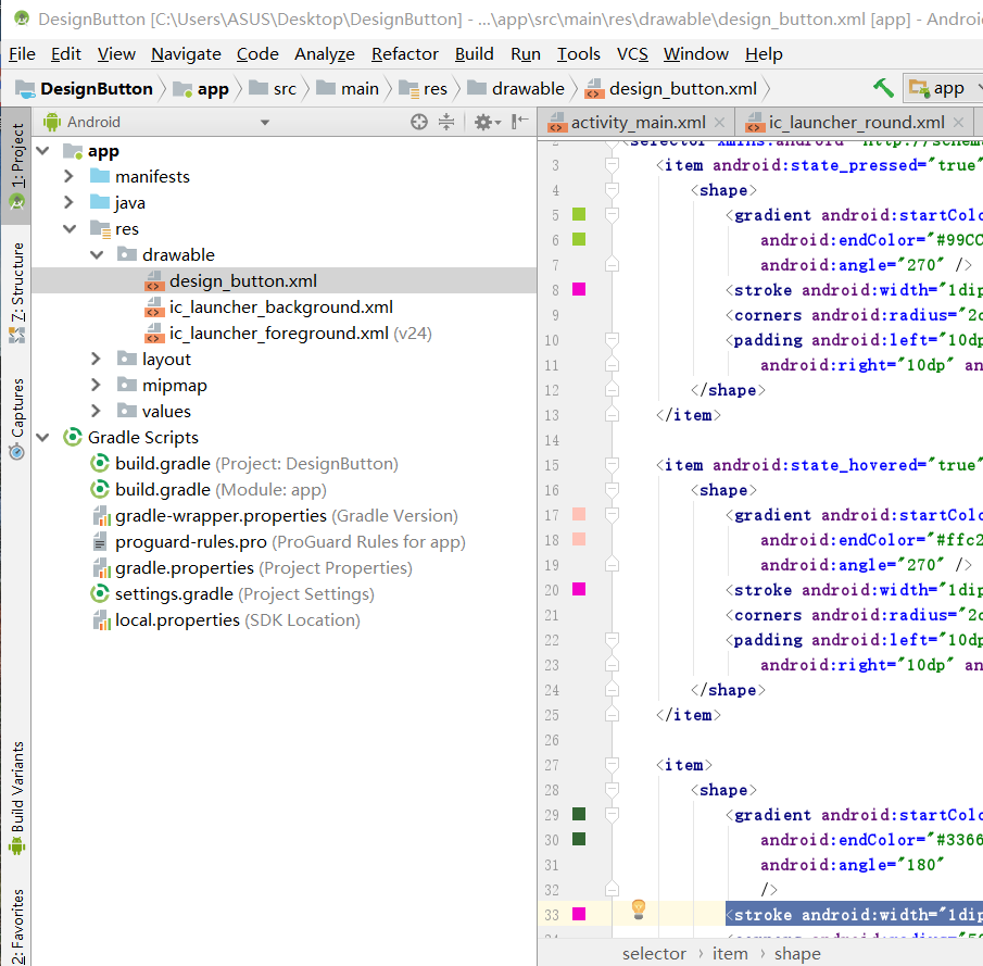
First, in the project app > res > drawable folder, right-click new to create a drawable return file, and then name the drawable file.
Then write the code to control the key shape in the new drawable xml file. 
The code is as follows:
<?xml version="1.0" encoding="utf-8"?>
<selector xmlns:android="http://schemas.android.com/apk/res/android">
    <!--Style when the key is pressed-->
    <item android:state_pressed="true">
        <shape>
            <!--Gradient color-->
            <gradient android:startColor="#99CC33"
                android:endColor="#99CC33"
                android:angle="270" />
            <!--Border width and color-->
            <stroke android:width="1dip" android:color="#f403c9" />
            <!--Border angle-->
            <corners android:radius="2dp" />
            <!--Key inside margin-->
            <padding android:left="10dp" android:top="10dp"
                android:right="10dp" android:bottom="10dp" />
        </shape>
    </item>

    <!--Initial key style-->
    <item >
        <shape>
            <gradient android:startColor="#336633"
                android:endColor="#336633"
                android:angle="180"
                />
            <stroke android:width="1dip" android:color="#f403c9" />
            <corners android:radius="500dip" />
            <padding android:left="10dp" android:top="10dp"
                android:right="10dp" android:bottom="10dp" />
        </shape>
    </item>

</selector>
After writing the code to control the shape of the key, just give the key application in activity the drawable file we created.
For example, I placed multiple buttons under the main interface, randomly selected a button, and set android:background = "@ drawable/design_button" for it in text
Then our buttons have their own style.

So far, the user-defined keys have been completed. In the code, timer is also used to control the basic animation of imageview, such as rotation, down shift and gradient. These codes are simple and can be downloaded.
Source address: https://download.csdn.net/download/qq_39143010/10669980