Introduction to this section:
This section brings you ProgressBar (progress bar) and SeekBar (drag bar) in Android basic UI control. There are many application scenarios of ProgressBar, such as when users log in, when the background is making requests and waiting for the server to return information, the progress bar will be used at this time; or when some time-consuming operations are carried out, it will take a long time to wait. If there is no prompt, users may think that the program Carsh or mobile phone crashed, which will greatly reduce the user experience, so in need of time-consuming operations, add a progress bar, so that users know the current program in execution, can also intuitively tell users the progress of the current task, etc.
SeekBar, I believe you are not unfamiliar with him, the most common place is the music player or video player, volume control or playback progress control, have used this SeekBar.
1.ProgressBar
From the official documents, we can see such a class diagram:
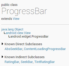
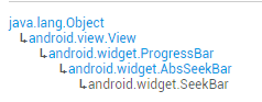
ProgressBar inherits from the View class. The direct subclasses are AbsSeekBar and ContentLoading ProgressBar, and the subclasses of AbsSeekBar are SeekBar and RatingBar. So they are also based on ProgressBar.
Detailed description of common attributes:
- android:max: maximum of progress bar
- android:progress: progress bar completed progress value
- android:progressDrawable: Set the Drawable object corresponding to the track
- android:indeterminate: If set to true, the progress bar does not accurately show progress
- android:indeterminateDrawable: Sets a Drawable object that does not display progress bar
- Android: indeterminate Duration: Sets the duration of imprecise display of progress
- Android: secondary progress: the second-level progress bar, similar to the current video playback progress, one is the buffer progress, the former is set through the progress attribute!
In corresponding Java, we can call the following methods:
- getMax(): Returns the upper limit of the scope of this progress bar
- getProgress(): Returns progress
- GetSecondary Progress (): Returns secondary progress
- Increment ProgressBy (int diff): Specifies the progress of the increase
- isIndeterminate(): Indicates whether the progress bar is in an uncertain mode
- setIndeterminate(boolean indeterminate): Set Uncertainty Mode
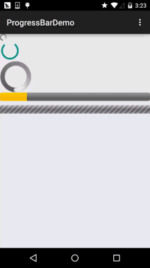
Next, let's look at an example of the default progress bar provided by the system.
System default progress bar usage example:
Operation effect diagram:
Implement layout code:
<LinearLayout xmlns:android="http://schemas.android.com/apk/res/android"
    xmlns:tools="http://schemas.android.com/tools"
    android:layout_width="match_parent"
    android:layout_height="match_parent"
    android:orientation="vertical"
    tools:context=".MainActivity">

    <!-- Circular progress bar provided by the system,The order is big, small and medium-sized. -->

    <ProgressBar
        style="@android:style/Widget.ProgressBar.Small"
        android:layout_width="wrap_content"
        android:layout_height="wrap_content" />

    <ProgressBar
        android:layout_width="wrap_content"
        android:layout_height="wrap_content" />

    <ProgressBar
        style="@android:style/Widget.ProgressBar.Large"
        android:layout_width="wrap_content"
        android:layout_height="wrap_content" />

    <!--Horizontal progress bar provided by the system-->
    <ProgressBar
        style="@android:style/Widget.ProgressBar.Horizontal"
        android:layout_width="match_parent"
        android:layout_height="wrap_content"
        android:max="100"
        android:progress="18" />

    <ProgressBar
        style="@android:style/Widget.ProgressBar.Horizontal"
        android:layout_width="match_parent"
        android:layout_height="wrap_content"
        android:layout_marginTop="10dp"
        android:indeterminate="true" />

</LinearLayout>
2.SeekBar
Hey hey, this thing is a subclass of ProgressBar, that is, the properties of ProgressBar can be used! And he also has one of his attributes: android:thumb, which allows us to customize the slider ~OK, start this section!
2.1. Basic usage of SeekBar
Well, the basic usage is very simple. The common attributes are just the following common attributes. In Java code, only setXxx can be used:
android:max="100" //Maximum value of slider
android:progress="60" //Current value of slider
android:secondaryProgress="70" //Progress of secondary slider
android:thumb = "@mipmap/sb_icon" //Draable slider
Next to the SeekBar event, SeekBar.OnSeekBarChangeListener only needs to rewrite three corresponding methods:
onProgressChanged: Triggered when progress changes
OnStart Tracking Touch: Triggered when you hold down SeekBar
OnStopTracking Touch: Triggered when SeekBar is released
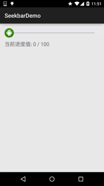
Simple code examples:
Design sketch:
Implementation code:
public class MainActivity extends AppCompatActivity {

    private SeekBar sb_normal;
    private TextView txt_cur;
    private Context mContext;

    @Override
    protected void onCreate(Bundle savedInstanceState) {
        super.onCreate(savedInstanceState);
        setContentView(R.layout.activity_main);
        mContext = MainActivity.this;
        bindViews();
    }

    private void bindViews() {
        sb_normal = (SeekBar) findViewById(R.id.sb_normal);
        txt_cur = (TextView) findViewById(R.id.txt_cur);
        sb_normal.setOnSeekBarChangeListener(new SeekBar.OnSeekBarChangeListener() {
            @Override
            public void onProgressChanged(SeekBar seekBar, int progress, boolean fromUser) {
                txt_cur.setText("Current progress value:" + progress + "  / 100 ");
            }

            @Override
            public void onStartTrackingTouch(SeekBar seekBar) {
                Toast.makeText(mContext, "Touch SeekBar", Toast.LENGTH_SHORT).show();
            }

            @Override
            public void onStopTrackingTouch(SeekBar seekBar) {
                Toast.makeText(mContext, "let go SeekBar", Toast.LENGTH_SHORT).show();
            }
        });
    }
}
2.2 Image Resource Customization SeekBar
1) Import the slider image (scrubber.png scrubber_focus.png), and the progress bar is drawn directly by xml.
scrubber_selector.xml
<?xml version="1.0" encoding="utf-8"?>
<selector xmlns:android="http://schemas.android.com/apk/res/android">
    <item android:state_pressed="true" android:drawable="@drawable/scrubber_focus"/>
    <item android:drawable="@drawable/scrubber"/>
</selector>
2) seekbar_layer.xml (progress bar drawing)
<?xml version="1.0" encoding="utf-8"?>
<layer-list xmlns:android="http://schemas.android.com/apk/res/android">
    <!--
    Because I am lazy, I use xml instead of pictures directly. If partners are interested, they can make a progress bar picture by themselves.
    Note: The order of stacking is background, secondary progress.
    The function of cilp tag is to display pictures step by step following the progress, dividing the pictures into N parts and displaying the progress one by one, so as to avoid the situation that the progress does not go in the process of dragging.
    -->
    <! - Background progress bar - >
    <item android:id="@android:id/background">
        <shape android:shape="line">
            <stroke android:width="1dp" android:color="#8B8378"/>
            <corners android:radius="1dp"></corners>
        </shape>
    </item>
    <! - Second progress bar - >
    <item android:id="@android:id/secondaryProgress">
        <clip>
            <shape android:shape="line">
                <stroke android:width="1dp" android:color="#9932CC"/>
                <corners android:radius="1dp"></corners>
            </shape>
        </clip>
    </item>
    <! - The first progress bar - >
    <item android:id="@android:id/progress">
        <clip>
            <shape android:shape="line">
                <stroke android:width="1dp" android:color="#CD5C5C"/>
                <corners android:radius="1dp"></corners>
            </shape>
        </clip>
    </item>
</layer-list>