In order to better manage the components in the user interface of Android applications, Android provides a layout manager. Through the use of layout manager, Android application GUI has good platform independence. It is recommended to use layout manager to manage the distribution and size of components, rather than directly setting the location and size of components. You can nest the layout manager using the layout manager, which can also be used as a UI component.
LinearLayout can control the horizontal or vertical arrangement of components. The content will not wrap, and the part beyond the screen will not be displayed.
Learning diagram
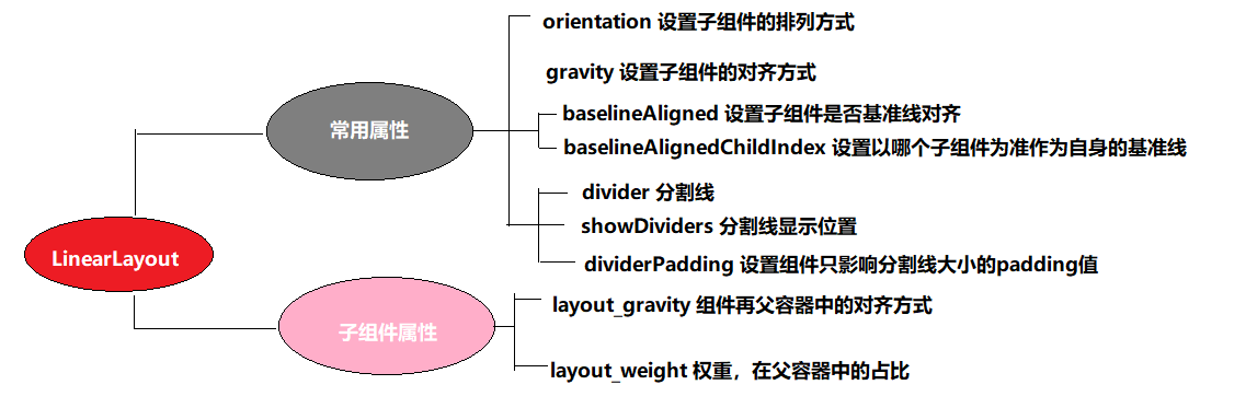
Common XML attributes and methods of LinearLayout
[attribute 1] orientation set the arrangement of subcomponents (single choice)
XML: android:orientation="horizontal"
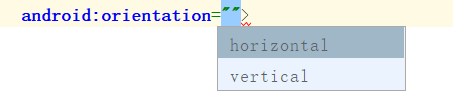
horizontal: horizontal
Vertical: vertical
JAVA : linearLayout.setOrientation(LinearLayout.VERTICAL);
LinearLayout.HORIZONTAL
LinearLayout.VERTICAL
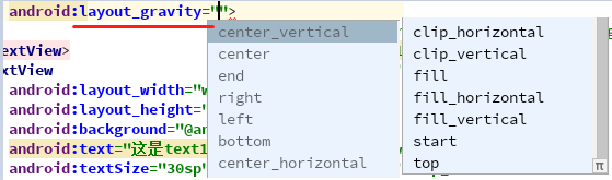
[attribute 2] gravity sets the alignment of subcomponents (multiple choices)
XML: android:gravity="center"
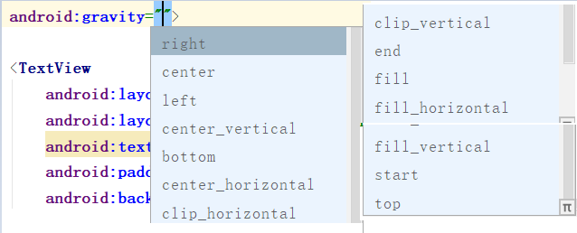
JAVA : linearLayout.setGravity(Gravity.CENTER);
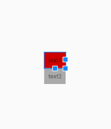
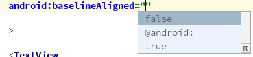
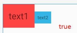
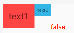
[attribute 3] baselineAligned sets the baseline pair of child elements to be discarded, which is true by default
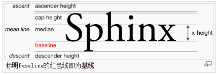
Baseline:
The red line is the reference line in the open English exercise book
XML: android:baselineAligned="false"
JAVA: linearLayout.setBaselineAligned(true);
Code: true
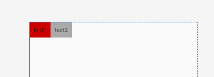
    <LinearLayout
        android:layout_width="match_parent"
        android:layout_height="wrap_content"
        android:baselineAligned="true"
        android:orientation="horizontal">

        <TextView
            android:layout_width="wrap_content"
            android:layout_height="wrap_content"
            android:background="@android:color/holo_red_light"
            android:padding="20dp"
            android:text="text1"
            android:textSize="30sp">

        </TextView>
        <TextView
            android:layout_width="wrap_content"
            android:layout_height="wrap_content"
            android:background="@android:color/holo_blue_light"
            android:padding="10dp"
            android:text="text2"
            android:textSize="16sp">

        </TextView>
    </LinearLayout>
Effect:
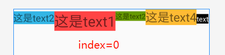
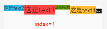
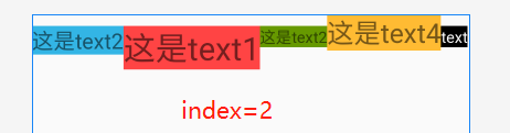
[collocation attribute 3] the baseline of baselineAlignedChildIndex LinearLayout is based on its child elements, and the subscript starts from 0
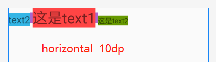
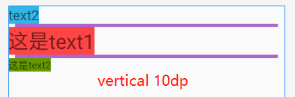
There are many textviews in a LinearLayout, and each textview has its own baseline, so LinearLayout may also be a sub element of another LinearLayout. As a sub element, baselineAlignedChildIndex determines its baseline
XML: android:baselineAlignedChildIndex="0"
JAVA: linearLayout.setBaselineAlignedChildIndex(0);
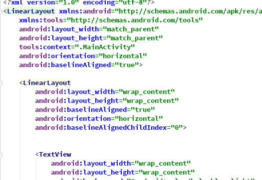
Code: A kind of Pay attention to the internal LinearLayout, and then add baselineAlignedChildIndex on the second LinearLayout, which is used with baselineAligned="false"
<LinearLayout
    android:layout_width="match_parent"
    android:layout_height="match_parent"
    android:orientation="horizontal">

    <LinearLayout
        android:layout_width="wrap_content"
        android:layout_height="wrap_content"
        android:baselineAligned="false"
        android:orientation="horizontal">


        <TextView
            android:layout_width="wrap_content"
            android:layout_height="wrap_content"
            android:background="@android:color/holo_blue_light"
            android:text="This is text2"
            android:textSize="20sp">

        </TextView>
        <TextView
            android:layout_width="wrap_content"
            android:layout_height="wrap_content"
            android:background="@android:color/holo_red_light"
            android:text="This is text1"
            android:textSize="30sp">

        </TextView>
        <TextView
            android:layout_width="wrap_content"
            android:layout_height="wrap_content"
            android:background="@android:color/holo_green_dark"
            android:text="This is text2"
            android:textSize="15sp">

        </TextView>
    </LinearLayout>
    <TextView
        android:layout_width="wrap_content"
        android:layout_height="wrap_content"
        android:text="This is text4"
        android:textSize="25sp"
        android:background="@android:color/holo_orange_light"
        >

    </TextView>
    <TextView
        android:layout_width="wrap_content"
        android:layout_height="wrap_content"
        android:background="@android:color/black"
        android:text="text"
        android:textColor="@android:color/white"
        android:textSize="15sp">

   </TextView>
</LinearLayout>
Effect:
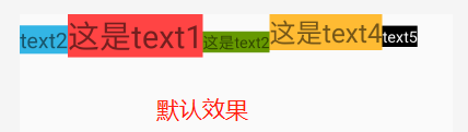
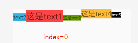
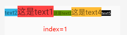
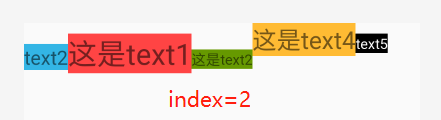
A kind of summary
- There is no baseline in the default LinearLayout. It can be seen from the comparison between figure 1 and figure 3.
- The subscript starts from 0, and the maximum index is 2. If it exceeds 2, the layout will not be displayed
- This attribute is used to determine which subcomponent the current LinearLayout's baseline is based on
A kind of Think 1: what is the effect of using baselineAligned="true"?
Code: (modify the code above)
Effect:
A kind of summary
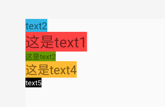
It seems that the above summary has been scrambled, but compared with the effect of baselineAligned="false", it can be found that in fact, the baseline of LinearLayout is still accurate when baselineAligned="false", which can refer to the position of text4 and text5. The baseline they abandoned is not the first three texts The reference line of the position after the change, but the position of the reference line before the change.
A kind of Think 2: when the baseline is parallel, if the LinearLayout subcomponent is set to be vertically arranged, is there any effect?
A: no effect, no change
[attribute 4] divider s
The first time I met this provider was in ListView
A kind of Code
<ListView
        android:layout_width="match_parent"
        android:layout_height="match_parent"
        android:divider="@color/colorPrimary"
        android:dividerHeight="3dp">
</ListView>
A kind of Effect
A kind of Note that here the dividermust be with dividerHeight to show the effect. So with experience, if you think it can be the same in LinearLayout, you're in a hole
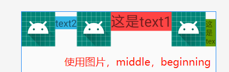
XML: android:divider="@mipmap/ic_launcher"
A kind of You must use pictures or shape files. You cannot use colors directly like ListView (it will cause no effect)
A kind of It needs to be used with showDividers to have effect
JAVA: linearLayout.setDividerDrawable(getResources().getDrawable(R.mipmap.ic_launcher));
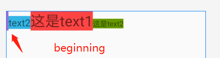
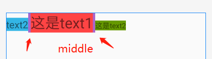
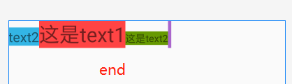
[key attribute 4] showDividers display position (multiple choices available)
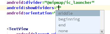
XML: android:showDividers="middle|beginning"
JAVA: linearLayout.setShowDividers(LinearLayout.SHOW_DIVIDER_MIDDLE);
A kind of Key code:
 <LinearLayout
        android:layout_width="match_parent"
        android:layout_height="wrap_content"
        android:divider="@mipmap/ic_launcher"
        android:showDividers="middle|beginning"
        android:orientation="horizontal">
<···/>
</LinearLayout>
A kind of Effect:
Split with shape
Create linear.xml
Change the selector to shape, as follows
<?xml version="1.0" encoding="utf-8"?>
<shape xmlns:android="http://schemas.android.com/apk/res/android">

    <size android:width="5dp" android:width="5dp"/> <solid android:color="@android:color/holo_purple" /> </shape>
A kind of Here we use size to define a width of the line as a horizontal split line, and if it is vertical, we need to define a height
        android:divider="@drawable/linear_line"
        android:showDividers="middle|beginning"
A kind of Effect: three can be combined with each other
[match attribute 4] adding of dividerPadding
XML: android:dividerPadding="10dp"
JAVA: linearLayout.setDividerPadding(10);
A kind of Code:
<LinearLayout
        android:layout_width="match_parent"
        android:layout_height="wrap_content"
        android:divider="@drawable/linear_line"
        android:showDividers="middle"
        android:dividerPadding="10dp"
        android:orientation="horizontal">
</LinearLayout>
A kind of Effect:
A kind of summary
- The height or width of the default split line is the same as the size of the LinearLayout layout manager
- If it is a horizontal layout, the height set in the shape has no effect on the display
- It can be found that if the horizontal arrangement only affects the vertical padding, the vertical arrangement affects the horizontal padding
Special properties of LinearLayout subcomponent
[attribute 1] layout > gravity sets its position in the layout manager
A kind of As explained above, gravity is not a special property of LinearLayout, but layout gravity is a special property of its sub components. For specific differences, please refer to the differences between layout & gravity and gravity in my blog: https://www.cnblogs.com/xqz0618/p/gravity.html , no more details here
Layout weight A kind of (important attribute)
This is a LinearLayout and its important attribute. Setting the proportion of subcomponents in the whole screen according to weight can achieve a good effect of screen adaptation
Code:
<LinearLayout
        android:layout_width="match_parent"
        android:layout_height="wrap_content"
        android:divider="@drawable/linear_line"
        android:baselineAligned="false">

        <TextView
            android:layout_width="wrap_content"
            android:layout_height="wrap_content"
            android:layout_weight="1"
            android:background="@android:color/holo_blue_light"
            android:text="text1"
            android:textSize="20sp">

        </TextView>
        <TextView
            android:layout_width="wrap_content"
            android:layout_height="wrap_content"
            android:layout_weight="2"
            android:background="@android:color/holo_red_light"
            android:text="text2"
            android:textSize="30sp">

        </TextView>
        <TextView
            android:layout_width="wrap_content"
            android:layout_height="wrap_content"
            android:layout_weight="3"
            android:background="@android:color/holo_green_dark"
            android:text="text3"
            android:textSize="15sp">

        </TextView>
    </LinearLayout>
A kind of Here is the horizontal layout, which will be modified to get different results
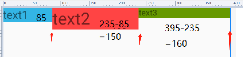
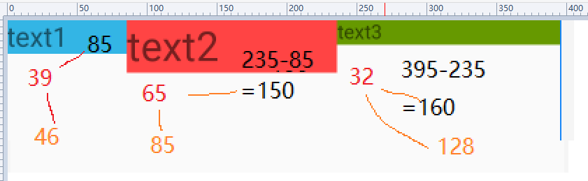
Case 1: set layout [width] to 0dp, and the weight is 1:2:3 respectively. After 0dp is set, the weight must be used to avoid error
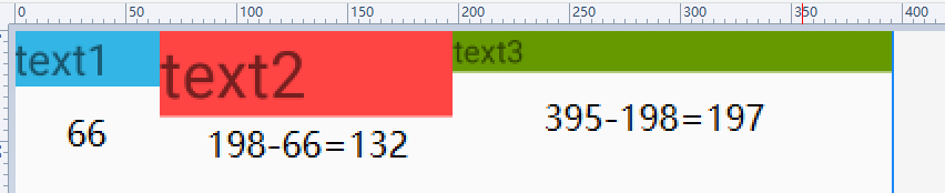
A kind of It can be seen that the width of three texts is 1:2:3 with the same weight within the error range, so the width of a single text is calculated as:
Suppose the width of the screen is P, the size of a single subcomponent is W, the weight sum of subcomponents is G, and the weight set by this component is H
 Then W = H/G*P
 Current 1:2:3
W = H/G*P = 1/(1+2+3)*P = 1/6P
 text1 accounts for 1 / 6 of the screen
Scenario 2: set layout [width] to wrapcontent
A kind of Case 2 is not like case 1. According to the proportion of weight 1:2:3, the formula of case 1 does not hold
A kind of In fact, the weight is based on the size P of the total screen minus the layout width of all sub components and then the size of the distribution according to the weight plus the layout width. It's a bit confusing here. Look at the analysis.
A kind of The width obtained by subtracting the size of the text from the size of the control. Considering the error range, it is actually 1:2:3
Suppose the width of the screen is P, the size of a single subcomponent is W, the weight sum of subcomponents is G, the weight set by the component is H, and the layout width of subcomponents is L
 Then W = H/G*(P-3L)+L
 Current 1:2:3
 The screen proportion of text1 W =H/G*(P-3L)+L = 1/(1+2+3)*(P-3L)+L
 It's not easy to use wrap content here
 Think in reverse when L=0dp
W = 1/(1+2+3)*(P-0)+0= 1/6P
 Consistent with the above results
Case 3: set layout width to match parent
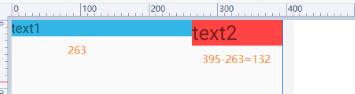
It can be seen from the figure above that the ratio of text1 to text2 is 2:1, and text3 is missing
Suppose the width of the screen is P, the size of a single subcomponent is W, the weight sum of subcomponents is G, the weight set by the component is H, and the layout width of subcomponents is L
 Then W = H/G*(P-3L)+L
 Current 1:2:3
 Since layout width is match parent, then L= P
 The screen proportion of text1 W =H/G*(P-3L)+L = 1/(1+2+3)*(P-3L)+L=1/(1+2+3)*(P-3P)+P = 1/6*(-2P)+P= 2/3P
 Thus
 W = 1/3P of text2
 W = 3 / (1 + 2 + 3) of text3 * (- 2P) + P = 0dp
 That is to say, text3 is not beyond the screen, but its width is 0 / / you can add a scroll control to verify it
A kind of summary
We get the unified formula to calculate the screen share (in fact, why are you so bothered? Why don't you use 0dp directly? Of course, some scenes may need warpcontent)
Suppose the width of the screen is P, the size of a single subcomponent is W, the weight sum of subcomponents is G, the weight set by the component is H, and the layout width of subcomponents is L
 Then W = H/G*(P-3L)+L