Inherited structure of controls and layouts:
Before using custom controls, we need to know the inheritance structure of controls and layouts of Android UI. As shown in the figure below:
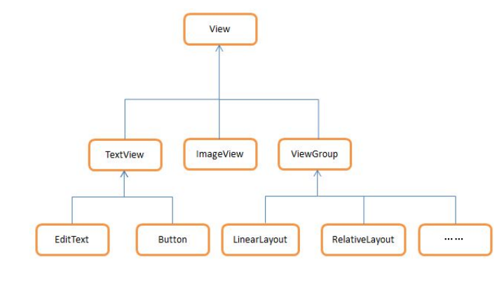
As you can see, all the controls we use are directly or indirectly inherited from View, and all the layouts we use are directly or indirectly inherited from ViewGroup.
View is one of the most basic UI components in Android. It can draw a rectangular area on the screen and respond to various events in this area. Therefore, various controls we use actually add their own unique functions on the basis of view.
ViewGroup is a special View. It can contain many sub views and sub viewgroups. It is a container for placing controls and layouts.
Usage scenarios:
When the system's own controls can not meet our needs, we can use the above inheritance structure to create custom controls.
Method 1: introduce layout
Through the combination of controls, a new control layout is formed, and then through the
<include layout="@layout/+Layout name"/>
Bring the layout into the layout interface you need.
Create a new test_layout01.xml layout, as shown in the following figure:
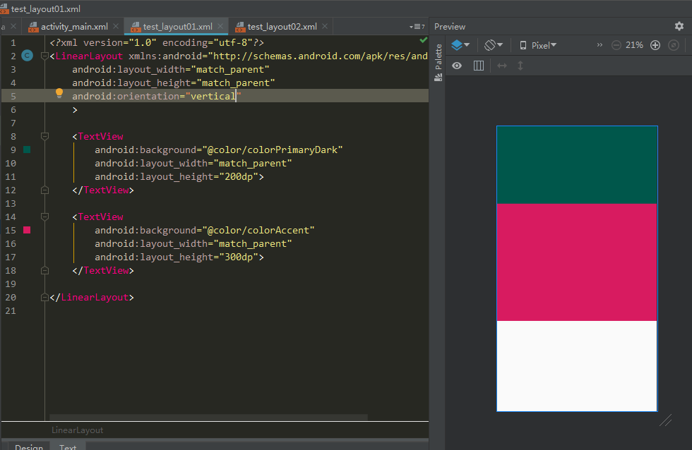
Create a new layout test_layout02.xml layout, add
<include layout="@layout/test_layout01"/>
As shown below: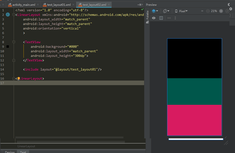
As you can see, the red and green layout has been imported to test through this line of code_ Layout02.xml.
Method 2: create a custom control
The technique of introducing layout does solve the problem of repeatedly writing layout code, but if there are some controls in the layout that need to be able to respond to events, we still need to write event registration code for these controls once in each activity.
For example, the return button in the title bar has the same function no matter which activity it is in, that is, the pin destroys the current activity.
If you need to re register the click event of the return button in every activity, there is no doubt that a lot of repetitive code has been added, which is best solved by using the custom control.
New MyView inherits from LinearLayout and makes it our custom control. The code is as follows:
public class MyView extends LinearLayout {

    public MyView(Context context, @Nullable AttributeSet attrs) {
        super(context, attrs);
        LayoutInflater.from(context).inflate(R.layout.test_layout01, this);
        TextView green = findViewById(R.id.green);
        TextView red = findViewById(R.id.red);
        green.setOnClickListener(new OnClickListener() {
            @Override
            public void onClick(View v) {
                Toast.makeText(getContext(), "You clicked Green!", Toast.LENGTH_SHORT).show();
            }
        });
        red.setOnClickListener(new OnClickListener() {
            @Override

            public void onClick(View v) {
                Toast.makeText(getContext(), "You clicked Red!", Toast.LENGTH_SHORT).show();
            }
        });
    }
}
First, we override the constructor with two parameters in LinearLayout, which will be called when the MyView control is introduced into the layout. Then the title block layout needs to be dynamically loaded in the constructor, which needs to be implemented with the help of layoutingger.
Through LayoutInflater's from() method, you can build a LayoutInflater object, and then invoke the inflate() method to dynamically load a layout file. The inflate() method receives two parameters:
The first parameter is the id of the layout file to load. Here we pass in R layout.test_ layout01.
The second parameter is to add another parent layout to the loaded layout. Here, we want to specify MyView as the parent layout, so we directly pass in this.
In test_ Add component ID in layout01.xml:
<?xml version="1.0" encoding="utf-8"?>
<LinearLayout xmlns:android="http://schemas.android.com/apk/res/android"
    android:layout_width="match_parent"
    android:layout_height="match_parent"
    android:orientation="vertical"
    >

    <TextView
        android:id="@+id/green"
        android:background="@color/colorPrimaryDark"
        android:layout_width="match_parent"
        android:layout_height="200dp">
    </TextView>

    <TextView
        android:id="@+id/red"
        android:background="@color/colorAccent"
        android:layout_width="match_parent"
        android:layout_height="300dp">
    </TextView>

</LinearLayout>
Now that the custom control has been created, we need to add the custom control to the layout file and modify the activity_main.xml The code in is as follows:
<?xml version="1.0" encoding="utf-8"?>
<LinearLayout xmlns:android="http://schemas.android.com/apk/res/android"
    xmlns:tools="http://schemas.android.com/tools"
    android:layout_width="match_parent"
    android:layout_height="match_parent"
    tools:context=".MainActivity">

    <com.apical.myapplication.MyView
        android:layout_width="match_parent"
        android:layout_height="match_parent"
        />

</LinearLayout>
The way to add a custom control is basically the same as the way to add a normal control. However, when adding a custom control, we need to indicate the complete class name of the control. The package name cannot be omitted here.
Run the program again and you will find that the effect is the same as using the introduced layout.
Click the red area, and the prompt "You clicked Red!" will be displayed. Of course, other logic can be added here (such as clicking exit).
At this point, the custom control has been fully implemented.