Preface
Recently, the company has given a requirement to show the loading progress when the picture is loaded. As it happens, I usually prefer to browse some pictures with Lofter, so I have an idea, just do a control that imitates Lofter picture loading.
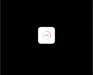
Take a look at the rendering first.
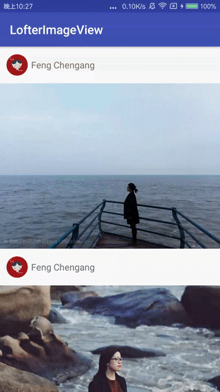
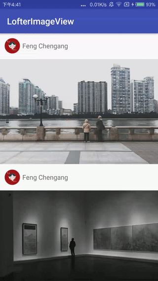
Perhaps the speed of the above network is too fast to see any effect. The following chart should be able to see clearly.
Analysis
Let's not say anything. First look at the screenshots of Lofter loaded images and carefully analyze what we should do if we do it.
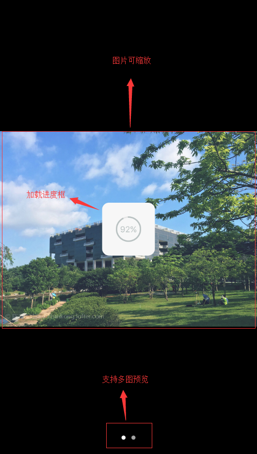
- First show the loading progress box
- Then the image is loaded to support zooming.
- Support multi-graph sliding Preview
There are only three steps, that's all; this article will first analyze the implementation of the load schedule box, that is, to write the Lofter ProgressView control.
Custom ProgressBar
The old rule, first take a closer look at Lofter's Progress Bar, pictured above
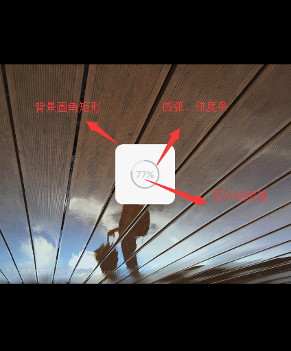
The ProgressBar control consists of three parts
- Background: A rounded rectangle
- Progress bar: an arc
- Percentage: Pure text, nothing special
So, let's do it step by step.
First, in order to unify the code, two private methods (obtaining custom configuration initAttrs() and initializing brush initProSettings()) are defined and executed in the constructor.
 public LofterProgressView(Context context, @Nullable AttributeSet attrs, int defStyleAttr) {
        super(context, attrs, defStyleAttr);
        //Get the custom configuration first
        initAttrs(context, attrs);
        //Re-initialization related configuration
        initProSettings();
    }
Step 1 Draws Rounded Rectangular Background
Background Here I define three configurations, width, color, and radius of rounded corners.
mBgWidth = typedArray.getDimensionPixelSize(R.styleable.ProgressView_bgWidth, 100);
mBgColor = typedArray.getColor(R.styleable.ProgressView_bgColor, Color.WHITE);
mBgCornerRadius = typedArray.getDimensionPixelSize(R.styleable.ProgressView_bgCornerRadius, 20);
Initialization brushes are nothing special, just color and fill modes.
mBgPaint = new Paint(Paint.ANTI_ALIAS_FLAG);
mBgPaint.setColor(mBgColor);
mBgPaint.setStyle(Paint.Style.FILL);
The next step is to draw a rectangle, but the premise is to know exactly where the rectangle is to be drawn, that is to say, to know the location of coordinates, it is not recommended to create objects in onDraw() and onMeasure(), so we create mBgRect member variables in LofterProgressView control, and assign this to mBgRect in initProSettings() method.
mBgRect = new RectF();
In onMeasure(), we just set the coordinates of the rectangle.
@Override
protected void onMeasure(int widthMeasureSpec, int heightMeasureSpec) {
    super.onMeasure(widthMeasureSpec, heightMeasureSpec);
    //Location of the Center
    centerX = getMeasuredWidth() / 2;
    centerY = getMeasuredHeight() / 2;

    //Calculate and set the position of bg rounded rectangle
    mBgRect.set(centerX - (mBgWidth / 2), centerY - (mBgWidth / 2), centerX + (mBgWidth / 2), centerY + (mBgWidth / 2));
    ...
}
Finally, drawing RoundRect () is used in onDraw(), and the rectangle coordinates, the radius of the xy axis of the rounded corner and the brush are passed in to draw the rounded rectangle background.
//Draw background, rounded rectangle
canvas.drawRoundRect(mBgRect, mBgCornerRadius, mBgCornerRadius, mBgPaint);
The background effect map comes out.

Step 2 Draws Progress Bar Arc
Look at the figure below. There are two steps in drawing an arc:
- Ring Background (static, zero progress status display)
-
Progress Circle (Dynamics)
 Arc Drawing Analysis of Progress Bar
Here I define four configuration items, radius, static ring color, progress bar arc color and width of progress bar arc.
mInnerRadius = typedArray.getDimensionPixelSize(R.styleable.ProgressView_innerRadius, 50);
mEdgeColor = typedArray.getColor(R.styleable.ProgressView_edgeColor, Color.RED);
mRingColor = typedArray.getColor(R.styleable.ProgressView_ringColor, Color.BLUE);
mRingWidth = typedArray.getDimensionPixelSize(R.styleable.ProgressView_ringWidth, 10);
Initialization Brush
//Static Ring Background Brush
mEdgePaint = new Paint(Paint.ANTI_ALIAS_FLAG);
mEdgePaint.setColor(mEdgeColor);
mEdgePaint.setStrokeCap(Paint.Cap.ROUND);
mEdgePaint.setStrokeWidth(mRingWidth);
mEdgePaint.setStyle(Paint.Style.STROKE);
//Dynamic Progress Bar Arc Brush
mPercentPaint = new Paint(Paint.ANTI_ALIAS_FLAG);
mPercentPaint.setColor(mPercentColor);
mPercentPaint.setStyle(Paint.Style.FILL);
mPercentPaint.setTextSize(mPercentSize);
Let's draw a static ring first. It's relatively simple.
 //Draw a static circle, which corresponds to the display when the progress is zero.
canvas.drawCircle(centerX, centerY, mInnerRadius, mEdgePaint);
Second, we need to draw progress arc. To draw an arc, we need to use its corresponding tangent rectangle, which is exactly the rectangle enclosing the circle where the arc is located. In the code, RectF is the class. Therefore, we need to determine the coordinates of the rectangle in onMeasure().
//A rectangle with an arc circumscribed (in)
private RectF mOval;

/**
 * Initialization configuration
 */
private void initProSettings(){
    ...
    mOval = new RectF();
}

@Override
protected void onMeasure(int widthMeasureSpec, int heightMeasureSpec) {
    super.onMeasure(widthMeasureSpec, heightMeasureSpec);
    centerX = getMeasuredWidth() / 2;
    centerY = getMeasuredHeight() / 2;

    ...
    //Calculate the position of the tangent rectangle
    mOval.left = (centerX - mInnerRadius);
    mOval.top = (centerY - mInnerRadius);
    mOval.right = centerX + mInnerRadius;
    mOval.bottom = centerY + mInnerRadius;
}
The tangential rectangle only determines the circle in which the arc is located, but how much the arc should be drawn (or how many parts of the whole circle the arc should occupy). Here we need to calculate the sweeping angle of the arc.
/**
 * mPercent Download progress
 * Round, 360 degrees a week
 * Here the angle swept by the arc must be multiplied by 360.
 */
progress = (float) mPercent / 100 * 360;
The final step is to draw the progress.
//Draw progress bar circles
//The second parameter refers to the starting point of the arc, which is zero in the direction of 3 o'clock, so let's write - 90 here.
//The third parameter, true, means to connect the arc to the center of the circle, that is, to draw a pie in a sector, where we don't need to set it to false.
canvas.drawArc(mOval, -90, progress, false, mRingPaint);
The above rendering (I changed the color of the progress bar for more visibility)

Step 3 Draws Percentage Text
The text defines two configuration items, color and size.
mPercentColor = typedArray.getColor(R.styleable.ProgressView_percentColor, Color.GRAY);
mPercentSize = typedArray.getDimensionPixelSize(R.styleable.ProgressView_percentSize, 30);
Initialization Brush
//Brushes in fonts
mPercentPaint = new Paint(Paint.ANTI_ALIAS_FLAG);
mPercentPaint.setColor(mPercentColor);
mPercentPaint.setStyle(Paint.Style.FILL);
mPercentPaint.setTextSize(mPercentSize);

//Calculate the height of the font
Paint.FontMetrics fm = mPercentPaint.getFontMetrics();
mTextHeight = (int) Math.ceil(fm.descent - fm.ascent);
Draw fonts (first adjust the position of the text so that the text is in the middle)
//Calculate font width
mTextWidth = mPercentPaint.measureText(percentText, 0, percentText.length());
 //Percentage of drawing
canvas.drawText(percentText, centerX - mTextWidth / 2, centerY + mTextHeight / 4, mPercentPaint);
Finally, that's the whole picture.
Step 4 exposes the interface to the outside world
Just pay attention to redrawing here.
/**
 * Set percentages directly from the outside
 *
 * @param percent Percentage
 */
 public void setPercent(int percent) {
     this.mPercent = percent;
     //Repaint
     postInvalidate();
 }
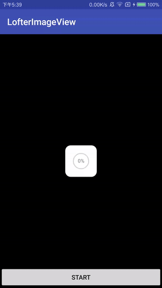
Finally, simulate the progress display
xml configuration
<chengang.library.widget.LofterProgressView
    android:id="@+id/pv2"
    android:layout_width="100dp"
    android:layout_height="100dp"
    android:layout_centerInParent="true"
    android:visibility="visible"
    app:bgColor="@color/white"
    app:bgCornerRadius="12dp"
    app:bgWidth="70dp"
    app:edgeColor="@color/default_edge_color"
    app:innerColor="@color/white"
    app:innerRadius="17dp"
    app:percentColor="@color/gray"
    app:percentSize="11sp"
    app:ringColor="@color/default_ring_color"
    app:ringWidth="2dp" />
Simulated download of pictures
btnStart.setOnClickListener(new View.OnClickListener() {
    @Override
    public void onClick(View v) {
        new Thread(new Runnable() {
            @Override
            public void run() {
                for (int i = 0; i < 101; i++) {
                    try {
                        lofterProgressView.setPercent(i);
                        Thread.sleep(50);
                    } catch (InterruptedException e) {
                        e.printStackTrace();
                    }
                }
            }
        }).start();
    }
});
Final custom rogressBar (Lofter ProgressView) completion
Attached project address
Thank you for reading.
In the next article, I'll combine Glide with the Image ProgressView in this article to make an in-progress image preview control.