preface
ClipXX series:
Android clipChildren usage and troubleshooting
Android clipToPadding usage and troubleshooting
The last article analyzed clipChildren and said that it had to mention its twin brother clipToPadding. You can guess from the name that these two are used for clip canvas. Next, this article will analyze them in detail.
Through this article, you will learn:
1. clipToPadding usage scenario
2. How to use clipToPadding
3. clipToPadding principle
4. Application of clipToPadding in RecyclerView
1. clipToPadding usage scenario
Let's take a look at the Demo:
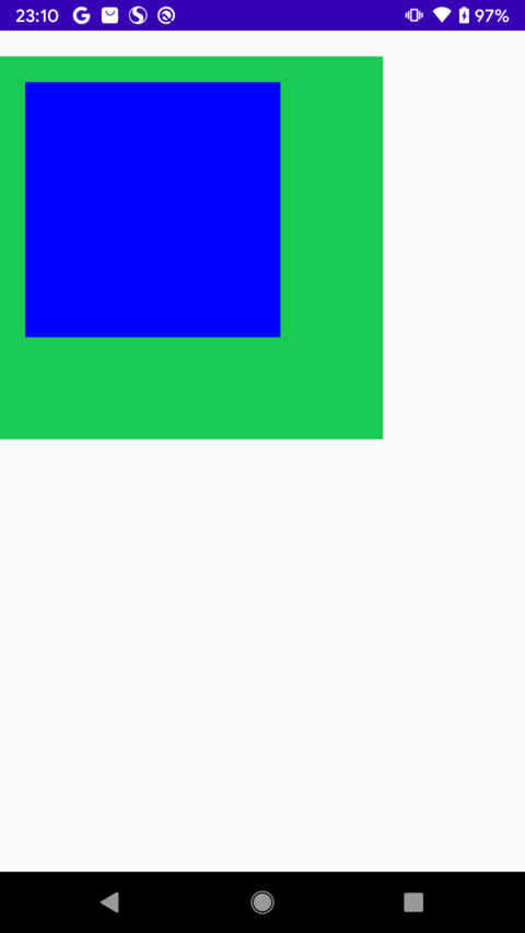
Green is the parent layout and blue is the child layout.
The layout file is as follows:
    <com.example.androiddemo.clippadding.ClipPaddingViewGroup
        android:background="@color/green"
        android:clipToPadding="true"
        android:layout_marginTop="20dp"
        android:paddingTop="20dp"
        android:scrollX="-20dp"
        android:layout_width="300dp"
        android:layout_height="300dp">
        <com.example.androiddemo.clippadding.ClipPaddingView
            android:clickable="true"
            android:background="@color/red"
            android:layout_width="200dp"
            android:layout_height="200dp">
        </com.example.androiddemo.clippadding.ClipPaddingView>
    </com.example.androiddemo.clippadding.ClipPaddingViewGroup>
It can be seen that paddingTop=20dp is set for the parent layout, so the corresponding padding distance is reserved when measuring, placing and drawing the sub layout.
Consider a question: can sub layouts be drawn in the padding area?
The answer is yes, and this will be done by the clipToPadding property.
2. How to use clipToPadding
clipToPadding is a property of ViewGroup. Generally speaking, custom properties can be set in two ways:
1. XML (static)
2. Code settings (dynamic)
Static settings
Set it in the corresponding parent layout xml.
android:clipToPadding="true"
android:clipToPadding="false"
Dynamic settings
#ViewGroup.java
    public void setClipToPadding(boolean clipToPadding) {
        if (hasBooleanFlag(FLAG_CLIP_TO_PADDING) != clipToPadding) {
            //If the value changes, reset it
            setBooleanFlag(FLAG_CLIP_TO_PADDING, clipToPadding);
            //Refresh
            invalidate(true);
        }
    }
It can be seen that the clipToPadding property is refreshed immediately after setting the value, indicating that the clipToPadding property takes effect immediately.
Default value
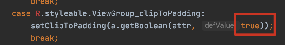
The default is true, which means that the default sub layout cannot be drawn in the padding area.
The above code is executed in the ViewGroup#initFromAttributes method.
clipToPadding setting effect
Let's take a look at the effect of sub layout sliding by default:
Obviously, when the sub layout (blue) moves upward, its drawing part can never surpass the padding drawing.
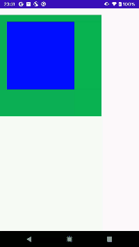
At this time, set clipToPadding = "false" for the parent layout, and then see the effect:

It can be seen that when the sub layout (blue) moves upward, it can be drawn in the padding area.
The question comes again: why didn't you draw in the padding area at the beginning, but you can draw when sliding?
This needs to analyze the problem from the perspective of source code, and then take a look.
3. clipToPadding principle
Since it is an attribute in ViewGroup, start with it first. Let alone, I really found a clue.
#ViewGroup.java
    protected void dispatchDraw(Canvas canvas) {
        //Query whether clipToPadding is set
        final boolean clipToPadding = (flags & CLIP_TO_PADDING_MASK) == CLIP_TO_PADDING_MASK;
        if (clipToPadding) {
            clipSaveCount = canvas.save(Canvas.CLIP_SAVE_FLAG);
            //If it is set, cut the canvas
            canvas.clipRect(mScrollX + mPaddingLeft, mScrollY + mPaddingTop,
                    mScrollX + mRight - mLeft - mPaddingRight,
                    mScrollY + mBottom - mTop - mPaddingBottom);
        }
    }
Take turning off hardware acceleration as an example, the Canvas will be passed to the child layout, that is, when clipToPadding == true, the Canvas of the child layout will be reduced by the parent layout, and the reduced size is the padding distance (the scroll distance is ignored here).
Then let's analyze: why didn't you draw in the padding area at the beginning, but you can draw when sliding?
Initial drawing
Take the initial Demo as an example:
Parent layout size:
width == height == 300dp
Sub layout dimensions:
width == height == 200dp
If the parent layout paddingTop == 20dp is set, under normal circumstances, the Canvas size of the sub layout is as follows:
Canvas = (0, 20dp, 200dp, 200dp)
This is determined by the parent layout matching sub layout measurement and placement process, that is, mTop = 20dp of the sub layout
Therefore, at the beginning, the sub layout cannot be drawn in padding.
Sliding drawing
Although the size of the Canvas is limited, we can also move the Canvas. Therefore, when the child layout slides, because clipToPadding==true is set, the parent layout will not trim the Canvas of the child layout. Since it is not trimmed, it can be displayed (within the scope of the parent layout, if it exceeds the parent layout, the ClipChildren property is involved).
Convert to numerical value as follows:
The Canvas of the sub layout can be displayed when it is moved to 0~20dp vertically, that is, the sub layout is not limited by padding.
According to the above analysis, the usage scenario of clipToPadding is:
When the parent layout is set with padding and you want the child layout to slide, you can ignore padding, that is, draw in the padding area. At this time, you need the clipToPadding attribute.
4. Application of clipToPadding in RecyclerView
When analyzing clipToPadding, almost all articles on the Internet first throw out the sliding effect of RecyclerView, and do not explain why. Through the analysis of the previous points, we clearly know the introduction reason and principle of clipToPadding, and the sliding of RecyclerView Item to the padding area is only one of the application scenarios of clipToPadding.
First look at the layout file:
    <androidx.recyclerview.widget.RecyclerView
        android:id="@+id/rv"
        android:visibility="visible"
        android:layout_marginTop="30dp"
        android:clipToPadding="false"
        android:paddingTop="20dp"
        android:background="@color/purple_200"
        android:layout_width="match_parent"
        android:layout_height="match_parent">
    </androidx.recyclerview.widget.RecyclerView>
RecyclerView set paddingTop = "20dp".
Let's look at the effect of setting different values of clipToPadding:
clipToPadding==true

clipToPadding==false

The purple part is the padding area.
It is consistent with the effect of the third point and will not be repeated here.
This article is based on Android 10.
Complete code demonstration If it's helpful, give github a compliment