With Matplotlib, various images can be easily generated, such as histogram, spectrogram, bar graph, scatter plot, etc.
Starter Code Example
    import matplotlib.pyplot as plt
    import numpy as np
    # An array of 50 elements is generated with np.linspace and evenly distributed over (0,2*pi) intervals.
    x = np.linspace(0, 2 * np.pi, 50)
    y = np.sin(x)
    # Draw the x;y function and use the Yellow * - line.
    plt.plot(x, y, "y*-",label="y=sin(x)")
    # Draw the x,y*2 functions in red -- lines.
    plt.plot(x, y * 2, "m--", label="y=2sin(x)")
    plt.legend()
    # plt.legend(loc="best")
    plt.title("sin(x) & 2sin(x)") # Set title
    plt.xlim(0, 6) # Set the range of the x-axis
    plt.ylim(-3, 3) # Setting the range of y coordinate axis
    # Set the scale of the axis by xticks or yticks.
    plt.xticks((0, np.pi * 0.5, np.pi, np.pi * 1.5, np.pi * 2))
    plt.xlabel("x") # Set the name of the x-axis
    plt.ylabel("y") # Set the name of the y axis
    # To show
    plt.show()
Code parsing:
1. An array of 50 elements evenly distributed in the [0,2pi] interval is generated by np.linspace.
2. plt.plot(x,y, "line style", "label="marker")The value of x,y in the first two parameters, the third parameter is the line style, and the fourth parameter is the marker in the upper right corner, which is used in conjunction with plt.legend().
3. plt.title("****" sets the title
4. plt.xlim() or plt.ylim() sets the range of the x-axis or y-axis
5. # Set the scale of the axis by xticks or yticks.
6. plt.xlabel("x") Sets the name of the x-axis
If you want to learn python programmers, you can come to my python to learn qun: 835017344, free video tutorials for python oh! I will also broadcast python knowledge in the group at 8 p.m. and welcome you to come to learn and communicate.
Common colors:
Blue: b cyan: c red: r black: k
Green: g magenta: r yellow: y white: w
Common points:
Point: Square: s circle: o pixel: triangle:^
Common lines:
Line: - dashed line: - - dotted line:: dotted line: -. asterisk: *
The results are as follows:
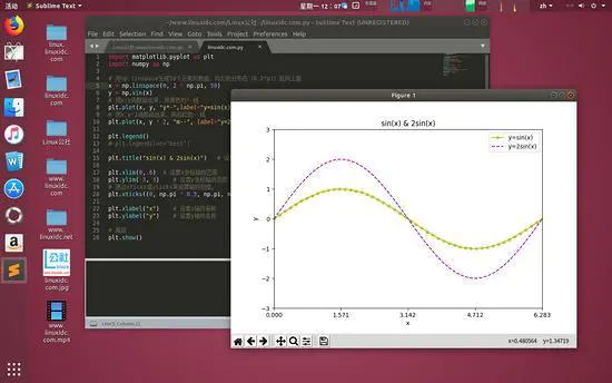
image
Add notes
Code first;
    import matplotlib.pyplot as plt
    import numpy as np
    x = np.linspace(0, 2 * np.pi, 50)
    y = np.sin(x)
    plt.plot(x, y)
    x0 = np.pi
    y0 = 0
    # Draw annotations
    plt.scatter(x0, y0, s=50)
    # Dexter
    plt.annotate('sin(np.pi)=%s' % y0, xy=(np.pi, 0), xycoords='data', xytext=(+30, -30),
    textcoords='offset points', fontsize=16,
    arrowprops=dict(arrowstyle='->', connectionstyle="arc3,rad=.2"))
    # Sinister
    plt.text(0.5, -0.25, "sin(np.pi) = 0", fontdict={'size': 16, 'color': 'r'})
    plt.show()
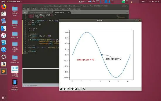
image
Sometimes we need to annotate specific points. We can use the plt.annotate function.
The point we want to mark here is (x0, y0) = (pi, 0).
We can also use the plt.text function to add comments.
For the parameters of annotate function, a simple explanation is given.
- 'sin (np.pi)=% s'% y0 represents the annotated content, and the value of y0 can be passed into the string through the string% s.
- The parameter xycoords='data'is to select the location based on the value of the data.
- xytext=(+30, -30) and textcoords='offset points'denote the description of the labeled position and the xy deviation value, that is, the labeled position moves 30 to the right and 30 to the downward.
- arrowprops are the settings of arrow type and arrow radian in the graph, which need to be passed in as dict.
Drawing multiple graphics at one time
When two sets of data are needed to be compared or displayed differently, we can draw more than one graph in one window.
Multiple Graphic Windows - figure
A figure is a graphics window, and matplotlib.pyplot has a default figure.
    import matplotlib.pyplot as plt
    import numpy as np
    data = np.arange(100, 201) # Generate an array of 100 to 200 with a step size of 1
    # Draw in the first default window
    plt.plot(data) # Drawing data
    data2 = np.arange(200,301)
    plt.figure(figsize=(6, 3)) # Generate a graphics window and set the window size to (6,3)
    # Draw in the second window
    plt.plot(data2) # Drawing data2
    plt.show() # To show
Code parsing:
1. matplotlib is in a default figure when drawing graphics. We can create another window through plt.figure().
2. plt.figure() has figsize parameter to control window size in array form
The results are as follows:
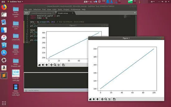
image
Multiple subgraphs - subplot
Sometimes we need to show multiple subgraphs together, which can be implemented using plt.subplot(). That is, the subplot() function needs to be called before calling the plot() function. The first parameter of the function represents the total number of rows of the subgraph, the second parameter represents the total number of columns of the subgraph, and the third parameter represents the active region. The following example is bound or unbound.
    import matplotlib.pyplot as plt
    import numpy as np
    x = np.linspace(0, 2 * np.pi, 50)
    y = np.sin(x)
    ax1 = plt.subplot(2, 2, 1) # (row, column, active area)
    plt.plot(x, np.sin(x), 'r')
    ax2 = plt.subplot(2, 2, 2, sharey=ax1) # Sharing the y axis with ax1
    plt.plot(x, 2 * np.sin(x), 'g')
    ax3 = plt.subplot(2, 1, 2) # Divide the window into two rows and one column. This figure is the second column.
    plt.plot(x, np.cos(x), 'b')
    plt.show()
Code parsing:
1. subplot(2,2,x) means that the image window is divided into two rows and two columns. X represents the active region of the current subgraph.
2. subplot(2,1,2) divides the window into two rows and one column. This figure is drawn in the second column.
3. plt.subplot(2,2,2,sharey=ax1)# is shared by a y axis with the ax1 function.
The results are as follows:
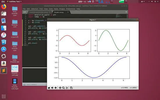
image
Note that the parameters of the subplot function not only support the above form, but also combine three integers (within 10) into one integer. For example, plt.subplot(2,2,1) can be written as plt.subplot(221), and the result is the same.
Common Graphic Examples
Matplotlib can generate a lot of graphics, commonly used are: linear graphs, scatter graphs, pie graphs, bar graphs, histograms. Let's take a look at it in turn.
Linear Map-plot
First up code
    import matplotlib.pyplot as plt
    plt.plot([1,2,3],[3,6,9], "-r")
    plt.plot([1,2,3],[2,4,9], ":g")
    plt.show()
Code parsing:
1. The first array of plot functions is the value of the horizontal axis, and the second array is the value of the vertical axis.
2. The last parameter consists of two characters, the style and the color of the line. The former is a red line and the latter is a green dot line. For an explanation of style and color, see APIDoc of plor function: matplotlib.pyplot.plot.
If you want to learn python programmers, you can come to my python to learn qun: 835017344, free video tutorials for python oh! I will also broadcast python knowledge in the group at 8 p.m. and welcome you to come to learn and communicate.

The results are as follows:
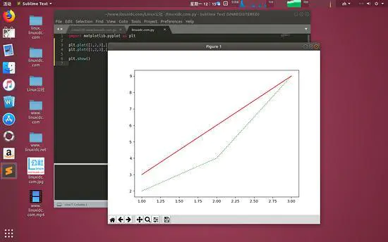
image
Scatter Graph-scatter
Code first:
    import matplotlib.pyplot as plt
    import numpy as np
    plt.subplot(2,1,1)
    k = 500
    x = np.random.rand(k)
    y = np.random.rand(k)
    size = np.random.rand(k) * 50 # Generate the size of each point
    colour = np.arctan2(x, y) # Generate the color of each point
    plt.scatter(x, y, s=size, c=colour)
    plt.colorbar() # Add color bar
    N = 20
    # The parameter c represents the color of the point, s is the size of the point, and alpha is the transparency.
    plt.subplot(2,3,4)
    plt.scatter(np.random.rand(N) * 100,
    np.random.rand(N) * 100,
    c="r", s=100, alpha=0.5) # gules
    plt.subplot(2,3,5)
    plt.scatter(np.random.rand(N) * 100,
    np.random.rand(N) * 100,
    c="g", s=200, alpha=0.5) # green
    plt.subplot(2,3,6)
    plt.scatter(np.random.rand(N) * 100,
    np.random.rand(N) * 100,
    c="b", s=300, alpha=0.5) # blue
    plt.show()
Code parsing:
1. This picture contains three sets of data, each of which contains 20 random coordinates.
2. The parameter c represents the color of the point, s is the size of the point, and alpha is the transparency.
3. plt.colorbar() Add the right color bar
Operation results:
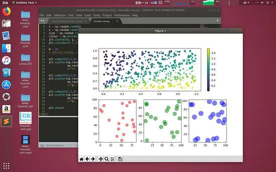
image
pie chart
Code first:
    import matplotlib.pyplot as plt
    import numpy as np
    labels = ["linuxidc", "Ubuntu", "Fedora", "CentOS", "Debian", "SUSE", "linux"]
    data = np.random.rand(7) * 100 # Generate 7 groups of random numbers
    # Labels specify labels, and autopct specifies the accuracy of values
    plt.pie(data, labels=labels, autopct="%1.1f%%")
    plt.axis("equal") # Set the coordinates to be the same size.
    plt.legend() # Specify the legend to be drawn
    plt.show()
Code parsing:
1. Data is a random number of seven data.
2. The labels in the graph are specified by labels
3. autopct specifies the precise format of the numerical value
4. plt.axis('equal') sets the coordinate axis to be the same size.
5. plt.legend() specifies the legend to be drawn (see the upper right corner of the figure below)
Operation results:
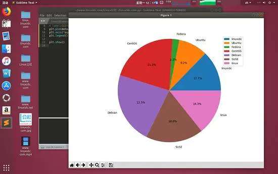
image
Column Diagram - bar
Code first:
    import matplotlib.pyplot as plt
    import numpy as np
    N = 7
    x = np.arange(N)
    # Is randint a random integer?
    # Random Height Generation of Columns
    data = np.random.randint(low=0, high=100, size=N)
    # Random color generation
    colors = np.random.rand(N * 3).reshape(N,-1)
    # Labels specify labels
    labels = ["Linux", "Ubuntu", "CentOS", "Fedora", "openSUSE", "Linuxidc.com", "Debian"]
    # The Title specifies the title of the graph.
    plt.title("Weekday Data")
    # alpha is transparency
    plt.bar(x, data, alpha=0.8, color=colors, tick_label=labels)
    # Increase in numerical value
    for x, y in zip(x, data):
    plt.text(x, y , '%.2f' % y, ha='center', va='bottom')
    plt.show()
Code parsing:
1. The cylindrical shapes of seven random values with heights between [0:100] are drawn.
2. colors = np.random.rand(N * 3).reshape(N,-1) denotes that Mr. A. forms 21 (Nx3) random numbers and then assembles them into seven rows. Then each row is three numbers, which corresponds to the three components of color. (What does column 7-1 mean here?
3. Title refers to the title of a graphic. Labels specify labels. alpha is transparent.
4. Number of plt.text() labeled cylinders
Operation results:
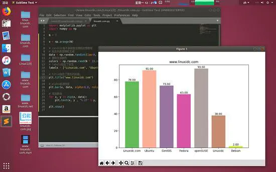
image
Histogram-hist
Histogram describes the frequency of data occurrence in a certain range of data.
Code first:
    import matplotlib.pyplot as plt
    import numpy as np
    # Generate three sets of data
    data = [np.random.randint(0, n, n) for n in [3000, 4000, 5000]]
    labels = ['3K', '4K', '5K'] # Setting labels
    # Setting up data points
    bins = [0, 100, 500, 1000, 2000, 3000, 4000, 5000]
    plt.hist(data, bins=bins, label=labels)
    plt.legend()
    plt.show()
Code parsing:
[np.random.randint(0, n, n) for n in [3000, 4000, 5000]] generates a list of three arrays.
The first array contains 3000 random numbers, and the range of these random numbers is [0,3000].
The second array contains 4000 random numbers in the range of [0,4000].
The third array contains 5000 random numbers in the range of [0,5000].
2. The bins array is used to specify the boundaries of the histogram we display, that is, [0,100] there will be a data point, [100,500] there will be a data point, and so on. So the final result shows a total of seven data points.
Operation results:
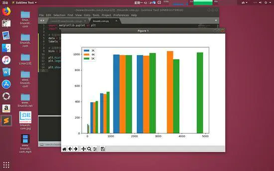
image shows that all three sets of data have data below 3000, and the frequency is about the same. But the blue bar has less than 3000 data and the orange bar has less than 4000 data. This coincides with our random array data.