Recently, Xiaobian saw some friends leave messages on the background to inquire about the drawing method of Manhattan plot. Xiaobian didn't understand it at the beginning. However, I'm a Xiaobian who dotes on readers. This summarizes the drawing methods of Manhattan plot R and Python and makes progress with you. The main contents are as follows:
- Introduction to Manhattan plot
- Manhattan plot r drawing method
- Manhattan plot Python drawing method
Introduction to Manhattan plot
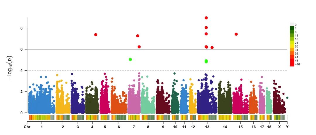
Manhattan plot is a scatter plot, which is usually used to display data with a large number of data points, many non-zero amplitudes and higher amplitude value distributions. (if you know the meaning, ha ~ ~), an example is as follows:
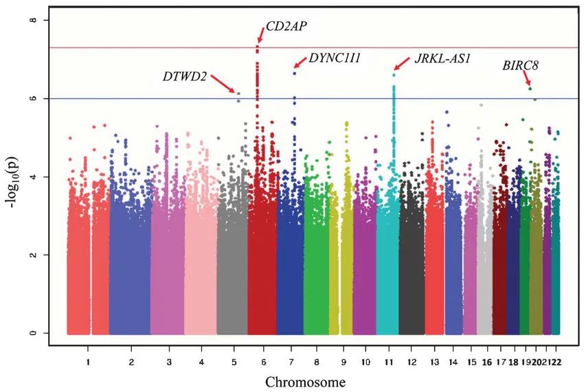
Manhattan map example
Manhattan plot r drawing method
There are many ways to use R to draw Manhattan plot. Here we mainly introduce the drawing method of R-CMplot package, as follows:
library(CMplot)
data(pig60K)
data(cattle50K)
# The data here are regular DF type data
#Visual rendering
CMplot(pig60K,type="p",plot.type="c",chr.labels=paste("Chr",c(1:18,"X","Y"),sep=""),r=0.4,cir.legend=TRUE,
        outward=FALSE,cir.legend.col="black",cir.chr.h=1.3,chr.den.col="black",
        file="jpg",memo="",dpi=600,file.output=TRUE,verbose=TRUE,width=10,height=10)
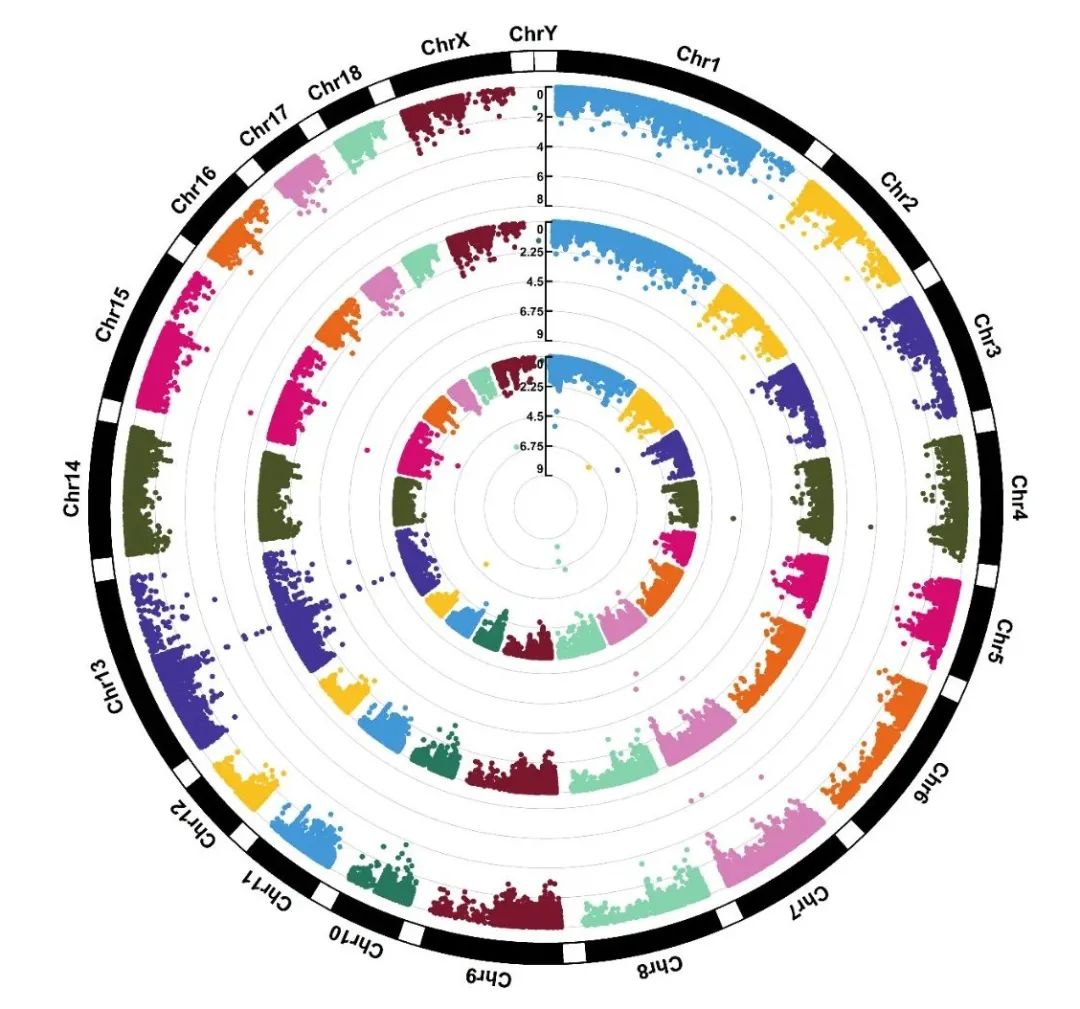
Example01 Of CMplot make
Of course, you can also add legends and modify colors as follows:
CMplot(pig60K,type="p",plot.type="c",r=0.4,col=c("grey30","grey60"),chr.labels=paste("Chr",c(1:18,"X","Y"),sep=""),
      threshold=c(1e-6,1e-4),cir.chr.h=1.5,amplify=TRUE,threshold.lty=c(1,2),threshold.col=c("red",
      "blue"),signal.line=1,signal.col=c("red","green"),chr.den.col=c("darkgreen","yellow","red"),
      bin.size=1e6,outward=FALSE,file="jpg",memo="",dpi=300,file.output=TRUE,verbose=TRUE,width=10,height=10)
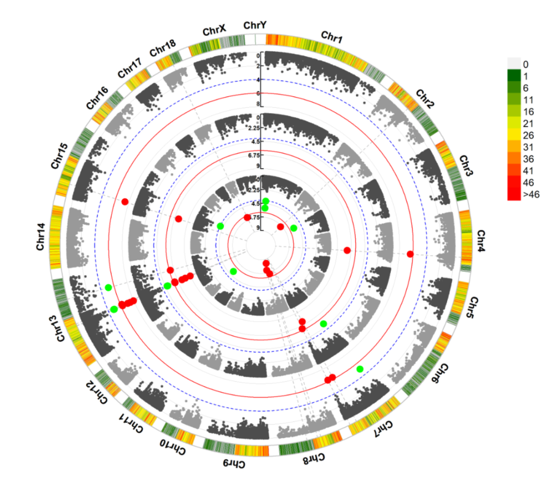
Example02 Of CMplot make
You can also draw a regular Manhattan plot as follows:
CMplot(pig60K,type="p",plot.type="m",LOG10=TRUE,threshold=NULL,file="jpg",memo="",dpi=300,
    file.output=TRUE,verbose=TRUE,width=14,height=6,chr.labels.angle=45)
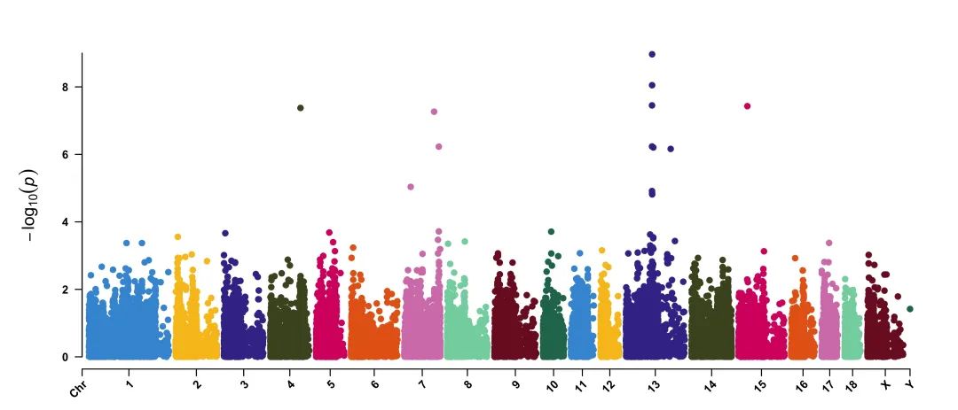
Example03 Of CMplot make
- Add chromosome density at the bottom of the Manhattan diagram
CMplot(pig60K, plot.type="m", LOG10=TRUE, ylim=NULL, threshold=c(1e-6,1e-4),threshold.lty=c(1,2),
        threshold.lwd=c(1,1), threshold.col=c("black","grey"), amplify=TRUE,bin.size=1e6,
        chr.den.col=c("darkgreen", "yellow", "red"),signal.col=c("red","green"),signal.cex=c(1.5,1.5),
        signal.pch=c(19,19),file="jpg",memo="",dpi=300,file.output=TRUE,verbose=TRUE,
        width=14,height=6)
Example03 Of CMplot make with chromosome density
Here are more small examples of Manhattan plot drawn by CMplot package, specifically the setting of different parameters in CMplot() drawing function. For more detailed parameter settings, please refer to the R-CMplot package official website [1]
Manhattan plot Python drawing method
Python needs to perform necessary data processing operations to draw Manhattan diagram. The details are as follows:
from pandas import DataFrame
from scipy.stats import uniform
from scipy.stats import randint
import numpy as np
import matplotlib.pyplot as plt

# sample data
df = DataFrame({'gene' : ['gene-%i' % i for i in np.arange(10000)],
               'pvalue' : uniform.rvs(size=10000),
               'chromosome' : ['ch-%i' % i for i in randint.rvs(0,12,size=10000)]})

# -log_10(pvalue)
df['minuslog10pvalue'] = -np.log10(df.pvalue)
df.chromosome = df.chromosome.astype('category')
df.chromosome = df.chromosome.cat.set_categories(['ch-%i' % i for i in range(12)], ordered=True)
df = df.sort_values('chromosome')

# How to plot gene vs. -log10(pvalue) and colour it by chromosome?
df['ind'] = range(len(df))
df_grouped = df.groupby(('chromosome'))

# manhattan plot
fig = plt.figure(figsize=(10,4),dpi=100)
ax = fig.add_subplot(111)

colors = ["#30A9DE","#EFDC05","#E53A40","#090707"]
x_labels = []
x_labels_pos = []
for num, (name, group) in enumerate(df_grouped):
    group.plot(kind='scatter', x='ind', y='minuslog10pvalue',color=colors[num % len(colors)], ax=ax)
    x_labels.append(name)
    x_labels_pos.append((group['ind'].iloc[-1] - (group['ind'].iloc[-1] - group['ind'].iloc[0])/2))
# add grid
ax.grid(axis="y",linestyle="--",linewidth=.5,color="gray")
ax.tick_params(direction='in',labelsize=13)
ax.set_xticks(x_labels_pos)
ax.set_xticklabels(x_labels)

ax.set_xlim([0, len(df)])
ax.set_ylim([0, 4])
# x axis label
ax.set_xlabel('Chromosome',size=14)
plt.savefig('Manhattan Plot in Python.png',dpi=900,bbox_inches='tight',facecolor='white')
plt.show()
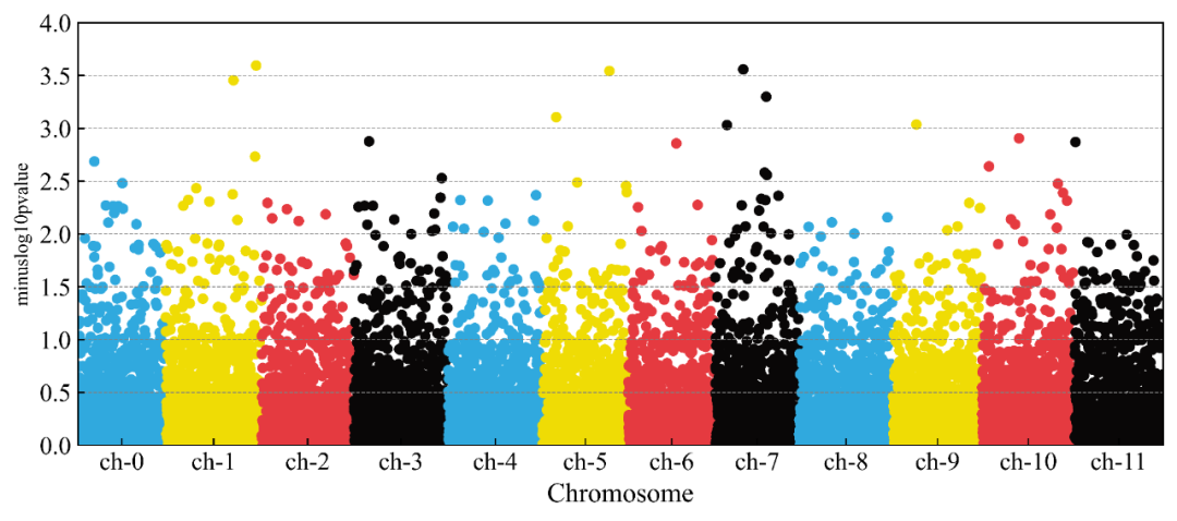
Example Of Manhattan Plot in Python
The above is a small example of drawing R and Python on Manhattan plot. I hope it will be helpful to my friends ~ ~.
summary
Today's tweet is a response to the drawing needs of readers. It briefly introduces the R and Python drawing methods of Manhattan plot, hoping to help the partners in need~~
reference material
[1]
R-CMplot package official website: https://github.com/YinLiLin/CMplot .