
Chapter 1: Preparatory work environment
WinPython-32bit-3.5.2.2Qt5.exe
1.1 Setting matplotlib parameters
Configure templates to facilitate project sharing
D:\Bin\WinPython-32bit-3.5.2.2Qt5\python-3.5.2\Lib\site-packages\matplotlib\mpl-data
Three ways:
Current working directory
User-level Documents and Setting
Installation level configuration file
D:\Bin\WinPython-32bit-3.5.2.2Qt5\python-3.5.2\Lib\site-packages\matplotlib\mpl-data
Chapter II: Understanding Data
In addition to importing and exporting data in various formats, there are also ways to clean up data, such as normalization, adding missing data, real-time data checking and so on.
2.1 Import data from csv files
If you want to load large data files, you usually use the NumPy module.
import csv

import sys

filename = 'E:\\python\\Visualization\\2-1\\10qcell.csv'

data = []


try:

    with open('E:\\python\\Visualization\\2-1\\21.csv') as f:

        reader = csv.reader(f, delimiter=',')

        data = [row for row in reader]

except csv.Error as e:

    sys.exit(-1)


for datarow in data:

    print( datarow)
2.2 Import data from excel files
import xlrd

import os

import sys

path = 'E:\\python\\Visualization\\2-3\\'

file = path + '2-2.xlsx'

wb = xlrd.open_workbook(filename=file)

ws = wb.sheet_by_name('Sheet1')   #Designated worksheet

dataset =  []


for  r in range(ws.nrows):

    col = []

    for c in range(ws.ncols):

        col.append(ws.cell(r,c).value)  #Number of a row or column

    dataset.append(col)


print(dataset)
2.3 Import from Fixed Width Data File
import struct

import string

path = 'E:\\python\\Visualization\\'

file = path + '2-4\\test.txt'


mask = '3c4c7c'


with open(file, 'r') as f:

    for line in f:

        fields = struct.unpack_from(mask,line)  #3.5.4 Upload Failure

        print([field.strip() for field in fields])
2.4 Import from tab-split files
Similar to reading from csv, the separator is different.
2.5 Export data to csv, excel
Example, not running

def write_csv(data)

f = StringIO.StringIO()

writer = csv.writer(f)

for row in data:

    writer.writerow(row)

return f.getvalue()
2.6 Importing data from the database
Connect to the database
Query data
Traverse the queried rows
2.7 Clean up outliers
MAD: median absolute deviation
box plox: Box plot
Different coordinate systems make the display deceptive:
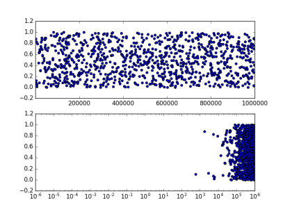
from pylab import *


x = 1e6*rand(1000)

y = rand(1000)


figure()


subplot(2,1,1)

scatter(x,y)

xlim(1e-6,1e6)


subplot(2,1,2)

scatter(x,y)

xscale('log')

xlim(1e-6,1e6)


show()
2.8 Read bulk data files
python is good at handling reading and writing files and class file objects. Instead of loading everything at once, it loads it intelligently as needed.
MapReduce, a parallel method, achieves greater processing power and memory space at low cost.
Multiprocess processing, such as thread, multiprocessing, threading;
If large files are processed repeatedly, it is recommended to establish its own data pipeline, so that every time data is output in a specific form, it is not necessary to find a data source for manual processing.
2.9 Generating controllable random data sets
Simulate data of various distributions.
2.10 Data smoothing
Methods: Convolutional filtering, etc.
Many methods can smooth the signal received by the external signal source, depending on the field of work and the characteristics of the signal. Many algorithms are dedicated to a particular signal, and there may not be a universal solution for all cases.
An important question is: when should signal be smoothed?
For real signals, the data smoothed may be wrong for real signals.
Chapter 3: Drawing and customizing charts
3.1 Column, Linear and Accumulated Column
from matplotlib.pyplot import *


x = [1,2,3,4,5,6]

y = [3,4,6,7,3,2]


#create new figure

figure()


#Line

subplot(2,3,1)

plot(x,y)


#Histogram

subplot(2,3,2)

bar(x,y)


#Horizontal histogram

subplot(2,3,3)

barh(x,y)


#Overlapping histogram

subplot(2,3,4)

bar(x,y)


y1=[2,3,4,5,6,7]

bar(x,y1,bottom=y,color='r')


#Box diagram

subplot(2,3,5)

boxplot(x)

#Scatter plot

subplot(2,3,6)

scatter(x,y)

show()

3.2 Box plots and histograms
from matplotlib.pyplot import *


figure()

dataset = [1,3,5,7,8,3,4,5,6,7,1,2,34,3,4,4,5,6,3,2,2,3,4,5,6,7,4,3]


subplot(1,2,1)


boxplot(dataset, vert=False)


subplot(1,2,2)

#histogram

hist(dataset)


show()

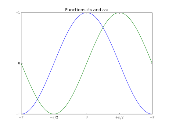
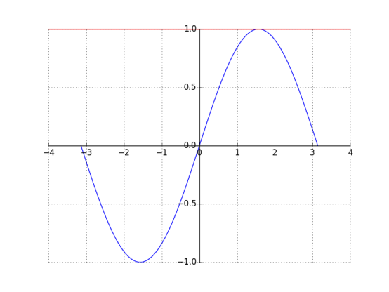
3.3 Sine cosine and Icon
from  matplotlib.pyplot import *

import numpy as np


x = np.linspace(-np.pi, np.pi, 256, endpoint=True)


y = np.cos(x)

y1= np.sin(x)


plot(x,y)

plot(x,y1)


#Chart name

title("Functions $\sin$ and $\cos$")


#x,y axis coordinate range

xlim(-3,3)

ylim(-1,1)


#Calibration in coordinates

xticks([-np.pi, -np.pi/2,0,np.pi/2,np.pi],

       [r'$-\pi$', r'$-\pi/2$', r'$0$', r'$+\pi/2$',r'$+\pi$'])

yticks([-1, 0, 1],

       [r'$-1$',r'$0$',r'$+1$' ])

#grid

grid()

show()
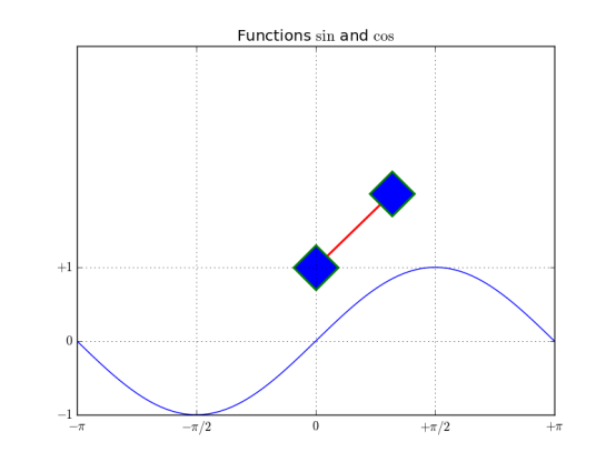
3.4 Setting the lines, attributes, and formatted strings of a chart
from  matplotlib.pyplot import *

import numpy as np


x = np.linspace(-np.pi, np.pi, 256, endpoint=True)


y = np.cos(x)

y1= np.sin(x)


#Line segment color, line style, line width, line marker, marker edge color, marker edge width, marker inner color, marker size

plot([1,2],c='r',ls='-',lw=2, marker='D', mec='g',mew=2, mfc='b',ms=30)

plot(x,y1)


#Chart name

title("Functions $\sin$ and $\cos$")


#x,y axis coordinate range

xlim(-3,3)

ylim(-1,4)


#Calibration in coordinates

xticks([-np.pi, -np.pi/2,0,np.pi/2,np.pi],

       [r'$-\pi$', r'$-\pi/2$', r'$0$', r'$+\pi/2$',r'$+\pi$'])

yticks([-1, 0, 1],

       [r'$-1$',r'$0$',r'$+1$' ])


grid()


show()
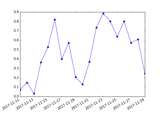
3.5 Setting scale, time scale label, grid
import matplotlib.pyplot as mpl

from pylab import *

import datetime

import numpy as np


fig = figure()


ax = gca()


#Time interval

start = datetime.datetime(2017,11,11)

stop = datetime.datetime(2017,11,30)

delta = datetime.timedelta(days =1)


dates = mpl.dates.drange(start,stop,delta)


values = np.random.rand(len(dates))


ax.plot_date(dates, values, ls='-')


date_format = mpl.dates.DateFormatter('%Y-%m-%d')


ax.xaxis.set_major_formatter(date_format)


fig.autofmt_xdate()


show()
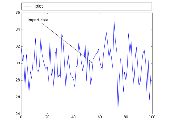
3.6 Adding legends and annotations
from matplotlib.pyplot import *

import numpy as np


x1 = np.random.normal(30, 2,100)

plot(x1, label='plot')


#Legend

#Normalized coordinates of starting position, width and height of Icon

#loc is optional so that icons do not overlay the map

#Number of illustrations

#Legend shop

#Spacing between coordinate axes and legend boundaries

legend(bbox_to_anchor=(0., 1.02, 1., .102),loc = 4,

       ncol=1, mode="expand",borderaxespad=0.1)


#annotation

# Import data annotation

#(55,30) Points for Attention

#xycoords = Data annotations and data use the same coordinate system

#xytest annotation location

#Arrowhead for arrowprops annotation

annotate("Import data", (55,30), xycoords='data',

               xytext=(5,35),

               arrowprops=dict(arrowstyle='->'))


show()
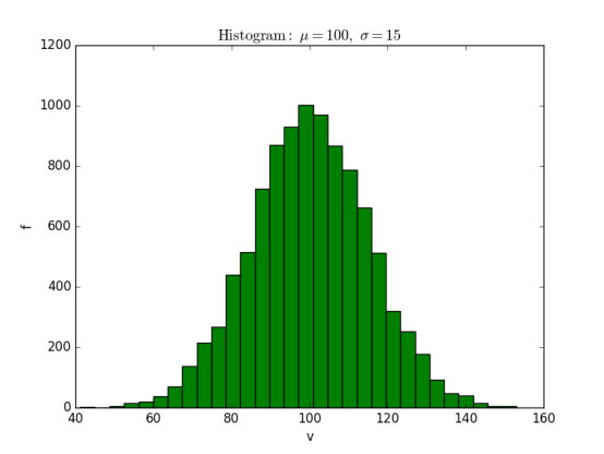
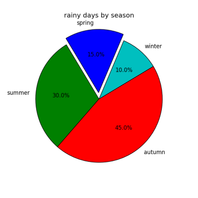
3.7 Histogram and pie chart
histogram
import matplotlib.pyplot as plt


import numpy as np


mu=100

sigma = 15

x = np.random.normal(mu, sigma, 10000)


ax = plt.gca()


ax.hist(x,bins=30, color='g')


ax.set_xlabel('v')

ax.set_ylabel('f')


ax.set_title(r'$\mathrm{Histogram:}\ \mu=%d,\ \sigma=%d$' % (mu,sigma))


plt.show()
Pie chart
from pylab import *


figure(1, figsize=(6,6))

ax = axes([0.1,0.1,0.8,0.8])


labels ='spring','summer','autumn','winter'

x=[15,30,45,10]

#explode=(0.1,0.2,0.1,0.1)

explode=(0.1,0,0,0)

pie(x, explode=explode, labels=labels, autopct='%1.1f%%', startangle=67)


title('rainy days by season')

show()
3.8 Setting coordinate axes
import matplotlib.pyplot as plt


import numpy as np


x = np.linspace(-np.pi, np.pi, 500, endpoint=True)

y = np.sin(x)


plt.plot(x,y)


ax = plt.gca()

#top bottom left right


#Upper and lower boundary colors

ax.spines['right'].set_color('none')

ax.spines['top'].set_color('r')


#Coordinate axis position

ax.spines['bottom'].set_position(('data', 0))

ax.spines['left'].set_position(('data', 0))


#Calibration position on coordinate axis

ax.xaxis.set_ticks_position('bottom')

ax.yaxis.set_ticks_position('left')


plt.grid()

plt.show()
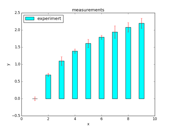
3.9 Error bar chart
import matplotlib.pyplot as plt


import numpy as np


x = np.arange(0,10,1)


y = np.log(x)


xe = 0.1 * np.abs(np.random.randn(len(y)))


plt.bar(x,y,yerr=xe,width=0.4,align='center',

        ecolor='r',color='cyan',label='experimert')


plt.xlabel('x')

plt.ylabel('y')

plt.title('measurements')

plt.legend(loc='upper left')  #This lexical use is more straightforward


plt.show()
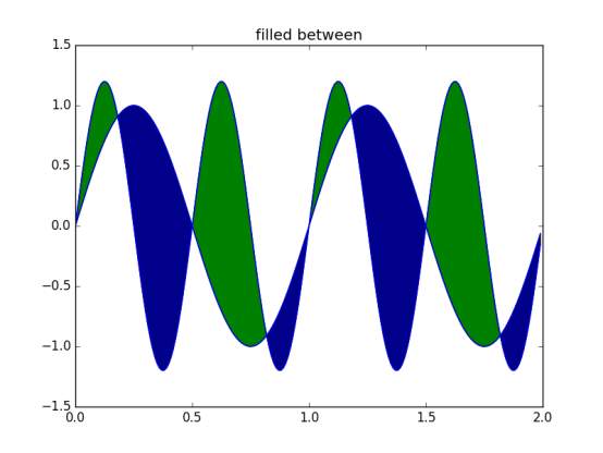
3.10 Charts with Filled Areas
import matplotlib.pyplot as plt

from matplotlib.pyplot import *

import numpy as np


x = np.arange(0,2,0.01)


y1 = np.sin(2*np.pi*x)

y2=1.2*np.sin(4*np.pi*x)


fig = figure()

ax = gca()


ax.plot(x,y1,x,y2,color='b')


ax.fill_between(x,y1,y2,where = y2>y1, facecolor='g',interpolate=True)

ax.fill_between(x,y1,y2,where = y2<y1, facecolor='darkblue',interpolate=True)


ax.set_title('filled between')


show()
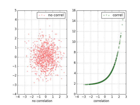
3.11 Scatter plot
import matplotlib.pyplot as plt


import numpy as np


x = np.random.randn(1000)


y1 = np.random.randn(len(x))


y2 = 1.8 + np.exp(x)


ax1 = plt.subplot(1,2,1)

ax1.scatter(x,y1,color='r',alpha=.3,edgecolors='white',label='no correl')

plt.xlabel('no correlation')

plt.grid(True)

plt.legend()


ax1 = plt.subplot(1,2,2)

#alpha transparency edge colors edge color label legend (used in conjunction with legend)

plt.scatter(x,y2,color='g',alpha=.3,edgecolors='gray',label='correl')

plt.xlabel('correlation')

plt.grid(True)

plt.legend()


plt.show()
Chapter IV More Charts and Customization
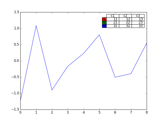
4.4 Adding data tables to charts
from matplotlib.pyplot import *

import matplotlib.pyplot as plt

import numpy as np


plt.figure()

ax = plt.gca()

y = np.random.randn(9)


col_labels = ['c1','c2','c3']

row_labels = ['r1','r2','r3']

table_vals = [[11,12,13],[21,22,23],[31,32,33]]

row_colors = ['r','g','b']


my_table = plt.table(cellText=table_vals,

                     colWidths=[0.1]*3,

                     rowLabels=row_labels,

                     colLabels=col_labels,

                     rowColours=row_colors,

                     loc='upper right')


plt.plot(y)

plt,show()
4.5 Use subplots
from matplotlib.pyplot import *

import matplotlib.pyplot as plt

import numpy as np


plt.figure(0)

#Partitioning Planning of Subgraphs

a1 = plt.subplot2grid((3,3),(0,0),colspan=3)

a2 = plt.subplot2grid((3,3),(1,0),colspan=2)

a3 = plt.subplot2grid((3,3),(1,2),colspan=1)

a4 = plt.subplot2grid((3,3),(2,0),colspan=1)

a5 = plt.subplot2grid((3,3),(2,1),colspan=2)


all_axex = plt.gcf().axes

for ax in all_axex:

    for ticklabel in ax.get_xticklabels() + ax.get_yticklabels():

        ticklabel.set_fontsize(10)


plt.suptitle("Demo")

plt.show()

4.6 Customized Grid
grid();
Parameters such as color, linestyle, linewidth can be set
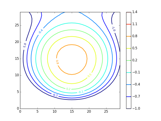
4.7 Create contour maps
Matrix based
Contour label
Contour Density
import matplotlib.pyplot as plt

import numpy as np

import matplotlib as mpl


def process_signals(x,y):

    return (1-(x**2 + y**2))*np.exp(-y**3/3)


x = np.arange(-1.5, 1.5, 0.1)

y = np.arange(-1.5,1.5,0.1)


X,Y = np.meshgrid(x,y)

Z = process_signals(X,Y)

N = np.arange(-1, 1.5, 0.3) #The interval as an isoline


CS = plt.contour(Z, N, linewidths = 2,cmap = mpl.cm.jet)

plt.clabel(CS, inline=True, fmt='%1.1f', fontsize=10) #Contour label

plt.colorbar(CS)

plt.show()
4.8 Fill in the bottom area of the chart
from matplotlib.pyplot import *

import matplotlib.pyplot as plt

import numpy as np

from math import sqrt


t = range(1000)

y = [sqrt(i) for i in t]


plt.plot(t,y,color='r',lw=2)

plt.fill_between(t,y,color='y')

plt.show()

Chapter 5: 3D Visualization Charts
It's better to think carefully before choosing 3D, because 3D visualization is more confusing than 2D.
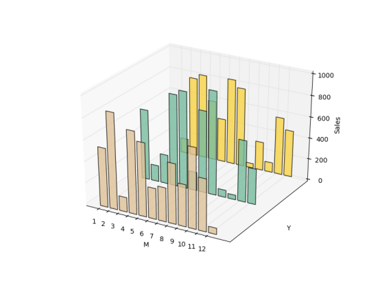
5.2 3D histogram
import matplotlib.pyplot as plt

import numpy as np

import matplotlib as mpl

import random

import matplotlib.dates as mdates


from mpl_toolkits.mplot3d import Axes3D


mpl.rcParams['font.size'] =10


fig = plt.figure()

ax = fig.add_subplot(111,projection='3d')


for z in [2015,2016,2017]:

    xs = range(1,13)

    ys = 1000 * np.random.rand(12)

    color = plt.cm.Set2(random.choice(range(plt.cm.Set2.N)))

    ax.bar(xs,ys,zs=z,zdir='y',color=color,alpha=0.8)


ax.xaxis.set_major_locator(mpl.ticker.FixedLocator(xs))

ax.yaxis.set_major_locator(mpl.ticker.FixedLocator(ys))


ax.set_xlabel('M')

ax.set_ylabel('Y')

ax.set_zlabel('Sales')


plt.show()
5.3 Surface Diagram
import matplotlib.pyplot as plt

import numpy as np

import matplotlib as mpl

import random

from mpl_toolkits.mplot3d import Axes3D

from matplotlib import cm

fig = plt.figure()

ax = fig.add_subplot(111,projection='3d')

n_angles = 36

n_radii = 8

radii = np.linspace(0.125, 1.0, n_radii)

angles = np.linspace(0, 2*np.pi, n_angles, endpoint=False)

angles = np.repeat(angles[..., np.newaxis], n_radii, axis=1)


x = np.append(0, (radii*np.cos(angles)).flatten())

y = np.append(0, (radii*np.sin(angles)).flatten())

z = np.sin(-x*y)


ax.plot_trisurf(x,y,z,cmap=cm.jet, lw=0.2)

plt.show()

5.4 3D Histogram
import matplotlib.pyplot as plt

import numpy as np

import matplotlib as mpl

import random

from mpl_toolkits.mplot3d import Axes3D


mpl.rcParams['font.size'] =10


fig = plt.figure()

ax = fig.add_subplot(111,projection='3d')

samples = 25

x = np.random.normal(5,1,samples)   #Normal distribution on x

y = np.random.normal(3, .5, samples) #Normal distribution on y


#On the X Y plane, according to 10*10 mesh division, the number of hist in the mesh, x boundary division, y boundary division

hist, xedges, yedges = np.histogram2d(x,y,bins=10)

elements = (len(xedges)-1)*(len(yedges)-1)

xpos,ypos = np.meshgrid(xedges[:-1]+.25,yedges[:-1]+.25)


xpos = xpos.flatten() #Multidimensional arrays become one-dimensional arrays

ypos = ypos.flatten()

zpos = np.zeros(elements)


dx = .1 * np.ones_like(zpos) #zpos consistent all-1 array

dy = dx.copy()

dz = hist.flatten()


#Each stereo takes (xpos,ypos,zpos) as the lower left corner and (xpos+dx,ypos+dy,zpos+dz) as the upper right corner.

ax.bar3d(xpos,ypos,zpos,dx,dy,dz,color='b',alpha=0.4)


plt.show()

Chapter VI: Mapping with Images and Maps
6.3 Drawing Charts with Images
6.4 Image Chart Display
Chapter 7: Understanding Data with Correct Charts
Why display data in this way?
7.2 Logarithmic graph
import matplotlib.pyplot as plt

import numpy as np


x = np.linspace(1,10)

y = [10**e1 for e1 in x]

z = [2*e2 for e2 in x]


fig = plt.figure(figsize=(10, 8))

ax1 = fig.add_subplot(2,2,1)

ax1.plot(x, y, color='b')

ax1.set_yscale('log')

#Two coordinate axes and primary and secondary scales open grid display

plt.grid(b=True, which='both', axis='both')


ax2 = fig.add_subplot(2,2,2)

ax2.plot(x,y,color='r')

ax2.set_yscale('linear')

plt.grid(b=True, which='both', axis='both')


ax3 = fig.add_subplot(2,2,3)

ax3.plot(x,z,color='g')

ax3.set_yscale('log')

plt.grid(b=True, which='both', axis='both')


ax4 = fig.add_subplot(2,2,4)

ax4.plot(x,z,color='magenta')

ax4.set_yscale('linear')

plt.grid(b=True, which='both', axis='both')


plt.show()

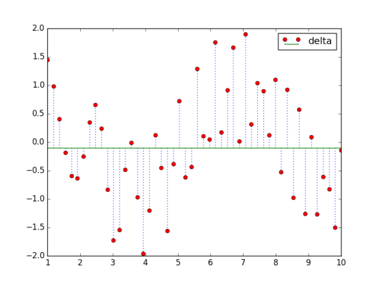
7.3 Create matchstick diagrams
import matplotlib.pyplot as plt

import numpy as np


x = np.linspace(1,10)

y = np.sin(x+1) + np.cos(x**2)


bottom = -0.1

hold = False

label = "delta"


markerline, stemlines, baseline = plt.stem(x, y, bottom=bottom,label=label, hold=hold)


plt.setp(markerline, color='r', marker= 'o')

plt.setp(stemlines,color='b', linestyle=':')

plt.setp(baseline, color='g',lw=1, linestyle='-')


plt.legend()


plt.show()
7.4 Vector Map
7.5 Use color tables
The color should pay attention to the fact that the observer will make certain assumptions about the information to be expressed by the color and the color. Do not do unrelated color mapping, such as mapping financial data to the color representing temperature.
If the data is not strongly associated with red and green, try not to use red and green colors.
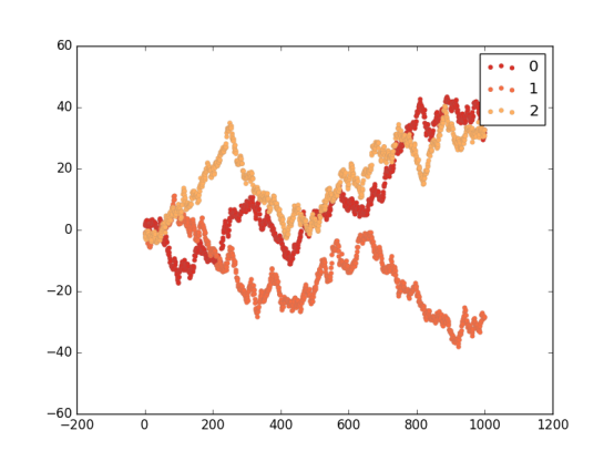
import matplotlib.pyplot as plt

import numpy as np

import matplotlib as mpl


red_yellow_green = ['#d73027','#f46d43','#fdae61']

sample_size = 1000

fig,ax = plt.subplots(1)


for i in range(3):

    y = np.random.normal(size=sample_size).cumsum()

    x = np.arange(sample_size)

    ax.scatter(x, y, label=str(i), lw=0.1, edgecolors='grey',facecolor=red_yellow_green[i])


plt.legend()

plt.show()
7.7 Use scatter plots and histograms
7.8 Cross-correlation graphs between two variables
7.9 Importance of autocorrelation
Chapter 8: More knowledge of matplotlib
8.6 Use text and font attributes
Function:
test: Add text at the specified location
xlabel:x-axis label
ylabel:y-axis label
Title: Set the title of the coordinate axis
suptitle: Add a central title to the chart
figtest: Add text and normalize coordinates anywhere in the graph
If Python programming, web crawler, machine learning, data mining, web development, artificial intelligence, interview experience exchange. Interest can be 519970686, there will be regular distribution of free links within the group, these materials are collected from various technical websites, collated out, if you have good learning materials can chat with me, I will indicate the source and share them with you.
Properties:
family: Font type
size/fontsize: font size
style/fontstyle: Font Style
Variant: Font variant
weight/fontweight: Thickness
stretch/fontstretch: Stretching
fontproperties:
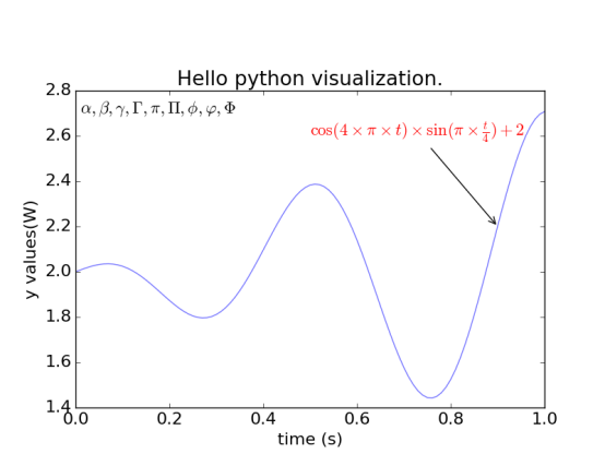
8.7 Rendering Text with LaTeX
LaTeX is a high-quality typesetting system used to generate scientific and technological documents. It is already the de facto standard for scientific typesetting or publications.
import matplotlib.pyplot as plt

import numpy as np


t = np.arange(0.0, 1.0+0.01, 0.01)

s = np.cos(4 * np.pi *t) * np.sin(np.pi*t/4) + 2


#plt.rc('text', usetex=True)  #Latex not installed

plt.rc('font', **{'family':'sans-serif','sans-serif':['Helvetica'],'size':16})


plt.plot(t, s, alpha=0.55)


plt.annotate(r'$\cos(4 \times \pi \times {t}) \times \sin(\pi \times \frac{t}{4}) + 2$',xy=(.9, 2.2), xytext=(.5, 2.6),color='r', arrowprops={'arrowstyle':'->'})


plt.text(.01, 2.7, r'$\alpha, \beta, \gamma, \Gamma, \pi, \Pi, \phi, \varphi, \Phi$')


plt.xlabel(r'time (s)')

plt.ylabel(r'y values(W)')


plt.title(r"Hello python visualization.")

plt.subplots_adjust(top=0.8)


plt.show()
It can be said that these are the essence of the "Python data visualization programming real battle". If necessary, we can read it first. If there is any improvement, we can also comment on the message. Welcome to the point of praise, and give the technical people a little support and care.