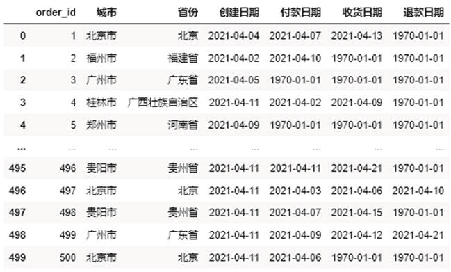
This chapter demonstrates how to combine Pandas library and openpyxl library to automatically generate reports in practical work. Suppose we now have a dataset as shown in Figure 1.
(Figure 1)
Now we need to make daily reports based on this data set, mainly including the following three aspects.
- The same / month on month comparison of various indicators of the day.
- Order quantity created by each province on that day.
- Create order volume trend in recent period.
Next, it is implemented separately.
01
Same day / month on month comparison of various indicators

We first calculate and process the data with Pandas library to obtain the same / month on month comparison of each index. The specific implementation code is as follows.
#Import file
import pandas as pd
df = pd.read_excel(r'D:\Data-Science\share\excel-python Report automation
\sale_data.xlsx')
#Construct functions that obtain different indicators at the same time
def get_data(date):
create_cnt = df[df['Creation date'] == date]['order_id'].count()
pay_cnt = df[df['Payment date'] == date]['order_id'].count()
receive_cnt = df[df['Date of receipt'] == date]['order_id'].count()
return_cnt = df[df['Refund date'] == date]['order_id'].count()
return create_cnt,pay_cnt,receive_cnt,return_cnt
#It is assumed that the day is April 11, 2021
#Obtain the index values in different time periods
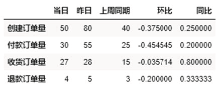
df_view = pd.DataFrame([get_data('2021-04-11')
,get_data('2021-04-10')
,get_data('2021-04-04')]
,columns = ['Create order quantity','Payment order quantity','Receipt order quantity','Refund order quantity']
,index = ['same day','yesterday','Same period last week']).T
df_view['Ring ratio'] = df_view['same day'] / df_view['yesterday'] - 1
df_view['Year on year'] = df_view['same day'] / df_view['Same period last week'] - 1
df_viewRunning the above code will get the result shown in Figure 2.
(Figure 2)
The above only obtains the same / month on month absolute values of various indicators, but the daily report generally needs to make some format adjustments, such as adjusting the font. The openpyxl library is required for format adjustment. We convert the data in DataFrame format in Pandas library into the data format applicable to openpyxl library. The specific implementation code is as follows.
from openpyxl import Workbook
from openpyxl.utils.dataframe import dataframe_to_rows
#Create an empty Workbook
wb = Workbook()
ws = wb.active
#Convert DataFrame format data to openpyxl format
for r in dataframe_to_rows(df_view,index = True,header = True):
ws.append(r)
wb.save(r'D:\Data-Science\share\excel-python Report automation\Core indicators_original.xlsx')
Running the above code will get the results shown in Figure 3. You can see that the original data file looks very chaotic.
(Figure 3)
Next, adjust the format of the above original data file. The specific adjustment code is as follows.
from openpyxl import Workbook
from openpyxl.utils.dataframe import dataframe_to_rows
from openpyxl.styles import colors
from openpyxl.styles import Font
from openpyxl.styles import PatternFill
from openpyxl.styles import Border, Side
from openpyxl.styles import Alignment
wb = Workbook()
ws = wb.active
for r in dataframe_to_rows(df_view,index = True,header = True):
ws.append(r)
#If line 2 is empty, delete line 2
ws.delete_rows(2)
#Assign a value to cell A1
ws['A1'] = 'index'
#Insert a row as the header row
ws.insert_rows(1)
ws['A1'] = 'E-commerce business direction 2021/4/11 daily'
#Merge the cells of the header row
ws.merge_cells('A1:F1') #merge cell
#Format the cells in rows 1 to 6
for row in ws[1:6]:
for c in row:
#Font settings
c.font = Font(name = 'Microsoft YaHei ',size = 12)
#Alignment settings
c.alignment = Alignment(horizontal = "center")
#Border line settings
c.border = Border(left = Side(border_style = "thin",color = "FF000000"),
right = Side(border_style = "thin",color = "FF000000"),
top = Side(border_style = "thin",color = "FF000000"),
bottom = Side(border_style = "thin",color = "FF000000"))
#Special settings are made for the header row and header row
for row in ws[1:2]:
for c in row:
c.font = Font(name = 'Microsoft YaHei ',size = 12,bold = True,color = "FFFFFFFF")
c.fill = PatternFill(fill_type = 'solid',start_color ='FFFF6100')
#Format month on month and year on year as a percentage
for col in ws["E":"F"]:
for r in col:
r.number_format = '0.00%'
#Adjust column width
ws.column_dimensions['A'].width = 13
ws.column_dimensions['E'].width = 10
#Save adjusted file
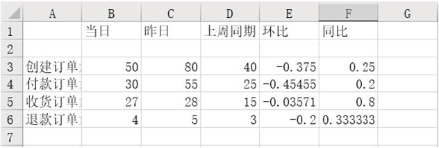
wb.save(r'D:\Data-Science\share\excel-python Report automation\Core indicators.xlsx')Running the above code will get the result shown in Figure 4.
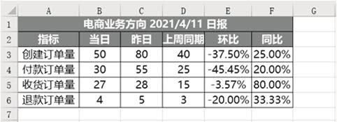
(Figure 4)
You can see that all items have been set successfully.
02
Order quantity created by provinces on the same day
We also use the Pandas library to process the order quantity created by each province on that day. The specific implementation code is as follows.
df_province = pd.DataFrame(df[df['Creation date'] == '2021-04-11'].groupby('province
')['order_id'].count())
df_province = df_province.reset_index()
df_province = df_province.sort_values(by = 'order_id',ascending = False)
df_province = df_province.rename(columns = {'order_id':'Create order quantity'})
df_province
Running the above code will get the result shown in Figure 5.
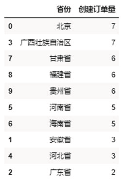
(Figure 5)
After obtaining the absolute value of the order quantity created in each province on that day, the format is also set. The specific setting code is as follows.
from openpyxl import Workbook
from openpyxl.utils.dataframe import dataframe_to_rows
from openpyxl.styles import colors
from openpyxl.styles import Font
from openpyxl.styles import PatternFill
from openpyxl.styles import Border, Side
from openpyxl.styles import Alignment
from openpyxl.formatting.rule import DataBarRule
wb = Workbook()
ws = wb.active
for r in dataframe_to_rows(df_province,index = False,header = True):
ws.append(r)
#Set the cells in rows 1 to 11
for row in ws[1:11]:
for c in row:
#Font settings
c.font = Font(name = 'Microsoft YaHei ',size = 12)
#Alignment settings
c.alignment = Alignment(horizontal = "center")
#Border line settings
c.border = Border(left = Side(border_style = "thin",color = "FF000000"),
right = Side(border_style = "thin",color = "FF000000"),
top = Side(border_style = "thin",color = "FF000000"),
bottom = Side(border_style = "thin",color = "FF000000"))
#Format progress bar conditions
rule = DataBarRule(start_type = 'min',end_type = 'max',
color="FF638EC6", showValue=True, minLength=None, maxLength=
None)
ws.conditional_formatting.add('B1:B11',rule)
#Set the title line of line 1
for c in ws[1]:
c.font = Font(name = 'Microsoft YaHei ',size = 12,bold = True,color = "FFFFFFFF")
c.fill = PatternFill(fill_type = 'solid',start_color='FFFF6100')
#Adjust column width
ws.column_dimensions['A'].width = 17
ws.column_dimensions['B'].width = 13
#Save adjusted file
wb.save(r'D:\Data-Science\share\excel-python Report automation\Sales by province.xlsx')
Running the above code will get the result shown in Figure 6.
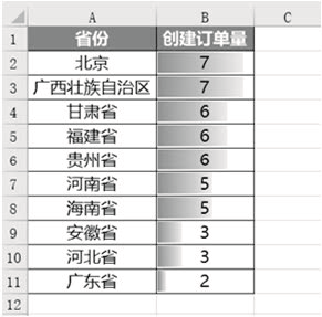
(Figure 6)
03
Create order volume trend in recent period
Generally, a line chart is used to reflect the trend of an index. As we mentioned earlier, in practical work, the chart is drawn and saved with matplotlib library or other visual libraries, and then the chart is inserted into Excel with openpyxl library.
First, use the matplotlib library to draw, and the specific implementation code is as follows.
%matplotlib inline
import matplotlib.pyplot as plt
plt.rcParams["font.sans-serif"]='SimHei'#Solve Chinese garbled code
#Set chart size
plt.figure(figsize = (10,6))
df.groupby('Creation date')['order_id'].count().plot()
plt.title('4.2 - 4.11 Create daily trend of order quantity')
plt.xlabel('date')
plt.ylabel('Order quantity')
#Save chart locally
plt.savefig(r'D:\Data-Science\share\excel-python Report automation\4.2 - 4.11 Create order quantity
Diurnal trend.png')
Insert the chart saved locally into Excel. The specific implementation code is as follows.
from openpyxl import Workbook
from openpyxl.drawing.image import Image
wb = Workbook()
ws = wb.active
img = Image(r'D:\Data-Science\share\excel-python Report automation\4.2 - 4.11 Create order quantity
Diurnal trend.png')
ws.add_image(img, 'A1')
wb.save(r'D:\Data-Science\share\excel-python Report automation\4.2 - 4.11 Create order quantity by day
trend.xlsx')
Running the above code will get the results shown in Figure 7. You can see that the chart has been successfully inserted into Excel.
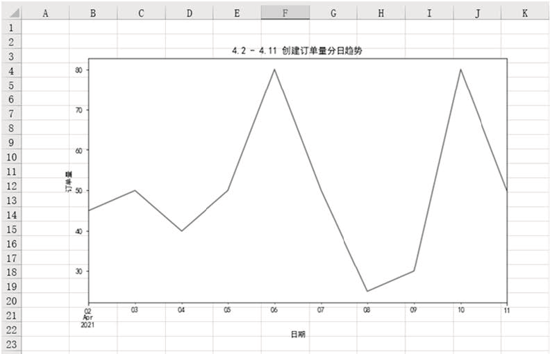
(Figure 7)
04
Merge different results
Above, we separate each part and store it in different Excel files.
Of course, sometimes it is troublesome to put them in different files, so you need to combine these results in the same Sheet or different sheets of the same Excel.
Merge different results into the same Sheet
The difficulty of merging different results into the same Sheet is that the results of different tables have different structures, and blank space needs to be left between different results.
First, insert the core indicator table df_review. The insertion method is the same as that of individual insertion. The specific code is as follows.
for r in dataframe_to_rows(df_view,index = True,header = True):
ws.append(r)
Then, insert the situation table DF of each province_ Province, because the append() method is inserted from line 1 by default, and we already have DF in the previous lines_ View table data, so you can't insert it with the append() method, but only by traversing each cell.
How do we know which cells to traverse? The core is to know the row / column at the beginning of traversal and the row / column at the end of traversal.
Row at the beginning of traversal = DF_ Rows occupied by the view Table + rows left blank (generally, 2 rows are left between tables) + 1
Line at the end of traversal = line at the beginning of traversal + DF_ Rows occupied by the province table
Column at the beginning of traversal = 1
End of traversal column = DF_ Columns occupied by the province table
In addition, the method of obtaining the column name in the DataFrame is different from that of obtaining the specific value, so we need to insert the column name separately. The specific code is as follows.
for j in range(df_province.shape[1]):
ws.cell(row = df_view.shape[0] + 5,column = 1 + j).value = df_province.columns[r]
df_province.shape[1]Representation acquisition df_province How many columns are there in the table, df_view.shape[0]Representation acquisition
df_view How many rows does the table have.
As mentioned earlier, the row at the beginning of traversal is the row occupied by the table plus the blank row plus 1. Generally, the blank row is 2,
But why is DF here_ What about view. Shape [0] + 5? Because df_view.shape[0] does not include column name rows, and one blank row will be added by default when inserting into Excel, so two more rows need to be added on the basis of leaving white rows,
That is, 2 + 2 + 1 = 5.
Because the range() function starts from 0 by default, and the columns in Excel start from 1, the column needs to be added with 1.
The above code just puts DF_ Insert the column name of the province table, and then insert the specific value. The method is the same as that of inserting the column name, but you need to insert it in the next row of the column name. The specific code is as follows.
for i in range(df_province.shape[0]):
for j in range(df_province.shape[1]):
ws.cell(row = df_view.shape[0] + 6 + i,column = 1 + j).value =
df_province.iloc[i,j]
Next, insert the picture. The method of inserting the picture is consistent with the previous separate insertion method. The specific code is as follows.
#Insert picture
img = Image(r'D:\Data-Science\share\excel-python Report automation\4.2 - 4.11 Create order quantity
Diurnal trend.png')
ws.add_image(img, 'G1')
After inserting all data, we should format these data. Because the structures of different tables are different, we can't directly format all cells in batch. We can only set them separately by range, and the formats of different ranges may be the same, so we preset some format variables first, In this way, you can directly call these variables later to reduce code redundancy. The specific codes are as follows.
#Format preset
#Header font settings
title_Font_style = Font(name = 'Microsoft YaHei ',size = 12,bold = True,color = "FFFFFFFF")
#Normal content font settings
plain_Font_style = Font(name = 'Microsoft YaHei ',size = 12)
Alignment_style = Alignment(horizontal = "center")
Border_style = Border(left = Side(border_style = "thin",color = "FF000000"),
right = Side(border_style = "thin",color = "FF000000"),
top = Side(border_style = "thin",color = "FF000000"),
bottom = Side(border_style = "thin",color = "FF000000"))
PatternFill_style = PatternFill(fill_type = 'solid',start_color ='FFFF6100')
After the format is preset, you can set the format of each range separately. The specific code is as follows.
#Set the cells in the range A1 to F6
for row in ws['A1':'F6']:
for c in row:
c.font = plain_Font_style
c.alignment = Alignment_style
c.border = Border_style
#Set the cells in rows 1 and 2
for row in ws[1:2]:
for c in row:
c.font = title_Font_style
c.fill = PatternFill_style
#Set the cells in columns E and F
for col in ws["E":"F"]:
for r in col:
r.number_format = '0.00%'
#Set the cells in the range A9 to B19
for row in ws['A9':'B19']:
for c in row:
c.font = plain_Font_style
c.alignment = Alignment_style
c.border = Border_style
#Set the cells in the range A9 to B9
for row in ws['A9':'B9']:
for c in row:
c.font = title_Font_style
c.fill = PatternFill_style
#Set progress bar
rule = DataBarRule(start_type = 'min',end_type = 'max',
color="FF638EC6", showValue=True, minLength=None,
maxLength=None)
ws.conditional_formatting.add('B10:B19',rule)
#Adjust column width
ws.column_dimensions['A'].width = 17
ws.column_dimensions['B'].width = 13
ws.column_dimensions['E'].width = 10
Finally, merging all the above code fragments together is the complete code of merging different result files into the same Sheet, as follows.
Sheet The complete code in is as follows.
from openpyxl import Workbook
from openpyxl.utils.dataframe import dataframe_to_rows
from openpyxl.styles import colors
from openpyxl.styles import Font
from openpyxl.styles import PatternFill
from openpyxl.styles import Border, Side
from openpyxl.styles import Alignment
from openpyxl.formatting.rule import DataBarRule
wb = Workbook()
ws = wb.active
#First put the core index DF_ Insert the view table
for r in dataframe_to_rows(df_view,index = True,header = True):
ws.append(r)
#Then the situation of each province DF_ Insert the province table
#Insert the header first
for j in range(df_province.shape[1]):
ws.cell(row = df_view.shape[0] + 5,column = 1 + j).value = df_province.columns[r]
#Then insert the specific value
#Traverse rows first
for i in range(df_province.shape[0]):
#Traversal column
for j in range(df_province.shape[1]):
ws.cell(row = df_view.shape[0] + 6 + i,column = 1 + j).value = df_province.
iloc[i,j]
#Insert picture
img = Image(r'D:\Data-Science\share\excel-python Report automation\4.2 - 4.11 Create order quantity
Diurnal trend.png')
ws.add_image(img, 'G1')
##---Format adjustment---
ws.delete_rows(2)
ws['A1'] = 'index'
ws.insert_rows(1)
ws['A1'] = 'E-commerce business direction 2021/4/11 daily'
ws.merge_cells('A1:F1') #merge cell
#Format preset
#Header font settings
title_Font_style = Font(name = 'Microsoft YaHei ',size = 12,bold = True,color = "FFFFFFFF")
#Normal content font settings
plain_Font_style = Font(name = 'Microsoft YaHei ',size = 12)
Alignment_style = Alignment(horizontal = "center")
Border_style = Border(left = Side(border_style = "thin",color = "FF000000"),
right = Side(border_style = "thin",color = "FF000000"),
top = Side(border_style = "thin",color = "FF000000"),
bottom = Side(border_style = "thin",color = "FF000000"))
PatternFill_style = PatternFill(fill_type = 'solid',start_color='FFFF6100')
#Set the cells in the range A1 to F6
for row in ws['A1':'F6']:
for c in row:
c.font = plain_Font_style
c.alignment = Alignment_style
c.border = Border_style
#Set the cells in rows 1 and 2
for row in ws[1:2]:
for c in row:
c.font = title_Font_style
c.fill = PatternFill_style
#Set the cells in columns E and F
for col in ws["E":"F"]:
for r in col:
r.number_format = '0.00%'
#Set the cells in the range A9 to B19
for row in ws['A9':'B19']:
for c in row:
c.font = plain_Font_style
c.alignment = Alignment_style
c.border = Border_style
#Set the cells in the range A9 to B9
for row in ws['A9':'B9']:
for c in row:
c.font = title_Font_style
c.fill = PatternFill_style
#Set progress bar
rule = DataBarRule(start_type = 'min',end_type = 'max',
color="FF638EC6", showValue=True, minLength=None, maxLength=
None)
ws.conditional_formatting.add('B10:B19',rule)
#Adjust column width
ws.column_dimensions['A'].width = 17
ws.column_dimensions['B'].width = 13
ws.column_dimensions['E'].width = 10
#Save the result file
wb.save(r'D:\Data-Science\share\excel-python Report automation\Multi result merging.xlsx')
Run the above code and you will get the results shown in Figure 8. You can see that different result files are merged together and their formats are well set.
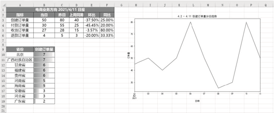
(Figure 8)
Merge different results into different sheets in the same workbook
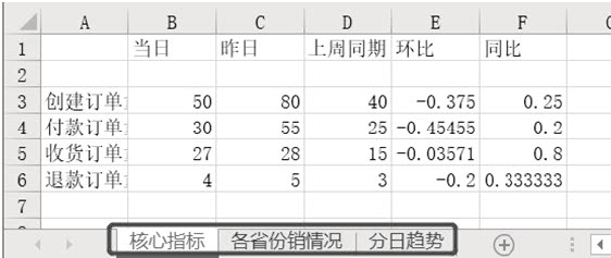
It is easier to merge different results into different sheets in the same workbook. You only need to create several sheets, and then insert data into different sheets. The specific implementation code is as follows.
from openpyxl import Workbook
from openpyxl.utils.dataframe import dataframe_to_rows
wb = Workbook()
ws = wb.active
ws1 = wb.create_sheet()
ws2 = wb.create_sheet()
#Change the name of the sheet
ws.title = "Core indicators"
ws1.title = "Sales by province"
ws2.title = "Diurnal trend"
for r1 in dataframe_to_rows(df_view,index = True,header = True):
ws.append(r1)
for r2 in dataframe_to_rows(df_province,index = False,header = True):
ws1.append(r2)
img = Image(r'D:\Data-Science\share\excel-python Report automation\4.2 - 4.11 Create order quantity
Diurnal trend.png')
ws2.add_image(img, 'A1')
wb.save(r'D:\Data-Science\share\excel-python Report automation\Multi result merging_many Sheet.xlsx')
Run the above code and you will get the results shown in Figure 9. You can see that three sheets are created and different contents are saved in different sheets.