This article mainly introduces the relevant materials about the visual analysis of the pull hook data of Python 3. The example code is introduced in detail in this article, which has certain reference value for you to learn or use Python 3. The friends who need to learn it will come to learn together
Preface
Last time we talked about how to grab the data of the tick. Since we have got the data, don't leave it alone. Take it out and analyze it to see what information is contained in the data.
Let's have a look at the detailed introduction
Article directory
1, Preliminary preparation
Because the data we grabbed last time contains information such as ID, we need to remove it and check the descriptive statistics to confirm whether there is an abnormal value or a true value.
read_file = "analyst.csv"
# Read file to get data
data = pd.read_csv(read_file, encoding="gbk")
# Remove irrelevant columns from data
data = data[:].drop(['ID'], axis=1)
# descriptive statistics
data.describe()
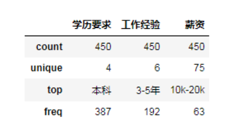 The unique value in the result indicates the number of different values under the attribute column. For example, the education requirement includes four different values [undergraduate, junior college, master, unlimited]. The top value indicates the maximum number of values [undergraduate], and the freq value is 387. Since there are many unique salaries, let's look at the values.
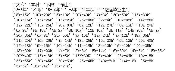
print(data['Academic requirements'].unique())
print(data['Hands-on background'].unique())
print(data['salary'].unique())
2, Pretreatment
It can be seen from the above two figures that the education requirements and work experience values are relatively small and there are no missing values and abnormal values, which can be analyzed directly; however, there are more than 75 kinds of salary distribution, in order to better analyze, we need to do a preprocessing of salary. According to its distribution, it can be divided into [5K below, 5k-10k, 10k-20k, 20k-30k, 30k-40k, 40K above], in order to facilitate our analysis, we take the median of each salary range and divide it into the range we specify.
# Preprocessing salary
def pre_salary(data):
 salarys = data['salary'].values
 salary_dic = {}
 for salary in salarys:
 # Split according to '-' and remove 'k', and convert the values at both ends to integers respectively
 min_sa = int(salary.split('-')[0][:-1])
 max_sa = int(salary.split('-')[1][:-1])
 # Median
 median_sa = (min_sa + max_sa) / 2
 # Judge its value and divide it into specified range
 if median_sa < 5:
 salary_dic[u'5k Following'] = salary_dic.get(u'5k Following', 0) + 1
 elif median_sa > 5 and median_sa < 10:
 salary_dic[u'5k-10k'] = salary_dic.get(u'5k-10k', 0) + 1
 elif median_sa > 10 and median_sa < 20:
 salary_dic[u'10k-20k'] = salary_dic.get(u'10k-20k', 0) + 1
 elif median_sa > 20 and median_sa < 30:
 salary_dic[u'20k-30k'] = salary_dic.get(u'20k-30k', 0) + 1
 elif median_sa > 30 and median_sa < 40:
 salary_dic[u'30k-40k'] = salary_dic.get(u'30k-40k', 0) + 1
 else:
 salary_dic[u'40 Above'] = salary_dic.get(u'40 Above', 0) + 1
 print(salary_dic)
 return salary_dic
After preprocessing salary, preprocess the text of employment requirements. In order to make a cloud of words, we need to segment the text and remove some words that appear frequently but have no meaning. We call them stop words, so we use the jieba library to process them. jieba is a word segmentation library implemented by python, which has a strong word segmentation ability for Chinese.
import jieba
def cut_text(text):
 stopwords =['be familiar with','technology','position','Relevant','work','Development','Use','ability',
 'first','describe','Serving','experience','Experienced person','Have','Have','Above','be good at',
 'one kind','as well as','Certain','Conduct','Can','We']
 for stopword in stopwords:
 jieba.del_word(stopword)

 words = jieba.lcut(text)
 content = " ".join(words)
 return content
After the preprocessing, the visual analysis can be carried out.
3, Visual analysis
Let's draw the ring chart and the bar chart first, and then pass the data in. The code of the ring chart is as follows
def draw_pie(dic):
 labels = []
 count = []

 for key, value in dic.items():
 labels.append(key)
 count.append(value)

 fig, ax = plt.subplots(figsize=(8, 6), subplot_kw=dict(aspect="equal"))

 # Draw a pie chart, and wedge props represent the width of each sector
 wedges, texts = ax.pie(count, wedgeprops=dict(width=0.5), startangle=0)
 # Text box settings
 bbox_props = dict(boxstyle="square,pad=0.9", fc="w", ec="k", lw=0)
 # Line and arrow settings
 kw = dict(xycoords='data', textcoords='data', arrowprops=dict(arrowstyle="-"),
 bbox=bbox_props, zorder=0, va="center")

 for i, p in enumerate(wedges):
 ang = (p.theta2 - p.theta1)/2. + p.theta1
 y = np.sin(np.deg2rad(ang))
 x = np.cos(np.deg2rad(ang))
 # Set which side of the fan the text box is on
 horizontalalignment = {-1: "right", 1: "left"}[int(np.sign(x))]
 # Used to set the bending degree of the arrow
 connectionstyle = "angle,angleA=0,angleB={}".format(ang)
 kw["arrowprops"].update({"connectionstyle": connectionstyle})
 # annotate() is used to annotate the drawn figure. Text is the annotation text, and the parameter containing 'xy' is related to the coordinate point
 text = labels[i] + ": " + str('%.2f' %((count[i])/sum(count)*100)) + "%"
 ax.annotate(text, size=13, xy=(x, y), xytext=(1.35*np.sign(x), 1.4*y),
  horizontalalignment=horizontalalignment, **kw)
 plt.show()
The code of the histogram is as follows:
def draw_workYear(data):
 workyears = list(data[u'Hands-on background'].values)
 wy_dic = {}
 labels = []
 count = []
 # Get the number of work experience and save it to count
 for workyear in workyears:
 wy_dic[workyear] = wy_dic.get(workyear, 0) + 1
 print(wy_dic)
 # wy_series = pd.Series(wy_dic)
 # Get the key and value of count respectively
 for key, value in wy_dic.items():
 labels.append(key)
 count.append(value)
 # Generate an array of keys
 x = np.arange(len(labels)) + 1
 # Convert values to arrays
 y = np.array(count)

 fig, axes = plt.subplots(figsize=(10, 8))
 axes.bar(x, y, color="#1195d0")
 plt.xticks(x, labels, size=13, rotation=0)
 plt.xlabel(u'Hands-on background', fontsize=15)
 plt.ylabel(u'Number', fontsize=15)

 # Mark the numbers in the figure according to the coordinates, ha and va are the alignment methods
 for a, b in zip(x, y):
 plt.text(a, b+1, '%.0f' % b, ha='center', va='bottom', fontsize=12)
 plt.show()
Let's turn the data of education requirements and salary into a dictionary form, and pass it into the ring chart function. In addition, we also need to visualize the text of [job requirements].
from wordcloud import WordCloud
# Draw word cloud
def draw_wordcloud(content):

 wc = WordCloud(
 font_path = 'c:\\Windows\Fonts\msyh.ttf',
 background_color = 'white',
 max_font_size=150, # Font maximum
 min_font_size=24, # Font min
 random_state=800, # random number
 collocations=False, # Avoid repeating words
 width=1600,height=1200,margin=35, # Image width height, word spacing
 )
 wc.generate(content)

 plt.figure(dpi=160) # Zoom in or out
 plt.imshow(wc, interpolation='catrom',vmax=1000)
 plt.axis("off") # Hidden coordinates
Recommend our python learning button qun: 913066266, and see how the seniors learn! From the basic python script to web development, crawler, django, data mining and so on [PDF, actual source], the data from zero base to project actual combat have been sorted out. To everyone in python! Every day, Daniel regularly explains python technology, shares some learning methods and small details that need attention, and click to join our [python learner gathering place]
4, Achievements and summary] (https://jq.qq.com/? ﹐ WV = 1027 & K = 5jijrvv)
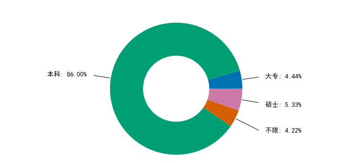
Most of the education requirements for python data analysts are undergraduate, accounting for 86%.
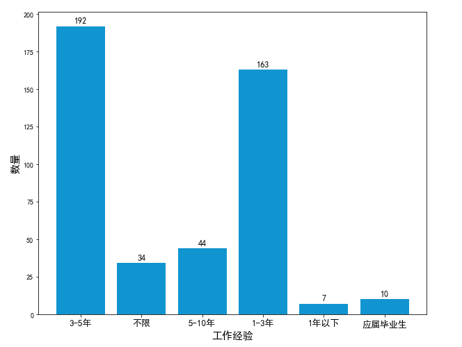
As can be seen from the histogram, most of the work experience of python data analysts requires 1-5 years.
From this, it can be concluded that there are more salaries of 10k-20k in python data analysis, and there are many salaries above 40. It is estimated that the requirements for high salaries will be higher, so let's take a look at the job requirements.
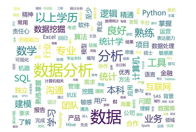
It can be seen from the word cloud chart that data analysis must be sensitive to data, and also have certain requirements for statistics, excel, python, data mining, hadoop, etc. Not only that, but also requires a certain degree of pressure resistance, problem-solving ability, good expression ability, thinking ability and so on.
summary
The above is the whole content of this article. I hope that the content of this article has a certain reference value for your study or work

