1.fit layout
In fit layout, child elements will automatically fill the entire parent container. Note: In fit layout, setting the width of its child elements is invalid. If multiple components are placed in the fit layout, only the first child element is displayed. A typical case is when a client requests a grid component to be placed in a windows or panel, the size of the grid component changes with the size of the parent container.
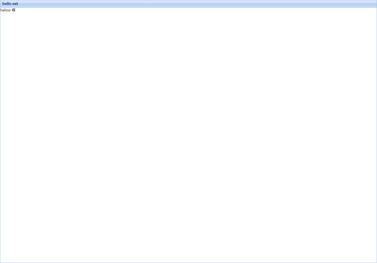
The example code is as follows:
Ext.application({

	name : 'HellowExt',

	launch : function() {
		Ext.create('Ext.container.Viewport', {
			layout:'fit',
			items:[{
				title:'hello ext',
				html:'hellow ah'
			}]
		});
	}
});
2.border layout
border layout is also called boundary layout. It divides the page into five parts: west, east, south, north and center. We need to specify the specific location of its sub-elements by using the region parameter in its items.
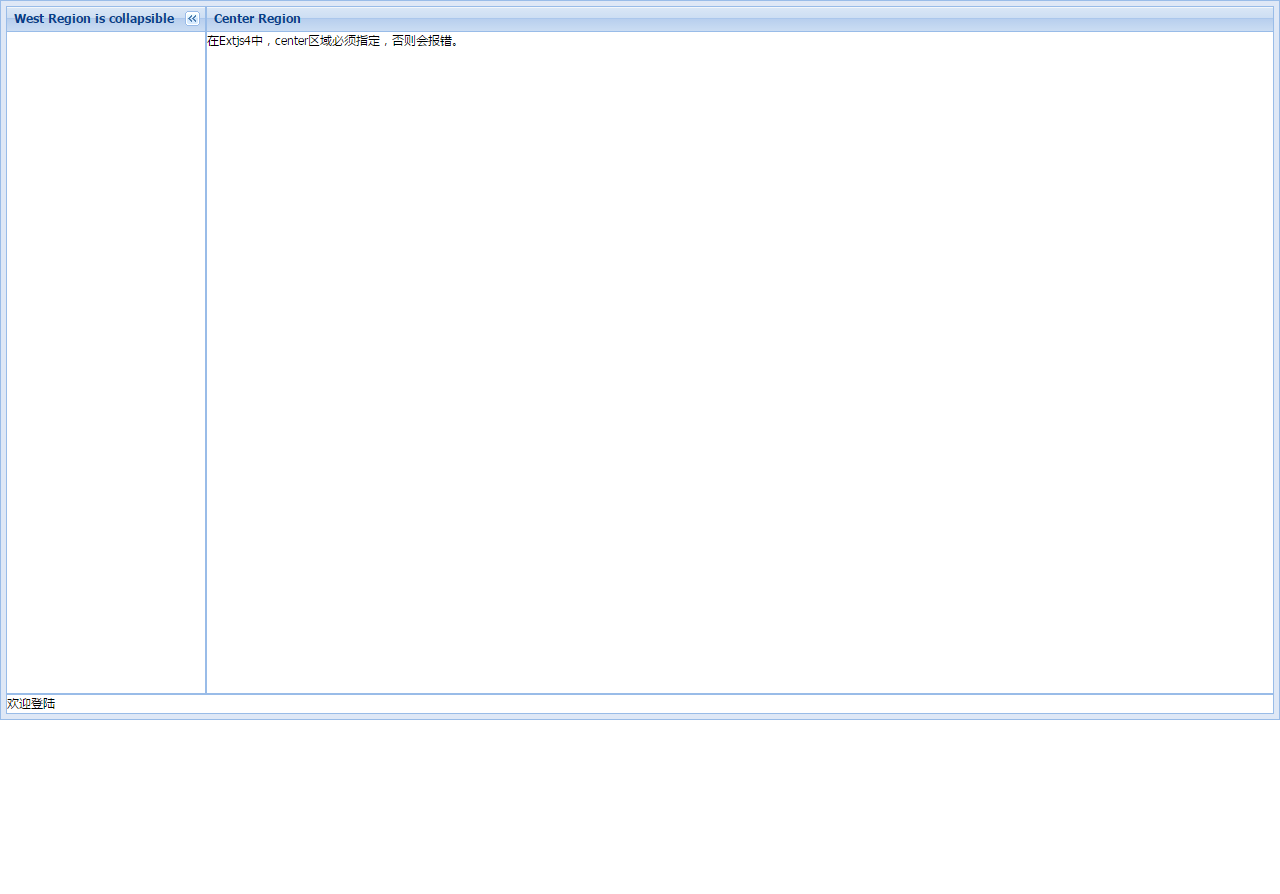
Note: The north and source sections can only set the height (hight), while the west and East sections can only set the width (width). The region of north, south, west and east becomes larger and the region of center becomes smaller.
The parameter split:true can adjust the size of four areas except the center.
The parameter collapsible:true will activate the collapsible function, and the title must be set because the collapsible button appears in the title section.
The center area must be used, and the center area does not allow folding. The Center area automatically fills the remaining space in other areas. Especially in Extjs 4.0, when the layout is specified as border, when the center area is not specified, an error message will appear.
Example code:
Ext.application({

	name : 'HellowExt',

	launch : function() {
		Ext.create('Ext.panel.Panel', {

			height : 720,
			layout : 'border',
			items : [ {
				region : 'south',
				xtype : 'panel',
				height : 20,
				split : false,
				html : 'Welcome landing',
				margins : '0 5 5 5'
			}, {
				title : 'West Region is collapsible',
				region : 'west',
				xtype : 'panel',
				margins : '5 0 0 5',
				width : 200,
				collapsible : true,
				id : 'west-region-container',
				layout : 'fit'
			}, {
				title : 'Center Region',
				region : 'center',
				xtype : 'panel',
				layout : 'fit',
				margins : '5 5 0 0',
				html : 'stay Extjs4 Medium, center Areas must be specified or errors will be reported.'
			} ],
			renderTo:Ext.getBody()
		});
	}
});
3.accordion layout
Accordion layout: accordion layout is also called accordion layout. Under accordion layout, only one panel is activated at any time. Each side supports unfolding and folding. Note: Only Ext.Panels and all Ext.panel.Panel subitems can use accordion layout.
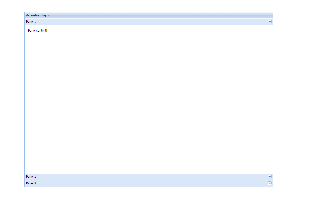
Sample code:
Ext.application({
	name : "HelloExt",
	launch : function() {
		Ext.create('Ext.panel.Panel', {
			title : 'Accordion Layout',
			width : 1024,
			height : 720,
			x : 100,
			y : 50,
			layout : 'accordion',
			defaults : {
				bodyStyle : 'padding:15px'
			},
			layoutConfig : {
				titleCollapse : false,
				animate : true,
				activeOnTop : true
			},
			items : [ {
				title : 'Panel 1',
				html : 'Panel content!'
			}, {
				title : 'Panel 2',
				html : 'Panel content!'
			}, {
				title : 'Panel 3',
				html : 'Panel content!'
			} ],
			renderTo : Ext.getBody()
		});
	}
});
4.card layout
Card layout: This layout is used to manage multiple sub-components, and only one sub-component can be displayed at any time. The most common case of this layout is the wizard pattern, which we call distributed submission. Card layout can be created using layout:'card'. Note: Since the layout itself does not provide step-by-step navigation, users are required to develop the function themselves. Since only one panel is in the display state, we can use the setActiveItem function to specify the display of a panel initially. When displaying the next panel or the previous panel, we can use getNext() or getPrev() to get the next or previous panel. Then the setDisabled method is used to set the display of the panel. In addition, if the FORM layout is displayed in the panel, when we click on the next panel, we process the elements submitted in the FORM and save the contents of the form to the database or SESSION through AJAX. The following example code shows a basic Card layout, which does not contain form elements. It also needs to be processed according to the actual situation.
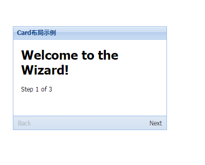
Example code:
Ext.application({
	name : 'HelloExt',
	launch : function() {
		var navigate = function(panel, direction) {
			var layout = panel.getLayout();
			layout[direction]();
			Ext.getCmp('move-prev').setDisabled(!layout.getPrev());
			Ext.getCmp('move-next').setDisabled(!layout.getNext());
		};
		Ext.create('Ext.panel.Panel', {
			title : 'Card Layout example',
			width : 300,
			height : 202,
			layout : 'card',
			activeItem : 0,
			x : 30,
			y : 60,
			bodyStyle : 'padding:15px',
			defaults : {
				border : false
			},
			bbar : [ {
				id : 'move-prev',
				text : 'Back',
				handler : function(btn) {
					navigate(btn.up("panel"), "prev");
				},
				disabled : true
			}, '->', {
				id : 'move-next',
				text : 'Next',
				handler : function(btn) {
					navigate(btn.up("panel"), "next");
				}
			} ],
			items : [ {
				id : 'card-0',
				html : '<h1>Welcome to the Wizard!</h1><p>Step 1 of 3</p>'
			}, {
				id : 'card-1',
				html : '<p>Step 2 of 3</p>'
			}, {
				id : 'card-2',
				html : '<h1>Congratulations!</h1><p>Step 3 of 3 - Complete</p>'
			} ],
			renderTo : Ext.getBody()
		});
	}
});
5.anchor layout
The anchor layout will fix the component at a certain position of the parent container. When the size of the child component using the anchor layout changes relative to the size of the container, that is, when the size of the parent container changes, the component using the anchor layout will re-render the location and size according to the specified rules.
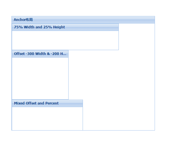
The AnchorLayout layout does not have any direct configuration options (except inheritance), but when using the AnchorLayout layout, its child components have an anchor attribute to configure the location of the child component in the parent container.
The anchor attribute is a set of strings that can be expressed as percentages or - numbers. Configuration strings are separated by spaces, such as
anchor:'75% 25%', which means 75% of the width of the parent container and 25% of the height of the parent container.
Anchor:'-300-200', which means that the right margin of the component relative to the parent container is 300, and the bottom of the parent container is 200.
anchor:'-250 20%', a mixed mode, indicates that the component party has a 20% height of the parent container, such as 250 on the right side of the container.
Example code:
Ext.application({
	name : 'HelloExt',
	launch : function() {
		Ext.create('Ext.Panel', {
			width : 500,
			height : 400,
			title : "Anchor layout",
			layout : 'anchor',
			x : 60,
			y : 80,
			renderTo : Ext.getBody(),
			items : [ {
				xtype : 'panel',
				title : '75% Width and 25% Height',
				anchor : '75% 25%'
			}, {
				xtype : 'panel',
				title : 'Offset -300 Width & -200 Height',
				anchor : '-300 -200'
			}, {
				xtype : 'panel',
				title : 'Mixed Offset and Percent',
				anchor : '-250 30%'
			} ]
		});
	}
});
6.absolute layout
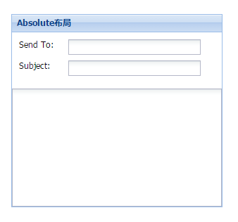
Absolute Layout inherits Ext.layout.container.Anchor Layout and adds X/Y configuration options to locate subcomponents. The purpose of Absolute Layout is to extend the attributes of the layout and make it easier to use.
Example code:
Ext.application({
	name : "HelloExt",
	launch : function() {
		Ext.create('Ext.form.Panel', {
			title : 'Absolute layout',
			width : 300,
			height : 275,
			x : 20,
			y : 90,
			layout : 'absolute',
			defaultType : 'textfield',
			items : [ {
				x : 10,
				y : 10,
				xtype : 'label',
				text : 'Send To:'
			}, {
				x : 80,
				y : 10,
				name : 'to',
				anchor : '90%'
			}, {
				x : 10,
				y : 40,
				xtype : 'label',
				text : 'Subject:'
			}, {
				x : 80,
				y : 40,
				name : 'subject',
				anchor : '90%'
			}, {
				x : 0,
				y : 80,
				xtype : 'textareafield',
				name : 'msg',
				anchor : '100% 100%'
			} ],
			renderTo : Ext.getBody()
		});
	}
});
7.column layout
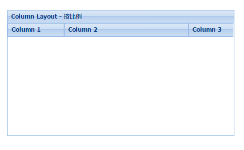
Column layouts are generally referred to as column layouts, which are designed to create a multi-column format. The width of each column can be specified as a percentage or a fixed width.
Column layout does not have direct configuration options (except inheritance), but Column layout supports a columnWidth attribute, in which the width of each panel is specified using columnWidth.
Note: When using a Column layout layout, all columnWidth values of its subpanels must be between 0 and 1 or a percentage. Their total should be 1.
In addition, if any SubPanel does not specify a columnWidth value, it will take up the remaining space
Sample code:
Ext.application({
	name : "HelloExt",
	launch : function() {
		Ext.create('Ext.panel.Panel', {
			title : 'Column Layout - In proportion',
			width : 450,
			height : 250,
			x : 20,
			y : 100,
			layout : 'column',
			items : [ {
				title : 'Column 1',
				columnWidth : .25
			}, {
				title : 'Column 2',
				columnWidth : .55
			}, {
				title : 'Column 3',
				columnWidth : .20
			} ],
			renderTo : Ext.getBody()
		});
	}
});