1, About vue.extend (options)
Explanation on the official website: use the basic Vue constructor Vue.extend to create a "subclass". A parameter is an object that contains component options.
Note - in Vue.extend(), the data option must be a function.
Generally, we will use Vue.extend to receive a component object to create a constructor, then use the created constructor to create a new instance, and mount the instance to an element.
Example of official website:
<div id="mount-point"></div>;
// Create constructor
var Profile = Vue.extend({
  template: "<p>{{firstName}} {{lastName}} aka {{alias}}</p>",
  data: function () {
    return {
      firstName: "Walter",
      lastName: "White",
      alias: "Heisenberg"
    };
  }
});
// Create a Profile instance and mount it on an element.
new Profile().$mount("#mount-point");
2, Practical application of Vue. Extend (options)
github address: https://github.com/ddx2019/modal
Tips: element UI is used in the demo to use its Progress component
  "element-ui": "^2.13.2",
   "mitt": "^3.0.0",
   "vue": "^2.6.11"
demand
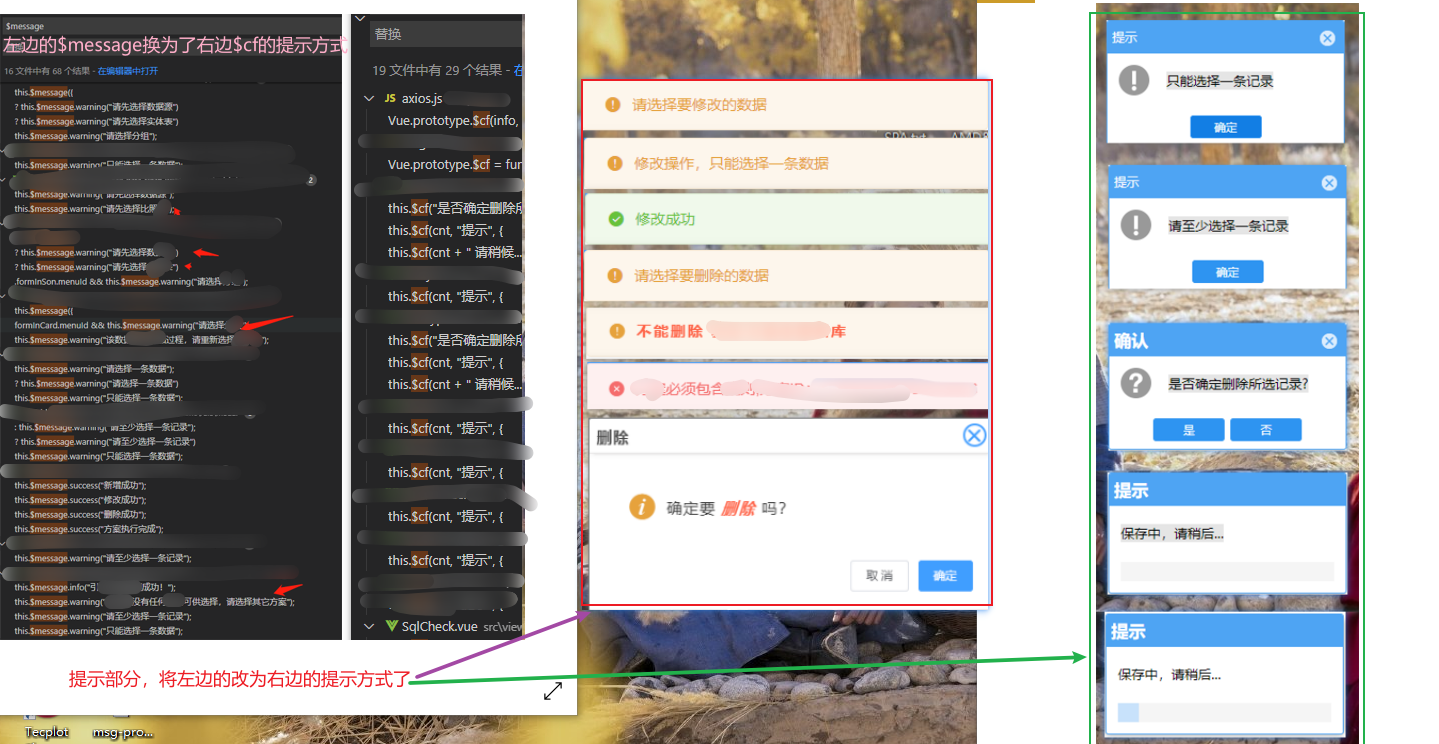
Requirement: change all parts of the original project that use the Message prompt component of Element to the style of MessageBox component similar to Element UI:
Packaging reason:
The Message component of Elemnet was originally used, but now it needs to be changed to the rightmost style. Due to the need to drag the function and the display of "saving..." when adding the function request background, a progress bar loading effect is required. The MessageBox component of element can not meet the requirements, so it encapsulates itself
1) Encapsulating Modal.vue components
src/components/Modal.vue file:
<template>
  <div class="modal-wrap" v-if="visible" v-modalDrag>
    <div class="modal">
      <div class="modal-header">
        <div class="modal-title">
          {{ title }}
        </div>
        <div
          v-if="cfOptions.showClose"
          @click="cancel"
          class="modal-close"
        ></div>
      </div>

      <div class="modal-body">
        <div class="icon-container " v-if="!cfOptions.useHTMLStr">
          <svg-icon
            v-if="cfOptions.iconName"
            :icon-name="cfOptions.iconName"
            icon-class="icon_style"
          ></svg-icon>
          <span class="info" :title="msg">{{ ctx }}</span>
        </div>
        <div v-else v-html="msg"></div>
      </div>

      <div v-if="cfOptions.isCustomFooter" class="modal-footer">
        <!-- Prompt after requesting background, such as saving... -->
        <span class="msg-progress">
          <el-progress
            :text-inside="true"
            :percentage="cfOptions.percentage"
            :stroke-width="18"
            stroke-linecap="square"
          ></el-progress>
        </span>
      </div>

      <div v-else class="modal-footer">
        <button @click="confirm" class="footer-btn">
          {{ cfOptions.cfBtnText }}
        </button>
        <button
          v-if="cfOptions.showCancelBtn"
          @click="cancel"
          class="footer-btn"
        >
          {{ cfOptions.cancelBtnText }}
        </button>
      </div>
    </div>
  </div>
</template>

<script>
import eventBus from "@/plugins/mitt.js";
export default {
  data() {
    return {
      msg: "",
      /**
       *  Show and hide
       */
      visible: true,

      /**
       * Timer instance
       */
      timer: null,
      /**
       * Timer default
       *
       */
      time: 2000,

      /**
       *  Whether to turn on automatic shutdown
       */
      close: false,

      title: "Tips",

      cfOptions: {
        cfBtnText: "determine",
        cancelBtnText: "cancel",
        showClose: true, //Show close icon
        useHTMLStr: false, //Using html fragments
        showCancelBtn: true, //Show cancel button
        isCustomFooter: false, //Use custom footer
        percentage: 0,
        autoClose: false, //Auto close
        iconName: "" //Icon name
      }
    };
  },
  computed: {
    ctx() {
      return this.msg.length > 10
        ? this.msg.substring(0, 10) + "..."
        : this.msg;
    }
  },
  watch: {
    "cfOptions.percentage"(newVal) {
      if (newVal !== 100) return;
      this.handleAutoClose(300);
    },
    "cfOptions.autoClose"(newVal) {
      if (!newVal) return;
      this.handleAutoClose(1200);
    }
  },
  methods: {
    confirm() {
      eventBus.emit("confirm", "cf");
      this.visible = false;
    },
    cancel() {
      eventBus.emit("cancel", "close");
      this.visible = false;
    },
    handleAutoClose(time) {
      setTimeout(() => {
        this.visible = false;
      }, time);
    }
  }
};
</script>

<style lang="scss">
.modal-wrap {
  position: fixed;
  top: 0;
  right: 0;
  bottom: 0;
  left: 0;
  overflow: auto;
  margin: 0;
  background: rgba(0.2, 0.2, 0.3, 0.5);
}

.modal {
  width: 250px;
  position: relative;
  margin: 0 auto;
  margin-top: 100px;
  background: #ffffff;
  border-radius: 2px;
  box-shadow: 0 1px 3px rgb(0 0 0 / 30%);
  box-sizing: border-box;

  &-header {
    border-color: #4ea4f3;
    background-color: #4ea4f3;
    position: relative;
  }

  &-title {
    color: #fff;
    letter-spacing: 1px;
    font-family: arial, helvetica, verdana, sans-serif;
    text-align: left;
    padding: 10px 0 10px 6px;
    font-size: 15px;
  }

  &-close {
    position: absolute;
    top: 9px;
    right: 10px;
    width: 18px;
    height: 18px;
    border-radius: 100%;
    border: 1px solid red;
    border: 1px solid #d7e9fa;
    background: #d7e9fa;
    cursor: pointer;

    &::after {
      content: "x";
      position: absolute;
      right: -4px;
      top: -3px;
      width: 17px;
      height: 17px;
      border-radius: 25px;
      color: #41a3ff;
    }
  }

  &-body {
    padding: 15px;
  }

  &-footer {
    display: inline-block;
    width: 100%;
    text-align: center;
    padding: 12px 0;

    .footer-btn {
      border-radius: 4px;
      width: 75px;
      padding: 4px 5px;
      background-color: #2e94f1;
      font-size: 13px;
      outline: none;
      border: 1px solid #dcdfe6;
      color: #fff;
      cursor: pointer;
      margin-right: 8px;

      & :last-child {
        margin-right: 0;
      }

      &:hover {
        background: #0b82f1;
      }
    }
  }

  .hidden {
    display: none;
  }

  .msg-progress {
    // Override El progress style
    .el-progress-bar__outer {
      border-radius: 0;
      width: 90%;
      margin: auto;
    }
    .el-progress-bar__inner {
      border-radius: 0;
      background: #b8d4f3;
    }
    .el-progress-bar__innerText {
      color: #b0d1f5;
    }
  }
}
.icon-container {
  span {
    display: inline-block;
    vertical-align: middle;
  }
  .icon_style {
    width: 35px;
    height: 35px;
    color: #bbb;
  }

  .info {
    color: #333;
    margin-left: 6px;
    font-size: 15px;
    font-weight: 500;
    letter-spacing: 1px;
  }
}
</style>
2) Create a new msgModal.js file and change its contents:
src/utils/msgModal.js file:
import Modal from "@/components/Modal.vue";
import Vue from "vue";
import eventBus from "@/plugins/mitt.js";
let msgModal = Vue.extend(Modal);

msgModal.install = function (Vue) {
  Vue.prototype.$cf = function (...args) {
    let instanceModal = new msgModal({ el: document.createElement("div") });

    document.querySelector("body").appendChild(instanceModal.$el);

    instanceModal.footer = true;
    instanceModal.visible = true;
    instanceModal.close = false;
    let cfObj = null;

    [instanceModal.msg, instanceModal.title, cfObj] = args;

    if (cfObj) {
      for (let key in cfObj) {
        instanceModal.cfOptions[key] = cfObj[key];
      }

      // Let progress have a loaded transition effect
      instanceModal.cfOptions.percentage = 30;
      setTimeout(() => {
        instanceModal.cfOptions.percentage = cfObj.percentage;
      }, 200);
    }

    return new Promise((resolve, reject) => {
      eventBus.on("confirm", data => {
        resolve(data);
      });

      eventBus.on("cancel", reason => {
        reject(reason);
      });
    });
  };
};

export default msgModal;
3) Customize the drag command v-modalDrag to realize the drag function
src/utils/directive.js file:
import Vue from "vue";

//   Custom drag command v-modalDrag
Vue.directive("modalDrag", {
  bind(el) {
    const dialogHeaderEl = el.querySelector(".modal-header");
    const dragDom = el.querySelector(".modal");
    handler(dialogHeaderEl, dragDom);
  }
});

function handler(dialogHeaderEl, dragDom) {
  // dialogHeaderEl.style.cssText += ";cursor:move;";
  dragDom.style.cssText += ";cursor:move;top:0px;";
  // Get the original attributes; ie: dom element. currentStyle; Firefox Google: window.getComputedStyle(dom element, null);
  const sty = (() => {
    if (window.document.currentStyle) {
      return (dom, attr) => dom.currentStyle[attr];
    } else {
      return (dom, attr) => getComputedStyle(dom, false)[attr];
    }
  })();

  dragDom.onmousedown = e => {
    // Press the mouse to calculate the distance between the current element and the visual area
    const disX = e.clientX - dialogHeaderEl.offsetLeft;
    const disY = e.clientY - dialogHeaderEl.offsetTop;

    const screenWidth = document.body.clientWidth; // Current height of body
    const screenHeight = document.documentElement.clientHeight; // Height of visible area (it should be the height of body, but it cannot be obtained in some cases)

    const dragDomWidth = dragDom.offsetWidth; // The width of the dialog box
    const dragDomHeight = dragDom.offsetHeight; // The height of the dialog box

    const minDragDomLeft = dragDom.offsetLeft;
    const maxDragDomLeft = screenWidth - dragDom.offsetLeft - dragDomWidth;

    const minDragDomTop = dragDom.offsetTop;
    const maxDragDomTop = screenHeight - dragDom.offsetTop - dragDomHeight;

    // The obtained value takes px and is replaced by regular matching
    let styL = sty(dragDom, "left");
    let styT = sty(dragDom, "top");

    // Note: in ie, the value obtained for the first time is 50% of the component, and it is assigned as px after moving

    if (styL.includes("%")) {
      styL = +document.body.clientWidth * (+styL.replace(/%/g, "") / 100);
      styT = +document.body.clientHeight + +styT.replace(/%/g, "") / 100;
    } else {
      styL = +styL.replace(/\px/g, "");
      styT = +styT.replace(/\px/g, "");
    }
    document.onmousemove = function (e) {
      // Calculate the moving distance through the event delegate
      let left = e.clientX - disX;
      let top = e.clientY - disY;

      // Boundary treatment

      if (-left > minDragDomLeft) {
        left = -minDragDomLeft;
      } else if (left > maxDragDomLeft) {
        left = maxDragDomLeft;
      }

      if (-top > minDragDomTop) {
        top = -minDragDomTop;
      } else if (top > maxDragDomTop) {
        top = maxDragDomTop;
      }

      // Move current element
      dragDom.style.cssText += `;left:${left + styL}px;top:${top + styT}px`;
    };

    document.onmouseup = function () {
      document.onmousemove = null;
      document.onmouseup = null;
    };
  };
}
4) Introduce the required content in main.js
import Vue from "vue";
import App from "./App.vue";
import "@/plugins/element.js";
import "./icons"; //import "@/icons/index.js";
import msgModal from "./utils/msgModal";
import "@/utils/directive.js";

Vue.config.productionTip = false;

Vue.use(msgModal);

new Vue({
  render: h => h(App)
}).$mount("#app");
5) Test and use
1. Use examples in components
App.vue file
<template>
  <div id="app">
    <!-- Example: when keywords by"Chinese and English"A pop-up prompt will be displayed when -->
    <input type="text" v-model="keywords" />
    <button @click="getLists">Click to get data</button>
    <ul>
      <li v-for="(item, index) in entries" :key="index">
        {{ item.entry }}-------{{ item.explain }}
      </li>
    </ul>
    <br />
    <br />
    <button @click="modal">Click test-1</button>
    <br />
    <br />
    <button @click="handleOnlyOrless">Click test-2</button>
    <br />
    <br />
    <button @click="handleDel">Click test-3</button>
  </div>
</template>

<script>
import axios from "@/plugins/axios.js";
import eventBus from "@/plugins/mitt.js";
export default {
  name: "App",
  data() {
    return {
      keywords: "chinese",
      entries: []
    };
  },
  mounted() {
    // listen to an event
    eventBus.on("foo", e => console.log("foo", e));
    // fire an event
    eventBus.emit("foo", { a: "b" });
    // clearing all events
    eventBus.all.clear();
  },
  methods: {
    modal() {
      const content = `<strong style="color:red">Hello, this is the text----content</strong>`;
      this.$cf(content, "Tips", {
        cfBtnText: "yes",
        cancelBtnText: "no",
        useHTMLStr: true,
        showCancelBtn: true
      })
        .then(data => {
          this.getData(data);
        })
        .catch(() => {
          console.log("cancel");
        });
    },
    getData(data) {
      console.log("determine", data);
      this.$cf("Saving, please wait...", "Tips", {
        showClose: false,
        isCustomFooter: true,
        percentage: 100
      });
    },
    handleOnlyOrless() {
      const radom = Math.floor(Math.random() * 10 + 1); //Generate random integers for [1,10]
      const cnt = radom > 5 ? "You can only select up to 5 pieces of data" : "data display";
      this.$cf(cnt, "Tips", {
        showCancelBtn: false,
        iconName: "help"
      }).catch(err => {
        console.log("err", err);
      });
    },
    handleDel() {
      this.$cf("Are you sure to delete this data?", "confirm", {
        cfBtnText: "yes",
        cancelBtnText: "no",
        iconName: "help"
      })
        .then(data => {
          this.$cf("Deleting, please wait...", "Tips", {
            showClose: false,
            isCustomFooter: true,
            percentage: 100
          });
          console.log("data", data);
        })
        .catch(err => {
          console.log("err", err);
        });
    },
    getLists() {
      axios({
        url: "/suggest",
        method: "post",
        data: {
          // num: 2, / / display several pieces of data
          q: this.keywords, //Keywords for query
          doctype: "json" //Format of display
        }
      })
        .then(res => {
          this.entries = res.data.data.entries;
          console.log("result:", res);
        })
        .catch(err => {
          console.log("err", err);
        });
    }
  }
};
</script>

<style>
#app {
  font-family: Avenir, Helvetica, Arial, sans-serif;
  -webkit-font-smoothing: antialiased;
  -moz-osx-font-smoothing: grayscale;
  color: #2c3e50;
  margin-top: 60px;
}
</style>
2. Use the example in the encapsulated axios.js file
src/plugins/axios.js file: (this is just an example: you need to determine the place to use according to the specific situation)
import axios from "axios";
import qs from "qs";
import Vue from "vue";

const options = {
  timeout: 3000,
  withCredentials: true,
  baseURL: "/api"
};

const _axios = axios.create(options);
_axios.interceptors.request.use(
  config => {
    if (config.method === "post" && !(config.data instanceof FormData)) {
      config.headers = {
        "Content-Type": "application/x-www-form-urlencoded"
      };
      config.data = qs.stringify(config.data, { allowDots: true });
    }
    return config;
  },
  error => {
    return Promise.reject(error);
  }
);
_axios.interceptors.response.use(
  res => {
    const { code, result, msg } = res.data;
    if (code === 0) return res;

    // The data does not meet the constraints
    let info = msg;
    if (res.data.code === 2000) {
      // There will be specific reasons for the error in the result here, and the user needs to be prompted
      for (let key in result) {
        info += result[key];
      }
    }
    Vue.prototype.$cf(info, "Tips", {
      showCancelBtn: false,
      iconName: "warning"
    });
    return res;
  },
  err => {
    return Promise.reject(err);
  }
);
export default _axios;
In vue2, the on-demand introduction of element
- Run the command to install element UI: yarn add element UI
- Install the plug-ins needed to import the element UI on demand: yarn add Babel plugin component - D
- Modify the configuration in babel.config.js file:
module.exports = {
  plugins: [
    [
      "component",
      {
        libraryName: "element-ui",
        styleLibraryName: "theme-chalk"
      }
    ]
  ]
};
- Create a new plugins directory under src and a new element.js file under plugins:
src/plugins/element.js file content, for example:
import Vue from "vue";
import { Progress } from "element-ui";
Vue.use(Progress);
- Just import the newly created element.js file in main.js
import Vue from "vue";
import App from "./App.vue";
import "@/plugins/element.js";
Vue.config.productionTip = false;
Vue.use(msgModal);
new Vue({
  render: h => h(App)
}).$mount("#app");
See for demo: https://github.com/ddx2019/modal
The use of MIT plug-in in vue
- Install mitt using the command: yarn add mitt
- Introduce and test in components:
import mitt from "mitt"; //using ES6 modules
const emitter = new mitt();
export default {
  mounted() {
    // listen to an event
    emitter.on("foo", e => console.log("foo", e));
    // fire an event
    emitter.emit("foo", { a: "b" });
    // clearing all events
    emitter.all.clear();
  }
};
For more use, refer to: https://github.com/developit/mitt
other
be careful:
sass,svg icons and other information in the demo:
- For the use of svg icon, see: https://blog.csdn.net/ddx2019/article/details/109048187
- Use of SASS in vue (pay attention to dart sass, pay attention to the version of SASS loader, and solve the error, see: https://blog.csdn.net/ddx2019/article/details/115352155)