6, Indicator light daq.Indicator()
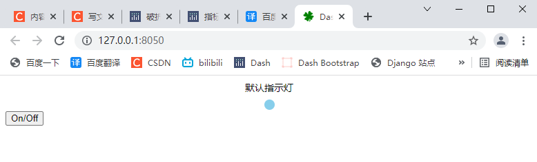
6.1 default indicator
import dash
from dash.dependencies import Input, Output
import dash_daq as daq
from dash import html

app = dash.Dash(__name__)

app.layout = html.Div([
    # Indicator light assembly
    daq.Indicator(
        id='my-indicator-1',
        label="Default indicator",
    ),
    html.Button(
        'On/Off',
        id='my-indicator-button-1',
        n_clicks=0
    ),
])

@app.callback(
    Output('my-indicator-1', 'value'),
    Input('my-indicator-button-1', 'n_clicks')
)
def update_output(value):
    """ Click to toggle the indicator status """
    return True if value % 2 == 0 else False

if __name__ == '__main__':
    app.run_server(debug=True)
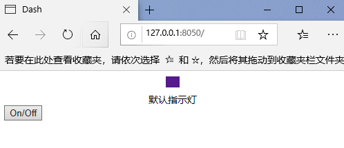
6.2 custom indicators
import dash
from dash.dependencies import Input, Output
import dash_daq as daq
from dash import html

app = dash.Dash(__name__)

app.layout = html.Div([
    # Indicator light assembly
    daq.Indicator(
        id='my-indicator-1',
        label="Default indicator",
        labelPosition='bottom',     # Label location
        value=False,                # The default value is True by default
        # Specify both the width and height to display as a rectangle, and specify a diameter as a circle
        width=20,       # width
        height=16,      # height
        color='#551A8B',    # colour
    ),
    html.Button(
        'On/Off',
        id='my-indicator-button-1',
        n_clicks=0
    ),
])

@app.callback(
    Output('my-indicator-1', 'value'),
    Input('my-indicator-button-1', 'n_clicks')
)
def update_output(value):
    """ Click to toggle the indicator status """
    return True if value % 2 == 0 else False

if __name__ == '__main__':
    app.run_server(debug=True)
6.3 indicator properties
help(dash_daq.Indicator)
- ID (string; optional): used to identify the ID of the indicator in the Dash callback.
- className (string; optional): the class applied to the root component element.
- Color (string; default colors. Marker_primary): the color of the indicator.
- Height (numeric; optional): the height of the component. Sets the width and height for the rectangular indicator.
- Label (dict; optional): description displayed with the control. To control styles, pass objects with label and style properties.
- label is a string | dictionary with keys:
- label (string; optional)
- Style (dict; optional)
- labelPosition (equal to the value of 'top', 'bottom', 'right' or 'left'; the default value is' top '): the position of the indicator label.
- Size (number; default 15): the size of the component. Use this or width and height.
- Style (dict; optional): the style applied to the root component element.
- Theme (dict; default light): theme configuration set by ThemeProvider.
- value (Boolean; optional): if True, the indicator lights up.
- Width (number; optional): the width of the component. Sets the width and height for the rectangular indicator.
7, Joystick daq.Joystick()
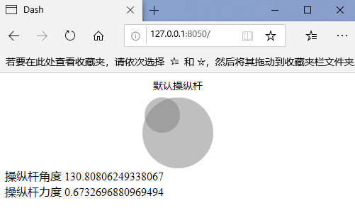
7.1 default joystick
import dash
from dash.dependencies import Input, Output
import dash_daq as daq
from dash import html

app = dash.Dash(__name__)

app.layout = html.Div([
    # Lever as-control
    daq.Joystick(
        id='my-joystick-1',
        label="Default joystick",
        angle=0     # angle
    ),
    html.Div(id='joystick-output-1')
])

@app.callback(
    Output('joystick-output-1', 'children'),
    Input('my-joystick-1', 'angle'),
    Input('my-joystick-1', 'force')
)
def update_output(angle, force):
    """ Angle 0-360 Degree, the force represents the distance from the click position to the center of the circle(0-1) """
    return [f'Lever angle {angle}', html.Br(), f'Lever force {force}']

if __name__ == '__main__':
    app.run_server(debug=True)
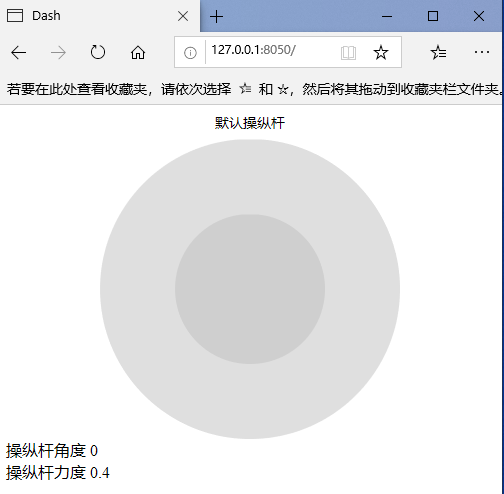
7.2 custom joystick
import dash
from dash.dependencies import Input, Output
import dash_daq as daq
from dash import html

app = dash.Dash(__name__)

app.layout = html.Div([
    # Lever as-control
    daq.Joystick(
        id='my-joystick-1',
        label="Default joystick",
        angle=0,     # angle
        size=300,       # size
        force=0.4,		# Force, the distance between the cursor and the center of the large circle radius
    ),
    html.Div(id='joystick-output-1')
])

@app.callback(
    Output('joystick-output-1', 'children'),
    Input('my-joystick-1', 'angle'),
    Input('my-joystick-1', 'force')
)
def update_output(angle, force):
    """ Angle 0-360 Degree, the force represents the distance from the click position to the center of the circle(0-1) """
    return [f'Lever angle {angle}', html.Br(), f'Lever force {force}']

if __name__ == '__main__':
    app.run_server(debug=True)
7.3 joystick properties
help(dash_daq.Joystick)
- ID (string; optional): used to identify the ID of the color selector in the Dash callback.
- Angle (numeric; optional): joystick angle in degrees, 0 = right, 90 = up, 180 = left, 270 = down.
- className (string; optional): the class applied to the root component element.
- disabled (Boolean; optional): if True, the color cannot be selected.
- Force (numeric; optional): force, the distance between the cursor and the center of the large circle radius.
- Label (dict; optional): description displayed with the control. To control styles, pass objects with label and style properties.
- label is a string | dictionary with keys:
- label (string; optional)
- Style (dict; optional)
- labelPosition (equal to the value of 'top' or 'bottom'; the default value is' top '): the position of the indicator label.
- Size (number; default 100): the size (width) of the component, in pixels.
- Style (dict; optional): the style applied to the root component element.
- Theme (dict; default light): theme configuration set by ThemeProvider.
8, Knob daq.Knob()
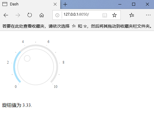
8.1 default knob
import dash
from dash.dependencies import Input, Output
import dash_daq as daq
from dash import html

app = dash.Dash(__name__)

app.layout = html.Div([
    # Knob control
    daq.Knob(id='my-knob-1'),
    html.Div(id='knob-output-1')
])

@app.callback(Output('knob-output-1', 'children'),
              Input('my-knob-1', 'value'))
def update_output(value):
    return f'Knob value is {value}.'

if __name__ == '__main__':
    app.run_server(debug=True)
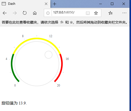
8.2 custom knob
import dash
from dash.dependencies import Input, Output
import dash_daq as daq
from dash import html

app = dash.Dash(__name__)

app.layout = html.Div([
    # Knob control
    daq.Knob(
        id='my-knob-1',
        size=200,       # size
        value=13.9,     # Default value
        max=20,         # Maximum, default 10
        # The color range should match the maximum value
        color={"ranges":{"green":[0,5],"yellow":[5,15],"red":[15,20]}},
    ),
    html.Div(id='knob-output-1')
])

@app.callback(Output('knob-output-1', 'children'),
              Input('my-knob-1', 'value'))
def update_output(value):
    return f'Knob value is {value}.'

if __name__ == '__main__':
    app.run_server(debug=True)
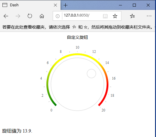
8.3 gradient knob
import dash
from dash.dependencies import Input, Output
import dash_daq as daq
from dash import html

app = dash.Dash(__name__)

app.layout = html.Div([
    # Knob control
    daq.Knob(
        id='my-knob-1',
        label='Custom knob',
        size=200,       # size
        value=13.9,     # Default value
        max=20,         # Maximum, default 10
        # The color range should match the maximum value
        color={
            'gradient': True,
            "ranges":{"green":[0,5],"yellow":[5,15],"red":[15,20]}
        },
        # Scale start, label interval, scale interval
        scale={'start':0, 'labelInterval': 2, 'interval': 1}
    ),
    html.Div(id='knob-output-1')
])

@app.callback(Output('knob-output-1', 'children'),
              Input('my-knob-1', 'value'))
def update_output(value):
    return f'Knob value is {value}.'

if __name__ == '__main__':
    app.run_server(debug=True)
8.4 knob properties
help(dash_daq.Knob)
- ID (string; optional): used to identify the ID of this component in the Dash callback.
- className (string; optional): the class applied to the root component element.
- Color (dict; optional): the color configuration of the knob track.
color is a string | dictionary with keys:
default (string; optional): the color used for the current value text and other small accents.
Gradient (Boolean; optional): displays the range as a gradient between given colors.
Ranges (dict; optional): define multiple color ranges on the track of the knob. The key determines the color of the range, and the value is the beginning and end of the range itself. The range must be continuous along the entire range of knob values.
ranges is a dictionary with keys:
color (list of numbers; optional) - disabled (Boolean; optional): if True, the knob cannot be moved.
- Label (dict; optional): description displayed with the control. To control styles, pass objects with label and style properties.
label is a string | dictionary with keys:
label (string; optional)
Style (dict; optional) - labelPosition (the value is equal to 'top' or 'bottom'; the default value is' top '): the position of the knob label.
- Max (number; default 10): the maximum value of the knob.
- Min (number; default 0): the minimum value of the knob.
- persisted_props (value list equals' value '; default [' value ']: the attribute whose user interaction will persist after refreshing the component or page. Since onlyvalue is allowed, this prop can usually be ignored.
- Persistence (Boolean | string | number; optional): used to allow user interaction in the component to be preserved when the component or page is refreshed. If persisted is true and does not change its previous value, the value a that the user changed when using the application will keep the change as long as the new value value also matches the value originally given. Use persistence with_ type.
- persistence_type (the value is equal to 'local', 'session' or 'memory'; the default value is' local '): the location where persistent user changes will be stored: memory: only kept in memory and reset when the page is refreshed. Local: window.localStorage. The data is retained after the browser exits. Session: window.sessionStorage. The data will be cleared after the browser exits.
- Scale (dict; optional): configuration of component scale.
scale is a dictionary with keys:
- Custom (dict; optional): custom scale markers. The key determines the position and the value determines the display content. If you want to style a specific marker point, the value should be the object that contains the style and label properties.
- custom is a numeric dictionary with keys:
- label (string; optional)
- style (string; optional)
- Interval (numeric; optional): the interval at which the proportion rises. By default, attempts to dynamically divide the min max range.
- labelInterval (numeric; optional): adds a label to the interval of the tick mark. The default is 2 (each other tag has a label).
- Start (number; optional): the value of the start scale. The default is minutes.
- Size (number; optional): the size (diameter) of the knob, in pixels.
- Style (dict; optional): the style applied to the root component element.
- Theme (dict; default light): theme configuration set by ThemeProvider.
- Value (numeric; optional): the value of the knob.
9, LED display (DAQ. Leddisplay)
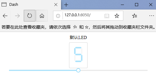
9.1 default LED
import dash
from dash.dependencies import Input, Output
import dash_daq as daq
from dash import html, dcc


app = dash.Dash(__name__)

app.layout = html.Div([
    # LED display control
    daq.LEDDisplay(
        id='my-LED-display-1',
        label="default LED",
        value=6         # Default value
    ),
    # Slider assembly
    dcc.Slider(
        id='my-LED-display-slider-1',
        min=0,
        max=10,
        step=1,
        value=5
    ),
])

@app.callback(
    Output('my-LED-display-1', 'value'),
    Input('my-LED-display-slider-1', 'value')
)
def update_output(value):
    return str(value)

if __name__ == '__main__':
    app.run_server(debug=True)
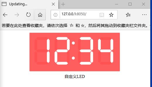
9.2 custom LED
import dash
from dash.dependencies import Input, Output
import dash_daq as daq
from dash import html, dcc


app = dash.Dash(__name__)

app.layout = html.Div([
    # LED display control
    daq.LEDDisplay(
        id='my-LED-display-1',
        label="custom LED",
        labelPosition='bottom',     # Label position, default 'top'
        value='12:34',         # Default value
        size=80,        # size
        color="#FFF",        # colour
        backgroundColor="#FF5E5E",  # background color
    ),
])

if __name__ == '__main__':
    app.run_server(debug=True)
9.3 LED properties
help(dash_daq.LEDDisplay)
- ID (string; optional): used to identify the displayed ID in the Dash callback.
- BackgroundColor (string; default '#fff'): displays the color of the background.
- className (string; optional): the class applied to the root component element.
- Color (string; default colors. Primary): displays the color.
- Label (dict; optional): description displayed with the control. To control styles, pass objects with label and style properties.
- label is a string | dictionary with keys:
- label (string; optional)
- Style (dict; optional)
- labelPosition (the value is equal to 'top' or 'bottom'; the default value is' top '): displays the position of the label.
- Size (number; default 42): the size of the display.
- Style (dict; optional): the style applied to the root component element.
- Theme (dict; default light): theme configuration set by ThemeProvider.
- Value (number | string; optional): the value to display. A number or string that contains only numbers (0-9), periods, and colons, and may begin with a minus sign.
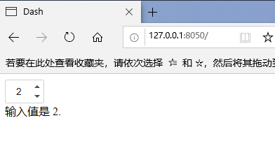
10, Digital input daq.NumericInput()
10.1 default digital input
import dash
from dash.dependencies import Input, Output
import dash_daq as daq
from dash import html

app = dash.Dash(__name__)

app.layout = html.Div([
    # Digital input control
    daq.NumericInput(
        id='our-numeric-input',
        value=0
    ),
    html.Div(id='numeric-input-result')
])


@app.callback(
    Output('numeric-input-result', 'children'),
    Input('our-numeric-input', 'value')
)
def update_output(value):
    return f'The input value is {value}.'


if __name__ == '__main__':
    app.run_server(debug=True)
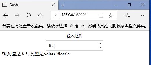
10.2 custom digital input
import dash
from dash.dependencies import Input, Output
import dash_daq as daq
from dash import html

app = dash.Dash(__name__)

app.layout = html.Div([
    # Digital input control
    daq.NumericInput(
        id='our-numeric-input',
        label='Input control',
        size=200,
        min=0,
        max=10,
        value=8.5,
        # disabled=True,
    ),
    html.Div(id='numeric-input-result')
])


@app.callback(
    Output('numeric-input-result', 'children'),
    Input('our-numeric-input', 'value')
)
def update_output(value):
    return f'The input value is {value}, Type is{type(value)}.'


if __name__ == '__main__':
    app.run_server(debug=True)
10.3 digital input properties
help(dash_daq.NumericInput)
- ID (string; optional): used to identify the ID of this component in the Dash callback.
- className (string; optional): the class applied to the root component element.
- disabled (Boolean; optional): if True, the numeric input cannot be changed.
- Label (dict; optional): description displayed with the control. To control styles, pass objects with label and style properties.
- label is a string | dictionary with keys:
- label (string; optional)
- Style (dict; optional)
- labelPosition (the value is equal to 'top' or 'bottom'; the default value is' top '): enter the position of the label numerically.
- Max (number; default 10): the maximum value of the number input.
- Min (number; default 0): the minimum value of digital input.
- persisted_props (value list equals' value '; default [' value ']: the attribute whose user interaction will persist after refreshing the component or page. Since onlyvalue is allowed, this prop can usually be ignored.
- Persistence (Boolean | string | number; optional): used to allow user interaction in the component to be preserved when the component or page is refreshed. If persisted is true and does not change its previous value, the value a that the user changed when using the application will keep the change as long as the new value value also matches the value originally given. Use persistence with_ type.
- persistence_type (the value is equal to 'local', 'session' or 'memory'; the default value is' local '): the location where persistent user changes will be stored: memory: only kept in memory and reset when the page is refreshed. Local: window.localStorage. The data is retained after the browser exits. Session: window.sessionStorage. The data will be cleared after the browser exits.
- Size (number; optional): enter the size (length) of a number in pixels.
- Style (dict; optional): the style applied to the root component element.
- Theme (dict; default light): theme configuration set by ThemeProvider.
- Value (number; optional): the value entered numerically.