Chapter I operation background
1.1 operation requirements
programming to realize the rotation of a polyhedron. In the process of polyhedron rotation, invisible lines are represented by dotted lines; Visible lines are represented by solid lines.
1.2 development technology
this job is implemented by front-end technology, mainly including HTML, css, css3, javascript and Jquery. Among them, html is used as the skeleton of page display, css is used to render page style and draw three-dimensional graphics, css3 controls graphics rotation and other related parameters, javascript is used as a script language to explicitly operate the css style of each dom of the page, and Jquery is the framework of javascript to realize the js writing of cross browser.
1.3 implementation ideas
① draw 6 squares and use css3 to assemble them into a cube;
② use the animation function of css3 to set the cube rotation;
③ use Jquery to read the rotation angle of the cube. When the angle is at a certain threshold, explicitly control the 12 edges of the cube to become dotted lines or solid lines.
Chapter 2 code implementation
2.1 draw cube
first, write html code to draw six faces of the cube:
<div class="box">
    <ul>
        <li id="panel_1">1</li>
        <li id="panel_2">2</li>
        <li id="panel_3">3</li>
        <li id="panel_4">4</li>
        <li id="panel_5">5</li>
        <li id="panel_6">6</li>
    </ul>
</div>
code block 2-1 cube html code
After , add css style to offset each face by a certain amount. Here, the 3D geometric basis of mathematics is required to calculate the offset of each face in X direction, Y direction and Z direction. The css code is as follows:
*{margin: o;padding: 0;}
body{background: white;}
.box{
    width: 400px;
    height: 400px;
    margin: 200px auto;
    perspective: 1000px;
}
.box ul{
    width: 300px;
    height: 300px;
    margin: 48px;
    position:relative;
    transform-style: preserve-3d;
    animation: move 20s infinite linear;
    transform-origin:center center 150px ;
}
.box ul li{
    width: 300px;
    height: 300px;
    list-style: none;
    font-size: 20px;
    color: #000;
    text-align: center;
    line-height: 300px;
    position: absolute;
}
.box ul li:nth-of-type(2){ transform:translateX(300px) rotateY(-90deg) ;transform-origin: left;}
.box ul li:nth-of-type(3){ transform:translateX(-300px) rotateY(90deg);transform-origin: right;}
.box ul li:nth-of-type(4){ transform: translateY(-300px) rotateX(-90deg);transform-origin:bottom;}
.box ul li:nth-of-type(5){ transform: translateY(300px) rotateX(90deg);transform-origin:top;}
.box ul li:nth-of-type(6){ transform: translateZ(300px);}
code block 2-2 cube css code
the rendering of the final cube is as follows:
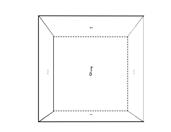
Figure 2-1 cube static effect
2.2 rotating the cube
the cube in Figure 2-1 is only static. We use the animation control of css3 to make the six faces of the cube rotate around the Y axis. The code is as follows:
@keyframes move{
    from{transform:rotateY(0deg);}
    to{transform: rotateY(360deg);}
}
code block 2-3 cube css3 code
the gif effect after rotation is as follows:
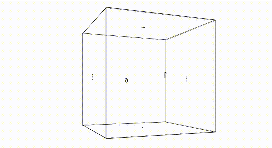
figure 2-2 cube rotation effect
2.3 switching between solid line and dotted line
in the cube in Figure 2-2, all lines are solid lines. We need to turn the edge into a dotted line when the edge of the cube is not visible, and then become a solid line when it is visible. Jquery is used here to judge the rotation angle of each face. When the rotation angle of a face is greater than or less than 0, it means that the face is visible or invisible. This time is often accompanied by the visibility and invisibility of a line edge, so write the JS code as follows:
setInterval( ()=>{
	 var deg_2 = parseFloat($("ul").css("transform").replace(/[^0-9\-.,]/g,'').split(',')[2])
	 var deg_3 = parseFloat($("ul").css("transform").replace(/[^0-9\-.,]/g,'').split(',')[8])
	 var deg_6 = parseFloat($("ul").css("transform").replace(/[^0-9\-.,]/g,'').split(',')[10])

	 // When face 3 is not visible
	 if(deg_3 <= 0){
	     /***Face 2 visible***/
	     // Face 2 up and down solid line
	     $("li").eq(1).css('borderTop','2px solid black')
	     $("li").eq(1).css('borderBottom','2px solid black')
	     // Face 3 is dotted up and down
	     $("li").eq(2).css('borderTop','2px dashed black')
	     $("li").eq(2).css('borderBottom','2px dashed black')
	     // When face 2 is visible, the line between faces 36 is not visible
	     $("li").eq(5).css('borderLeft','2px dashed black')
	 }else{
	     /***Face 3 visible***/
	     // Face 3 up and down solid line
	     $("li").eq(2).css('borderTop','2px solid black')
	     $("li").eq(2).css('borderBottom','2px solid black')
	     // Face 2 is dotted up and down
	     $("li").eq(1).css('borderTop','2px dashed black')
	     $("li").eq(1).css('borderBottom','2px dashed black')
	     // When face 3 is visible, the line between faces 12 is not visible
	     $("li").eq(0).css('borderRight','2px dashed black')
	 }

	 if(deg_6 <= 0){
	     /***Face 1 visible***/
	     // Face 1 up and down solid line
	     $("li").eq(0).css('borderTop','2px solid black')
	     $("li").eq(0).css('borderBottom','2px solid black')
	     // Face 6 is dotted up and down
	     $("li").eq(5).css('borderTop','2px dashed black')
	     $("li").eq(5).css('borderBottom','2px dashed black')
	     // When face 1 is visible, the line between faces 12 is visible
	     $("li").eq(0).css('borderRight','2px solid black')
	     // When face 2 is visible, line 26 is visible
	     $("li").eq(5).css('borderRight','2px dashed black')
	 }else{
	     /***Face 6 visible***/
	     // Face 1 is dotted up and down
	     $("li").eq(0).css('borderTop','2px dashed black')
	     $("li").eq(0).css('borderBottom','2px dashed black')
	     // Face 6 up and down
	     $("li").eq(5).css('borderTop','2px solid black')
	     $("li").eq(5).css('borderBottom','2px solid black')
	     // When face 6 is visible, the line between faces 36 is visible
	     $("li").eq(5).css('borderLeft','2px solid black')
	     // When face 3 is visible, line 13 is visible
	     $("li").eq(2).css('borderRight','2px dashed black')
	 }

	 if(deg_2<=0){
	     // When face 3 is visible, line 13 is visible
	     $("li").eq(2).css('borderRight','2px solid black')
	 }else{
	     // When face 2 is visible, line 26 is visible
	     $("li").eq(5).css('borderRight','2px solid black')
	 }
	},20)
code block 2-4 cube edge virtual real JS code
at this time, the effect drawing is as follows:
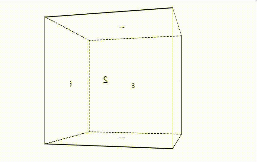
figure 2-3 final rotation effect of cube
2.4 dynamic switching Perspective
the cube in Figure 2-3 is viewed from a certain perspective. We add a function to switch the viewpoint, as follows:
var per = 1000 ;

$(document).mousewheel(function(event) {
    if(event.deltaY < 0 ){
        per = per >= 2000 ? 2000 : per+100
    }else{
        per = per <= 300 ? 300 : per-100
    }
    $('.box').css('perspective', per + 'px')
    console.log(per)
});
code block 2-5 cube switching angle code
when the mouse wheel slides up and down, you can zoom in or out of the viewpoint.
Chapter III summary
it is difficult to realize the operation. If you master certain professional tools, the effect and efficiency will be very high. Using the front-end web page can only realize some simple functions.
it should be easy to master some game making engines, development tools and concepts, such as UE4, Unity, light pursuit, light capture, particles, etc.
when I was in graduate school, I also had a passion for computer graphics. Why can't the picture quality of the film Nezha compare with Pixar and Disney? Why can't China make its own special effects? Later, I found that this road was too difficult, and the family conditions did not support it. Finally, I compromised and chose NLP as the direction of scientific research.
Attached code and usage
There are three files, one index.html, one jquery-3.3.1.min.js and one jquery.mousewheel.min.js. The last two JS files can be downloaded online and are easy to find. Index.html is attached below
<!DOCTYPE html>
<html lang="en">
<head>
    <meta charset="UTF-8">
    <meta name="viewport" content="width=device-width, initial-scale=1.0">
    <title>Cube</title>
    <style>
        *{margin: o;padding: 0;}
        body{background: white;}
        .box{
            width: 400px;
            height: 400px;
            margin: 200px auto;
            perspective: 1000px;
        }
        .box ul{
            width: 300px;
            height: 300px;
            margin: 48px;
            position:relative;
            transform-style: preserve-3d;
            animation: move 20s infinite linear;
            transform-origin:center center 150px ;
        }
        .box ul li{
            width: 300px;
            height: 300px;
            list-style: none;
            font-size: 20px;
            color: #000;
            text-align: center;
            line-height: 300px;
            position: absolute;
        }
        .box ul li:nth-of-type(2){ transform:translateX(300px) rotateY(-90deg) ;transform-origin: left;}
        .box ul li:nth-of-type(3){ transform:translateX(-300px) rotateY(90deg);transform-origin: right;}
        .box ul li:nth-of-type(4){ transform: translateY(-300px) rotateX(-90deg);transform-origin:bottom;}
        .box ul li:nth-of-type(5){ transform: translateY(300px) rotateX(90deg);transform-origin:top;}
        .box ul li:nth-of-type(6){ transform: translateZ(300px);}

        @keyframes move{
            from{transform:rotateY(0deg);}
            to{transform: rotateY(360deg);}
        }
    </style>
</head>
<body>

    <div class="box">

        <ul>
            <li id="panel_1">1</li>
            <li id="panel_2">2</li>
            <li id="panel_3">3</li>
            <li id="panel_4">4</li>
            <li id="panel_5">5</li>
            <li id="panel_6">6</li>
        </ul>
    </div>

</body>
<script src="./jquery-3.3.1.min.js"></script>
<script src="./jquery.mousewheel.min.js"></script>
<script>
    /**
     * 6 As opposed to 1, 2 as opposed to 3
     * deg_2 Side 2: positive visible, negative invisible
     * deg_3 Side 3: positive visible, negative invisible
     * deg_6 Side 6: positive visible, negative invisible
     *
     * When a face is visible, the right border of the face is visible, which is a solid line
     **/
    setInterval( ()=>{
        var deg_2 = parseFloat($("ul").css("transform").replace(/[^0-9\-.,]/g,'').split(',')[2])
        var deg_3 = parseFloat($("ul").css("transform").replace(/[^0-9\-.,]/g,'').split(',')[8])
        var deg_6 = parseFloat($("ul").css("transform").replace(/[^0-9\-.,]/g,'').split(',')[10])

        // When face 3 is not visible
        if(deg_3 <= 0){
            /***Face 2 visible***/
            // Face 2 up and down solid line
            $("li").eq(1).css('borderTop','2px solid black')
            $("li").eq(1).css('borderBottom','2px solid black')
            // Face 3 is dotted up and down
            $("li").eq(2).css('borderTop','2px dashed black')
            $("li").eq(2).css('borderBottom','2px dashed black')
            // When face 2 is visible, the line between faces 36 is not visible
            $("li").eq(5).css('borderLeft','2px dashed black')
        }else{
            /***Face 3 visible***/
            // Face 3 up and down solid line
            $("li").eq(2).css('borderTop','2px solid black')
            $("li").eq(2).css('borderBottom','2px solid black')
            // Face 2 is dotted up and down
            $("li").eq(1).css('borderTop','2px dashed black')
            $("li").eq(1).css('borderBottom','2px dashed black')
            // When face 3 is visible, the line between faces 12 is not visible
            $("li").eq(0).css('borderRight','2px dashed black')
        }

        if(deg_6 <= 0){
            /***Face 1 visible***/
            // Face 1 up and down solid line
            $("li").eq(0).css('borderTop','2px solid black')
            $("li").eq(0).css('borderBottom','2px solid black')
            // Face 6 is dotted up and down
            $("li").eq(5).css('borderTop','2px dashed black')
            $("li").eq(5).css('borderBottom','2px dashed black')
            // When face 1 is visible, the line between faces 12 is visible
            $("li").eq(0).css('borderRight','2px solid black')
            // When face 2 is visible, line 26 is visible
            $("li").eq(5).css('borderRight','2px dashed black')
        }else{
            /***Face 6 visible***/
            // Face 1 is dotted up and down
            $("li").eq(0).css('borderTop','2px dashed black')
            $("li").eq(0).css('borderBottom','2px dashed black')
            // Face 6 up and down
            $("li").eq(5).css('borderTop','2px solid black')
            $("li").eq(5).css('borderBottom','2px solid black')
            // When face 6 is visible, the line between faces 36 is visible
            $("li").eq(5).css('borderLeft','2px solid black')
            // When face 3 is visible, line 13 is visible
            $("li").eq(2).css('borderRight','2px dashed black')
        }

        if(deg_2<=0){
            // When face 3 is visible, line 13 is visible
            $("li").eq(2).css('borderRight','2px solid black')
        }else{
            // When face 2 is visible, line 26 is visible
            $("li").eq(5).css('borderRight','2px solid black')
        }
    },20)

    var per = 1000 ;


        $(document).mousewheel(function(event) {
            if(event.deltaY < 0 ){
                per = per >= 2000 ? 2000 : per+100
            }else{
                per = per <= 300 ? 300 : per-100
            }
            $('.box').css('perspective', per + 'px')
            console.log(per)
        });
</script>
</html>