Bootstrap4
1. Network system
rule
-
The screen can be divided into 12 columns at most (the sum of the numbers in the same row should be 12)

-
Use rows to create horizontal column groups
-
In order to automatically set the outer and inner margins, each row of the grid needs to be placed in a container with the. Container (fixed width) or. Container fluid (full screen width) class set
-
Predefined classes such as. row and. col-sm-4 can be used to quickly make grid layouts.
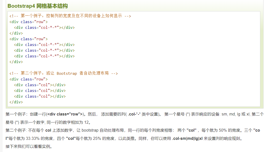
5 network categories:
- col - for all devices
- . col SM flat panel - screen width equal to or greater than 576px
- . col MD - desktop display - screen width equal to or greater than 768px)
- . col LG - large desktop display - screen width equal to or greater than 992px)
- . col XL - large desktop display - screen width equal to or greater than 1200px)
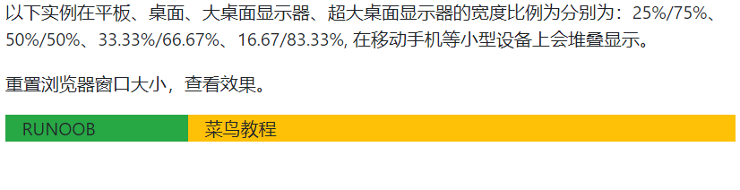
For example:
<div class="row">
      <div class="col-sm-3 col-md-6 col-lg-4 col-xl-2 bg-success">
        RUNOOB
      </div>
      <div class="col-sm-9 col-md-6 col-lg-8 col-xl-10 bg-warning">
        Rookie tutorial
      </div>
    </div>
Offset column:
In the same div, the latter one is offset from the base position of the previous one
<div class="container-fluid">
    <div class="row">
      <div class="col-md-4 bg-success">.col-md-4</div>
      <div class="col-md-4 offset-md-4 bg-warning">.col-md-4 .offset-md-4</div>
    </div>
    <div class="row">
      <div class="col-md-3 offset-md-3 bg-success">.col-md-3 .offset-md-3</div>
      <div class="col-md-3 offset-md-3 bg-warning">.col-md-3 .offset-md-3</div>
    </div>
    <div class="row">
      <div class="col-md-6 offset-md-3 bg-success">.col-md-6 .offset-md-3</div>
    </div>
  </div>

- The. Rounded class makes the picture rounded
- . rounded circle class oval picture
- The. Img thumbnail class is used to set the picture thumbnail, that is, the picture has a border
- Float right float left picture alignment
- The. MX auto (margin: Auto) and. d-block (display:block) classes set the center alignment of the picture
- The. Img fluid class (max width: 100%; height: auto;) automatically adjusts according to the screen size
3. carousel
Prompt
<div id="demo" class="carousel slide" data-ride="carousel">
 <!-- Indicator -->
  <ul class="carousel-indicators">
    <li data-target="#demo" data-slide-to="0" class="active"></li>
    <li data-target="#demo" data-slide-to="1"></li>
    <li data-target="#demo" data-slide-to="2"></li>
  </ul>
class = "carousel slide" ---- the whole div is a rotation, and the rotation animation method is slide

Data ride = "carousel" --- the rotation starts when the page is loaded. If it is deleted, it will not be rotated
class = "active" --- current position
Data slide to = "2" --- the position of the rotation, move the small rectangle to the second block, and the index starts from 0
. carousel indicators ---- indicators representing the time of rotation (i.e. a column of small rectangles). The current figure can be displayed during rotation.
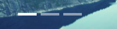
Rotate pictures
<!-- Rotate pictures -->
  <div class="carousel-inner">
    <div class="carousel-item active">
      <img src="https://static.runoob.com/images/mix/img_fjords_wide.jpg">
    </div>
    <div class="carousel-item">
      <img src="https://static.runoob.com/images/mix/img_nature_wide.jpg">
    </div>
    <div class="carousel-item">
      <img src="https://static.runoob.com/images/mix/img_mountains_wide.jpg">
    </div>
  </div>
Add < div class = "carousel caption" > in each < div class = "carousel item" > to set the description text of the rotation picture``
<div class="carousel-item">
  <img src="https://static.runoob.com/images/mix/img_fjords_wide.jpg">
  <div class="carousel-caption">
    <h3>First picture description title</h3>
    <p>Description text!</p>
  </div>
</div>
As follows:

Left and right switch button
 <!-- Left and right switch button -->
  <a class="carousel-control-prev" href="#demo" data-slide="prev">
    <span class="carousel-control-prev-icon"></span>
  </a>
  <a class="carousel-control-next" href="#demo" data-slide="next">
    <span class="carousel-control-next-icon"></span>
  </a>

</div>

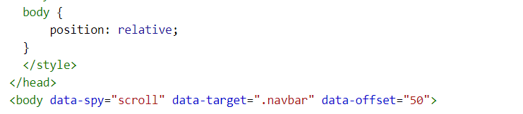
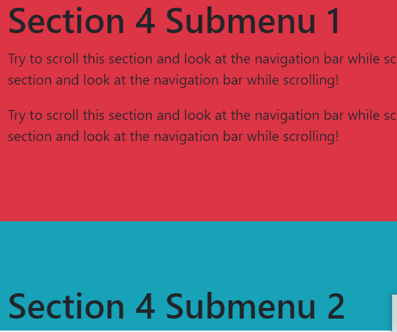
4. Scrollspy: the content scrolls with the scroll bar
method:
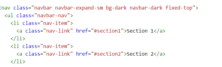
- First, make sure that the listening object is generally body, so set the relative positioning position relative. In order to realize rolling listening, add data spy = "scroll", and then add the data target attribute, whose value is the id or class (.navbar) of the navigation bar
- Secondly, the ID (< div id = "Section1" >) on the scrollable item element of the created navigation bar (navigation bar and scrolling content are in the same DIV) must match the link option on the navigation bar (< a href = "#section1" >)
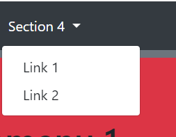
A drop-down menu can be set in the navigation bar. At the same time, the scrolling content can be changed into corresponding parts
<li class="nav-item dropdown">
      <a class="nav-link dropdown-toggle" href="#" id="navbardrop" data-toggle="dropdown">
        Section 4
      </a>
      <div class="dropdown-menu">
        <a class="dropdown-item" href="#section41">Link 1</a>
        <a class="dropdown-item" href="#section42">Link 2</a>
      </div>
    </li>
  </ul>
</nav>
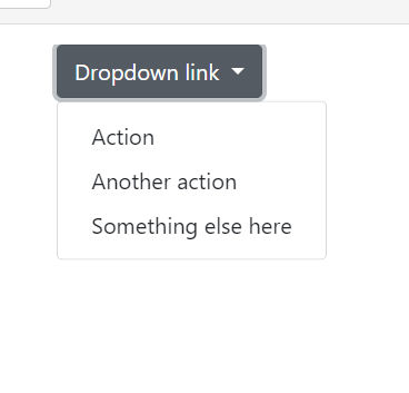
5. Drop down menu
Specify drop-down menu:. dropdown class
General method:
Examples are as follows:
<div class="container">
	<div class="dropdown">
	  <a class="btn btn-secondary dropdown-toggle" href="#" role="button" id="dropdownMenuLink" data-toggle="dropdown" aria-haspopup="true" aria-expanded="false">
		Dropdown link
	  </a>

	  <div class="dropdown-menu" aria-labelledby="dropdownMenuLink">
		<a class="dropdown-item" href="#">Action</a>
		<a class="dropdown-item" href="#">Another action</a>
		<a class="dropdown-item" href="#">Something else here</a>
	  </div>
	</div>
</div>
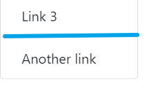
Split line: put the front of < a > back into a new box and add the. Dropdown divider class to the < div > to create the split line
<div class="dropdown-divider"></div>
      <a class="dropdown-item" href="#">Another link</a>
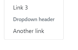
Title: use. Dropdown header to add a title
     <a class="dropdown-item" href="#">Link 3</a>
      <h5 class="dropdown-header">Dropdown header</h5>
      <a class="dropdown-item" href="#">Another link</a>
Pop up direction of drop-down menu: added in total < div > (the default pop-up direction is lower)
- Right pop up:. dropright class
- Left popup:. dropleft class
- Pop up on:. Drop class
Positioning: add the. Dropdown menu right class after the. Dropdown menu class of the element -- right alignment
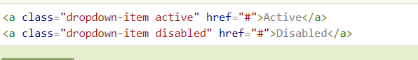
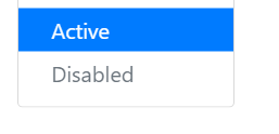
Disable and highlight options add. Disabled class to the child element as the disabled option, and add. active class to highlight (blue background)
6. Navigation
Add a. nav class on the < UL > element, a. nav item class on each < li > option, and a. nav link class on each link to create a simple horizontal navigation bar
<div class="container">
  <h2>Navigation</h2>
  <p>Simple horizontal navigation:</p>
  <ul class="nav">
    <li class="nav-item">
      <a class="nav-link" href="#">Link</a>
    </li>
    <li class="nav-item">
      <a class="nav-link" href="#">Link</a>
    </li>
    <li class="nav-item">
      <a class="nav-link" href="#">Link</a>
    </li>
    <li class="nav-item">
      <a class="nav-link disabled" href="#">Disabled</a>
    </li>
  </ul>
</div>
Above, disabled is forbidden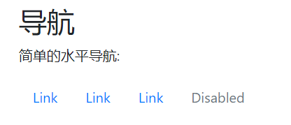
Center alignment: add the. Justify content center class in < UL >
Align navigation right: add the. Justify content end class in < UL >
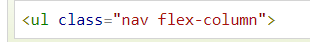
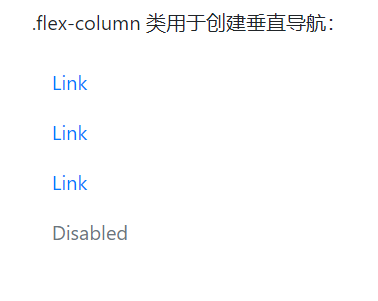
Vertical navigation: add the. Flex column class in < UL >
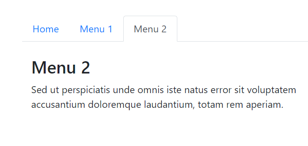
Tab: add the <. NAV tabs > class to < UL >, and then mark the selected option with the. active class
Dynamic tab (switchable):
Add the data toggle = "tab" attribute on each link. Then add the. Tab pane class on the corresponding content of each option. The div element corresponding to the tab content uses the. Tab content class. The fade effect can add the. Fade class after the. Tab pane:
<li class="nav-item">
      <a class="nav-link" data-toggle="tab" href="#menu2">Menu 2</a>
    </li>

    <div id="menu2" class="container tab-pane fade"><br>
      <h3>Menu 2</h3>
      <p>Sed ut perspiciatis unde omnis iste natus error sit voluptatem accusantium doloremque laudantium, totam rem aperiam.</p>
    </div>
Capsule navigation: add the. NAV pills class to < UL >
Flush and equal width: add. NAV justified class
7. The navigation bar is usually at the top of the page
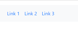
General method: first create a navigation bar. navbar class, followed by:. navbar expand xl|lg|md|sm class to create a responsive navigation bar (the large screen is spread horizontally and the small screen is stacked vertically, You can create a vertical navigation bar by deleting this class ), and then create navigation bar options, that is, add. Navbar NAV class in < UL > element, add. NAV item class on < li > element, and use. NAV link class on < a > element
<nav class="navbar navbar-expand-sm bg-light">
  <ul class="navbar-nav">
    <li class="nav-item">
      <a class="nav-link" href="#">Link 1</a>
    </li>
    <li class="nav-item">
      <a class="nav-link" href="#">Link 2</a>
    </li>
    <li class="nav-item">
      <a class="nav-link" href="#">Link 3</a>
    </li>
  </ul>
</nav>
Namely
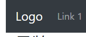
Brand / Logo: add. Navbar brand class in < a > element to highlight
<nav class="navbar navbar-expand-sm bg-dark navbar-dark">
  <!-- Brand/logo -->
  <a class="navbar-brand" href="#">Logo</a>

  <!-- Links -->
  <ul class="navbar-nav">
    <li class="nav-item">
      <a class="nav-link" href="#">Link 1</a>
    </li>
Fixed navigation bar:. Fixed top class ---- page header,. Fixed bottom class ---- page bottom
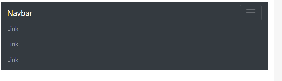
Collapse navigation bar: Click to display the navigation bar
Create a folded navigation bar: add class = "navbar toggle", data toggle = "collapse" and data target = "#thetarget" classes on the button, then wrap the navigation content (link) on the div with class = "collapse navbar collapse" class set, and the id on the div element matches the id specified on the button data target:
<nav class="navbar navbar-expand-md bg-dark navbar-dark">
  <a class="navbar-brand" href="#">Navbar</a>
  <button class="navbar-toggler" type="button" data-toggle="collapse" data-target="#collapsibleNavbar">
    <span class="navbar-toggler-icon"></span>
  </button>
  <div class="collapse navbar-collapse" id="collapsibleNavbar">
    <ul class="navbar-nav">
      <li class="nav-item">
        <a class="nav-link" href="#">Link</a>
      </li>
      <li class="nav-item">
        <a class="nav-link" href="#">Link</a>
      </li>
      <li class="nav-item">
        <a class="nav-link" href="#">Link</a>
      </li>
    </ul>
  </div>
</nav>
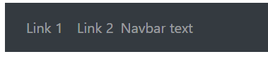
Navigation bar text:. Navbar text class to set non linked text, horizontal alignment, and the same color as the inner margin
  </ul>
  <!-- Navbar text-->
  <span class="navbar-text">
    Navbar text
  </span>
</nav>
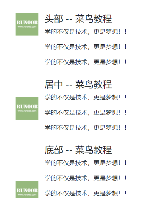
8. Multimedia objects
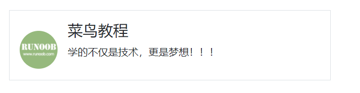
Create: add the. media class on the container element, and then put the multimedia content on the sub container. The sub container needs to add the. media body class, and then add the outer margin, inner margin and other effects:
Basic multimedia objects:
<div class="media border p-3">
    <img src="https://static.runoob.com/images/mobile-icon.png" alt="John Doe" class="mr-3 mt-3 rounded-circle" style="width:60px;">
    <div class="media-body">
      <h4>Rookie tutorial</h4>
      <p>Learn not only technology, but also dream!!!</p>
    </div>
  </div>
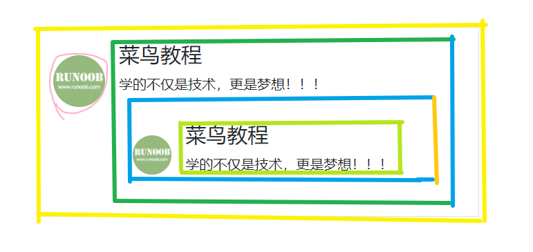
Multimedia object nesting: one multimedia object contains another multimedia object
<div class="container mt-3">
  <h2>Multimedia object nesting</h2>
  <p>Multimedia objects can be nested in multiple (one multimedia object contains another multimedia object):</p><br>
  <div class="media border p-3">
    <img src="https://static.runoob.com/images/mobile-icon.png" alt="John Doe" class="mr-3 mt-3 rounded-circle" style="width:60px;">
    <div class="media-body">
      <h4>Rookie tutorial</h4>
      <p>Learn not only technology, but also dream!!!</p>
      <div class="media p-3">
        <img src="https://static.runoob.com/images/mobile-icon.png" alt="Jane Doe" class="mr-3 mt-3 rounded-circle" style="width:45px;">
        <div class="media-body">
          <h4>Rookie tutorial</h4>
          <p>Learn not only technology, but also dream!!!</p>
        </div>
      </div>
    </div>
  </div>
</div>
. align self - * related classes: set the picture display position of multimedia objects
- Align self start: header
- Align self center: Center
- Align end: bottom
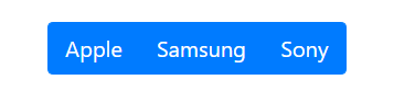
9. Button group: add. BTN group class to div element to create button group
<div class="btn-group">
  <button type="button" class="btn btn-primary">Apple</button>
  <button type="button" class="btn btn-primary">Samsung</button>
  <button type="button" class="btn btn-primary">Sony</button>
</div>
- BTN group vertical set vertical button group
- . BTN group LG / SM set button group size
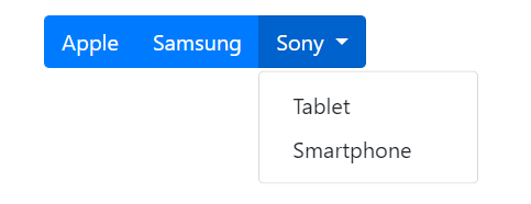
Embedded button group: put the button to be embedded in the drop-down menu into a div, add the. BTN group class to the div, and then add the second level div to the div to set the drop-down menu
<div class="btn-group">
    <button type="button" class="btn btn-primary">Apple</button>
    <button type="button" class="btn btn-primary">Samsung</button>
    <div class="btn-group">
      <button type="button" class="btn btn-primary dropdown-toggle" data-toggle="dropdown">
      Sony
      </button>
      <div class="dropdown-menu">
        <a class="dropdown-item" href="#">Tablet</a>
        <a class="dropdown-item" href="#">Smartphone</a>
      </div>
    </div>
  </div>