Day10-CSS
1, Why clear float
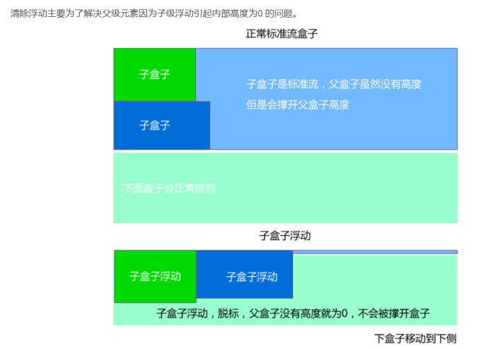
Since the floating element no longer occupies the position of the original file stream, it will affect the layout of subsequent elements. In order to solve these problems, you need to clear the floating element at this time.
To be precise, it is not to clear the float, but the impact caused by clearing the float.
For example, on the news details page, a div is used to wrap all news content, and the number of words of news content changes at any time. So this div is not convenient to set the height!!!!
In the standard flow, the box occupies the position, but the floating box does not occupy the position and will not open the box. At the same time, the parent box has no height and becomes a line.
2, Clear the essence of floating
1. Why float: multiple block level elements can be displayed on one line.
2. Why to clear floating: in order to solve the problem of the parent box, the height of the parent box caused by the floating of the child box is zero.
3, Method of clearing floating
Syntax:
	selector {
		clear:Attribute value;
}
Attribute value:
	left Clear left float
	right Clear right float
	both Clear left-right float
- Additional labeling method
Add a < div style = "clear:both" > < / div > after the last floating element
(1) Advantages: easy to understand and write.
(2) Disadvantages: it will lead to structural confusion.
=================Not recommended
Code demonstration:
<!DOCTYPE html>
<html lang="en">
<head>
	<meta charset="UTF-8">
	<meta name="viewport" content="width=device-width, initial-scale=1.0">
	<title>Document</title>
	<style>
		.father {
			border: 1px solid #ccc;
			width: 300px;
		}
		.big {
			width: 200px;
			height: 200px;
			background-color: pink;
			float: left;
		}
		.small {
			width: 100px;
			height: 100px;
			background-color: skyblue;
			float: left;
		}
		.footer {
			width: 300px;
			height: 100px;
			background-color: purple;
		}
		.clear {
			clear: both;
		}
	</style>
</head>
<body>
	<div class="father">
		<div class="big"></div>
		<div class="small"></div>
		<!-- Additional labeling method -->
		<!-- <div style="clear: both;"></div> -->
		<div class="clear"></div>
	</div>
	<div class="footer"></div>

</body>
</html>
- Add an overflow attribute to the parent element
You can add: overflow:hidden\auto\scoll to the parent element
Note: don't write it in the wrong position. Add ------ "son" to the parent element. It's not the fault of the godfather
infer other things from one fact:
Should all floats be cleared??? No, whoever affects the layout will clear it!!!
(1) Advantages: simple code
(2) Disadvantages: when there is too much content, the elements that need to overflow cannot be displayed.
Code demonstration:
<!DOCTYPE html>
<html lang="en">
<head>
	<meta charset="UTF-8">
	<meta name="viewport" content="width=device-width, initial-scale=1.0">
	<title>Document</title>
	<style>
		.father {
			border: 1px solid #ccc;
			width: 300px;
			overflow: hidden;
		}
		.big {
			width: 200px;
			height: 200px;
			background-color: pink;
			float: left;
		}
		.small {
			width: 100px;
			height: 100px;
			background-color: skyblue;
			float: left;
		}
		.footer {
			width: 300px;
			height: 100px;
			background-color: purple;
		}

	</style>
</head>
<body>
	<div class="father">
		<div class="big"></div>
		<div class="small"></div>
	</div>
	<div class="footer"></div>

</body>
</html>
- Use the after pseudo element to clear the float
Writing method:
	.clearfix:after {
		content:"";
		display:block;
		height:0;
		clear:both;
		visibility:hidden;
	}
	.clearfix {
		*zoom:1;
	}
Code demonstration:
<!DOCTYPE html>
<html lang="en">
<head>
	<meta charset="UTF-8">
	<meta name="viewport" content="width=device-width, initial-scale=1.0">
	<title>Document</title>
	<style>
		.clearfix:after {
			content: "";
			display: block;
			height: 0;
			clear: both;
			visibility: hidden;
		}
		.clearfix {
			*zoom: 1;  /*ie6 Method of clearing floating*/
		}

		.father {
			border: 1px solid #ccc;
			width: 300px;
		}
		.big {
			width: 200px;
			height: 200px;
			background-color: pink;
			float: left;
		}
		.small {
			width: 100px;
			height: 100px;
			background-color: skyblue;
			float: left;
		}
		.footer {
			width: 300px;
			height: 100px;
			background-color: purple;
		}

	</style>
</head>
<body>
	<div class="father clearfix">
		<div class="big"></div>
		<div class="small"></div>
	</div>
	<div class="footer"></div>

</body>
</html>
- Use before and after double pseudo elements to clear floats
Writing method:
	.clearfix:before,.clearfix:after {
		content:"";
		display:table;
	}
	.clearfix:after{
		clear:both;
	}
	.clearfix {
		*zoom:1;
	}
Code demonstration:
<!DOCTYPE html>
<html lang="en">
<head>
	<meta charset="UTF-8">
	<meta name="viewport" content="width=device-width, initial-scale=1.0">
	<title>Document</title>
	<style>
		.clearfix:before,.clearfix:after {
			content: "";
			display: table;
		}
		.clearfix:after {
			clear: both;
		}
		.clearfix {
			*zoom: 1;  /*ie6 Method of clearing floating*/
		}

		.father {
			border: 1px solid #ccc;
			width: 300px;
		}
		.big {
			width: 200px;
			height: 200px;
			background-color: pink;
			float: left;
		}
		.small {
			width: 100px;
			height: 100px;
			background-color: skyblue;
			float: left;
		}
		.footer {
			width: 300px;
			height: 100px;
			background-color: purple;
		}

	</style>
</head>
<body>
	<div class="father clearfix">
		<div class="big"></div>
		<div class="small"></div>
	</div>
	<div class="footer"></div>

</body>
</html>
4, Positioning
1. Positioning attribute of element
The positioning attribute of element includes positioning mode and edge offset. not a single one can be omitted.
Edge offset:
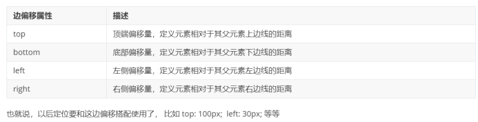
Positioning mode:
Syntax:
Selector{
position: attribute value;
}
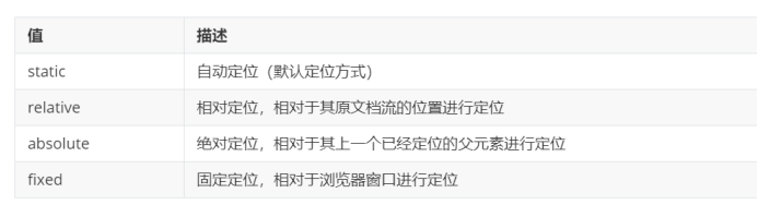
2. Static positioning
(1) Static positioning is the default positioning method for all elements. When the value of the position attribute is static, the element can be positioned in a static position. The so-called static position is the default position of each element in the HTML document stream.
(2) The above words are translated into Vernacular: all elements in the web page default to static positioning. In fact, it is the feature of standard flow.
(3) In the static positioning state, the position of an element cannot be changed by the edge offset attribute (top, bottom, left, or right).
(4) PS: static positioning actually has nothing to say.
(5) The only use of static positioning is to cancel positioning;
(6) For example, Jingdong, when sliding down, a menu will appear, and then disappear when sliding up
3. Relative positioning (narcissistic)
characteristic:
(1) Every time you move, take your upper left corner as the reference point!
(2) The most important point of relative positioning is that you can move the position through edge offset, but the original position continues to occupy!
4. Absolute positioning (split type)
Absolute positioning can move the position through edge offset. At the same time, it will no longer occupy the original position after moving.
(1) Parent element is not located: when the parent element is not located, it is based on the current screen of the browser.
(2) Parent element positioning: when the parent element is positioned, it is based on the positioned parent element.
5. Son Jue father phase (key)
(1) Because the child element adds absolute positioning and does not occupy a position, it can be placed anywhere in the parent box!
(2) Add relative positioning to the parent element to occupy the position (so as not to affect the placement of the box below)
6. The box with absolute positioning is horizontally centered and vertically centered
In the standard flow, center a div with width horizontally: margin:0 auto;
However, if absolute positioning is added to this div, margin:0 auto will fail!!!
Practice:
Horizontal center:
(1) First, left 50%, half of the parent box
(2) Then go half the width of your box, that is, margin left: - half the width of your box.
Vertical center:
(1) First, top 50%, half of the parent box
(2) Then go half the width of your box, that is, margin top: - half the width of your box.
Code demonstration:
<!DOCTYPE html>
<html lang="en">
<head>
	<meta charset="UTF-8">
	<meta name="viewport" content="width=device-width, initial-scale=1.0">
	<title>Document</title>
	<style>
		div {
			width: 200px;
			height: 200px;
			background-color: pink;
			margin: 0 auto;
			/*position: absolute;*/
			/*float: left;*/
			/*With the addition of floating and positioning boxes, the horizontal center will fail*/
			position: absolute;
			left: 50%;
			margin-left: -100px;
			top: 50%;
			margin-top: -100px;
		}
	</style>
</head>
<body>

	<div></div>

</body>
</html>
7. Fixed positioning (death recognition type)
Position:fixed;
be careful:
(1) The fixed positioning box has nothing to do with my father. I only recognize the browser.
(2) The fixed positioning box is off marked, does not occupy the position, and does not scroll with the scroll bar.
8. Positioning mode conversion
(1) Adding floating elements has the characteristics of inline blocks!!!
(2) After adding absolute positioning and fixed positioning to the element, the element also has the characteristics of in-line fast!!!
9. Stacking sequence
Control the order of positioned boxes: use attribute: z-index
be careful:
(1) The default value of z-index is 0. The larger the value, the higher the number of positioned elements.
(2) If the values are the same, the latter takes the upper place according to the writing order
(3) You can't give it to the unit later
(4) Only relative positioning, fixed positioning and absolute positioning have this attribute, while other standard flows and floats do not.
Code demonstration:
<!DOCTYPE html>
<html lang="en">
<head>
	<meta charset="UTF-8">
	<meta name="viewport" content="width=device-width, initial-scale=1.0">
	<title>Document</title>
	<style>
		div {
			width: 200px;
			height: 200px;
		}
		.one {
			background-color: red;
			position: absolute;
			top: 10px;
			left: 10px;
			z-index: 999;
		}
		.two {
			background-color: pink;
			position: absolute;
			top: 20px;
			left: 20px;
			z-index: 0;
		}
		.three {
			background-color: purple;
			position: absolute;
			top: 30px;
			left: 30px;
			z-index: 0;
		}
	</style
</head>
<body>
	<div class="one"></div>
	<div class="two"></div>
	<div class="three"></div>
</body>
</html>
Exercise 1:
Code demonstration:
<!DOCTYPE html>
<html lang="en">
<head>
	<meta charset="UTF-8">
	<meta name="viewport" content="width=device-width, initial-scale=1.0">
	<title>Document</title>
	<style>

		*{
			padding: 0;
			margin: 0;
		}

		.adv {
			width: 310px;
			height: 190px;
			padding: 10px;
			position: relative;
			margin: 100px auto;
			border: 1px solid #ccc;
		}

		.one {
			position: absolute;
			left: 0;
			top: 0;
		}

		.two {
			position: absolute;
			right: 0;
			bottom: 0;
		}

	</style>
</head>
<body>
	<div class="adv">
		<img src="images/adv.jpg" alt="">
		<img src="images/top_tu.gif" alt="" class="one">
		<img src="images/br.gif" alt="" class="two">
	</div>
</body>
</html>
Code demonstration results:

Exercise 2:
Code demonstration:
<!DOCTYPE html>
<html lang="en">
<head>
	<meta charset="UTF-8">
	<meta name="viewport" content="width=device-width, initial-scale=1.0">
	<title>Document</title>
	<style>
		*{
			padding: 0;
			margin: 0;
		}

		.sf {
			width: 1259px;
			height: 472px;
			margin: 100px auto;
			position: relative;
		}

		.nav {
			width: 960px;
			height: 100px;
			background-color: black;
			position: absolute;
			left: 150px;
			bottom: 0;
		}

		.nav li {
			list-style: none;
			width: 150px;
			height: 100px;
			line-height: 100px;
			float: left;
		}

		.nav a {
			width: 150px;
			font-size: 16px;
			font-weight: 700;
			display: inline-block;
			line-height: 100px;
			text-align: center;
			text-decoration: none;
			color: white;
			margin-left: 70px;
		}

		.nav a:hover{
			background-color: white;
			color: black;
		}
	</style>
</head>
<body>
	<div class="sf">
		<a href="#">
			<img src="images/sf.png" alt="">
		</a>
		<div class="nav">
			<ul>
				<li><a href="#"> Express query</a></li>
				<li><a href="#"> Express query</a></li>
				<li><a href="#"> Express query</a></li>
				<li><a href="#"> Express query</a></li>
				<li><a href="#"> Express query</a></li>
				<li><a href="#"> Express query</a></li>
			</ul>


		</div>
	</div>
</body>
</html>
Code demonstration results:
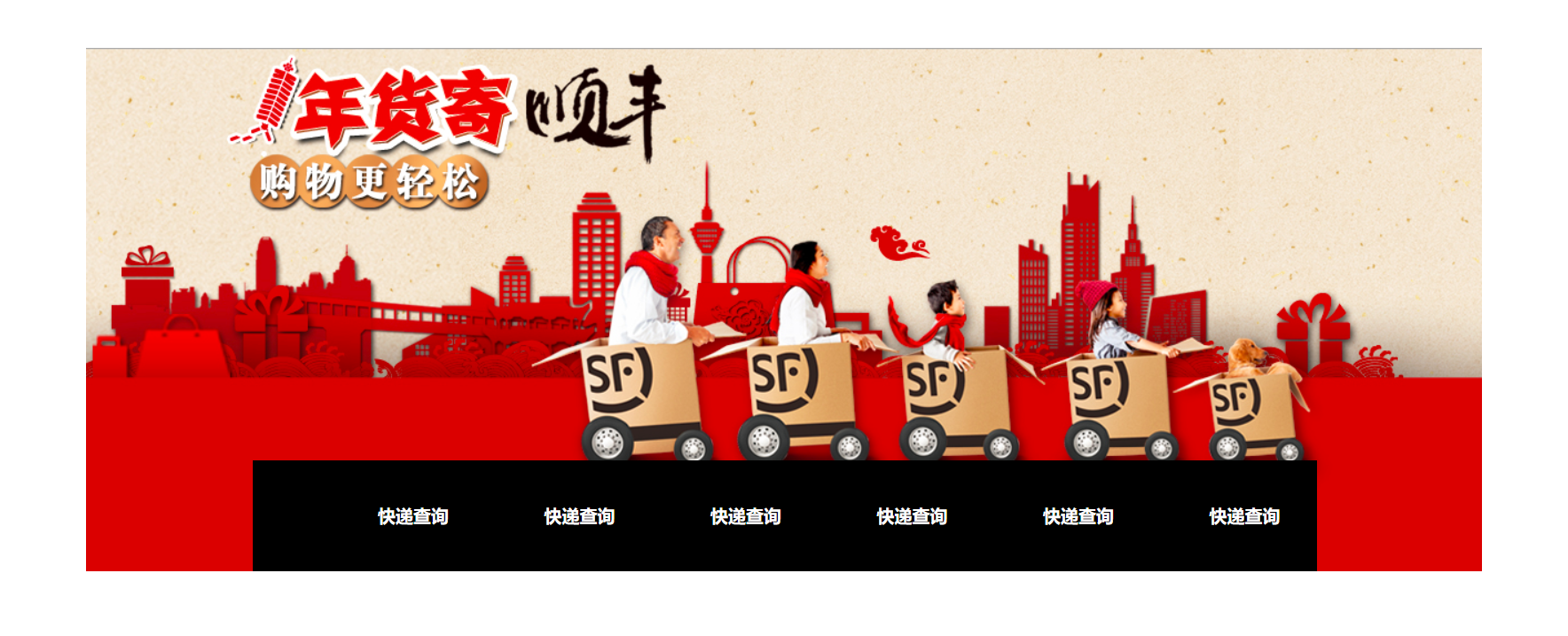
Exercise 3:
Code demonstration:
<!DOCTYPE html>
<html lang="en">
<head>
	<meta charset="UTF-8">
	<meta name="viewport" content="width=device-width, initial-scale=1.0">
	<title>Document</title>
	<style>

		*{
			padding: 0;
			margin: 0;
		}

		.img {
			width: 520px;
			height: 280px;
			margin: 100px auto 0;
			position: relative;
		}

		.left {
			position: absolute;
			left: 0;
			top: 50%;
			margin-top: -18px;
		}

		.right {
			position: absolute;
			right: 0;
			top: 50%;
			margin-top: -18px;
		}

		.bottom {
			position: absolute;
			left: 50%;
			bottom: 20px;
			margin-left: -40px;
			width: 80px;
			height: 12px;
			background-color: rgba(0, 0, 0, .3);
			border-radius: 5px;
		}

		.inner div {
			width: 8px;
			height: 8px;
			border-radius: 50%;
			/*margin-right: 5px;*/
			background-color: white;
			float: left;
			margin-right: 10px;
		}
	</style>
</head>
<body>
	<div class="img">
		<img src="images/tb.jpg" alt="">
		<img src="images/left.png" alt="" class="left">
		<img src="images/right.png" alt="" class="right">
		<div class="bottom">
			<div class="inner">
				<div></div>
				<div></div>
				<div></div>
				<div></div>
			</div>
		</div>
	</div>
</body>
</html>
Code demonstration results: