Pandas is the most important data analysis toolkit in Python. It is the abbreviation of Panel Data Analysis and the most popular Python data analysis tool at present. With the development of digital transformation of global economy, a large number of data have been accumulated in all walks of life. Companies with unique insights from big data analysis and data science can have key information advantages
For us, no matter whether we are engaged in data analysis industry or not, learning how to analyze data is good for us.
As the saying goes, if you want to do a good job, you must first sharpen your tools. If you want to learn steadily, then a good learning environment is essential, because
I have written tutorials before, so I won't repeat them here. Click the following link to configure and install:
Anaconda, jupyter installation and configuration
2, Introduction to Pandas
Pandas is the most important data analysis toolkit in Python. It is the abbreviation of Panel Data Analysis and the most popular Python data analysis tool at present.

The design of data structure and function provided by Pandas will make tabular data work fast, simple and expressive. Therefore, using Pandas for data operation, preprocessing and cleaning is an important skill in Python data analysis.
Official documents of Pandas: https://pandas.pydata.org/docs/
one ️⃣ Pandas installation
1.pandas can be installed through PyPI's pip. pip install pandas
2. pandas is part of Anaconda distribution and can be installed with Anaconda: conda install pandas
NumPy is a Python library for numerical operations. It is specially optimized for numerical operations. Its biggest advantage is fast. The underlying data structure of Pandas is implemented by NumPy. We can also understand Pandas as as the encapsulation of NumPy, which makes it easier to realize some functions of data analysis.
two ️⃣ Data structure of Pandas
Common data storage forms include Excel and database. What do they have in common?
Whether Excel or database, they store data in a table style, with rows and columns, and each row and column has its own index
# Import pandas module
import pandas as pd

#Store the basic information of each hero through Series
#Create Series
s1 = pd.Series([1001,'Xiao Ming','eighteen','150.00','male'])
s2 = pd.Series([1002,'Xiao Hong','19','16.00','female'])
s3 = pd.Series([1003,'Xiao Zhang','30','seventeen 0.00','male'])

series_list=[s1,s2,s3]

#Create a DataFrame object to store the address book
df=pd.DataFrame(series_list)
# Print the DataFrame just constructed
print(df)
Run this code in jupyter
✨ effect

three ️⃣ Creation of Series
Series is the most basic object in Pandas. Series is similar to a one-dimensional array. In fact, series
It is basically based on NumPy array objects. Unlike NumPy's array, Series
You can customize the label for the data, that is, the index, and then access the data in the array through the index
Let's create a series and see what the effect is.
# Import Series
from pandas import Series,DataFrame


# Create a Series using the default index
sel =  Series(data=[1,'Xiao Ming',19,'Play games',9])
print(sel)
✨ Operation effect
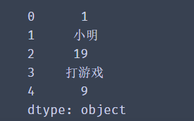
A Series is actually a piece of data. The first parameter of the Series method is data and the second parameter is index. If no value is passed, the default value (0-N) will be used.
Next, let's customize our index.
# Import Series
from pandas import Series,DataFrame

# Create Series, using custom indexes
sel =  Series(data=[1,'Xiao Ming',twenty,'Play games'],
              index = ['ranking','ID number','Age','hobby'])
print(sel)
✨ Operation effect

When creating a Series, the data does not have to be a list, but a dictionary can also be passed in.
from pandas import Series,DataFrame

# Convert dictionary to Series
dic={"red":100,"black":400,"green":300,"pink":900}
se2=Series(data=dic)
print(se2)
✨ Operation effect
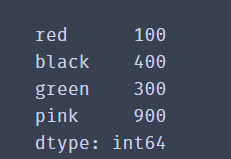
When the data is a dictionary, the key of the dictionary will be used as the index, and the value of the dictionary will be used as the data value corresponding to the index.
🚩 To sum up, Series is a group of indexed arrays, which is similar to list. Generally, we use it to hold a piece of data or a row of data. Multiple Series can form a DataFrame
four ️⃣ Creation of DataFrame
DataFrame (data table) is a two-dimensional data structure. Data is stored in the form of table and divided into several rows and columns.
Calling DataFrame() can convert data in various formats into DataFrame objects. Its three parameters data, index and columns are data, row index and column index respectively.
from pandas import Series,DataFrame

# Create a 2D list to store player information
lol_list = [['top','Nuguri',1],
            ['Fight wild','Tian',2],
            ['mid','Doinb',3],
            ['ADC','Lwx',4],
            ['auxiliary','Crisp',5]]
# Create dataframe
df = DataFrame(data=lol_list)
print(df)
✨ Operation effect
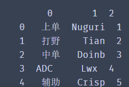
lol_list uses a two-dimensional list to store the information of each team member in a list. Of course we can
Pass values to the parameters index and columns in the DataFrame constructor to set the value of the row and column index in the DataFrame.
from pandas import Series,DataFrame

# Create a 2D list to store player information
lol_list = [['top','Nuguri',1],
            ['Fight wild','Tian',2],
            ['mid','Doinb',3],
            ['ADC','Lwx',4],
            ['auxiliary','Crisp',5]]
# Create dataframe
df = DataFrame(data=lol_list,
               index=['a','b','c','d','e'],
               columns=['position','ID number','Age'])
print(df)
✨ Operation effect
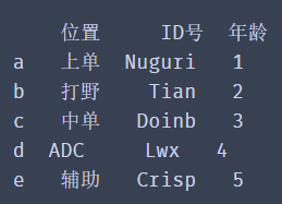
Of course, we can also use a dictionary to create a DataFrame data.
from pandas import Series,DataFrame
import pandas as pd
# Create using dictionary
dic={
    'position': ['top', 'Fight wild', 'mid', ' ADC','auxiliary'],
    'ID number': ['Nuguri', 'Tian', 'Doinb', 'Lwx', 'Crisp'],
    'year': [1, 2, 3, 4,5]}
df=pd.DataFrame(dic)
print(df)
✨ Operation effect

The results show that when the data in dictionary format is sorted by dataframe, the dictionary key will be used as the column index value of the data.
🚩 Through DataFrame, you can easily process data. Common operations, such as selecting and replacing row or column data, reorganizing data tables, modifying indexes, multiple filtering, etc. We can basically understand a DataFrame as a set of Series with the same index.
2, Properties and methods of Series
one ️⃣ Data acquisition of Series
The above briefly introduces how to create series. Now let's study the properties and methods of series carefully
The data structure of each column or row in table data is Series, which can be regarded as one-dimensional table data.
It can be part of the DataFrame or exist as an independent data structure.
Next, we create a Series. The index is the employee number and the data is the employee's name. We can obtain all the data of each part through the attributes of Series such as values, index and items.
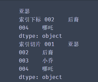
from pandas import Series
emp=['001','002','003','004','005','006']
name=['Arthur', 'offspring','Little Joe','nezha' ,'Yu Ji','Wang Zhaojun']
series = Series(data=name,index=emp)

# Gets the value of the data
print(series.values)
# Gets the value of the index
print(series.index.tolist())
# Get each pair of indexes and values
print(list(series.items()))
✨ Operation effect

The objects returned by values, index and items are List, index and Zip data respectively. In order to facilitate our use and observation of data, we can use the series.index.tolist() and list(series.items()) methods to convert them into List data.
Series is like a List that exposes index values. In fact, they are very similar in terms of obtaining data in addition to their appearance. We can access single data through index value, and also support slicing to select multiple data.
from pandas import Series
emp=['001','002','003','004','005','006']
name=['Arthur', 'offspring','Little Joe','nezha' ,'Yu Ji','Wang Zhaojun']
series = Series(data=name,index=emp)

# Get single data using index values
print(series['001'])

# Get multiple discontinuous data using index values
print('Index subscript',series[['002','004']])

# Use slices to obtain continuous data
print('Index slice',series['001':'004'])
✨ Operation effect

Get data format - object name []
Double parentheses when getting multiple discontinuous data - object name [[]]
Here is one thing worth noting:
Our index values are user-defined. Where are the original index values of 0, 1, 2? Some small partners may think that they are overwritten by the custom index. In fact, they are not. We can still use the default index to get the value. Our self-defined index value is called the index subscript. When the index value is not set, there will be a default value called the position subscript.
from pandas import Series
emp=['001','002','003','004','005','006']
name=['Arthur', 'offspring','Little Joe','nezha' ,'Yu Ji','Wang Zhaojun']
series = Series(data=name,index=emp)
# Get single data
print(series[0])
# Get multiple discontinuous data
print('Position subscript',series[[1,3]])
# Use slices to obtain continuous data
print('Position slice',series[0:3])
✨ The operation effect is the same as above
two ️⃣ Traversal of Series
Similar to other data structures in Python, we can easily use loops to traverse Series. We can directly traverse the values of Series:
# Traverse and get data
for value in series:
    print(value)
Or traverse the Series index through keys():
# Traverse and get index data
for value in series.keys():
    print(value)
You can also traverse each pair of indexes and data of the Series through items()
# Traverse and get each pair of indexes and data
for value in series.items():
    print(value)
You can run it yourself to see the effect
from pandas import Series
emp=['001','002','003','004','005','006']
name=['Arthur', 'offspring','Little Joe','nezha' ,'Yu Ji','Wang Zhaojun']
series = Series(data=name,index=emp)
print(series)
for value in series.keys():
    print(value)
for value in series:
    print(value)
for value in series.items():
    print(value)

for value in series.items():
    print(value)
3, Properties and methods of DataFrame
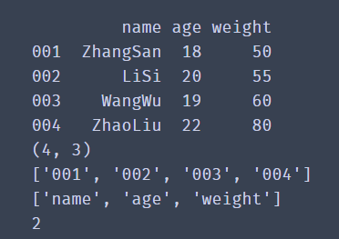
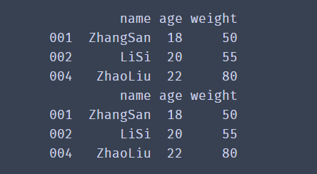
The data in the DataFrame is arranged according to rows and columns. Now let's see how to select, traverse and modify the data in the DataFrame according to rows or columns.In order to determine the data condition in the DataFrame and whether the data dimension is one-dimensional or two-dimensional, we can use ndim to view the number of rows and columns of the data, the shape, and the index values index and columns of the rows and columns.
import pandas as pd

df_dict = {
	'name':['ZhangSan','LiSi','WangWu','ZhaoLiu'],
	'age':['18','20','19','22'],
	'weight':['50','55','60','80']
}
df = pd.DataFrame(data=df_dict,index=['001','002','003','004'])
print(df)
# Gets the number of rows and columns
print(df.shape)

# Get row index
print(df.index.tolist())

# Get column index
print(df.columns.tolist())

# Get dimension of data
print(df.ndim)
✨ Operation effect
head() method: you can get the first five pieces of data by default, but you can define it yourself
# Get the first two
df.head(2)
# Get the last two
df.tail(2)
one ️⃣ Get row data for Series
import pandas as pd

df_dict = {
	'name':['ZhangSan','LiSi','WangWu','ZhaoLiu'],
	'age':['18','20','19','22'],
	'weight':['50','55','60','80']
}
df = pd.DataFrame(data=df_dict,index=['001','002','003','004'])
# Get a row by location index slice
print(df[0:1])
# Get multiple rows by location index slice
print(df[0:3])
# Get some columns in multiple rows
print(df[1:3][['name','age']])
# Gets the column of the DataFrame
print(df['name'])
# If you get multiple columns
print(df[['name','age']])
✨ Operation effect
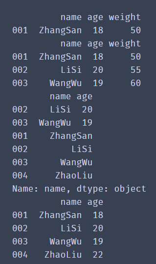
df [] does not support direct input of label index to obtain row data, for example: df ['001']
In this way, you can obtain a column of data, such as df ['name']
If you want to get some columns in multiple rows, you can write them as: df [row] [column], for example: df[1:3] ['name', 'age]],
Put the column index values in the same list, and then put the list in the second square bracket
We can also use another method to obtain data
Row label index filter loc [], filter iloc [] by row position index.
import pandas as pd

df_dict = {
	'name':['ZhangSan','LiSi','WangWu','ZhaoLiu'],
	'age':['18','20','19','22'],
	'weight':['50','55','60','80']
}
df = pd.DataFrame(data=df_dict,index=['001','002','003','004'])
print(df)

# Get the data of a row and a column
print(df.loc['001','name'])
# Data in one row and multiple columns
print(df.loc['001',['name','weight']])
# All columns in one row
print(df.loc['001',:])
# Select multiple rows and columns for the interval
print(df.loc[['001','003'],['name','weight']])
# Select consecutive rows and spaced columns
print(df.loc['001':'003','name':'weight'])
✨ Operation effect
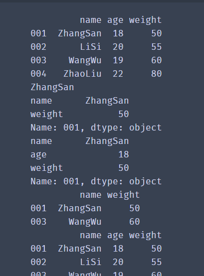
🚩 Df.loc [] obtains row data through label index. Its syntax structure is as follows: df.loc [[row], [column]], separated by commas in square brackets, rows on the left and columns on the right.
Please note:
If rows or columns use slicing, remove the square brackets,
Column df.loc ['001': '003', 'name': 'weight'].
df.iloc [] obtains row data through location index. Its operation is the same as loc [] operation. Just change the label index to location index.
# Take one line
print(df.iloc[1])
# Take multiple consecutive lines
print(df.iloc[0:2])
# Take interrupted multiple lines
print(df.iloc[[0,2],:])
# Take a column
print(df.iloc[:,1])
# A value
print(df.iloc[1,0])
Beginners will certainly find it difficult and easy to confuse, but you can learn by knocking and thinking more. When using these two methods
It should be noted that:
The slicing operations of loc and iloc differ in whether the data containing the end point of slicing is included. The result of loc['001':'003'] contains the row corresponding to row index 003. The iloc[0:2] result does not contain the data with serial number 2, and the data corresponding to the slice end point is not in the filtering result.
How to print out all the data
iterrows(): traverse by row, and convert each row of the DataFrame into (index, Series) pairs. Index is the row index value, and series is the data corresponding to the row.
for index,row_data in df.iterrows():
    print(index,row_data)
iteritems(): traversal by column, converting each column of the DataFrame into (column, Series) pairs. Column is the value of the column index, and series is the data corresponding to the column.
for col,col_data in df.iteritems():
    print(col)
🚩 If you don't master the above content, you can remember this position and continue to learn later.
3, Write and read of data
When doing data analysis, excel is our most commonly used tool, but when the amount of data is large, it takes a long time for Excel to open the data file alone, so the use of Pandas will be very efficient.
Let's take a look at CSV writing first
one ️⃣ CSV data writing
csv is the most common format for storing data files in plain text files. Its advantage is that it is very universal and is not limited by the operating system and specific software. Let's take writing csv as an example to see how pandas writes data to csv files.
from pandas import Series,DataFrame
# Create using dictionary
index_list = ['001','002','003','004','005','006','007','008']
name_list = ['Li Bai','Wang Zhaojun','Zhuge Liang','Di Renjie','Sun Shangxiang','Daji','Zhou Yu','Fei Zhang']
age_list = [25,28,27,25,30,29,25,32]
salary_list = ['10k','12.5k','20k','14k','12k','17k','18k','21k']
marital_list = ['NO','NO','YES','YES','NO','NO','NO','YES']
dic={
    'full name': Series(data=name_list,index=index_list),
    'Age': Series(data=age_list,index=index_list),
    'salary': Series(data=salary_list,index=index_list),
    'marital status': Series(data=marital_list,index=index_list)
    }
df=DataFrame(dic)
print(df)
# Write csv, path_or_buf is written to a text file
df.to_csv(path_or_buf='./People_Information.csv', encoding='utf_8_sig')
# If index = False, the row index information of DataFrame can not be stored
print('end')
✨ Operation effect
      Name age     Salary marital status
001   Li Bai 25    10k   NO
002  Wang Zhaojun 28 12.5k   NO
003  Zhuge Liang 27    20k  YES
004  Di Renjie 25    14k  YES
005  Sun Shangxiang 30    12k   NO
006   Daji 29    17k   NO
007   Zhou Yu 25    18k   NO
008   Zhang Fei 32    21k  YES
end
In the above code, we create a DataFrame, and then pass to_ The csv () method saves the DataFrame as a csv file.
It can be found from the results that to_ When csv () saves data, the row index of df is output to the csv file as a column.
How to save the csv file without storing the row index information of the DataFrame? Let's look at the following solutions.
df.to_csv(path_or_buf='route',index=False,encoding='utf_8_sig')
In to_ If you set the parameter index to False in the CSV method, you can not store the row index information of the DataFrame.
How to avoid garbled code? The garbled code will disappear after the encoding parameter is set to "utf_8_sig".
two ️⃣ Reading of CSV data
We found that the storage of data is very simple. Call to_ You can set the file storage path after CSV (). Just put the file path you saved into it
import pandas as pd
df = pd.read_csv('D:\jupy\People_Information.csv',header=0)
# read_csv() defaults to the first row in the file as the column index of the data.
# You can set the header to None, and the column index values will use the default values of 1, 2, 3, and 4
print(df)
print(df.shape)
   Unnamed: 0   Name age     Salary marital status
0           1   Li Bai 25    10k   NO
1           2  Wang Zhaojun 28 12.5k   NO
2           3  Zhuge Liang 27    20k  YES
3           4  Di Renjie 25    14k  YES
4           5  Sun Shangxiang 30    12k   NO
5           6   Daji 29    17k   NO
6           7   Zhou Yu 25    18k   NO
7           8   Zhang Fei 32    21k  YES
8           9  Wang Zhaojun 28    22k   NO
9          10   Big Joe 26 21.5k  YES
(10, 5)
As you can see from the figure, you can also see that read_csv() defaults to the first row in the file as the column index of the data.
What if the first row is not the index value we want? Of course, there is a solution to this problem, read_ The header parameter of CSV () is 0 by default. Take the value of the first row. You can set the header value according to specific requirements to determine the column index.
import pandas as pd
people = pd.read_csv('route',header = 1)
print(people.head())
three ️⃣ Reading Excel data
The reading method of Excel file is similar to that of csv_ csv() read csv file, read_excel() reads Excel files.
import pandas as pd
sheet = pd.read_excel('route.xlsx')
print(sheet.head())
However, there are differences. An Excel file can create multiple tables and then store different data in different tables. This form of file is very common. However, it should be noted that there is no problem of multiple sheet s in csv files.
import pandas as pd
sheet1 = pd.read_excel('route.xlsx',sheet_name='sheet1')
print(sheet1.head())

sheet2 = pd.read_excel('route.xlsx',sheet_name='sheet2')
print(sheet2.head())
# to_csv() is better than to_excel() is missing a sheet_ Parameter for name
In the above code, we introduced the Excel file sheet.xlsx with two tables named 'sheet1' and 'sheet2', and then we specified sheet_name to get the data in different tables.
4, Data processing
After we have the ability to save data, there will certainly be unnecessary data in our daily work, that is, data requiring special processing. At this time, we need to have the ability to process data
one ️⃣ Delete data
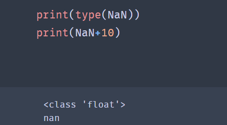
The value of nan is provided in the NumPy module. If you want to create a null value, you can use the following code:
from numpy import nan as NaN
Moreover, it should be noted that NaN is special in that it is a kind of float data.
✨ Operation effect
When the data we need to delete appears in the data, such as NaN, what data does NaN represent?
If there is no value in the cell of the file, it will be represented by NaN after reading with pandas, which is often called null value.
For a large number of Series data, it is difficult to judge the existence of null value with the naked eye. At this time, we can filter the null value first.
from numpy import nan as NaN
import pandas as pd
se=pd.Series([4,NaN,8,NaN,5])
print(se.notnull())
print(se[se.notnull()])
print(se)
✨ Operation effect
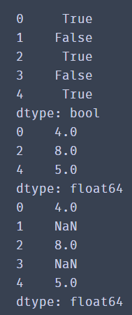
Through the results, we find that there are still null values in the results, and null values are not filtered out.
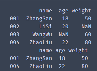
Therefore, in DataFrame type data, we will generally delete all data with NaN using dropna() method:
df1 = df.dropna()
from numpy import nan as NaN
import pandas as pd

df_dict = {
	'name':['ZhangSan','LiSi','WangWu','ZhaoLiu'],
	'age':['18','20',NaN,'22'],
	'weight':['50',NaN,'60','80']
}
df = pd.DataFrame(data=df_dict,index=['001','002','003','004'])
print(df)
df1 = df.dropna()
print(df1)
dropna() is a method to delete null data. By default, the entire row of data containing NaN is deleted. If you want to delete data with null values in the entire row, you need to add the how='all 'parameter.
✨ Operation effect
If you want to delete a column, you need to add an axis parameter. axis=1 represents a column and axis=0 represents a row.
We can also use the thresh parameter to filter the data to be deleted. thresh=n retains at least n rows of non NaN data. You can try with confidence
DataFrame.drop(labels=None,axis=0, index=None, columns=None, inplace=False)
Code interpretation:
axis=0 column, = 1 row labels: is the name of the row and column to be deleted, given in the list. index: directly specify the row to delete.
Columns: directly specify the columns to delete.
inplace=False: by default, the deletion operation does not change the original data, but returns a new dataframe after the deletion operation.
inplace=True: the original data will be deleted directly and cannot be returned after deletion.
Therefore, according to the parameters, we can conclude that there are two ways to delete rows and columns:
1.labels=None,axis=0 Combination of

2.index or columns Directly specify the row or column to delete
two ️⃣ Processing of null values
For null values, we can delete the whole piece of data or fill in the null values with the fillna() method.
df.fillna(value=None, method=None, axis=None, inplace=False, limit=None, downcast=None, **kwargs)
Note: the method parameter cannot appear with the value parameter at the same time.
import pandas as pd
df = pd.read_excel('date.xlsx')# Fill with constant fillna#
print(df.fillna(0))# Fill with the average of a column#
print(df.fillna(df.mean())# Fill in fillna with the previous value
print(df.fillna(method='ffill', axis=0))
three ️⃣ Duplicate data processing
The existence of duplicate data will sometimes not only reduce the accuracy of analysis, but also reduce the efficiency of analysis. Therefore, we should delete the duplicate data when sorting out the data.
Using the duplicated() function, you can return the result of judging whether each line is repeated (true if repeated).
import pandas as pd

df_dict = {
	'name':['ZhangSan','LiSi','WangWu','ZhaoLiu'],
	'age':['18','20','19','22'],
	'weight':['50','55','60','80']
}
print(df)
df = pd.DataFrame(data=df_dict,index=['001','002','003','004'])
print(df.duplicated())
✨ Operation effect
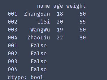
Through the results, we find that the returned value is a Series of Bool type. If the data of all columns in the current row is duplicate with the previous data, it returns True; otherwise, it returns False.
To delete, you can use the drop_duplicates() function to delete duplicate data rows
df.drop_duplicates()
We can also only judge the duplicate data of a column and delete it.
df.drop_duplicates(['Name'],inplace=False)
Where ['Name'] indicates whether the data of the comparative example is duplicate, and inplace is used to control whether the original data is modified directly.
import pandas as pd

df_dict = {
	'name':['ZhangSan','LiSi','LiSi','ZhaoLiu'],
	'age':['18','20','19','22'],
	'weight':['50','55','60','80']
}
print(df)
df = pd.DataFrame(data=df_dict,index=['001','002','003','004'])
df1=df.drop_duplicates(['name'],inplace=False)
print(df1)
✨ Operation effect
That's all for data processing. You've already achieved half the success. There will be more details waiting for you later. Continue to learn
5, Consolidation of data
After having the basic data filtering ability, we need to have more nb operations. Next, we will learn how to use Pandas to merge multiple DataFrame data and filter the data we like. In data merging, we mainly talk about the usage of two functions
one ️⃣ Concat() function
Data consolidation mainly includes the following two operations:
Axial connection:
pd.concat(): multiple DataFrame objects can be connected together along one axis to form a new DataFrame object.
The concat() function can merge data according to different axes. Let's take a look at the common parameters of concat():
pd.concat(objs, axis=0, join='outer')
- Objs: a sequence list composed of series, dataframe or panel.
- Axis: axis to merge links. 0 is row and 1 is column. The default is 0.
- join: the connection mode is inner or outer. The default is outer.
First create two DataFrame objects
import pandas as pd
dict1={
    'A': ['A0', 'A1', 'A2', 'A3'],
    'B': ['B0', 'B1', 'B2', 'B3'],
    'C': ['C0', 'C1', 'C2', 'C3']}
df1=pd.DataFrame(dict1)
print(df1)

dict2={
    'B': ['B0', 'B1', 'B2', 'B3'],
    'C': ['C0', 'C1', 'C2', 'C3'],
    'D': ['D0', 'D1', 'D2', 'D3']}
df2=pd.DataFrame(dict2)
print(df2)
pd.concat([df1,df2],axis=0,join='outer',ignore_index=True)
✨ When concat() merges df1 and df2 with default parameters, the merge result is:
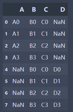
It can be found from the above results that when the join ='outer 'and the axis parameter is 0, the columns are merged, the vertical table is spliced, the missing values are filled by NaN, and the row index of the original data will be retained.
If the indexes of the two tables have no actual meaning, use the ignore_index parameter, set true, and rearrange a new index.
✨ When the axis parameter of concat() is 1 and df1 and df2 are merged, the merging result is:
| 0 | 1 | 2 | 3 | 4 | 5 | |
|---|---|---|---|---|---|---|
| 0 | A0 | B0 | C0 | B0 | C0 | D0 |
| 1 | A1 | B1 | C1 | B1 | C1 | D1 |
| 2 | A2 | B2 | C2 | B2 | C2 | D2 |
| 3 | A3 | B3 | C3 | B3 | C3 | D3 |
It can be seen that when join ='outer ', the axis parameter is 1, the rows are merged, the horizontal table is spliced, and the missing values are filled by NaN.
There are many combinations in this way of combination. We don't do too many demonstrations here. We can do more and try more.
When combining df1 and df2 when the join parameter of concat() is inner:
pd.concat([df1,df2],axis=0,join='inner')
Based on the above results, we can get:
If it is inner, you get the intersection of the two tables. If it is outer, you get the union of the two tables.
two ️⃣ merge() function
merging: the pd.merge() method can connect rows in different dataframes according to one or more keys.
The merge() function splices column data by specifying the connection key. Let's take a look at the common parameters of merge:
1.left and right: two dataframes to be mergedmerge(left, right, how='inner', on=None)
2.how: connection method, including inner, left, right and outer. The default is inner
3.on: refers to the column index name used for connection. It must exist in the left and right dataframes. If it is not specified and other parameters are not specified, the intersection of the two DataFrame column names will be used as the connection key
Run the following code to see the effect
import pandas as pd
left = pd.DataFrame({'key':['a','b','b','d'],'data1':range(4)})
print(left)

right = pd.DataFrame({'key':['a','b','c'],'data2':range(3)})
print(right)
When merge() connects two dataframes with default parameters:
pd.merge(left, right)
✨ effect
| key | data2 | data1 | |
|---|---|---|---|
| 0 | a | 0 | 0 |
| 1 | b | 1 | 1 |
| 2 | b | 1 | 2 |
merge() is used as the inner connection by default, and uses the intersection of column names (keys) of two dataframes as the connection key. Similarly, the final connected data is also the intersection of column data of two dataframes.
When two dataframs are used as outer connections:
pd.merge(left,right,on=['key'],how='outer')
✨ effect
| key | data1 | data2 | |
|---|---|---|---|
| 0 | a | 0.0 | 0.0 |
| 1 | b | 1.0 | 1.0 |
| 2 | b | 2.0 | 1.0 |
| 3 | d | 3.0 | NaN |
| 4 | c | NaN | 2.0 |
When merge() makes an outer connection, the final connected data is the union of the data of two DataFramekey columns, and the missing contents are filled by NaN.
pd.merge(left,right,on=['key'],how='left')
pd.merge(left,right,on=['key'],how='right')
The above two codes are for you to try
🚩 Above, we know about the two methods of merging data. Beginners may be confused and easily confused. Let's take an example:
For example, there are two tables that store the transaction information of September and October respectively. At this time, we can use concat() to merge the two tables along the 0 axis.
For example, there are two tables. One is transaction information, including order number, amount, customer ID and other information; The second is customer information, including customer ID, name, phone number and other information. At this time, we can use merge() to merge the two tables into a complete table according to the customer ID.
6, Data filtering
In actual work, we often need to process tens of thousands of data, especially hundreds of millions of merged data. How can we quickly screen qualified data?
Let's take the following data as an example
from pandas import Series,DataFrame

# Create a 2D list to store player information
lol_list = [['top','Nuguri',31,78],
            ['Fight wild','Tian',42,68],
            ['mid','Doinb',51,83],
            ['ADC','Lwx',74,72],
            ['auxiliary','Crisp',53,69]]
# Create dataframe
df = DataFrame(data=lol_list,
               index=['a','b','c','d','e'],
               columns=['position','ID number','Age','data'])
print(df)
#bools1 = df ['age'] > 50
#bools2 =df ['data'] > 70
#df1=df[bools1&bools2]
#print(df1)
We found people over 50
bools= df['age']>50
# First, judge whether everyone is older than 50
#If it is greater than, it will return True, indicating that the row is marked as True,
# Otherwise, it is marked as False. bools records whether each row meets the filter criteria,
# Is a Series object where the value is of type bool.
# df is filtered according to the value of each row of bools. The value is True,
# Indicates that the corresponding line will be left, otherwise, it will be removed.
Filter required data
df1=df[bools]
print(df1)
Of course, we can also select multiple criteria to filter
bools1 = df['Age']>50
bools2 =df['data']>70
df1=df[bools1&bools2]

print(df1)
In the process of data acquisition, data sorting is also a problem we often need to deal with. For example, we need to find out the user information of the top ten followers.
7, Sorting of data
In the process of data acquisition, data sorting is also a problem we often need to deal with. For example, we need to find out the user information of the top ten followers.
one ️⃣ sort_values() method
sort_index(),sort_ The values () two methods sort the data, and both of them are supported by Series and DataFrame.
1. Sort of dataframe_ The index () method sorts by row index
2.sort_values() can specify specific columns to sort.
df.sort_values(by='Age',ascending=False,inplace=True)
✨ effect
The inplace=True parameter is used to control whether to modify the original data directly, just as we have seen before.
ascending can control the sorting order. The default value is True. It is arranged from small to large. When it is set to False, the reverse order can be realized
two ️⃣ sort_index() method
Using sort_index(), you need to set the index when reading data
df = pd.read_excel('route',index_col='Index name')
Usage and sort_values is similar
df.sort_index(inplace=True,ascending=True)
df.head()
🚩 Data merging, filtering and sorting are important skills in data sorting. Just like changing a bicycle into a sports car, it will greatly improve your work efficiency. There is no shortcut to success. You must practice repeatedly and summarize diligently.
8, Data grouping, traversal, statistics
As the saying goes, "people and classes gather, and things divide into groups". Here we will learn the grouping of data and the statistics after grouping. The grouping of Pandas is simpler and more flexible than Excel.
one ️⃣ grouping
Pandas provides a flexible and efficient groupby function, which enables you to slice, chunk, summarize and other operations on data sets in a natural way.
✨ effect
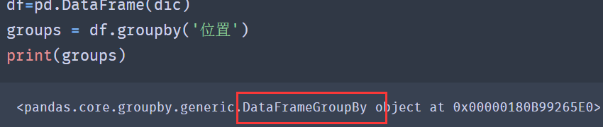
According to the results, it can be found that the result after grouping is DataFrameGroupBy object, which is a grouped object.
Using the size method of groupby, you can view the number of each group after grouping and return a Series containing the grouping size:
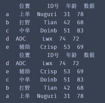
from pandas import Series,DataFrame

# Create a 2D list to store player information
lol_list = [['top','Nuguri',31,78],
            ['Fight wild','Tian',42,68],
            ['mid','Doinb',51,83],
            ['mid','Faker',38,76],
            ['ADC','Lwx',74,72],
            ['auxiliary','Crisp',53,69]]
# Create dataframe
df = DataFrame(data=lol_list,
               index=['a','b','c','d','e','f'],
               columns=['position','ID number','Age','data'])

groups = df.groupby('position')
print('----------------------------------')
✨ effect
According to the above method, we can get the proportion of each position. Don't hesitate to try in the code box below.
for i,j in groups.size().items():
    account = j/df.shape[0]
    dd="%.2f%%"%(account*100)
    print(f"{i}The proportion is{dd}")
print(groups.size())
✨ effect
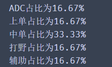
df.groupby('location ') groups the entire data according to the location column. Similarly, we can group only one column of data and keep only the column data we need.
group = df['Age'].groupby(df['position'])
# View groups
print(group.groups)
# Select grouping according to the name after grouping
print(group.get_group('mid'))
✨ effect
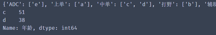
1. Code group = df ['age']. groupby(df ['position'])
Its logic is to take out the age column data in df and group the column data according to df ['location'] column data.
2. The code in the previous step can also be rewritten as group = df.groupby(df ['position'] ['age']
Its logic is to group df data through df ['position'], and then take out the grouped age column data. The effect of the two writing methods is the same.
3. The result of group.groups is a dictionary. The key of the dictionary is the name of each group after grouping, and the corresponding value is the data after grouping. This method is convenient for us to view the grouping.
4.group.get_group('medium order ') this method can obtain the data of each group according to the name of the specific group
two ️⃣ Traverse the group
Above, we calculated the proportion of each position through the two methods of group by () and size() and some skills learned before.
If we want to join, we can judge by age, groups.get_group('medium order ') can obtain the data of a group after grouping, and' medium order 'is the name of the group, so we can process a group.
from pandas import Series,DataFrame

# Create a 2D list to store player information
lol_list = [['the republic of korea','top','Nuguri',31,78],
            ['China','Fight wild','Tian',42,68],
            ['the republic of korea','mid','Doinb',51,83],
            ['the republic of korea','mid','Faker',38,76],
            ['China','mid', 'xiye',21,45],
            ['China','ADC','Lwx',74,72],
            ['China','auxiliary','Crisp',53,69]]
# Create dataframes
df = DataFrame(data=lol_list,
               index=['a','b','c','d','e','f','g'],
               columns=['country','position','ID number','Age','data'])


group = df.groupby(df['position'])['Age']
# View groups
print(group.groups)
# Select grouping according to the name after grouping
print(group.get_group('mid'))
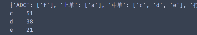
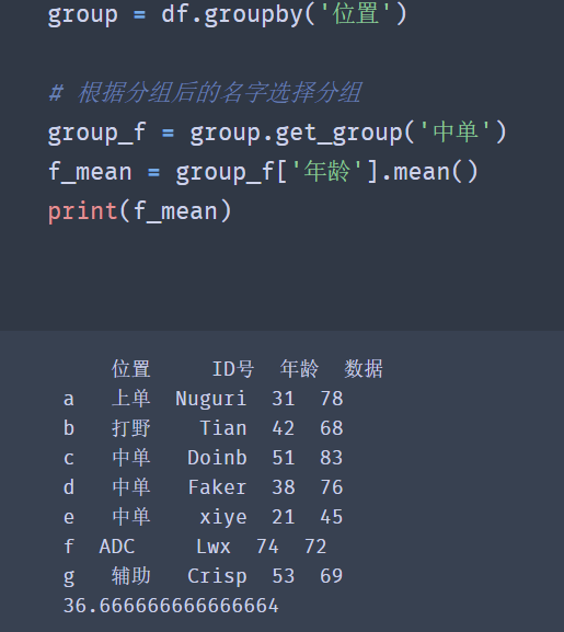
From the above figure, we can get the age of Zhongdan. Next, let's calculate their average age and maximum and minimum age (the number of samples here is small, but it does not affect the operation)
group = df.groupby('position')

# Select grouping according to the name after grouping
group_f = group.get_group('mid')
f_mean = group_f['Age'].mean()
print(f_mean)
✨ effect
🚩 Pandas common functions
| function | significance |
|---|---|
| count() | Count the number of non empty data in the list |
| nunique() | Count the number of non duplicate data |
| sum() | Count the sum of all values in the list |
| mean() | Calculate the average of the data in the list |
| median() | The median of the data in the statistical list |
| max() | Find the maximum value of data in the list |
| min() | Find the minimum value of data in the list |
You can try the other functions yourself
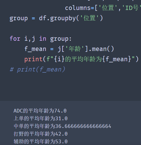
The above code successfully calculates the data we want. We can also traverse the grouped data and obtain their maximum age, minimum age and average age.
group = df.groupby('position')

for i,j in group:
    f_mean = j['Age'].mean()
    print(f"{i}The average age is{f_mean}")
# print(f_mean)
✨ effect
three ️⃣ Group by multiple columns
When our demand is more complex, if we want to divide a group of data based on the corresponding data, for example, we need to get the number of locations in each country
According to the above analysis, should we write the grouping operation of group by twice? NO, our powerful groupby() method supports grouping by multiple columns. Look down
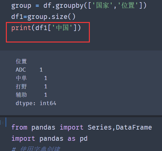
group = df.groupby(['country','position'])
df1=group.size()
print(df1)
✨ effect
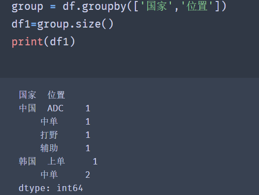
When grouping by multiple columns is required, we pass in a list in the groupby method, in which the column names on which the grouping is based are stored respectively.
Note: the order of column names in the list determines to group by country column first, and then by location column. Different order produces different group names.
How do we get a single data? It is found that the index value is multi-layer in the result returned by group.size(), so we only need to get it layer by layer
four ️⃣ Make statistics on the data after grouping
Data statistics (also known as data aggregation) is the last step of data processing. It is usually to make each array generate a single value.
pandas provides an agg() method to count the grouped data.
import pandas as pd
df = pd.read_excel('data.xlsx')
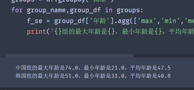
groups = df.groupby('gender')
for group_name,group_df in groups:
f_se = group_df['age'].agg(['max','min','mean'])
print('{}The maximum age of the group is{},The minimum age is{},The average age is{}'.format(group_name,f_se[0],f_se[1],f_se[2]))
#Note: the custom function name does not need to be converted into a string when passed into the agg() function.
Observing the above code, we can find that when using the agg() function, we can put multiple statistical functions together into one agg() function.
🚩 It should also be noted that if the statistical function is provided by pandas, we only need to store the name of the function in the list as a string, for example, change max() to 'Max'.
✨ effect
This not only simplifies our code, we only need to change the list in the agg() function when adding and deleting statistical functions.
For example, there is a new demand to calculate the difference between the maximum and minimum values of age. However, pandas does not provide such a statistical function, so we need to define a statistical function ourselves:
def peak_range(df):
    """
        Return value range
    """
    return df.max() - df.min()
Now let's take a look at how to use the statistical function defined by ourselves
groups = df.groupby('country')
def peak_range(df):
    """
        Return value range
    """
    return df.max() - df.min()
for group_name,group_df in groups:
    f_se = group_df['Age'].agg(['max','min','mean',peak_range])
    print(f'{group_name}The maximum age of the group is{f_se[0]},The minimum age is{f_se[1]},The average age is{f_se[2]},Maximum minus minimum{f_se[3]}')
That's all for the grouping statistical processing of data. If you want to continue to learn from it, come on!
9, Index creation, value taking and sorting
one ️⃣ Creation of multi-layer index
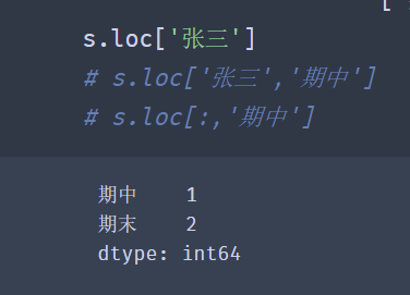
Multi level index is a core concept in Pandas, which allows you to have multiple index levels in one axis. Many students can't deal with complex data. The biggest problem is that they can't deal with multi-level index flexibly.
import pandas as pd
s = pd.Series([1, 2, 3, 4, 5, 6],
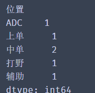
index=[['Zhang San', 'Zhang San', 'Li Si', 'Li Si', 'Wang Wu', 'Wang Wu'],
['Mid term', 'End of term', 'Mid term', 'End of term', 'Mid term', 'End of term']])
print(s)
✨ effect
Zhang Sanzhong    1
    End of term    2
 Li siqizhong    3
    End of term    4
 Wang wuqizhong    5
    End of term    6
dtype: int64
It can be seen from the data in the figure that the column of Zhang San is the first level index of the data, the column of mid-term is the second level index of the data, and the second level index value corresponds to the data one by one.
However, when we created it, we found that we also need to match the name with the examination stage one by one.
🚩 Now, we will add the scores of several subjects to the data and demonstrate the creation method of DataFrame multi-layer index.
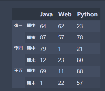
Due to the large amount of performance data, we will use numpy's random number method to construct performance data.
Numpy will be explained later. Now let's experience how to use numpy to build experimental data:
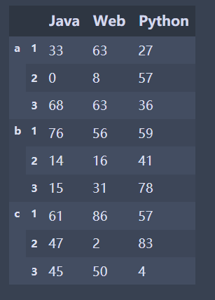
import pandas as pd
import numpy as np
#The size parameter specifies to generate an array of 6 rows and 3 columns
data = np.random.randint(0,100,size=(6,3))
names = ['Zhang San','Li Si','Wang Wu']
exam = ['Mid term','End of term']
index = pd.MultiIndex.from_product([names,exam])
df = pd.DataFrame(data,index=index,columns=['Java','Web','Python'])
df
✨ The following is the running effect, which I will show you in tabular form
| Java | Web | Python | ||
|---|---|---|---|---|
| Zhang San | Mid term | 84 | 35 | 57 |
| End of term | 96 | 36 | 92 | |
| Li Si | Mid term | 42 | 5 | 64 |
| End of term | 47 | 55 | 76 | |
| Wang Wu | Mid term | 81 | 34 | 74 |
| End of term | 54 | 81 | 69 |
Although we have successfully created a multi-layer index of DataFrame, there is a problem that there will be many duplicate index values when setting the index. How can we simplify the writing of the index?
In order to solve this problem, Pandas provides a construction method of creating multi-layer index.
pd.MultiIndex.from_ How product () builds indexes
First, determine the value of each layer index, and then pass it to from in the form of a list_ Just use the product () method.
import pandas as pd
import numpy as np

data = np.random.randint(0,100,size=(6,3))
names = ['Zhang San','Li Si','Wang Wu']
exam = ['Mid term','End of term']
index = pd.MultiIndex.from_product([names,exam])
df = pd.DataFrame(data,index=index,columns=['Java','Web','Python'])
print(df)
✨ effect
We have successfully created a multi-layer index of DataFrame, and you will find that we only need to focus on the values of each layer of index.
Different positions in the [names,exam] list will produce different indexes.
import pandas as pd
import numpy as np

data = np.random.randint(0,100,size=(6,3))
names = ['Zhang San','Li Si','Wang Wu']
exam = ['Mid term','End of term']
index = pd.MultiIndex.from_product([exam,names])
df = pd.DataFrame(data,index=index,columns=['Java','Web','Python'])
print(df)
✨ effect
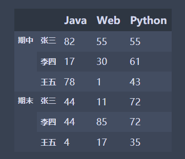
🚩 After the above two codes, let's summarize:
-
First: from_product([exam,names]) takes the first element in the list as the outermost index, and so on;
-
Second: the corresponding relationship between the element values in the list, as shown in the following figure:

two ️⃣ Value of multi-layer index
Creation is not our goal. Our goal is how to get the data we want from the multi-layer index.
Look at the code below
import pandas as pd
s = pd.Series([1,2,3,4,5,6],index=[['Zhang San','Zhang San','Li Si','Li Si','Wang Wu','Wang Wu'],
                                   ['Mid term','End of term','Mid term','End of term','Mid term','End of term']])
print(s)
You can directly use [] to take the outermost level s ['Zhang San']
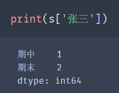
🚩 Note: [] for the value selection method, other levels other than the outermost layer cannot be directly used, for example: s ['end of period'], and the order of ['Zhang San', 'end of period'] cannot be changed.
I wonder if you still remember the use of loc and iloc?
loc uses tag index, iloc uses location index.
The use of loc is basically the same as that of []:
However, the value of iloc is not affected by the multi-layer index, but only based on the location index of the data.
import pandas as pd
import numpy as np
#The size parameter specifies to generate an array of 6 rows and 3 columns
data = np.random.randint(0,100,size=(6,3))
names = ['Zhang San','Li Si','Wang Wu']
exam = ['Mid term','End of term']
index = pd.MultiIndex.from_product([names,exam])
df = pd.DataFrame(data,index=index,columns=['Java','Web','Python'])
df.iloc[0]
✨ effect
Java      84
Web       35
Python    57
Name: (Zhang San, Mid term), dtype: int32
When the value of multi-layer index DataFrame is, we recommend using the loc() function.
Search the primary and secondary indexes at the same time:
df.loc['Zhang San'].loc['Mid term']
✨ effect
Java      84
Web       35
Python    57
Name: Mid term, dtype: int32
df.loc[('Zhang San','Mid term')]
✨ effect
Java      84
Web       35
Python    57
Name: (Zhang San, Mid term)
dtype: int32
🚩 Note: when indexing rows in the DataFrame, we have the same note as the Series, that is, we cannot directly index the secondary index. We must make the secondary index become the primary index before indexing it!
three ️⃣ Sorting of multi-level indexes
Sometimes, we need to sort the grouped or created multi-layer index data according to the index value.
Let's create a simple multi-layer index data:
import pandas as pd
data = np.random.randint(0, 100, size=(9, 3))
key1 = ['b', 'c', 'a']
key2 = [2, 1, 3]
index = pd.MultiIndex.from_product([key1, key2])
df = pd.DataFrame(data, index=index, columns=['Java', 'Web', 'Python'])
df
✨ effect
| Java | Web | Python | ||
|---|---|---|---|---|
| a | 2 | 19 | 70 | 14 |
| 1 | 27 | 6 | 14 | |
| 3 | 93 | 27 | 46 | |
| b | 2 | 35 | 88 | 87 |
| 1 | 23 | 31 | 99 | |
| 3 | 59 | 90 | 17 | |
| c | 2 | 73 | 40 | 58 |
| 1 | 14 | 86 | 87 | |
| 3 | 10 | 5 | 75 |
The method of sorting the DataFrame by row index is sort_index(), let's take a look at sort_index() is how to sort multi-level indexes.
Sorting by default:
df.sort_index()
✨ effect
The results show that each layer will be arranged in ascending order according to the index value.
df.sort_ The level parameter in index () can specify whether to arrange according to the specified level. The index value of the first level is 0 and the index value of the second level is 1.
When level = 0, it will be sorted in descending order according to the index value of the first layer: df.sort_index(level=0, ascending=False)
✨ effect
Through the above sorting, it is found that the index level of sorting can be set through level, and the indexes of other layers will also be sorted according to their sorting rules.
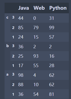
When level=1, it will be sorted in descending order according to the index value of the second layer:
✨ effect
| Java | Web | Python | ||
|---|---|---|---|---|
| c | 3 | 10 | 5 | 75 |
| b | 3 | 59 | 90 | 17 |
| a | 3 | 93 | 27 | 46 |
| c | 2 | 14 | 86 | 87 |
| b | 2 | 23 | 31 | 99 |
| a | 2 | 27 | 6 | 14 |
| c | 1 | 73 | 40 | 58 |
| b | 1 | 35 | 88 | 87 |
| a | 1 | 19 | 70 | 14 |
🚩 It can be seen from the results that the data will be arranged in descending order according to the index values of the second layer. If the index values are the same, they will be arranged according to the index values of other layers.
10, Date and time data type
In the fields of finance, economy, physics and so on, it is necessary to observe or measure data at multiple time points, which produces data about time series.
Time Series Data is data collected at different times. This kind of data is collected in chronological order to describe the changes of phenomena over time.
It is very important to learn how to skillfully process time series data. Pandas provides us with a powerful method of time series data processing.
one ️⃣ datetime module
The Python standard library contains the data types of date and time data. The datetime module is the most extensive module to start processing time data.
# Creation time
import datetime
time = datetime.time(13, 14, 20)
print(time)
# Get hours
print(time.hour)
# Get minutes
print(time.minute)
# Get seconds
print(time.second)
Use of time type:
# Creation time
import datetime
time = datetime.time(13, 14, 20)
print(time)
# Get hours
print(time.hour)
# Get minutes
print(time.minute)
# Get seconds
print(time.second)
Combination of date and time – datetime:
import datetime
# Creation date and time
datetime = datetime.datetime(2019, 9, 9, 13, 14, 20)
print(datetime)
# Acquisition year
print(datetime.year)
# Get month
print(datetime.month)
# Acquisition day
print(datetime.day)
# Get hours
print(datetime.hour)
# Get minutes
print(datetime.minute)
# Get seconds
print(datetime.second)
The time method of datetime can create time, the date method can create date, and the datetime method is a combination of date and time.
The corresponding date or time values can be obtained through the year, month, day, hour, minute and second attributes.
Similarly, the current time can be obtained by using the datetime.now() method
🚩 Try to run the above code yourself. There is no demonstration here. so easy
Now we know how to use the datetime module to create time, but sometimes we may need to convert the datetime type to string style.
For example, convert Aug-23-19 20:13 of string type to datetime of 2019-08-23 20:13:00 style.
import datetime
strp = datetime.datetime.strp
time('may-23-19 20:13', '%b-%d-%y %H:%M')
print(strp)
✨ effect
2019-05-23 20:13:00
Some partners will ask, "the output of datetime.datetime(2019, 9, 9, 13, 14, 20) is not 2019-9-9 13:14:20? Why do you need to change?".
Yes, the result is the style we want, but it should be noted that its type is datetime, not str.
If we just want to change the type, we can use cast:
import datetime
date_time = datetime.datetime(2019, 9, 9, 13, 14, 20)
print(type(date_time))
str_date_time = str(date_time)
print(str_date_time)
print(type(str_date_time))
✨ effect
<class 'datetime.datetime'>
2019-09-09 13:14:20
<class 'str'>
However, I want to make a requirement: convert datetime.datetime(2019, 9, 9, 13, 14, 20) into a string of 9 / 9 / 2019 13:14 style.
two ️⃣ strftime() method
Don't panic, use the strftime() method to solve itimport datetime
date_time = datetime.datetime(2019, 9, 9, 13, 14, 20)
str_time = date_time.strftime('%m/%d/%Y %H:%M')
str_time
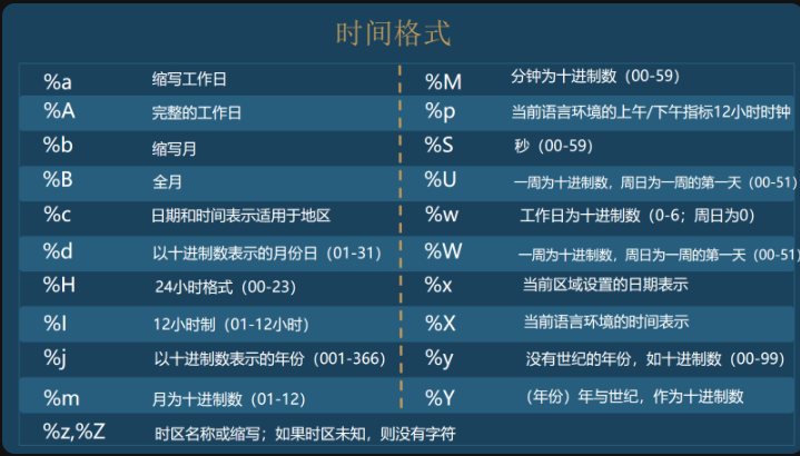
The time format is summarized as follows:
So how to convert str type to datetime type.
three ️⃣ strptime() method
For example, convert Aug-23-19 20:13 of string type to datetime of 2019-08-23 20:13:00 style. Similarly, use the strptime() method.import datetime
strp = datetime.datetime.strptime('Aug-23-19 20:13', '%b-%d-%y %H:%M')
print(strp)
print(type(strp))
🚩 The strptime() method is used to convert the string time into datetime format. It should be noted that the time is output in a certain format.
For example, the second parameter cannot be written as% B -% d -% Y% H:% m, or% B /% D /% Y% H:% M
11, Basis of Pandas time series
Earlier, we learned about the processing methods of Python's built-in datetime module for time and date. Next, let's take a look at the processing methods of Pandas.
Use the date of Pandas_ The range () method can quickly create a date range.
pd.date_range(start=None,end=None,periods=None,freq="D")
- Start: the start of the date range;
- End: end of date range;
- periods: number of fixed dates;
- freq: Date offset. The value is string,
The default is'D ', that is, one day is the date offset
import pandas as pd
import time
#Create using start and periods and the default frequency parameters:
dat = pd.date_range(start='20010919', periods=10, freq="D")
#Create for 10 days using start and end and frequency parameter freq:
date = pd.date_range(start='20190808', end='20190921', freq="10D")
print(date)
print(dat)
✨ effect
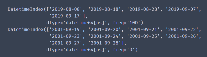
The combination of start, end and freq can generate a set of time indexes with frequency freq within the range of start and end.
The combination of start, periods and freq can generate a time index with a frequency of freq from start.
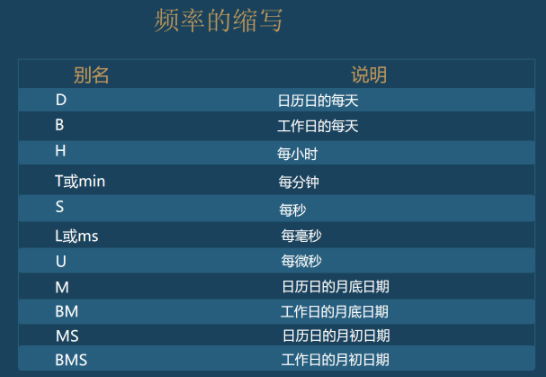
More abbreviations for frequency:
Sometimes we will analyze the data of a day or a month, which requires us to set the time as the data index, and then obtain the data within a certain time range through the time index for analysis.
Now let's create a Series data indexed by time Series.
import pandas as pd
time_index = pd.date_range('2019-01-01', periods=365)
print(time_index)
Then, use the random number of numpy to create 365 random integers:
import numpy as np
time_data = np.random.randint(100,size=365)
Finally, create Series data indexed by time Series, run the following code to see the data:
import pandas as pd
import numpy as np
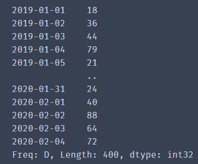
time_index = pd.date_range('2019-01-01', periods=400)
time_data = np.random.randint(100,size=400)
date_time = pd.Series(data=time_data,index=time_index)
print(date_time)
✨ effect
Now that the data has been successfully created and the time index value has been set as the index item of the data, the next focus is how to obtain the data according to the time series index?
You can index by year:
date_time['2020']
It can be indexed by year and month:
date_time['2019-10']
You can slice data using a timestamp
date_time['2019-10-05':'2019-10-10']
🚩 When obtaining data, you can directly use the form of string and slicing operation.
Sometimes when importing time data with csv, the default is the data type of string. When visualizing, there will be no drawing in chronological order, so it is necessary to parse the string into the data type of time type.
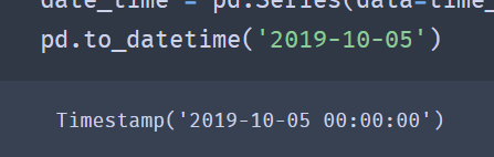
pd.to_datetime(arg,format=None)
- arg: data to be modified
- Format: format of data
- to_ The datetime () method will convert the time of string type to Timestamp('2019-10-05 00:00:00 ').
✨ effect
If you want to modify the time format, you can also use to_ The pydatetime () method converts the Timestamp type to the datetime type.
pd.to_datetime('2019-10-05').to_pydatetime()
It should be noted that the string date contains Chinese, which can be handled as follows:
pd.to_datetime('2019 October 10',format='%Y year%m month%d day')
There are many fancy methods like this. Let's try it by ourselves
💙 If you can see this, you have succeeded 99%. The next step is about data visualization, which is very dependent on the previous foundation. Therefore, it is recommended to be familiar with the previous data processing and learn the following data visualization. 💙
12, First meet Matplotlib
Previously, we have learned how to use Python to simply process data. As the saying goes, "the text is not as good as the table, and the table is not as good as the graph". If we draw a large amount of data into a graph, we can make our data more intuitive and persuasive
one ️⃣ What is Matplotlib
Matplotlib is a Python 2D drawing library, which can generate publishing quality graphics in various hard copy formats and interactive environments on various platforms.
Matplotlib tries to make simple things easier and make impossible things possible. It is also one of the most commonly used visualization tools in Python. Its function is very powerful. It can easily and conveniently draw various common images in data analysis by calling functions, such as line chart, bar chart, histogram, scatter chart, pie chart, etc.
two ️⃣ Types and significance of common graphics
Choice is the most important. The results of one choice and another may be very different. Before we visualize the data, we also need to select the graphics to draw the data according to the characteristics of the graphics, so that we can quickly find the characteristics of the data.
Next, let's learn about the types and significance of common graphics in Matplotlib.
1. Line chart
A statistical chart showing the increase or decrease of a statistical quantity by the rise or fall of a broken line
Features: it can display the change trend of data and reflect the change of things. (change)
2. Scatter diagram
Two sets of data are used to form multiple coordinate points, investigate the distribution of coordinate points, judge whether there is some correlation between the two variables, or summarize the distribution mode of coordinate points.
Features: judge whether there is quantitative correlation trend between variables and display outliers (distribution law).
3. Histogram
Data arranged in columns or rows of a worksheet can be drawn into a histogram.
Features: draw discrete data, can see the size of each data at a glance, and compare the differences between data. (Statistics / comparison)
4. Histogram
The data distribution is represented by a series of longitudinal stripes or line segments with different heights.
Generally, the horizontal axis represents the data range and the vertical axis represents the distribution.
Features: draw continuous data to show the distribution of one or more groups of data (Statistics).
5. Pie chart
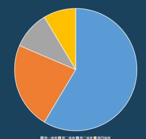
It is used to represent the proportion of different classifications and compare various classifications by radian size.
Features: proportion of classified data (proportion).
Of course, in addition to these common graphs, matplotlib can also draw some other images. Then, how are these graphs drawn?
three ️⃣ Understanding Matplotlib image structure
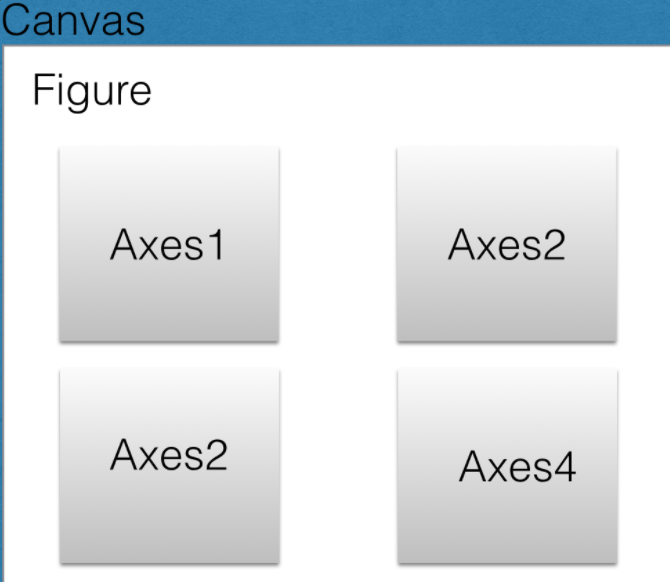
Generally, we can divide a Matplotlib image into three layers:
1. The first layer is the bottom container layer, mainly including Canvas, Figure and Axes;
2. The second layer is the auxiliary display layer, mainly including axis, spines, grid, legend, title, etc;
3. The third layer is the image layer, that is, the image drawn by plot, scatter and other methods.
1. First floor
The first layer is the bottom container layer, mainly including Canvas, Figure and Axes;
Canvas is the system layer at the bottom. It acts as a Sketchpad in the process of drawing, that is, a tool for placing canvas, which is generally inaccessible to users.
Axes is the second layer of the application layer, which is equivalent to the role of the drawing area on the canvas during the drawing process. A Figure object can contain multiple axes objects. Each axis is an independent coordinate system. All images in the drawing process are drawn based on the coordinate system.
2. Second floor
The second layer is the auxiliary display layer, mainly including axis, spines, grid, legend, title, etc;
The auxiliary display layer is the content in axes (drawing area) except the image drawn according to the data, mainly including
Axes appearance (facecolor), border lines (spines), axis, axis name (axis)
Label, tick, tick
label), grid, legend, title, etc.
3. Third floor
The third layer is the image layer, that is, the image drawn by plot, scatter and other methods.
The image layer refers to the image drawn according to the data through functions such as plot, scatter, bar, histogram and pie in Axes.
🚩 Sum up
Canvas (drawing board) is located at the bottom, which is generally inaccessible to users
Figure (Canvas) is built on Canvas
Axes (drawing area) is built on Figure
axis, legend and other auxiliary display layers and image layers are built on Axes
four ️⃣ Initial experience of line chart
Like Pandas, before using Matplotlib, we need to add its module. Because we use the pyplot module of Matplotlib for graphics rendering, we need to import the pyplot module.
from matplotlib import pyplot as plt
We imported the pyplot module from the matplotlib package and renamed it plt. When writing code, we can call the method directly using plt.
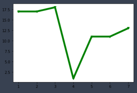
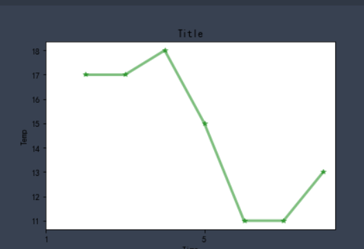
#When using Jupiter notebook, call the plot function plot() of matplotlib.pyplot
# When drawing or generating a figure canvas, you need to add% matplotlib
%matplotlib inline


from matplotlib import pyplot as plt
x = range(1,8)
y = [17, 17, 18, 1, 11, 11, 13]
plt.plot(x,y)
plt.show()
Code meaning
To draw a two-dimensional graph, you need to determine the X and Y values: the value of the midpoint of the graph (the number of X and Y values should be the same) plot. Plot (x, y): draw a broken line graph according to the transmitted X and Y valuesplt.show(): displays the drawn graph
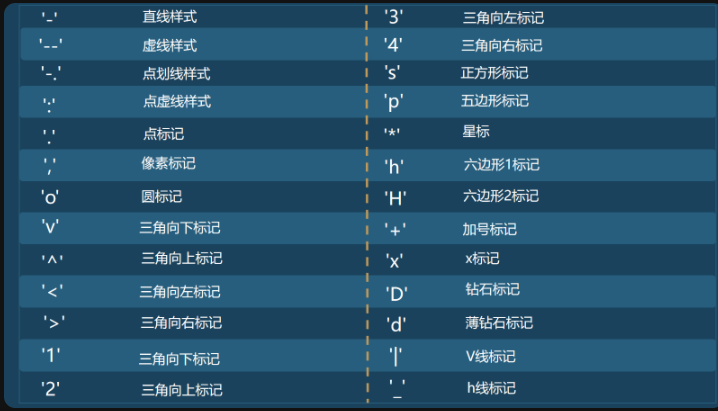
How to set the color, break point and width of the broken line
plt.plot(x, y, color='green',alpha=1,linestyle='-',linewidth=5,marker='v')
plt.show()
✨ effect
color='green ': sets the color of the line
alpha=0.5: set the transparency of the line to make it feel like leakage but not leakage. inestyle = '-': set the style of the line-
Solid, --- dashed, -. Dashedot, -: dotted
linewidth=3: set the width of the line marker='o ': set the style of the break point
Here are various styles of break points
1. Set title
The most important thing for a graph is the drawing of the content, followed by the title. We need to let others know what the meaning of the graph is, what the x-axis represents and what the y-axis represents. At this time, we need to add some titles to the image.
%matplotlib inline

from matplotlib import pyplot as plt
x = range(1,8)
y = [17, 17, 18, 15, 11, 11, 13]
plt.plot(x, y, color='green',alpha=0.5,linestyle='-',linewidth=3,marker='*')
plt.xlabel('Time')
plt.ylabel("Temp")
plt.title('Title')
plt.show()
✨ effect
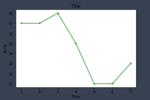
🚩 As a result, we found that the x-axis title, y-axis title and picture title were successfully added through plt.xlabel('Time '), PLT. Ylabel ('temp') and plt.title('Title '), so that we can clearly see the meaning of the picture and each axis.
2. Chinese display
I believe you have encountered such a problem when practicing. The pictures drawn with Matplotlib don't show Chinese. How can it be done
If you want Matplotlib to display Chinese, we can use three methods:
The first method: directly modify the Matplotlib configuration file matplotlibrc
The second is to dynamically modify the configuration
Third: set custom font
We use the third method, because the customized font has a high degree of freedom, and it is also convenient for us to use different styles of fonts in a drawing.
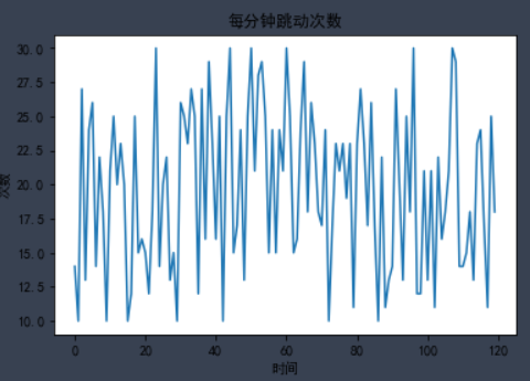
plt.rcParams['font.sans-serif'] = ['SimHei']     #This method is used under windows
plt.rcParams['font.family'] = 'Arial Unicode MS' #This method is used under mac
Let's try the following code
%matplotlib inline
from matplotlib import pyplot as plt
from matplotlib import font_manager
import random
# Create font object
plt.rcParams['font.sans-serif'] = ['SimHei']     #This method is used under windows
y = [random.randint(10,30) for i in range(120)]
# Add font properties
plt.ylabel("frequency")
plt.xlabel("time")
# Set title
plt.title('Beats per minute')
plt.plot(x,y)
plt.show()
✨ effect
3. Customize X-axis scale
In the process of writing, I found two problems:
- The text of the scale is too long, but the width of the picture is not enough.
- The x-axis and y-axis scales are generated by default based on the X and Y values, and Matplotlib generates the scale spacing it deems appropriate by default.
These conditions cause the scale values of the x-axis to overlap
To change the size of the image, we need to change the size of the canvas. The statement for setting the graphic size in matplotlib is as follows:
plt.figure(figsize=(a, b), dpi=dpi)
Of which:
- figsize sets the size of the drawing. a is the width of the drawing, b is the height of the drawing, and the unit is inches
- dpi sets the number of points per inch of the graph, that is, how many pixels per inch
We set the width and height of the graph to 20 and 10 inches respectively, and the resolution to 80. It is found that the overlapping effect of the x-axis is reduced. But what if we encounter a long scale in the future?
plt.figure(figsize=(20, 20),dpi=80)
Show bottom image
✨ effect
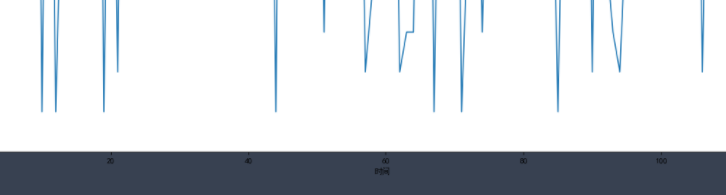
Do we have to continue to modify the width and height? The answer must be No. if we continue to zoom in, the graph will become large, which is not the effect we want. Therefore, not all scale problems can be solved by changing the size of the picture.
If we can set the x-axis scale by ourselves, isn't it perfect? We can set the density and scale value of the x-axis scale according to our own ideas.
Of course, there is a solution. Use plt.xticks() to customize the scale of the x-axis
xticks(locs, [labels], **kwargs)
The locks parameter is an array parameter, indicating where the tick mark of x-axis is displayed, that is, where the ticks are placed
The second parameter is also an array parameter, which represents the label added at the position represented by the LOC array.
plt.xticks(range(0,len(x),4),x[::4],rotation=45)
✨ effect
range(0,len(x),4) is the first parameter of xticks(). The scale density of X axis is adjusted according to the number of X values.
x[::4] is the second parameter of xticks(), or the value of x is used as the label value of the scale, but some of them are obtained here to ensure that the number of the first parameter and the second parameter are the same.
rotation=45 the default scale value is written horizontally, so there will be some overlap. Therefore, we rotate the text to 45 degrees.
4. One drawing and multiple lines
To draw two polylines in a coordinate system, you only need to use the plot. Plot () method twice. Look at the code below.
%matplotlib inline

from matplotlib import pyplot as plt
x = range(1,8)
y = [17, 17, 18, 15, 11, 11, 13]
z=[11,4,2,6,7,1,8]
plt.plot(x, y, color='green',alpha=0.5,linestyle='-',linewidth=3,marker='*')
plt.plot(x,z)

plt.xticks(range(0,len(x),2),x[::2],rotation=0)
plt.xlabel('Time')
plt.ylabel("Temp")
plt.title('Title')
plt.show()
✨ effect
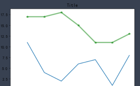
To draw two polylines in a coordinate system, you only need to use the plot. Plot () method twice.
However, we don't know which line is which line through the graphics. Therefore, we should add corresponding legend in the image to indicate the function of each line.
plt.legend() method is the method of adding legend to graphics, but this method is special. It takes two steps to successfully add legend. Let's run the code to see the effect of legend:
plt.plot(x, y, color='green',alpha=0.5,linestyle='-',label='green')
plt.grid(alpha=0.8)
plt.plot(x,z,label='blue')
plt.legend()
✨ effect
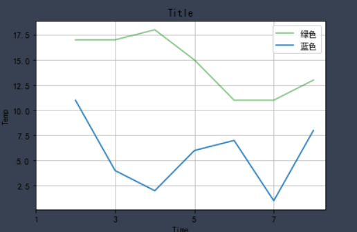
Careful friends will find that we not only added legends in the results, but also found many grids in the graphics.
Yes, this line of code plt.grid(alpha=0.4) is added to the code. This line of code is the effect of adding grid. alpha=0.4 in this line is to set the transparency of grid lines, and the range is (0 ~ 1).
The purpose of drawing grid is to help us better observe the x value and y value of data.
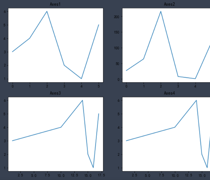
5. Multiple coordinate system subgraphs in one drawing
You can create a subgraph on the canvas by calling the plot. Subplot() function,
plt.subplot(nrows, ncols, index)
Functional
The nrows parameter specifies how many rows the data graph area is divided into;
The ncols parameter specifies how many columns the data graph area is divided into;
The index parameter specifies which region to get.
Axes1, Axes2, Axes3 and Axes4 represent four regions respectively.
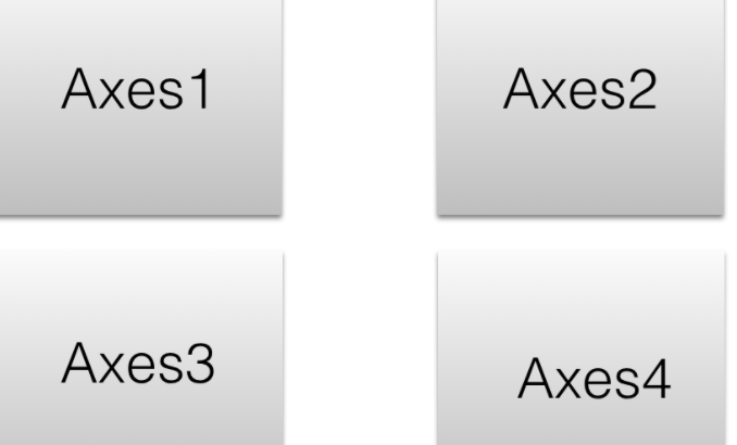
Try running the following code
%matplotlib inline
from matplotlib import pyplot as plt
import numpy as np
x = [1,10,14,15,16,17]
y = np.array([3,4,6,2,1,5])

plt.figure(figsize = (10,8))
# First subgraph
# Line chart
plt.subplot(2, 2, 1)
plt.plot(y)
plt.title('Axes1')
#Second subgraph
# Line graph, y-axis, cube of each data
plt.subplot(2, 2, 2)
plt.plot(y**3)
plt.title('Axes2')
#Third subgraph
# Line chart, x-axis and y-axis specify data
plt.subplot(2, 2, 3)
plt.plot(x,y)
plt.title('Axes3')

plt.subplot(2, 2, 4)
plt.plot(x,y)
plt.title('Axes4')
plt.show()#When there are multiple show s, a Sketchpad will be restarted
✨ effect
🚩 Here, I believe you have a certain understanding of matplotlib. These functions and methods do not need to memorize, but need to type more code. After a long time, you can naturally come at your fingertips.
13, Drawing of other common images
one ️⃣ Histogram
The histogram is applicable to two-dimensional data sets (each data point includes two values x and y), but only one dimension needs to be compared. For example, annual sales is two-dimensional data, and "year" and "sales" are its two dimensions, but only the "sales" dimension needs to be compared.
When drawing a line chart, we use the plt.plot() method, while when drawing a column chart, we use the plt.bar() function:
plt.bar(x,height,width,color)
Code parameters:
x: Record the label on the x-axis
Height: record the height of each column
Width: sets the width of the column
Color: sets the color of the column and passes in the list of color values, for example:
['blue','green','red'].
Here we use the relationship between the film and the box office to show the advantages of the histogram. It doesn't matter if you don't understand it. Here's the code explanation
%matplotlib inline
from matplotlib import pyplot as plt
a = ['Wandering the earth','Crazy aliens','Gallop life','Bumblebee','Bear haunt·primeval ages','King of new comedy']
b = [38.13,19.85,14.89,11.36,6.47,5.93]
plt.rcParams['font.sans-serif'] = ['SimHei']     #This method is used under windows

plt.figure(figsize=(20,8),dpi=80)

# Draw histogram
rects = plt.bar(a,b,width=0.2,color=['red','green','blue','cyan','yellow','gray'])
plt.xticks(a,)
plt.yticks(range(0,41,5),range(0,41,5))

# Label bar chart (horizontal center)
for rect in rects:
    height = rect.get_height()
    plt.text(rect.get_x() + rect.get_width() / 2, height+0.3, str(height),ha="center")
plt.show()
✨ effect
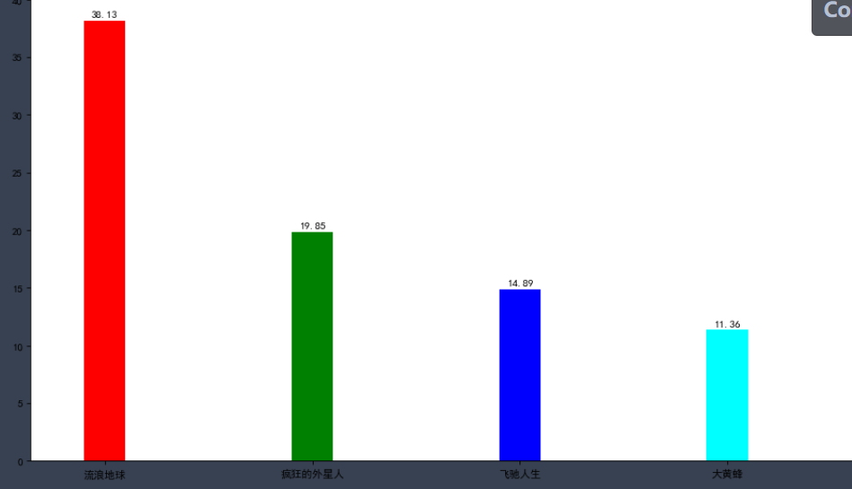
We used the plt.text() function to label the height value for each column.
plt.text(x,y,s,ha,va)
In function:
The first two parameters are the coordinates of the labeled data, x and y coordinates,
Parameter s records the marked content,
The parameters ha and va are used to set the horizontal and vertical alignment respectively
rects is the return value of plt.bar(), which contains each column. Adding numerical labels for each column needs to be added one by one, so we set a loop to complete this operation.
for rect in rects:
    height = rect.get_height()
    plt.text(rect.get_x() + rect.get_width() / 2, height+0.3, str(height),ha="center")
Through get_height(),get_x(),rect.get_width() and other methods can get the height of the column, the x value of the left side and the width of the column respectively. Then, use plt.text to add text so that you can clearly see the height of each column.
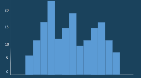
two ️⃣ histogram
Histogram is generally used to describe equidistant data, and histogram is generally used to describe name (category) data or sequence data.
Intuitively, each long bar of histogram is connected together to represent the mathematical relationship between data;
There is a gap between the long bars of the bar chart to distinguish different classes.
plt.hist(data, bins, facecolor, edgecolor)
Common parameters
Data: data used for drawing
bins: controls the number of intervals in the histogram
facecolor: the fill color of the rectangle
edgecolor: the border color of the bar
%matplotlib inline
from matplotlib import pyplot as plt
time = [131,  98, 125, 131, 124, 139, 131, 117, 128, 108, 135, 138, 131, 102, 107, 114,
        119, 128, 121, 142, 127, 130, 124, 101, 110, 116, 117, 110, 128, 128, 115,  99,
        136, 126, 134,  95, 138, 117, 111,78, 132, 124, 113, 150, 110, 117,  86,  95, 144,
        105, 126, 130,126, 130, 126, 116, 123, 106, 112, 138, 123,  86, 101,  99, 136,123,
        117, 119, 105, 137, 123, 128, 125, 104, 109, 134, 125, 127,105, 120, 107, 129, 116,
        108, 132, 103, 136, 118, 102, 120, 114,105, 115, 132, 145, 119, 121, 112, 139, 125,
        138, 109, 132, 134,156, 106, 117, 127, 144, 139, 139, 119, 140,  83, 110, 102,123,
        107, 143, 115, 136, 118, 139, 123, 112, 118, 125, 109, 119, 133,112, 114, 122, 109,
        106, 123, 116, 131, 127, 115, 118, 112, 135,115, 146, 137, 116, 103, 144,  83, 123,
        111, 110, 111, 100, 154,136, 100, 118, 119, 133, 134, 106, 129, 126, 110, 111, 109,
        141,120, 117, 106, 149, 122, 122, 110, 118, 127, 121, 114, 125, 126,114, 140, 103,
        130, 141, 117, 106, 114, 121, 114, 133, 137,  92,121, 112, 146,  97, 137, 105,  98,
        117, 112,  81,  97, 139, 113,134, 106, 144, 110, 137, 137, 111, 104, 117, 100, 111,
        101, 110,105, 129, 137, 112, 120, 113, 133, 112,  83,  94, 146, 133, 101,131, 116,
        111,  84, 137, 115, 122, 106, 144, 109, 123, 116, 111,111, 133, 150]
plt.rcParams['font.sans-serif'] = ['SimHei']     #This method is used under windows

# 2) Create canvas
plt.figure(figsize=(20, 8), dpi=100)

# 3) Draw histogram
# Set group spacing
distance = 2
# Number of calculation groups
group_num = int((max(time) - min(time)) / distance)
# Draw histogram
plt.hist(time, bins=group_num)

# Modify x-axis scale display
plt.xticks(range(min(time), max(time))[::2])

# Add grid display
plt.grid(linestyle="--", alpha=0.5)

# Add x, y axis description information
plt.xlabel("Movie duration size")
plt.ylabel("Movie data volume")

# 4) Display image
✨ effect
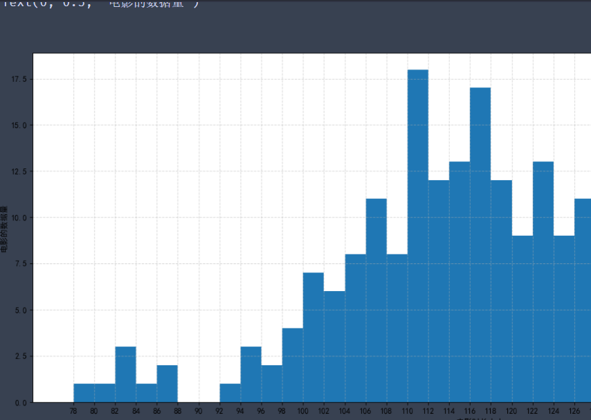
In this way, we draw the distribution state histogram of these movie durations. The longest movies we see are between 110 and 112.
In fact, the focus of drawing histogram is to set the group distance, and then divide it into several groups. The frequency of each set of data is represented by the height of the rectangle.
So what's the difference between histogram and column chart.
First, in the column chart, the height of the column is used to represent the value of each category, the horizontal axis is used to represent the category, and the width is fixed; The histogram represents the frequency or frequency of each group with the height of the rectangle, and the width represents the group distance of each group, so its height and width are meaningful.
Second, histograms are mainly used to display continuous numerical data, so rectangles are usually arranged continuously; The column chart is mainly used to display the classified data, which is often arranged separately.
three ️⃣ Scatter diagram
Scatter chart is used to judge whether there is a quantitative correlation trend between variables and show outliers. The coordinate position of each point is determined by the value of the variable and completed by a group of unconnected points to observe the correlation between the two variables. For example, height weight, temperature dimension.
Common parameters:
x. Y: array
s: The size of the point in the scatter chart, optional
c: The color of the dot in the scatter chart, optional
marker: the shape of the scatter chart, optional
alpha: indicates transparency. It takes value from 0 to 1 and is optional
linewidths: indicates the line thickness, optional
plt.scatter(x,y,s,c,marker,alpha,linewidths)
Let's use random numbers to demonstrate the scatter diagram
import pandas as pd
import numpy as np

data = np.random.randint(100, 200, size=(100, 2))

df = pd.DataFrame(data,columns=['height', 'weight'])
df.sort_index(level=0)# Set drawing size
plt.figure(figsize=(20,8),dpi=80)
# Scatter plot using scatter
plt.scatter(df['height'],df['weight'],alpha=0.5,c='blue')
plt.show()
✨ effect
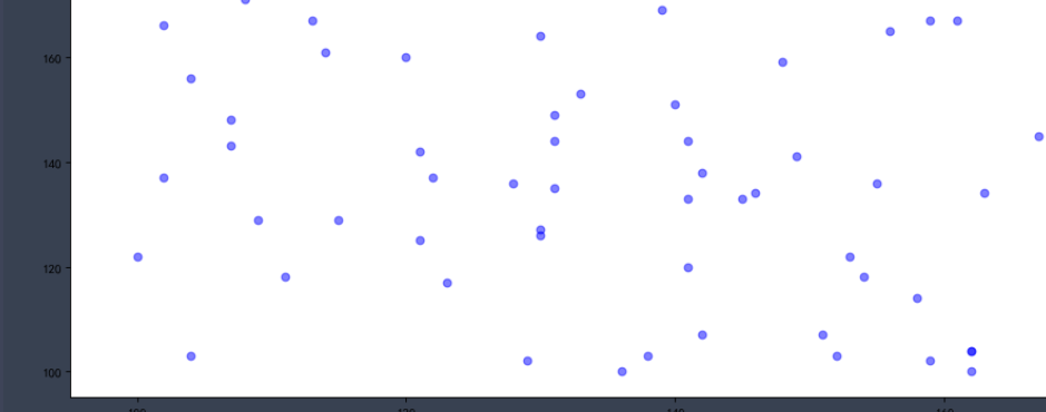
Take the height and weight data as the x-axis and y-axis data of the scatter chart respectively, and set the color of the point to blue and the transparency to 0.5. In this way, we successfully draw the scatter diagram of height and weight.
Because this is not real data, it has no reference value and is only used for demonstration.
four ️⃣ Pie chart
Startangle: sets the starting drawing angle. By default, the drawing starts from the positive direction of the x axis counterclockwise. If startangle=90 is set, the drawing starts from the positive direction of the y axis
The pie chart shows the proportion of classified data, which reflects the proportion of a certain part in the whole, such as the percentage of poor people in the total population.
The whole circle of the pie chart represents the total data, and each sector represents each data. We can clearly see the proportion of each sector in the total data according to the angle of the sector.
plt.pie(x, labels, autopct, shadow, startangle)
Common parameters
x: Data used for drawing
labels: used to set the display description text on the outside of each sector in the pie chart
autopct: set the percentage data in the pie chart. You can use format string or format function. For example, '%. 1f%%' means to keep 1 decimal place after the decimal point
Shadow: indicates whether to draw a shadow under the pie chart. The default value is False, that is, no shadow is drawn
Because the amount of data is too large, only the core code is demonstrated here, and the word "data" can only be used to obtain data
from matplotlib import pyplot as plt
import pandas as pd

plt.rcdefaults()
plt.rcParams['font.sans-serif'] = ['SimHei']

df = pd.read_csv('data')
# grouping
groups = df.groupby(by='Large classification').size()
# Draw pie chart
plt.pie(groups,labels=groups.index, autopct='%.1f%%',startangle=90)
# Graphic display
plt.show()
✨ effect
df.groupby('Big classification '). Size() groups the original data according to the type variable classification, uses the groupby function, then calculates the data amount of each group of data, and uses the size() function to record the output data as num. (if you forget, you can go back and have a look)
plt.pie() will have three return values
patches: matplotlib.patches.Wedge list (fan instances)
l_text: label matplotlib.text.Text list (label instances)
p_text: label matplotlib.text.Text list (percentage label instances)
🚩 These are the common images. You can knock the code yourself and get familiar with it.
14, Draw a double Y coordinate system
Previously, we learned the drawing process and common settings of Matplotlib and the drawing methods of common statistical charts.
At the same time, we also found that there are some problems in the graphics drawn by Matplotlib, such as how to draw the double Y-axis coordinate system? How to remove the default border of a drawing? And how to move the coordinates to the specified position? Let's see how to solve it
one ️⃣ twinx() function
Key function of double y-axis drawing: twinx().
The twinx() function means to share the x-axis, which means that the x-axis uses the same tick mark.
Use the Axes coordinate axis instance to call the twinx() function to achieve the effect that two Y Axes share an X axis.
Using add_subplot adds an axis instance.
%matplotlib inline
import pandas as pd

from matplotlib import pyplot as plt
x = range(1,8)
y = [17, 13, 18, 15, 16, 11, 10]
plt.rcParams['font.sans-serif'] = ['SimHei']     #This method is used under windows

fig = plt.figure(figsize=(20,8),dpi=80)
ax = fig.add_subplot(111)
lin1 = ax.plot(x,y,label='Opening price',color='red')
ax.legend(loc=0)
ax.set_ylabel("Opening price(element)")
ax.set_xlabel("date")


plt.show()
Because we will use the Axes coordinate axis instance to call the twinx() function, so as to achieve the effect that two Y Axes share one X axis.
ax2 = ax.twinx()
ax.twinx() is to create a coordinate axis instance sharing the X axis within the coordinate axis of ax.
%matplotlib inline
import pandas as pd

from matplotlib import pyplot as plt
x = range(1,8)
y = [17, 13, 18, 15, 16, 11, 10]
z=[11,19,7,2,12,86,16]
plt.rcParams['font.sans-serif'] = ['SimHei']     #This method is used under windows

fig = plt.figure(figsize=(20,8),dpi=80)
ax = fig.add_subplot(111)
lin1 = ax.plot(x,y,label='Opening price',color='red')
ax.legend()
ax.set_ylabel("Opening price(element)")
ax.set_xlabel("date")

ax2=ax.twinx()
lin2=ax.plot(x,z,label='Closing price',color='blue')

ax2.legend()
ax2.set_ylabel('Closing price',)
#Merge column
lns = lin1+lin2
labs = [l.get_label() for l in lns]
ax2.legend(lns,labs)
plt.show()
✨ effect
The way to merge legends is to use the legend() function of only one axis.
Lin1 and lin2 are the return values of the two drawing methods plot(), that is, the polyline object. Note that the types of lin1 and lin2 are list.
The legend() method can specify which values are in the legend,
The first parameter lns means that multiple lines in the figure are passed in as a list,
The second parameter, labs, means that the name of the legend is passed in as a list.
two ️⃣ De border
In the above figure, one is the image drawn by Matplotlib by default, and the other is to modify some default display methods of Matplotlib.
When drawing graphics, Matplotlib will display the upper and right borders by default, and the color of the coordinate axis is black by default.
If you want to remove the default border, get the current Axes object through plt.gca()
ax = plt.gca()
Use the spines property to get the corresponding border.
ax.spines['right']
Right right border, left border, top border, bottom border.
By set_ The color ('none ') method can set the color of the border.
ax.spines['right'].set_color('none')
For the color setting, none means colorless. You can also use English words such as red and blue or hexadecimal color values #0000FF.
import matplotlib.pyplot as plt
y = range(0,14,2)
x = [-3,-2,-1,0,1,2,3]

# Gets an image of the current chart
ax = plt.gca()

# Sets the bounding line of the pattern
ax.spines['right'].set_color('none')
#ax.spines['top'].set_color('none')
#ax.spines['bottom'].set_color('red')
#ax.spines['left'].set_color('#0000FF')

plt.plot(x,y)
plt.show()
We have successfully set the border color, but another problem is that the intersection of coordinate axes is also set by default.
three ️⃣ Move axis
If you want the 0 point on the X axis to cross the 0 point on the Y axis, you need to use set_ The position method moves the position of the coordinate axis.
ax.spines['bottom'].set_position(('data', 0))
Set the moving range of the bottom edge to the 0 position of the Y axis
data: move the position of the axis to the specified coordinates of the cross axis.
Run the following code to move the X-axis and Y-axis to the (0, 0) point.
Try the following code to move the X-axis and Y-axis to the (0, 0) point.
import matplotlib.pyplot as plt
import numpy as np
y = range(0,14,2) # Position of x-axis
x = [-3,-2,-1,0,1,2,3]
# plt.figure(figsize=(20,8),dpi=80)

# Gets an image of the current chart
ax = plt.gca()

# Sets the bounding line of the pattern
ax.spines['right'].set_color('none')
ax.spines['top'].set_color('none')
ax.spines['bottom'].set_color('blue')
ax.spines['left'].set_color('red')

ax.spines['bottom'].set_position(('data', 2))
ax.spines['left'].set_position(('data', 1))

plt.plot(x,y)
plt.show()
✨ effect
How to draw a double Y-axis coordinate system, how to remove the default border of the drawing, and how to move the coordinates to the specified position. That's it. Now we have reached the advanced stage, new knowledge.
15, Seaborn
Earlier, we learned how Pandas processes data and visualizes data with Matplotlib. In today's course, we will experience a more attractive drawing tool called Seaborn.one ️⃣ seaborn introduction
Seaborn carries out more advanced packaging on the basis of Matplotlib, which makes the drawing more convenient and fast. You can make very beautiful graphics with analytical value through very simple code.
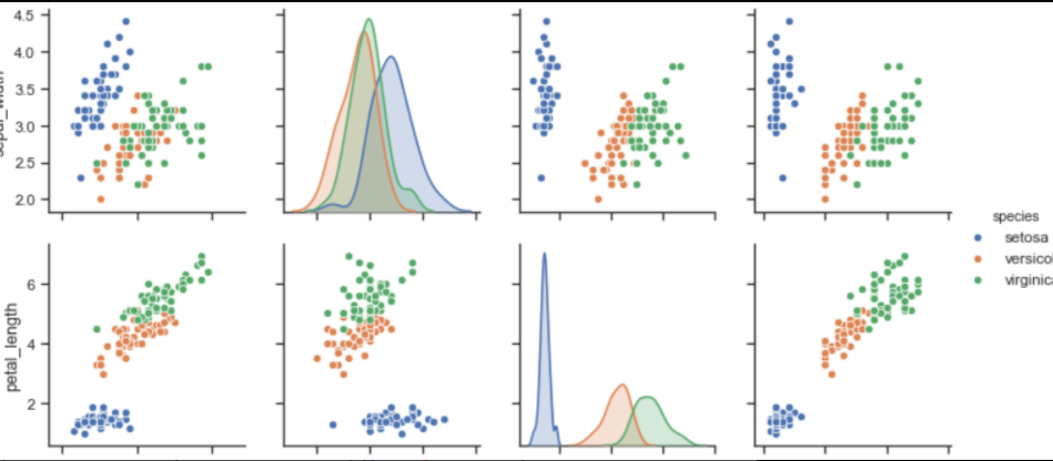
Are you surprised to see these pictures
Similarly, before using Seaborn, we need to import it:
import seaborn as sns
First, let's learn about seaborn.set() function:
sns.set(context='notebook',style='darkgrid',palette='deep',font='sans-serif',font_scale=1,color_codes=True)
context='':
The parameter controls the default frame size, with four values of {paper, notebook, talk and poster}. Where poster > talk > notebook > paper.
style='':
Parameters control the default styles, including {darkgrid, whitegrid, dark, white and ticks}. You can change them to see the differences between them.
palette='':
Parameters are preset palettes. There are {deep, muted, bright, pastel, dark, colorblind} and so on. You can change them and see the differences between them.
Font = '' is used to set the font.
font_scale = '': set the font size.
color_codes = '': use the previous color abbreviations such as' r 'instead of the palette.
Then, we use numpy's np.linspace() function to generate 100 equally spaced sequences from 0 to 15.
x = np.linspace(0, 15, 100)
For example, let's draw a hyperbola
import numpy as np
import matplotlib.pyplot as plt
import seaborn as sns
def sinplot():
    x = np.linspace(0, 15, 100)
    for i in range(1, 3):
        plt.plot(x, np.sin(x + i))

sinplot()
✨ effect
In the code, we don't have any settings for style.
Next, we call the sns.set() function to change the style and see how it works:
%matplotlib inline
import numpy as np
import matplotlib.pyplot as plt
import seaborn as sns
def sinplot():
	x = np.linspace(0, 15, 100)
	for i in range(1, 3):
		plt.plot(x, np.sin(x + i))
sns.set()
sinplot()
plt.show()
According to the results, after adding the sns.set() method, the graph adds a grid and hides the coordinate axis.
two ️⃣ seaborn style
seaborn provides five default styles. In actual drawing, we just need to choose one style we like. Let's take a look at the usage and effects of these five styles.
sns.set(style='white')
sns.set(style='whitegrid')
sns.set(style='darkgrid')
sns.set(style='dark')
sns.set(style='ticks')
Of course, in addition to the built-in styles in these 5, we can also personalize them through other functions.
For example, when our style is set to style='ticks', there will be upper and right coordinate axes, which can be removed by using seaborn.despine() function.
%matplotlib inline
import numpy as np
import matplotlib.pyplot as plt
import seaborn as sns
def sinplot():
	x = np.linspace(0, 15, 100)
	for i in range(1, 3):
		plt.plot(x, np.sin(x + i))
sns.set(style='ticks')
sinplot()
sns.despine()
plt.show()
✨ effect
The sns.despine() function removes the upper and right axes by default. Of course, we can also remove other axes.
Whether to remove an axis can be controlled by setting the values of the top, right, left and bottom parameters of the sns.despine() function. When the value is True, the axis will be removed; otherwise, the axis will be retained.
In a figure object, we can add multiple subgraphs, so how can we use different styles for different subgraphs?
We can use with to set the style, and all drawings drawn under with can use this style.
%matplotlib inline
import numpy as np
import matplotlib.pyplot as plt
import seaborn as sns
def sinplot():
	x = np.linspace(0, 15, 100)
	for i in range(1, 3):
		plt.plot(x, np.sin(x + i))

# Set subgraph style
with sns.axes_style("darkgrid"):
    plt.subplot(311)
    sinplot()

plt.subplot(212)
sinplot()
plt.show()
✨ effect
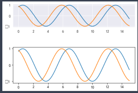
We can see that the style of the first sub graph is successfully set to darkgrid, and it is not affected when drawing the second sub graph.
sns.axes_style() is used to temporarily set the parameters of the drawing, that is, only the drawing within the scope opened with with will be set without affecting other drawings.
🚩 This is the style setting of common seaborn libraries. We often use sns.set() to set the graphic style and with SNS. Axes_ The style () function sets different styles for different subgraphs.
three ️⃣ seaborn palette and color settings
Color is very important in visualization, which is used to represent various features and improve the viewing of the whole picture.
color_ Palette palette
seaborn.color_palette(palette=None, n_colors=None, desat=None)
The return value of this function is a color list defined by a palette.
Palette: palette. You can fill in a string or a sequence without writing.
n_colors: you can specify the number of colors.
desat: reduce the saturation of each color proportionally.
Without any parameters, it means to obtain all the watercolor pens in the box.
import seaborn as sns
# Gets the color list of the default palette
current_palette = sns.color_palette()
# The color of the paint palette
sns.palplot(current_palette)
✨ effect

color_palette() provides us with 6 theme colors by default to correspond to 10 colors in matplotlib.
The six default color themes are: deep, muted, pastel, bright, dark and colorblind.
Let's take a look at the effects of each theme color in turn:
import seaborn as sns
# Gets the color list of the default palette
current_palette = sns.color_palette()
# The color of the paint palette
sns.palplot(current_palette)


theme_list=['deep', 'muted', 'pastel','bright', 'dark', 'colorblind']
for i in theme_list:
    sns.palplot(sns.color_palette(i))
✨ effect

🚩 Note: there are at most 10 colors in the color list formed by these six themes. If we set n_ If the value of colors is more than 10, these 10 colors will be used for cyclic increase.
If we want to use different colors to represent different categories, are there more colors for us to use?
The most common method is to use hls color space, which is a simple conversion of RGB values.
sns.palplot(sns.color_palette("hls", 12))
hls: you can see it as a palette with rich colors.
Run the following code to experience the palette:
%matplotlib inline
from matplotlib import pyplot as plt
import seaborn as sns
a = ['a','b','c','d','e','f']
b =[38.13,19.85,14.89,11.36,6.47,5.93]
plt.figure(figsize=(20,8),dpi=80)

# Draw bar chart
plt.bar(a,b,width=0.3,color=sns.color_palette("hls", 16))
plt.show()
✨ effect
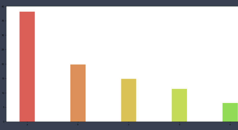
four ️⃣ seaborn drawing mode
Only by understanding seaborn's drawing method can we feel its charm.
1. Univariate analysis drawing
A single variable is actually a column of data in the data set we usually contact.
Univariate analysis is the simplest form of data analysis, in which the analyzed data contains only one variable. Because it is a single variable, it does not deal with causes or relationships
The main purpose of univariate analysis is to describe the data and find out the existing patterns, that is to "reflect the basic information contained in a large number of data in the simplest form".
In the future, we will study the distribution of continuous numerical data, so what kind of data is continuous numerical data? What kind of data is discrete data? (the data obtained by recording the number of individuals in different categories is called discrete data)
Learn how to plot univariate distribution with seaborn? Firstly, we use NumPy module to randomly extract 1000 numbers from the standard normal distribution as our continuous numerical data.
data = np.random.normal(size=1000)
Random is a random module of NumPy. The normal method in the random module indicates that size values are randomly generated from the normal distribution.
import numpy as np
# Randomly extract data from the normal distribution
data = np.random.normal(size=1000)
# View the presentation of data
print(data)
✨ effect
size=1000, which means 1000 numbers are randomly generated, and the data composed of them is a group of continuous numerical data.
The most commonly used function for observing univariate distribution in seaborn is distplot(). By default, this function will draw a histogram and fit a kernel density estimation.
sns.distplot(data, bins, hist = True, kde = True)
Data parameter: records the data used for drawing
bins parameter: it can be set when drawing histogram. It is used to set the number of groups. By default, it will be automatically divided into n groups according to the data. If you want to specify the number of groups, you can set this parameter, and then calculate. We can increase the number to see more detailed information.
Hist and kde parameters: used to adjust whether histogram and kernel density estimation map are displayed. By default, hist and kde are True, indicating that both are displayed. We can choose whether to remove one of them by changing the parameter to False.
Use distplot() of seaborn to draw the histogram of data distribution and observe the probability density curve:
%matplotlib inline
import numpy as np
import seaborn as sns
# Randomly select 1000 numbers from the standard normal distribution
data = np.random.normal(size=1000)
sns.set(style='darkgrid')
sns.distplot(data,kde=True)
✨ effect
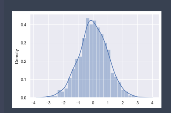
In the above results, the horizontal axis represents the value of data points, and the vertical axis represents the probability density value.
If we only want to display the probability density curve instead of the histogram, we can also use the sns.kdeplot() function to plot the probability density curve of the data.
The sns.kdeplot() function is used as follows:
sns.kdeplot(data1, data2, shade = False)
The shadow parameter is used to set whether shadows are set in the lower part of the image. The default value is False, indicating that shadows are not drawn.
%matplotlib inline
import numpy as np
import seaborn as sns
data = np.random.normal(size=1000)
sns.set(style='darkgrid')
sns.kdeplot(data, shade = True)
Plot probability density curve:
✨ effect
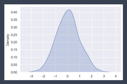
These two images are integrated in Seaborn, and they can be drawn in the same figure using the sns.distplot() function.
2. Draw Bivariate Joint distribution map
Sometimes we need to view not only the distribution of a single variable, but also the relationship between variables. We often need to make predictions, etc. Then we need to use the bivariate joint distribution.
seaborn.jointplot(x, y, data=None, kind='scatter')
x. Y: record the data names of x-axis and y-axis respectively.
Data: data set. The data type of data is DataFrame.
kind: used to set the type of image. The optional types are 'scatter' | 'reg' | 'resid' | 'kde' | 'hex', representing scatter diagram, regression diagram, residual diagram, kernel density diagram and honeycomb diagram respectively.
Parameter x_jitter: this parameter can set the deviation range of the size value. Here, size represents the number of diners, so we set x_jitter should be between 0-1, and we set it to 0.3, so the scatter diagram is easier to see
Now we also use the np.random.normal() function to create a DataFrame with two columns of data, and then draw a bivariate scatter chart based on the data.
import seaborn as sns
import numpy as np
import pandas as pd

# Create dataframe: df
df = pd.DataFrame({'x': np.random.normal(size=500),
                   'y': np.random.normal(size=500)})
print(df)
✨ effect
Now let's try to draw a bivariate scatter plot using seaborn.jointplot() function:
import numpy as np
import pandas as pd
import matplotlib.pyplot as plt
import seaborn as sns

# Create dataframe: df
df = pd.DataFrame({'x': np.random.normal(size=500),
                   'y': np.random.normal(size=500)})
# Draw bivariate scatter diagram
sns.jointplot(x='x', y='y', data=df,kind='reg')
plt.show()
✨ effect
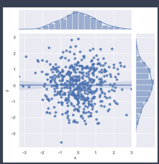
🚩 You can try different kind and get different results
According to the results, we found that the sns.jointplot() function can display the joint relationship between two variables and the distribution of each single variable.
We can do some simple linear model fitting by setting the kind parameter in the function to 'reg'.
We drew the joint scatter diagram based on the data above, but you will find that there is no clear linear relationship between the two data, and there is a problem with the scatter diagram, that is, the same points will be covered together, so we can't see the dense and sparse.
The beehive graph is drawn by using seaborn.jointplot() function, just changing the kind parameter to hex.
import numpy as np
import pandas as pd
import matplotlib.pyplot as plt
import seaborn as sns
%matplotlib inline
df = pd.DataFrame({'x': np.random.randn(500),
                   'y': np.random.randn(500)})
sns.jointplot(x='x', y='y', data=df, kind='hex')
plt.show()
Each hexagon in the honeycomb diagram represents a range, and the color represents the amount of data in this range. The whiter the color, the smaller the amount of data, and the darker the color, the larger the amount of data.
🚩 Therefore, in different cases, we should choose the appropriate kind for data analysis
3. Multivariate relationship distribution diagram
When we do data analysis, there are often many columns of data in the data set. When we haven't determined which two variables to mine, the safer way is to consider every two columns in the data once and make a complete visualization of variable relations.
Using the pairplot() method in seaborn, we can draw a continuous numerical multivariable relationship distribution map.
sns.pairplot( data, hue, vars, kind, diag_kind)
Parameter introduction:
Data: represents the data set used in the drawing
hue parameter: indicates classification by a field
vars parameter: it can be used to filter the variables for drawing images, and the column name is passed in the form of list
kind parameter: used to set the type of image between variables. You can select 'scatter' or 'reg' regression
diag_kind parameter: used to set the image type on the diagonal. You can select 'hist' histogram or 'kde' kernel density map
import pandas as pd
import matplotlib.pyplot as plt
import seaborn as sns
data = pd.read_csv('Data path')
sns.pairplot(data)
plt.show()
Because the data is too large, it is impossible to show the complete code here. If you need data to implement this code, you can add a group: 785318982. You can get learning materials and required information packages here
✨ effect

As can be seen from the figure, in petal_length and petal_ In the width scatter diagram, there is an obvious linear relationship.
We set the hue parameter to species.
import pandas as pd
import matplotlib.pyplot as plt
import seaborn as sns
data = pd.read_csv('Data path')
sns.pairplot(data,hue='species')
plt.show()
It can be seen from the figure that different colors represent different kinds of flowers. The data of the same kind are gathered together, and there is less intersection with the data of other categories, indicating that there are obvious differences among the three kinds of flowers.
We can also use the pairplot function to plot the relationship distribution of two variables.
Use the kind parameter to set the relationship between the two variables, use the regression graph, and use diag_ The kind parameter sets the image type on the diagonal to density map.
import pandas as pd
import matplotlib.pyplot as plt
import seaborn as sns

data = pd.read_csv('Data path')
# The bivariate image is set as the regression map, and the univariate (diagonal map) is set as the kernel density map
sns.pairplot(data, hue='species',vars=['sepal_length', 'sepal_width'],kind='reg', diag_kind='kde')
plt.show()
✨ effect
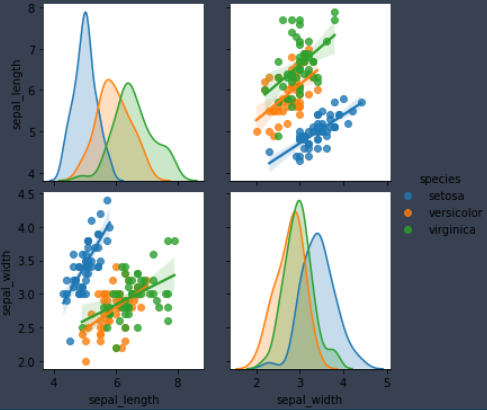
You can set different image styles according to your understanding of the data to continue to explore the information in the data.
🚩 Seaborn's study has come to an end. No matter how to say that hands-on is the most important. It seems that you can't learn. Come on, Sao Nian
🎊 Finally, it's really not easy to say that this course of liver. For me, in the process of sorting out these scattered materials, I have learned the knowledge again, and can write it in some of my own languages, so that more people can learn this skill. This is a very fulfilling thing. For everyone, I can learn new things and knowledge, It is also a harvest.
Get the data used in the text plus qq number: 2024810652. You can exchange any programming questions with me and answer them at any time
So if it's useful to you, give it attention or praise!