Shortcut directory
- Vertical alignment
- Extend an element to window height
- Use different styles based on file format
- Create image grayscale across browsers
- Background gradient animation
- CSS: table column width self applicable
- Show box shadows on one or both sides only
- Package long text
- Make fuzzy text
- Style reset
- Typical CSS clear float
- New version clear float (2011)
- Transparency across browsers
- CSS reference template
- Personality fillet
- General media query
- Modern font stack
- Custom text selection
- Hide H1 for logo
- Picture border polarization
- Anchor link pseudo class
- Strange CSS references
- CSS3: full screen background
- Content vertically centered
- Force vertical scroll bar
- CSS3 gradient template
- @Font face template
- Stitching CSS3 elements
- CSS3 zebra crossing 31, interesting&
- Large paragraph
- Inner CSS3 box shadow
- External CSS3 box shadow
- Triangle list bullet
- Center layout with fixed width
- CSS3 column text
- CSS fixed footer
- PNG transparent repair of IE6 40. Minimum height of cross browser settings 41. Colorful input of CSS3
- Link style based on file type
- Force newline
- Force hand shape on clickable items
- Page top box shadow
- CSS3 dialog bubble
- H1-H5 default style
- Pure CSS background noise
- Persistent list sorting
- CSS hover prompt text
- Dark grey round button
- Display URLs in printable web pages
- Disable mobile Webkit selection highlighting
- CSS3 dot pattern
- CSS3 grid pattern
- Github's fork ribbon
- CSS font property abbreviation
- Curl effect of paper page
- Colorful anchor links
- Banner display with CSS3 features
Vertical alignment
If you use CSS, you will be confused: how can I align elements in the container vertically? Now, with the transformation of CSS3, this puzzle can be solved gracefully:
.verticalcenter{
    position: relative;
    top: 50%;
    -webkit-transform: translateY(-50%);
    -o-transform: translateY(-50%);
    transform: translateY(-50%);
}
Use this technique to align vertically from a single line of text, paragraph to box. At present, the browser's support for Transform needs attention,
Chrome 4, Opera 10, Safari 3, Firefox 3, and Internet Explorer 9 all support this property.
Extend an element to the height of the window
In a specific scenario, you may want to extend an element to the window height. The adjustment of basic elements can only adjust the size of the container. Therefore, to extend an element to the window height, we need to extend the top-level elements: html and body:
html,body { height: 100%; }
Then apply 100% to the height of any element
div {
    height: 100%;
}
Use different styles based on file format
Sometimes you want some links to look different from others in order to make it easier to know what they're targeting. The following clip adds an icon before the text link, using different icons or pictures for different resources:
a[href^="http://"]{
    padding-right: 20px;
    background: url(external.gif) no-repeat center right;
}
/* emails */
a[href^="mailto:"]{
    padding-right: 20px;
    background: url(email.png) no-repeat center right;
}

/* pdfs */
a[href$=".pdf"]{
    padding-right: 20px;
    background: url(pdf.png) no-repeat center right;
}
Create image grayscale across browsers
Grayscale sometimes looks simple and elegant, which can present a deeper tone for the website. In the example, we will add gray filtering to an SVG image:
<svg xmlns="http://www.w3.org/2000/svg">
    <filter id="grayscale">
        <feColorMatrix type="matrix" values="0.3333 0.3333 0.3333 0 0 0.3333 0.3333 0.3333 0 0 0.3333 0.3333 0.3333 0 0 0 0 0 1 0"/>
    </filter>
</svg>
To cross browser, the filter property is used:
img {
    filter: url(filters.svg#grayscale); /* Firefox 3.5+ */
    filter: gray; /* IE6-9 */
    -webkit-filter: grayscale(1); /* Google Chrome, Safari 6+ & Opera 15+ */
}
Background gradient animation
One of the most attractive features of CSS is the ability to add animation effects. In addition to gradients, you can add animation to background color, transparency, and element size. Currently, you can't animate gradients, but the following code might help. It makes the background look animated by changing its position.
button {
    background-image: linear-gradient(#5187c4, #1c2f45);
    background-size: auto 200%;
    background-position: 0 100%;
    transition: background-position 0.5s;
}
button:hover {
    background-position: 0 0;
}
CSS: table column width self applicable
For tables, when it comes to adjusting column width, it's more painful. Then, here's a technique you can use: adding white space: nowrap to td elements; wrapping text correctly
td {
    white-space: nowrap;
}
Show box shadows on one or both sides only
If you want a box shadow, try this technique to add shadow to either side. To achieve this, first define a box with specific width and height, and then locate it correctly: after pseudo class. The code to realize bottom shadow is as follows:
.box-shadow {
	background-color: #FF8020;
	width: 160px;
	height: 90px;
	margin-top: -45px;
	margin-left: -80px;
	position: absolute;
	top: 50%;
	left: 50%;
}

.box-shadow:after {
	content: "";
	width: 150px;
	height: 1px;
	margin-top: 88px;
	margin-left: -75px;
	display: block;
	position: absolute;
	left: 50%;
	z-index: -1;
	-webkit-box-shadow: 0px 0px 8px 2px #000000;
	-moz-box-shadow: 0px 0px 8px 2px #000000;
	box-shadow: 0px 0px 8px 2px #000000;
}
Package long text
If you come across a text that is longer than your own container, this technique is useful for you. In this example, by default, the text is filled horizontally, regardless of the width of the container.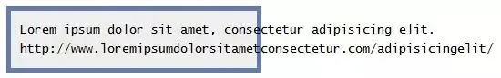
Simple CSS code can adjust text in the container:
pre {
    white-space: pre-line;
    word-wrap: break-word;
}
The effect looks like this: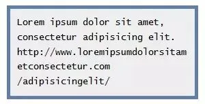
Make fuzzy text
Want to blur the text? You can use color transparency and text shadow to achieve:
.blurry-text {
   color: transparent;
   text-shadow: 0 0 5px rgba(0,0,0,0.5);
}
Using CSS animation to realize ellipsis animation
This clip will help you create an animation of ellisis, which is useful for simple loading states without using gif images.
.loading:after {
    overflow: hidden;
    display: inline-block;
    vertical-align: bottom;
    animation: ellipsis 2s infinite;
    content: "\2026"; /* ascii code for the ellipsis character */
}
@keyframes ellipsis {    from {
        width: 2px;
    }
    to {
        width: 15px;
    }
}
Style reset
html, body, div, span, applet, object, iframe, h1, h2, h3, h4, h5, h6, p, blockquote, pre, a, abbr, acronym, address, big, cite, code, del, dfn, em, img, ins, kbd, q, s, samp, small, strike, strong, sub, sup, tt, var, b, u, i, center, dl, dt, dd, ol, ul, li, fieldset, form, label, legend, table, caption, tbody, tfoot, thead, tr, th, td, article, aside, canvas, details, embed, figure, figcaption, footer, header, hgroup, menu, nav, output, ruby, section, summary, time, mark, audio, video {
  margin: 0;
  padding: 0;
  border: 0;
  font-size: 100%;
  font: inherit;
  vertical-align: baseline;
  outline: none;
  -webkit-box-sizing: border-box;
  -moz-box-sizing: border-box;
  box-sizing: border-box;
}
html { height: 101%; }
body { font-size: 62.5%; line-height: 1; font-family: Arial, Tahoma, sans-serif; }
article, aside, details, figcaption, figure, footer, header, hgroup, menu, nav, section { display: block; }
ol, ul { list-style: none; }
blockquote, q { quotes: none; }
blockquote:before, blockquote:after, q:before, q:after { content: ''; content: none; }
strong { font-weight: bold; }
table { border-collapse: collapse; border-spacing: 0; }
img { border: 0; max-width: 100%; }
p { font-size: 1.2em; line-height: 1.0em; color: #333; }
Typical CSS clear float
.clearfix:after { content: "."; display: block; clear: both; visibility: hidden; line-height: 0; height: 0; }
.clearfix { display: inline-block; }
html[xmlns] .clearfix { display: block; }
* html .clearfix { height: 1%; }
New version clear float (2011)
clearfix:before, .container:after { content: ""; display: table; }
.clearfix:after { clear: both; }
/* IE 6/7 */
.clearfix { zoom: 1; }
Transparency across browsers
.transparent {
    filter: alpha(opacity=50); /* internet explorer */
    -khtml-opacity: 0.5;      /* khtml, old safari */
    -moz-opacity: 0.5;       /* mozilla, netscape */
    opacity: 0.5;           /* fx, safari, opera */
}
CSS reference template
blockquote {
    background: #f9f9f9;
    border-left: 10px solid #ccc;
    margin: 1.5em 10px;
    padding: .5em 10px;
    quotes: "\201C""\201D""\2018""\2019";
}
blockquote:before {
    color: #ccc;
    content: open-quote;
    font-size: 4em;
    line-height: .1em;
    margin-right: .25em;
    vertical-align: -.4em;
}
blockquote p {
    display: inline;
}
Personality fillet
#container {
    -webkit-border-radius: 4px 3px 6px 10px;
    -moz-border-radius: 4px 3px 6px 10px;
    -o-border-radius: 4px 3px 6px 10px;
    border-radius: 4px 3px 6px 10px;
}
/* alternative syntax broken into each line */#container {
    -webkit-border-top-left-radius: 4px;
    -webkit-border-top-right-radius: 3px;
    -webkit-border-bottom-right-radius: 6px;
    -webkit-border-bottom-left-radius: 10px;
    -moz-border-radius-topleft: 4px;
    -moz-border-radius-topright: 3px;
    -moz-border-radius-bottomright: 6px;
    -moz-border-radius-bottomleft: 10px;
}
General media query
/* Smartphones (portrait and landscape) ----------- */
@media only screen
and (min-device-width : 320px) and (max-device-width : 480px) {
  /* Styles */
}
/* Smartphones (landscape) ----------- */
@media only screen and (min-width : 321px) {
  /* Styles */
}
/* Smartphones (portrait) ----------- */
@media only screen and (max-width : 320px) {
  /* Styles */
}
/* iPads (portrait and landscape) ----------- */
@media only screen and (min-device-width : 768px) and (max-device-width : 1024px) {
  /* Styles */
}
/* iPads (landscape) ----------- */
@media only screen and (min-device-width : 768px) and (max-device-width : 1024px) and (orientation : landscape) {
  /* Styles */
}
/* iPads (portrait) ----------- */
@media only screen and (min-device-width : 768px) and (max-device-width : 1024px) and (orientation : portrait) {
  /* Styles */
}
/* Desktops and laptops ----------- */
@media only screen and (min-width : 1224px) {
  /* Styles */
}
/* Large screens ----------- */
@media only screen and (min-width : 1824px) {
  /* Styles */
}
/* iPhone 4 ----------- */
@media only screen and (-webkit-min-device-pixel-ratio:1.5), only screen and (min-device-pixel-ratio:1.5) {
  /* Styles */
}
Modern font stack
/* Times New Roman-based serif */
font-family: Cambria, "Hoefler Text", Utopia, "Liberation Serif", "Nimbus Roman No9 L Regular", Times, "Times New Roman", serif;
/* A modern Georgia-based serif */
font-family: Constantia, "Lucida Bright", Lucidabright, "Lucida Serif", Lucida, "DejaVu Serif," "Bitstream Vera Serif", "Liberation Serif", Georgia, serif;
/*A more traditional Garamond-based serif */
font-family: "Palatino Linotype", Palatino, Palladio, "URW Palladio L", "Book Antiqua", Baskerville, "Bookman Old Style", "Bitstream Charter", "Nimbus Roman No9 L", Garamond, "Apple Garamond", "ITC Garamond Narrow", "New Century Schoolbook", "Century Schoolbook", "Century Schoolbook L", Georgia, serif;
/*The Helvetica/Arial-based sans serif */
font-family: Frutiger, "Frutiger Linotype", Univers, Calibri, "Gill Sans", "Gill Sans MT", "Myriad Pro", Myriad, "DejaVu Sans Condensed", "Liberation Sans", "Nimbus Sans L", Tahoma, Geneva, "Helvetica Neue", Helvetica, Arial, sans-serif;
/*The Verdana-based sans serif */
font-family: Corbel, "Lucida Grande", "Lucida Sans Unicode", "Lucida Sans", "DejaVu Sans", "Bitstream Vera Sans", "Liberation Sans", Verdana, "Verdana Ref", sans-serif;
/*The Trebuchet-based sans serif */
font-family: "Segoe UI", Candara, "Bitstream Vera Sans", "DejaVu Sans", "Bitstream Vera Sans", "Trebuchet MS", Verdana, "Verdana Ref", sans-serif;
/*The heavier "Impact" sans serif */
font-family: Impact, Haettenschweiler, "Franklin Gothic Bold", Charcoal, "Helvetica Inserat", "Bitstream Vera Sans Bold", "Arial Black", sans-serif;
/*The monospace */
font-family: Consolas, "Andale Mono WT", "Andale Mono", "Lucida Console", "Lucida Sans Typewriter", "DejaVu Sans Mono", "Bitstream Vera Sans Mono", "Liberation Mono", "Nimbus Mono L", Monaco, "Courier New", Courier, monospace;
Custom text selection
::selection { background: #e2eae2; }
::-moz-selection { background: #e2eae2; }
::-webkit-selection { background: #e2eae2; }
Hide H1 for logo
h1 {
    text-indent: -9999px;
    margin: 0 auto;
    width: 320px;
    height: 85px;
    background: transparent url("images/logo.png") no-repeat scroll;
}
Picture border polarization
img.polaroid {
    background:#000; /*Change this to a background image or remove*/
    border:solid #fff;
    border-width:6px 6px 20px 6px;
    box-shadow:1px 1px 5px #333; /* Standard blur at 5px. Increase for more depth */
    -webkit-box-shadow:1px 1px 5px #333;
    -moz-box-shadow:1px 1px 5px #333;
    height:200px; /*Set to height of your image or desired div*/
    width:200px; /*Set to width of your image or desired div*/
}
Anchor link pseudo class
a:link { color: blue; }
a:visited { color: purple; }
a:hover { color: red; }
a:active { color: yellow; }
Strange CSS references
.has-pullquote:before {
    /* Reset metrics. */
    padding: 0;
    border: none;
    /* Content */
    content: attr(data-pullquote);
    /* Pull out to the right, modular scale based margins. */
    float: right;
    width: 320px;
    margin: 12px -140px 24px 36px;
    /* Baseline correction */
    position: relative;
    top: 5px;
    /* Typography (30px line-height equals 25% incremental leading) */
    font-size: 23px;
    line-height: 30px;
}
.pullquote-adelle:before {
    font-family: "adelle-1", "adelle-2";
    font-weight: 100;
    top: 10px !important;
}
.pullquote-helvetica:before {
    font-family: "Helvetica Neue", Arial, sans-serif;
    font-weight: bold;
    top: 7px !important;
}
.pullquote-facit:before {
    font-family: "facitweb-1", "facitweb-2", Helvetica, Arial, sans-serif;
    font-weight: bold;
    top: 7px !important;
}
CSS3: full screen background
html {
    background: url('images/bg.jpg') no-repeat center center fixed;
    -webkit-background-size: cover;
    -moz-background-size: cover;
    -o-background-size: cover;
    background-size: cover;
}
Content vertically centered
.container {
    min-height: 6.5em;
    display: table-cell;
    vertical-align: middle;
}
Force vertical scroll bar
html { height: 101% }
CSS3 gradient template
#colorbox {
    background: #629721;
    background-image: -webkit-gradient(linear, left top, left bottom, from(#83b842), to(#629721));
    background-image: -webkit-linear-gradient(top, #83b842, #629721);
    background-image: -moz-linear-gradient(top, #83b842, #629721);
    background-image: -ms-linear-gradient(top, #83b842, #629721);
    background-image: -o-linear-gradient(top, #83b842, #629721);
    background-image: linear-gradient(top, #83b842, #629721);
}
@Font face template
@font-face {
    font-family: 'MyWebFont';
    src: url('webfont.eot'); /* IE9 Compat Modes */
    src: url('webfont.eot?#iefix') format('embedded-opentype'), /* IE6-IE8 */
    url('webfont.woff') format('woff'), /* Modern Browsers */
    url('webfont.ttf')  format('truetype'), /* Safari, Android, iOS */
    url('webfont.svg#svgFontName') format('svg'); /* Legacy iOS */
}
body {
    font-family: 'MyWebFont', Arial, sans-serif;
}
Stitching CSS3 elements
p {
    position:relative;
    z-index:1;
    padding: 10px;
    margin: 10px;
    font-size: 21px;
    line-height: 1.3em;
    color: #fff;
    background: #ff0030;
    -webkit-box-shadow: 0 0 0 4px #ff0030, 2px 1px 4px 4px rgba(10,10,0,.5);
    -moz-box-shadow: 0 0 0 4px #ff0030, 2px 1px 4px 4px rgba(10,10,0,.5);
    box-shadow: 0 0 0 4px #ff0030, 2px 1px 6px 4px rgba(10,10,0,.5);
    -webkit-border-radius: 3px;
    -moz-border-radius: 3px;
    border-radius: 3px;
}
p:before {
    content: "";
    position: absolute;
    z-index: -1;
    top: 3px;
    bottom: 3px;
    left :3px;
    right: 3px;
    border: 2px dashed #fff;}
p a {
    color: #fff;
    text-decoration:none;
}
p a:hover, p a:focus, p a:active {
    text-decoration:underline;
}
CSS3 zebra crossing 31, interesting&
tbody tr:nth-child(odd) {
    background-color: #ccc;
}
Large paragraph
p:first-letter{
    display: block;
    margin: 5px 0 0 5px;
    float: left;
    color: #ff3366;
    font-size: 5.4em;
    font-family: Georgia, Times New Roman, serif;
}
Inner CSS3 box shadow
#mydiv {
    -moz-box-shadow: inset 2px 0 4px #000;
    -webkit-box-shadow: inset 2px 0 4px #000;
    box-shadow: inset 2px 0 4px #000;
}
External CSS3 box shadow
#mydiv {
    -webkit-box-shadow: 0 2px 2px -2px rgba(0, 0, 0, 0.52);
    -moz-box-shadow: 0 2px 2px -2px rgba(0, 0, 0, 0.52);
    box-shadow: 0 2px 2px -2px rgba(0, 0, 0, 0.52);
}
Triangle list bullet
ul {
    margin: 0.75em 0;
    padding: 0 1em;
    list-style: none;
}
li:before {
    content: "";
    border-color: transparent #111;
    border-style: solid;
    border-width: 0.35em 0 0.35em 0.45em;
    display: block;
    height: 0;
    width: 0;
    left: -1em;
    top: 0.9em;
    position: relative;
}
Center layout with fixed width
#page-wrap {
    width: 800px;
    margin: 0 auto;
}
CSS3 column text
#columns-3 {
    text-align: justify;
    -moz-column-count: 3;
    -moz-column-gap: 12px;
    -moz-column-rule: 1px solid #c4c8cc;
    -webkit-column-count: 3;
    -webkit-column-gap: 12px;
    -webkit-column-rule: 1px solid #c4c8cc;
}
CSS fixed footer
#footer {
    position: fixed;
    left: 0px;
    bottom: 0px;
    height: 30px;
    width: 100%;
    background: #444;
}
/* IE 6 */
* html #footer {
    position: absolute;
    top: expression((0-(footer.offsetHeight)+(document.documentElement.clientHeight ? document.documentElement.clientHeight : document.body.clientHeight)+(ignoreMe = document.documentElement.scrollTop ? document.documentElement.scrollTop : document.body.scrollTop))+'px');
}
PNG transparent repair of IE6 40. Minimum height of cross browser settings 41. Colorful input of CSS3
.bg {
    width:200px;
    height:100px;
    background: url(/folder/yourimage.png) no-repeat;
    _background:none;
    _filter:progid:DXImageTransform.Microsoft.AlphaImageLoader(src='/folder/yourimage.png',sizingMethod='crop');
}
/* 1px gif method */
img, .png {
    position: relative;
    behavior: expression((this.runtimeStyle.behavior="none")&&(this.pngSet?this.pngSet=true:(this.nodeName == "IMG" && this.src.toLowerCase().indexOf('.png')>-1?(this.runtimeStyle.backgroundImage = "none",
       this.runtimeStyle.filter = "progid:DXImageTransform.Microsoft.AlphaImageLoader(src='" + this.src + "', sizingMethod='image')",
       this.src = "images/transparent.gif"):(this.origBg = this.origBg? this.origBg :this.currentStyle.backgroundImage.toString().replace('url("','').replace('")',''),
       this.runtimeStyle.filter = "progid:DXImageTransform.Microsoft.AlphaImageLoader(src='" + this.origBg + "', sizingMethod='crop')",
       this.runtimeStyle.backgroundImage = "none")),this.pngSet=true));
}
Link style based on file type
/* external links */
a[href^="http://"] {
    padding-right: 13px;
    background: url('external.gif') no-repeat center right;
}
/* emails */
a[href^="mailto:"] {
    padding-right: 20px;
    background: url('email.png') no-repeat center right;
}
/* pdfs */
a[href$=".pdf"] {
    padding-right: 18px;
    background: url('acrobat.png') no-repeat center right;
}
Force newline
pre {
    white-space: pre-wrap;       /* css-3 */
    white-space: -moz-pre-wrap;  /* Mozilla, since 1999 */
    white-space: -pre-wrap;      /* Opera 4-6 */
    white-space: -o-pre-wrap;    /* Opera 7 */
    word-wrap: break-word;       /* Internet Explorer 5.5+ */
}
Force hand shape on clickable items
a[href], input[type='submit'], input[type='image'], label[for], select, button, .pointer {
    cursor: pointer;
}
Page top box shadow
body:before {
    content: "";
    position: fixed;
    top: -10px;
    left: 0;
    width: 100%;
    height: 10px;
    -webkit-box-shadow: 0px 0px 10px rgba(0,0,0,.8);
    -moz-box-shadow: 0px 0px 10px rgba(0,0,0,.8);
    box-shadow: 0px 0px 10px rgba(0,0,0,.8);
    z-index: 100;
}
CSS3 dialog bubble
.chat-bubble {
    background-color: #ededed;
    border: 2px solid #666;
    font-size: 35px;
    line-height: 1.3em;
    margin: 10px auto;
    padding: 10px;
    position: relative;
    text-align: center;
    width: 300px;
    -moz-border-radius: 20px;
    -webkit-border-radius: 20px;
    -moz-box-shadow: 0 0 5px #888;
    -webkit-box-shadow: 0 0 5px #888;
    font-family: 'Bangers', arial, serif;
}
.chat-bubble-arrow-border {
    border-color: #666 transparent transparent transparent;
    border-style: solid;
    border-width: 20px;
    height: 0;
    width: 0;
    position: absolute;
    bottom: -42px;
    left: 30px;
}
.chat-bubble-arrow {
    border-color: #ededed transparent transparent transparent;
    border-style: solid;
    border-width: 20px;
    height: 0;
    width: 0;
    position: absolute;
    bottom: -39px;
    left: 30px;
}
H1-H5 default style
h1,h2,h3,h4,h5{
    color: #005a9c;}
h1{
    font-size: 2.6em;
    line-height: 2.45em;
}
h2{
    font-size: 2.1em;
    line-height: 1.9em;
}
h3{
    font-size: 1.8em;
    line-height: 1.65em;
}
h4{
    font-size: 1.65em;
    line-height: 1.4em;
}
h5{
    font-size: 1.4em;
    line-height: 1.25em;
}
Pure CSS background noise
body {
    background-image: url(data:image/png;base64,iVBORw0KGgoAAAANSUhEUgAAADIAAAAyCAMAAAAp4XiDAAAAUVBMVEWFhYWDg4N3d3dtbW17e3t1dXWBgYGHh4d5eXlzc3OLi4ubm5uVlZWPj4+NjY19fX2JiYl/f39ra2uRkZGZmZlpaWmXl5dvb29xcXGTk5NnZ2c8TV1mAAAAG3RSTlNAQEBAQEBAQEBAQEBAQEBAQEBAQEBAQEBAQEAvEOwtAAAFVklEQVR4XpWWB67c2BUFb3g557T/hRo9/WUMZHlgr4Bg8Z4qQgQJlHI4A8SzFVrapvmTF9O7dmYRFZ60YiBhJRCgh1FYhiLAmdvX0CzTOpNE77ME0Zty/nWWzchDtiqrmQDeuv3powQ5ta2eN0FY0InkqDD73lT9c9lEzwUNqgFHs9VQce3TVClFCQrSTfOiYkVJQBmpbq2L6iZavPnAPcoU0dSw0SUTqz/GtrGuXfbyyBniKykOWQWGqwwMA7QiYAxi+IlPdqo+hYHnUt5ZPfnsHJyNiDtnpJyayNBkF6cWoYGAMY92U2hXHF/C1M8uP/ZtYdiuj26UdAdQQSXQErwSOMzt/XWRWAz5GuSBIkwG1H3FabJ2OsUOUhGC6tK4EMtJO0ttC6IBD3kM0ve0tJwMdSfjZo+EEISaeTr9P3wYrGjXqyC1krcKdhMpxEnt5JetoulscpyzhXN5FRpuPHvbeQaKxFAEB6EN+cYN6xD7RYGpXpNndMmZgM5Dcs3YSNFDHUo2LGfZuukSWyUYirJAdYbF3MfqEKmjM+I2EfhA94iG3L7uKrR+GdWD73ydlIB+6hgref1QTlmgmbM3/LeX5GI1Ux1RWpgxpLuZ2+I+IjzZ8wqE4nilvQdkUdfhzI5QDWy+kw5Wgg2pGpeEVeCCA7b85BO3F9DzxB3cdqvBzWcmzbyMiqhzuYqtHRVG2y4x+KOlnyqla8AoWWpuBoYRxzXrfKuILl6SfiWCbjxoZJUaCBj1CjH7GIaDbc9kqBY3W/Rgjda1iqQcOJu2WW+76pZC9QG7M00dffe9hNnseupFL53r8F7YHSwJWUKP2q+k7RdsxyOB11n0xtOvnW4irMMFNV4H0uqwS5ExsmP9AxbDTc9JwgneAT5vTiUSm1E7BSflSt3bfa1tv8Di3R8n3Af7MNWzs49hmauE2wP+ttrq+AsWpFG2awvsuOqbipWHgtuvuaAE+A1Z/7gC9hesnr+7wqCwG8c5yAg3AL1fm8T9AZtp/bbJGwl1pNrE7RuOX7PeMRUERVaPpEs+yqeoSmuOlokqw49pgomjLeh7icHNlG19yjs6XXOMedYm5xH2YxpV2tc0Ro2jJfxC50ApuxGob7lMsxfTbeUv07TyYxpeLucEH1gNd4IKH2LAg5TdVhlCafZvpskfncCfx8pOhJzd76bJWeYFnFciwcYfubRc12Ip/ppIhA1/mSZ/RxjFDrJC5xifFjJpY2Xl5zXdguFqYyTR1zSp1Y9p+tktDYYSNflcxI0iyO4TPBdlRcpeqjK/piF5bklq77VSEaA+z8qmJTFzIWiitbnzR794USKBUaT0NTEsVjZqLaFVqJoPN9ODG70IPbfBHKK+/q/AWR0tJzYHRULOa4MP+W/HfGadZUbfw177G7j/OGbIs8TahLyynl4X4RinF793Oz+BU0saXtUHrVBFT/DnA3ctNPoGbs4hRIjTok8i+algT1lTHi4SxFvONKNrgQFAq2/gFnWMXgwffgYMJpiKYkmW3tTg3ZQ9Jq+f8XN+A5eeUKHWvJWJ2sgJ1Sop+wwhqFVijqWaJhwtD8MNlSBeWNNWTa5Z5kPZw5+LbVT99wqTdx29lMUH4OIG/D86ruKEauBjvH5xy6um/Sfj7ei6UUVk4AIl3MyD4MSSTOFgSwsH/QJWaQ5as7ZcmgBZkzjjU1UrQ74ci1gWBCSGHtuV1H2mhSnO3Wp/3fEV5a+4wz//6qy8JxjZsmxxy5+4w9CDNJY09T072iKG0EnOS0arEYgXqYnXcYHwjTtUNAcMelOd4xpkoqiTYICWFq0JSiPfPDQdnt+4/wuqcXY47QILbgAAAABJRU5ErkJggg==);
    background-color: #0094d0;}
Persistent list sorting
ol.chapters {
    list-style: none;
    margin-left: 0;
}
ol.chapters > li:before {
    content: counter(chapter) ". ";
    counter-increment: chapter;
    font-weight: bold;
    float: left;
    width: 40px;
}
ol.chapters li {
    clear: left;
}
ol.start {
    counter-reset: chapter;
}
ol.continue {
    counter-reset: chapter 11;
}
CSS hover prompt text
a {
    border-bottom:1px solid #bbb;
    color:#666;
    display:inline-block;
    position:relative;
    text-decoration:none;
}
a:hover,
a:focus {
    color:#36c;}
a:active {
    top:1px;
}
/* Tooltip styling */
a[data-tooltip]:after {
    border-top: 8px solid #222;
    border-top: 8px solid hsla(0,0%,0%,.85);
    border-left: 8px solid transparent;
    border-right: 8px solid transparent;
    content: "";
    display: none;
    height: 0;
    width: 0;
    left: 25%;
    position: absolute;
}
a[data-tooltip]:before {
    background: #222;
    background: hsla(0,0%,0%,.85);
    color: #f6f6f6;
    content: attr(data-tooltip);
    display: none;
    font-family: sans-serif;
    font-size: 14px;
    height: 32px;
    left: 0;
    line-height: 32px;
    padding: 0 15px;
    position: absolute;
    text-shadow: 0 1px 1px hsla(0,0%,0%,1);
    white-space: nowrap;
    -webkit-border-radius: 5px;
    -moz-border-radius: 5px;
    -o-border-radius: 5px;
    border-radius: 5px;
}
a[data-tooltip]:hover:after {
    display: block;
    top: -9px;
}
a[data-tooltip]:hover:before {
    display: block;
    top: -41px;
}
a[data-tooltip]:active:after {
    top: -10px;
}
a[data-tooltip]:active:before {
    top: -42px;
}
Dark grey round button
.graybtn {
    -moz-box-shadow:inset 0px 1px 0px 0px #ffffff;
    -webkit-box-shadow:inset 0px 1px 0px 0px #ffffff;
    box-shadow:inset 0px 1px 0px 0px #ffffff;
    background:-webkit-gradient( linear, left top, left bottom, color-stop(0.05, #ffffff), color-stop(1, #d1d1d1) );
    background:-moz-linear-gradient( center top, #ffffff 5%, #d1d1d1 100% );
    filter:progid:DXImageTransform.Microsoft.gradient(startColorstr='#ffffff', endColorstr='#d1d1d1');
    background-color:#ffffff;
    -moz-border-radius:6px;
    -webkit-border-radius:6px;
    border-radius:6px;
    border:1px solid #dcdcdc;
    display:inline-block;
    color:#777777;
    font-family:arial;
    font-size:15px;
    font-weight:bold;
    padding:6px 24px;
    text-decoration:none;
    text-shadow:1px 1px 0px #ffffff;}
.graybtn:hover {
    background:-webkit-gradient( linear, left top, left bottom, color-stop(0.05, #d1d1d1), color-stop(1, #ffffff) );
    background:-moz-linear-gradient( center top, #d1d1d1 5%, #ffffff 100% );
    filter:progid:DXImageTransform.Microsoft.gradient(startColorstr='#d1d1d1', endColorstr='#ffffff');
    background-color:#d1d1d1;}
.graybtn:active {
    position:relative;
    top:1px;
}
Display URLs in printable web pages
@media print   {
  a:after {
    content: " [" attr(href) "] ";
  }
}
Disable mobile Webkit selection highlighting
body {
    -webkit-touch-callout: none;
    -webkit-user-select: none;
    -khtml-user-select: none;
    -moz-user-select: none;
    -ms-user-select: none;
    user-select: none;
}
CSS3 dot pattern
body {
    background: radial-gradient(circle, white 10%, transparent 10%),
    radial-gradient(circle, white 10%, black 10%) 50px 50px;
    background-size: 100px 100px;
}
CSS3 grid pattern
body {
    background-color: white;
    background-image: linear-gradient(45deg, black 25%, transparent 25%, transparent 75%, black 75%, black),
    linear-gradient(45deg, black 25%, transparent 25%, transparent 75%, black 75%, black);
    background-size: 100px 100px;
    background-position: 0 0, 50px 50px;
}
Github's fork ribbon
.ribbon {
    background-color: #a00;
    overflow: hidden;
    /* top left corner */
    position: absolute;
    left: -3em;
    top: 2.5em;
    /* 45 deg ccw rotation */
    -moz-transform: rotate(-45deg);
    -webkit-transform: rotate(-45deg);
    /* shadow */
    -moz-box-shadow: 0 0 1em #888;
    -webkit-box-shadow: 0 0 1em #888;
}
.ribbon a {
    border: 1px solid #faa;
    color: #fff;
    display: block;
    font: bold 81.25% 'Helvetiva Neue', Helvetica, Arial, sans-serif;
    margin: 0.05em 0 0.075em 0;
    padding: 0.5em 3.5em;
    text-align: center;
    text-decoration: none;
    /* shadow */
    text-shadow: 0 0 0.5em #444;
}
CSS font property abbreviation
p {
  font: italic small-caps bold 1.2em/1.0em Arial, Tahoma, Helvetica;
}
Curl effect of paper page
ul.box {
    position: relative;
    z-index: 1; /* prevent shadows falling behind containers with backgrounds */
    overflow: hidden;
    list-style: none;
    margin: 0;
    padding: 0;
}
ul.box li {
    position: relative;
    float: left;
    width: 250px;
    height: 150px;
    padding: 0;
    border: 1px solid #efefef;
    margin: 0 30px 30px 0;
    background: #fff;
    -webkit-box-shadow: 0 1px 4px rgba(0, 0, 0, 0.27), 0 0 40px rgba(0, 0, 0, 0.06) inset;
    -moz-box-shadow: 0 1px 4px rgba(0, 0, 0, 0.27), 0 0 40px rgba(0, 0, 0, 0.06) inset;
    box-shadow: 0 1px 4px rgba(0, 0, 0, 0.27), 0 0 40px rgba(0, 0, 0, 0.06) inset;
}
ul.box li:before,
ul.box li:after {
    content: '';
    z-index: -1;
    position: absolute;
    left: 10px;
    bottom: 10px;
    width: 70%;
    max-width: 300px; /* avoid rotation causing ugly appearance at large container widths */
    max-height: 100px;
    height: 55%;
    -webkit-box-shadow: 0 8px 16px rgba(0, 0, 0, 0.3);
    -moz-box-shadow: 0 8px 16px rgba(0, 0, 0, 0.3);
    box-shadow: 0 8px 16px rgba(0, 0, 0, 0.3);
    -webkit-transform: skew(-15deg) rotate(-6deg);
    -moz-transform: skew(-15deg) rotate(-6deg);
    -ms-transform: skew(-15deg) rotate(-6deg);
    -o-transform: skew(-15deg) rotate(-6deg);
    transform: skew(-15deg) rotate(-6deg);
}
ul.box li:after {
    left: auto;
    right: 10px;
    -webkit-transform: skew(15deg) rotate(6deg);
    -moz-transform: skew(15deg) rotate(6deg);
    -ms-transform: skew(15deg) rotate(6deg);
    -o-transform: skew(15deg) rotate(6deg);
    transform: skew(15deg) rotate(6deg);
}
Colorful anchor links
a {
    color: #00e;}
a:visited {
    color: #551a8b;}
a:hover {
    color: #06e;}
a:focus {
    outline: thin dotted;
}
a:hover, a:active {
    outline: 0;
}
a, a:visited, a:active {
    text-decoration: none;
    color: #fff;
    -webkit-transition: all .3s ease-in-out;
}
a:hover, .glow {
    color: #ff0;
    text-shadow: 0 0 10px #ff0;}
Banner display with CSS3 features
.featureBanner {
    position: relative;
    margin: 20px
}
.featureBanner:before {
    content: "Featured";
    position: absolute;
    top: 5px;
    left: -8px;
    padding-right: 10px;
    color: #232323;
    font-weight: bold;
    height: 0px;
    border: 15px solid #ffa200;
    border-right-color: transparent;
    line-height: 0px;
    box-shadow: -0px 5px 5px -5px #000;
    z-index: 1;
}
.featureBanner:after {
    content: "";
    position: absolute;
    top: 35px;
    left: -8px;
    border: 4px solid #89540c;
    border-left-color: transparent;
    border-bottom-color: transparent;
}
Pick it up to the front-end team of the opening bar, read it and share it. I hope it will help you~