Hello, everyone. I am determined to cut the long river. Today I learned about adaptive display. A small case is made to complete the adaptive display.
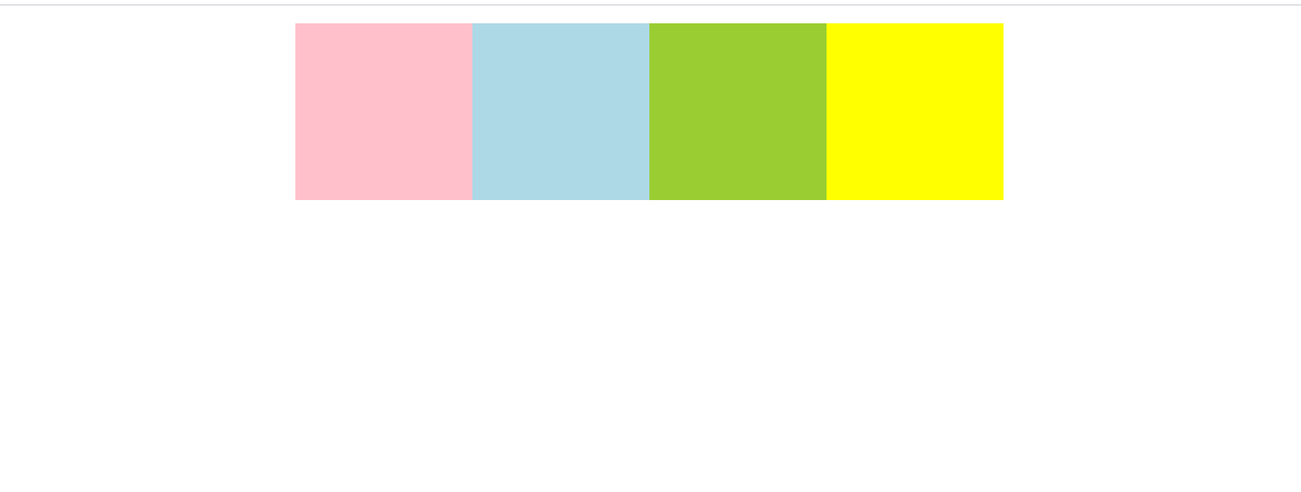
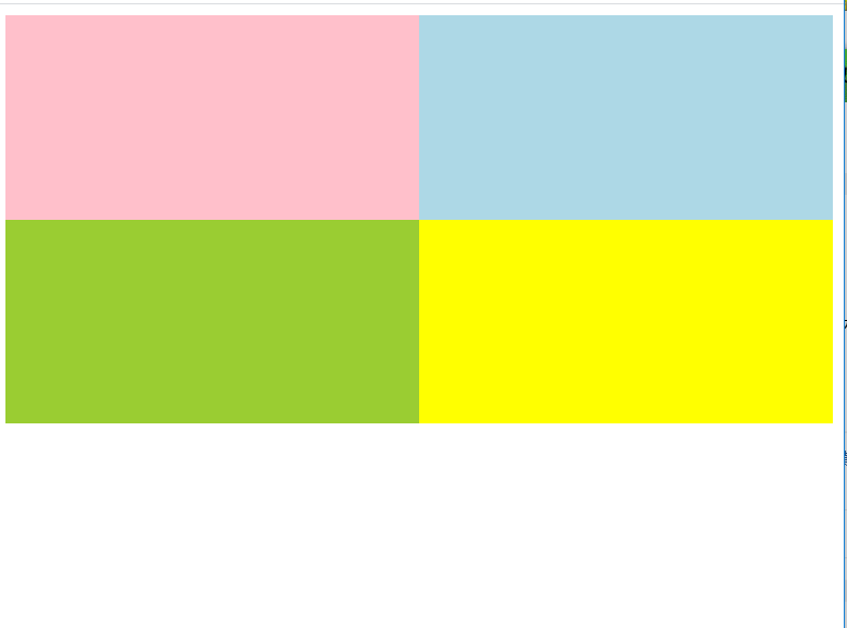
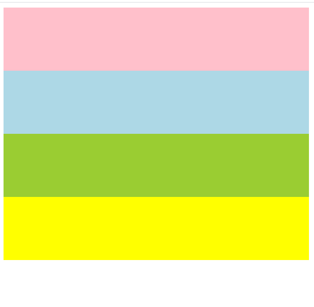
Experimental effect
Explanation of experimental realization
There is a kind of thing called @ media in css3. You type it in and judge it according to the device you want to adapt to. The blogger uses screen. The complete format of this function looks like this
@media mediatype and|not|only (media feature) {
css-code
}
Note: media type is the type of media you want to adapt to, just for beginners or most screen s
and|only|not is the condition that you want to set to form a conjunction
media feature media style is generally set according to the width and height.
If there's a better separation of business: file format. You need to write the condition into the media attribute. The format is as follows:
<link rel="stylesheet" media="mediatype and|not|only(media fearure)" href ="css.css">
Example 1: when the screen type is suitable and the minimum width is 800px
@media screen and (min-width:800px) {
Example 2: adapt to screen type and minimum width 500px, maximum width 800px
@media screen and (min-width:500px) and
			(max-width:800px)
Example 3: when the screen type is applicable and the maximum width is 500px
@media screen and (max-width:500px)
Summary
Type determines the user orientation of your web location. Screen type is that you define the mainstream width. and|not|only is that the satisfaction logic can be compared to and or non memory. To achieve this, can you come up with three patterns of "experimental effect"? If you can, try to tap it yourself. If you can't, let's take the source code and draw a gourd ladle
Experimental results
html code
html code only needs four divs in one div
<div class="content">
	<div class="box d1"></div>
	<div class="box d2"></div>
	<div class="box d3"></div>
	<div class="box d4"></div>
</div>
css code
.d1 {
	background: pink;
}
.d2 {
	background: lightblue;
}
.d3 {
	background: yellowgreen;
}
.d4 {
	background: yellow;
}
@media screen and (min-width:800px) {
	.content {
		width: 800px;
		margin: 20px auto;
	}
	.box {
		width: 200px;
		height: 200px;
		float: left;
	}

}
@media screen and (min-width:500px) and
(max-width:800px){
	.content {
		width: 100%;
		column-count: 1;
	}
	.box {
		width: 50%;
		height: 150px;
		float: left;
	}

}
@media screen and (max-width:500px) {
	.content {
		width: 100%
		column-count: 1;
	}
	.box {
		width: 100%;
		height: 100px;
	}

}
Full code
<!DOCTYPE html>
<html>
	<head>
		<meta charset="utf-8">
		<title></title>
		<style>
			.d1 {
				background: pink;
			}
			.d2 {
				background: lightblue;
			}
			.d3 {
				background: yellowgreen;
			}
			.d4 {
				background: yellow;
			}
			@media screen and (min-width:800px) {
				.content {
					width: 800px;
					margin: 20px auto;
				}
				.box {
					width: 200px;
					height: 200px;
					float: left;
				}

			}
			@media screen and (min-width:500px) and
			(max-width:800px){
				.content {
					width: 100%;
					column-count: 1;
				}
				.box {
					width: 50%;
					height: 150px;
					float: left;
				}

			}
			@media screen and (max-width:500px) {
				.content {
					width: 100%
					column-count: 1;
				}
				.box {
					width: 100%;
					height: 100px;
				}

			}
		</style>
	</head>
	<body>
		<div class="content">
			<div class="box d1"></div>
			<div class="box d2"></div>
			<div class="box d3"></div>
			<div class="box d4"></div>
		</div>
	</body>
</html>
I'm glad that blog can help you!