vue2.0+SVG realizes the round progress bar component of music playing, and the real-time percentage is introduced to realize the circle progress animation effect
Demand analysis:
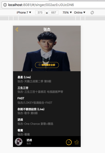
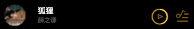
Similar to the mini player control button in most music players, it displays the playing progress and updates the progress in real time.
progress-circle.vue source code:
<template>
  <div class="progress-circle">
    <svg :width="radius" :height="radius" viewBox="0 0 100 100" version="1.1" xmlns="http://www.w3.org/2000/svg">
      <circle class="progress-background" r="50" cx="50" cy="50" fill="transparent"/>
      <circle class="progress-bar" r="50" cx="50" cy="50" fill="transparent" :stroke-dasharray="dashArray"
              :stroke-dashoffset="dashOffset"/>
    </svg>
    <slot></slot>
  </div>
</template>

<script type="text/ecmascript-6">
  export default {
    props: {
      radius: {
        type: String,
        default: '0.32rem'
      },
      percent: {
        type: Number,
        default: 0
      }
    },
    data() {
      return {
        dashArray: Math.PI * 100
      }
    },
    computed: {
      dashOffset() {
        return (1 - this.percent) * this.dashArray
      }
    }
  }
</script>

<style scoped lang="stylus" rel="stylesheet/stylus">
  .progress-circle
    position: relative
    circle
      stroke-width: 0.16rem
      transform-origin: center
      &.progress-background
        transform: scale(0.9)
        stroke: rgba(255, 205, 49, 0.5)
      &.progress-bar
        transform: scale(0.9) rotate(-90deg)
        stroke: #ffcd32
</style>
Parent component DOM structure:
      <div class="control">
        <progress-circle :radius="radius" :percent="percent">
          <i @click.stop="togglePlaying" class="icon-mini" :class="iconMiniPlay"></i>
        </progress-circle>
</div>Parameters passed in like components are required:
The svg circle size radius and the percent age of song playing progress are two data sources:
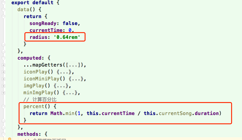
Explanation:
percent is obtained through the currentTime of the audio tag. duration is the total length of the current song obtained by the interface, and divided by the current progress percentage.
radius can be set according to its own development specifications (other layouts, styles, etc.)
Parent component style (I use stylus):
      .control
        position absolute
        top 0.35rem
        right 1rem
        color $color-theme-d
        .icon-mini
          font-size: 0.64rem
          position: absolute
          left: 0
          top: 0
Recently, it can be changed to listen to music and developed
After the development and use of this component, set the appropriate layout, style effect: