I. Thematic Web Crawler Design
1. Thematic web crawler name: Crawl the Meituan platform Gule Buffalo Mixed Hotpot Review and Scoring Data Analysis and Visualization Processing
2. Contents crawled by thematic web crawlers: Comments and rating data of Gule Buffalo Mixed Hotpot on Meituan Platform
3. Design overview:
Implement ideas: Grab the data of Gule Buffalo Miscellaneous Hotpot Comments and Rating with the developer tools, analyze the url splicing of the data, and then turn it into json data for analysis through requests module.Extract user names, user reviews, user ratings and user ratings data, save the data through the pandas module, then clean and process the data, analyze and present the text data through jieba and wordcloud word segmentation, and finally use a variety of modules to analyze and visualize the rating and star data, and analyze one of the two variables according to the relationship between the dataCorrelation coefficient between variables to establish multivariate regression equation between variables
Technical difficulties: There are many libraries used this time, which require careful reading of official documents and skilled use.
2. Analysis of the Structural Characteristics of Theme Pages
1. First we enter the Meitu platform Gule Buffalo Mixed Hotpot (Nanjun shop) (https://www.meituan.com/meishi/114865734/)
Open the developer tool to grab the package as follows:
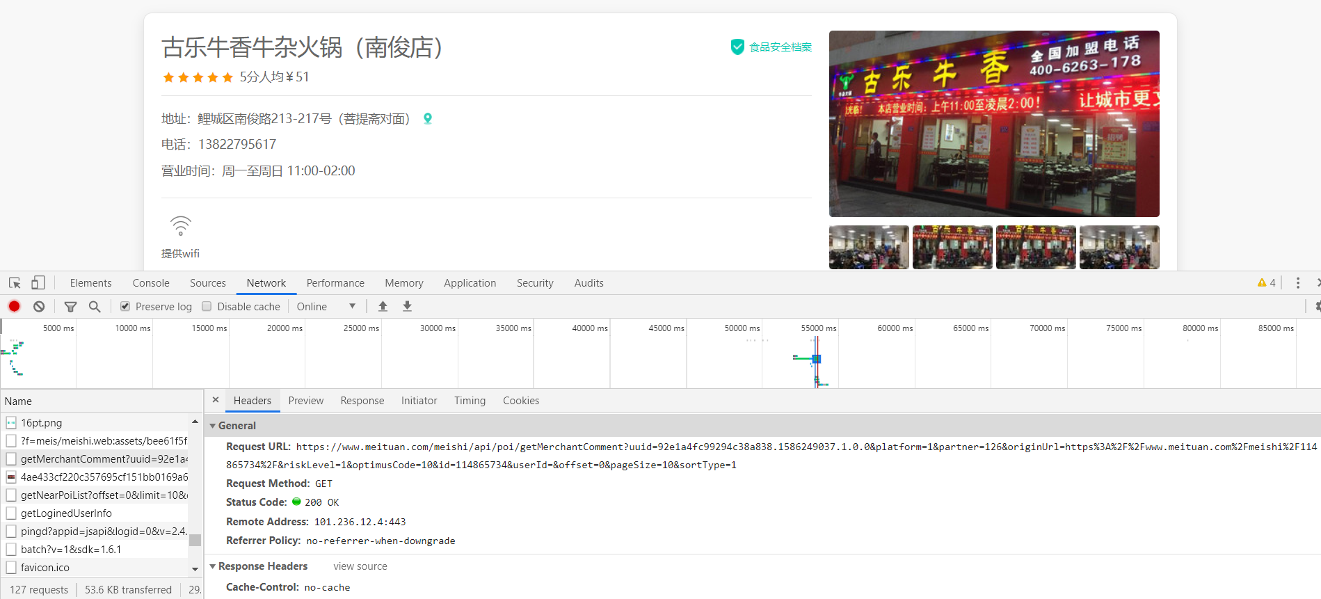
We'll grab a lot of packets, and by looking repeatedly, we'll find this requestURL is: https:///www.meituan.com/meishi/api/poi/getMerchantComment? Uuid=0bb11f41505036498cae5a.158590902206.1.0.0&platform=1&partner=126&originUrl=126&originUrl=https%3A%2F%2F www.meituan.com%2Fmeishi%2F1141486865757343434342F&kLevel=1&Code=10&id=114865734&userId=&pageId=&offsSipageId=&offset=&offsSipageId=&offset=&pageId=&11484848485151515190909090ze=10&sortType=1A package that we click on Previvew to see its content and find that it is the user review package we are looking for:
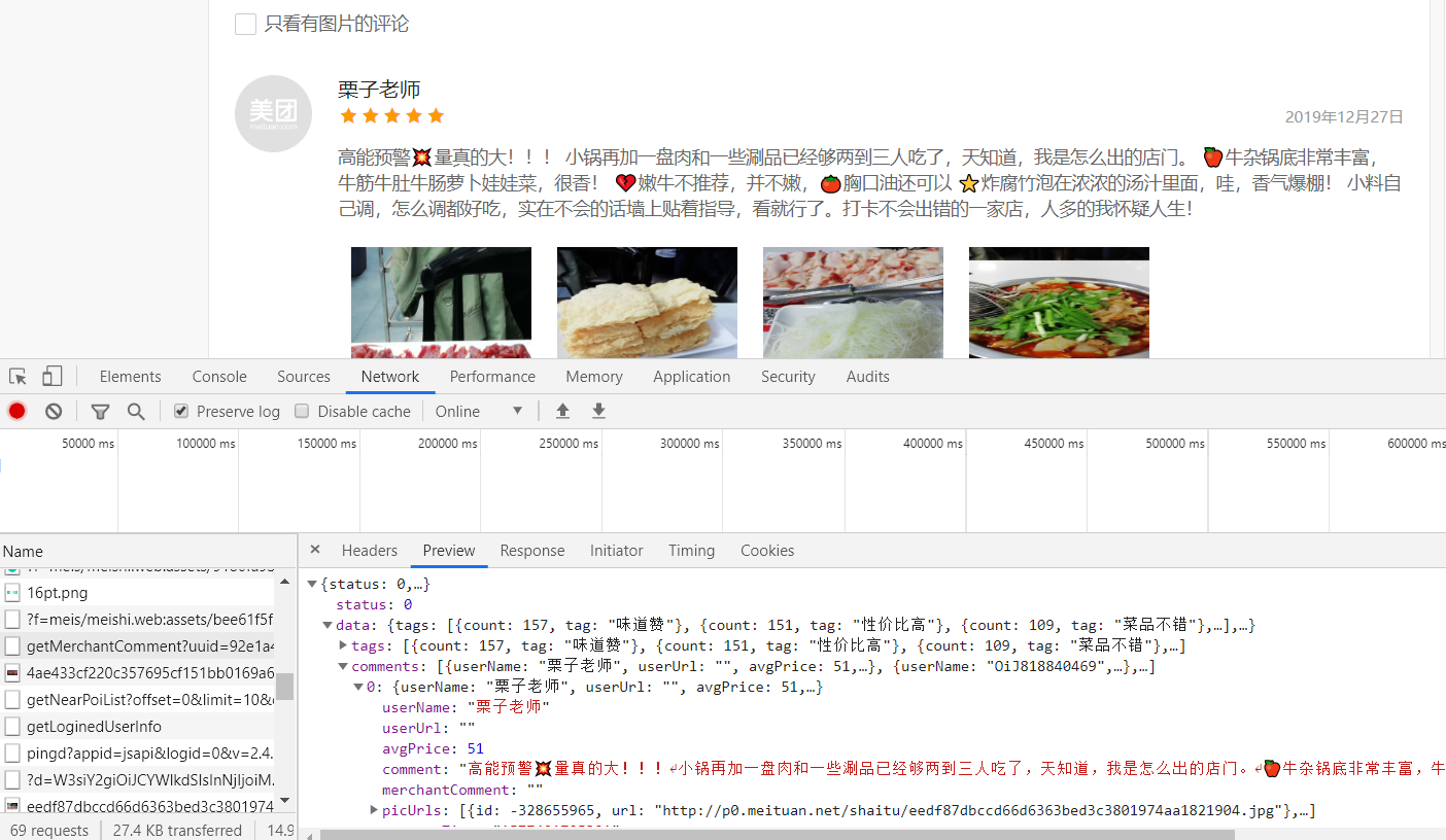
Then you can open this URL and see the data we want!!!
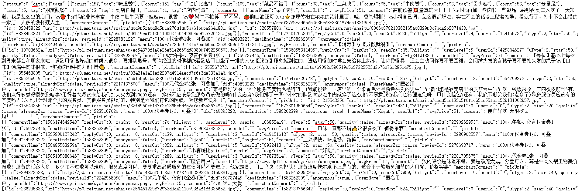
It's not difficult to find the user name, user reviews, user ratings, and user ratings that we want are stored in comments, userLevel, star under data//comments respectively, so let's start python crawling and saving it!
First we take the cookie s, user-agent, host and referer down
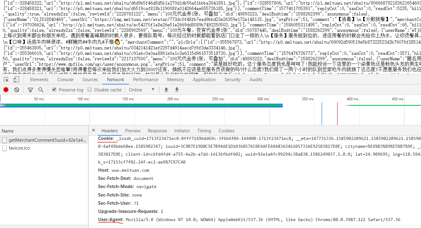
Then, the URLs that these users comment on are analyzed.
By clicking on the next page, we can see that only offset=xx has changed:
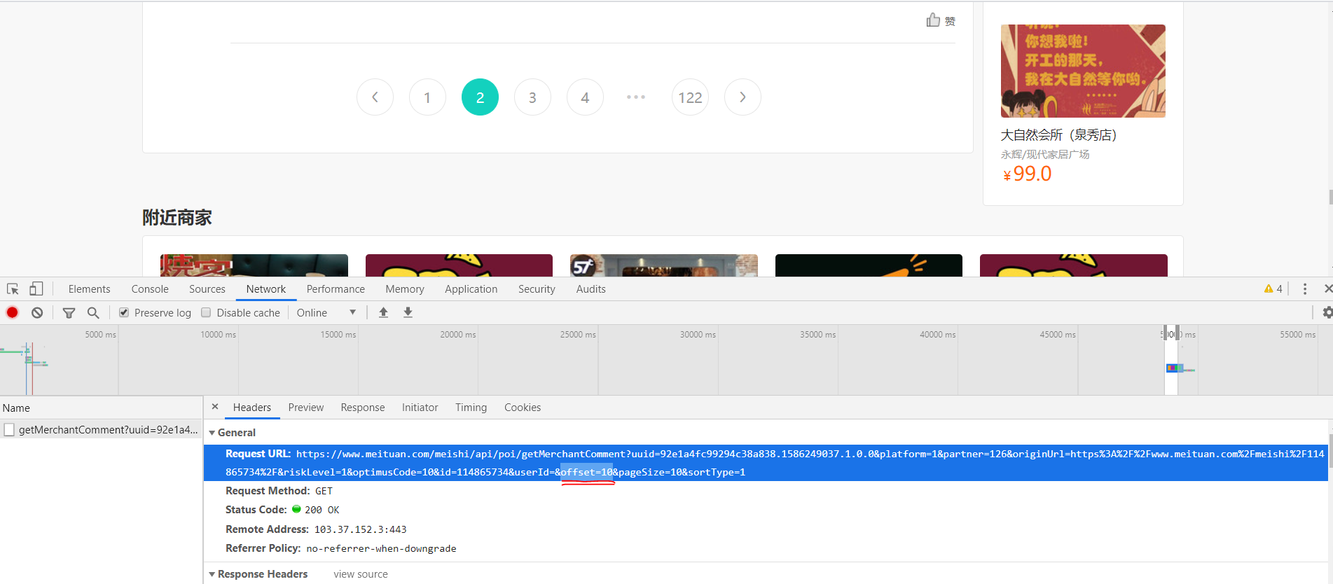
And we find the rule that the first page corresponds to offset=0, the second page corresponds to offset=10, and the third page is offset=20.... So we can stitch URL s to achieve page flip crawling.
url1='https://www.meituan.com/meishi/api/poi/getMerchantComment?uuid=0bb11f415036498cae5a.1585902206.1.0.0&platform=1&partner=126&originUrl=https%3A%2F%2Fwww.meituan.com%2Fmeishi%2F114865734%2F&riskLevel=1&optimusCode=10&id=114865734&userId=&offset='
url2='&pageSize=10&sortType=1'
#We might as well split it into two parts, take out the numeric part of offset=xx separately, change it through the for loop, and stitch url1 and url2 together
#We crawled the first 10 pages of data for analysis
for set in range(10):
url=url1+str(set*10)+url2
#Note that you want to use str to turn numbers into characters and stitch them together
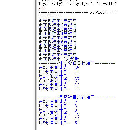
print('Crawling #{}Page Data'.format(set+1))
#print(url), check if the URL is stitched correctly
html=requests.get(url=url,headers=headers)
Then we converted the crawled data into processable json data and stored all the data we wanted in four previously defined arrays in F:\python\\PL//pl.xlsx
#Use json.loads Functions make data processable json format
    a=json.loads(html.text)


    #You can find the users, reviews, ratings, stars we want in this data["data"]["comments"]in
    #So we can use it for Loop through this json data
    for x in a["data"]["comments"]:
        #Assign all the data we want to a variable
        o=x["comment"]
        p=x["userLevel"]
        q=x["userName"]
        s=int(x["star"]/10) #Divide by 10 because star ratings are only 0~5 Stars,Reuse int Make it shaping


        #Add data to all four arrays we previously generated
        pl.append(o)
        pf.append(p)
        yh.append(q)
        xj.append(s)
        #print('user:'+str(q)+'score:'+str(p)+'branch'+'Stars'+str(s)+'Stars')
        #Check here if the extraction is correct

        #Use pandas Of DataFrame Function creates matching column names and stores data
        df = pd.DataFrame({'user':yh,'comment':pl,'score':pf,'Stars':xj})

        #Save data as excel Files, stored in F:\\python\\PL Medium and named pl.xlsx
        df.to_excel('F:\\python\\PL//pl.xlsx',index=False)
Let's see if our data was saved successfully
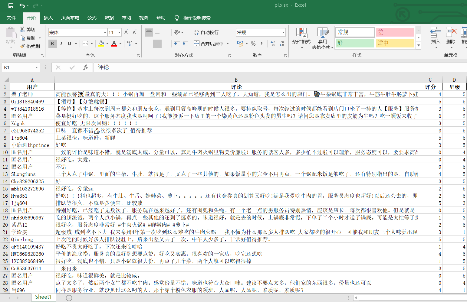
ok!Data saved
Next, before word breaking, in order to get a more intuitive view of user ratings and the proportion of user ratings, we draw pie charts by aggregating score scores and number of stars to see the proportion of 5 and 5 stars
#Number of points 0, 1, 2, 3, 4, 5 out of all ratings
m=collections.Counter(pf)
#Total number of 0, 1, 2, 3, 4, 5 stars out of all stars
x=collections.Counter(xj)
#First see how many of them are
print('=========The total score is as follows=========')
print('The total score of 0 is:',m[0],'\n'
'The total of score 1 is:',m[1],'\n'
'The total of 2 points is:',m[2],'\n'
'The total of score 3 is:',m[3],'\n'
'The total of 4 points is:',m[4],'\n'
'The total score of 5 is:',m[5],'\n'
)
print('=========The total number of stars is as follows=========')
print('The total score of 0 points is:',x[0],'\n'
'The total score of Score 1 is:',x[1],'\n'
'The total score of 2 points is:',x[2],'\n'
'The total score of 3 points is:',x[3],'\n'
'The total score of 4 points is:',x[4],'\n'
'The total score of 5 points is:',x[5],'\n'
)
plt.rcParams['font.sans-serif']=['SimHei'] # Used for normal display of Chinese labels
plt.rcParams['axes.unicode_minus'] = False
#Error reporting when converting dict to DataFrame requires adding a parameter at the end: index = [0]
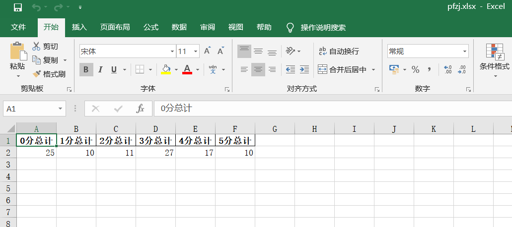
#We keep the statistical score data in an excel
df = pd.DataFrame({'0 Total Score':m[0],'1 Total Score':m[1],'2 Total Score':m[2],'3 Total Score':m[3],'4 Total Score':m[4],'5 Total Score':m[5]},index = [0])
df.to_excel('pfzj.xlsx',index=False)
#We started drawing pie charts for the total score
plt.figure(figsize=(10,10))#If you set the canvas to a square, the pie chart you draw is a square circle
label=['0 Total Score','1 Total Score','2 Total Score','3 Total Score','4 Total Score','5 Total Score']#Define the label of the pie chart, the label is a list
explode=[0,0,0,0,0,0.1] #Set n radii for each distance from the center of the circle
#Draw pie chart
values=[m[0],m[1],m[2],m[3],m[4],m[5]] #Add value
plt.pie(values,explode=explode,labels=label,autopct='%1.1f%%')#Parameters for drawing pie charts
plt.title('Total Score Chart')
plt.savefig('./Total Score Chart')
plt.show()
#We'll save the stated star data in another excel
dm = pd.DataFrame({'0 Total Stars':x[0],'1 Total Stars':x[1],'2 Total Stars':x[2],'3 Total Stars':x[3],'4 Total Stars':x[4],'5 Total Stars':x[5]},index = [0])
dm.to_excel('xjzj.xlsx',index=False)
#We started drawing pie charts for the total number of stars
plt.figure(figsize=(10,10))#If you set the canvas to a square, the pie chart you draw is a square circle
label=['0 Total Stars','1 Total Stars','2 Total Stars','3 Total Stars','4 Total Stars','5 Total Stars']#Define the label of the pie chart, the label is a list
explode=[0,0,0,0,0,0.1]#Set n radii for each distance from the center of the circle
#Draw pie chart
values=[x[0],x[1],x[2],x[3],x[4],x[5]]#Add value
plt.pie(values,explode=explode,labels=label,autopct='%1.1f%%')#Parameters for drawing pie charts
plt.title('Total Star Quantity Map')
plt.savefig('Total Star Quantity Map')
plt.show()
Run the code as follows:
Let's see if the total rating data and the total number of stars are saved successfully:
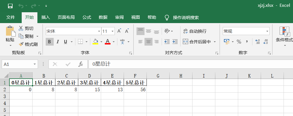
ok!Successfully saved data for total rating and total number of stars
Let's look at the resulting pie chart data again:
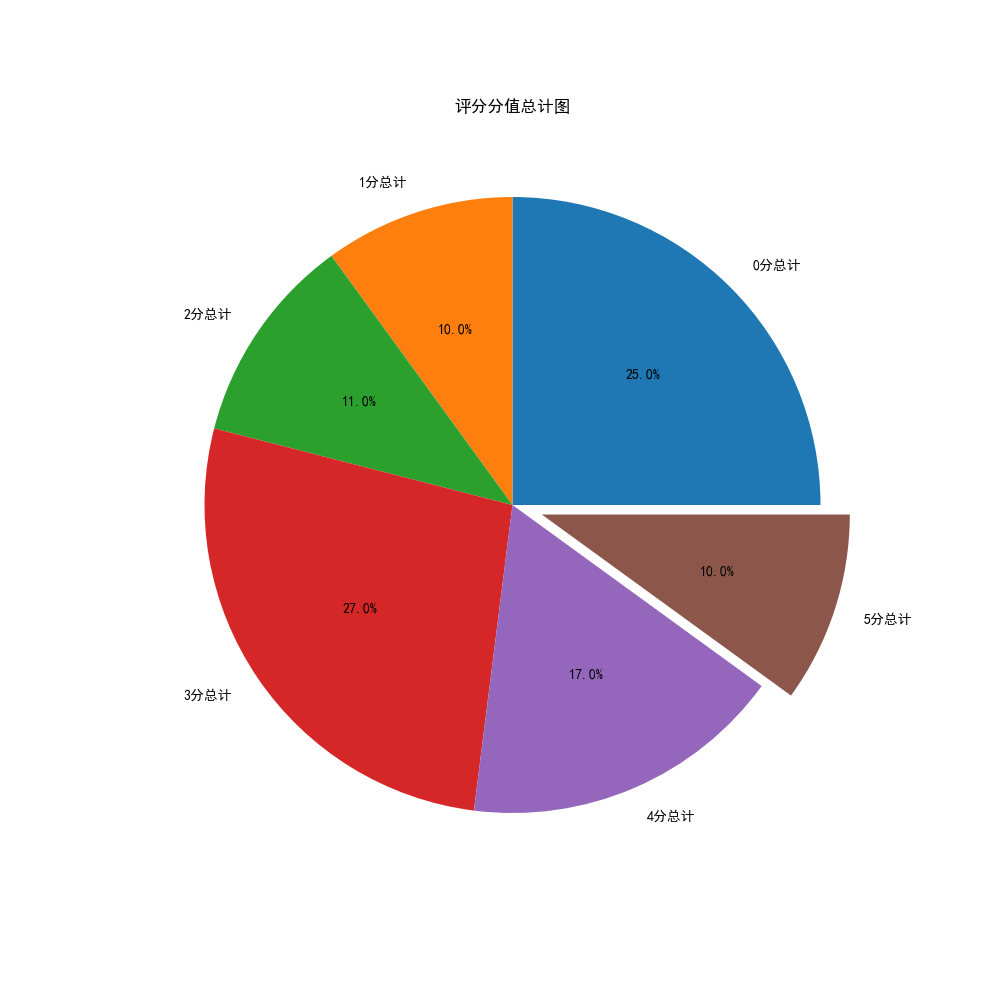
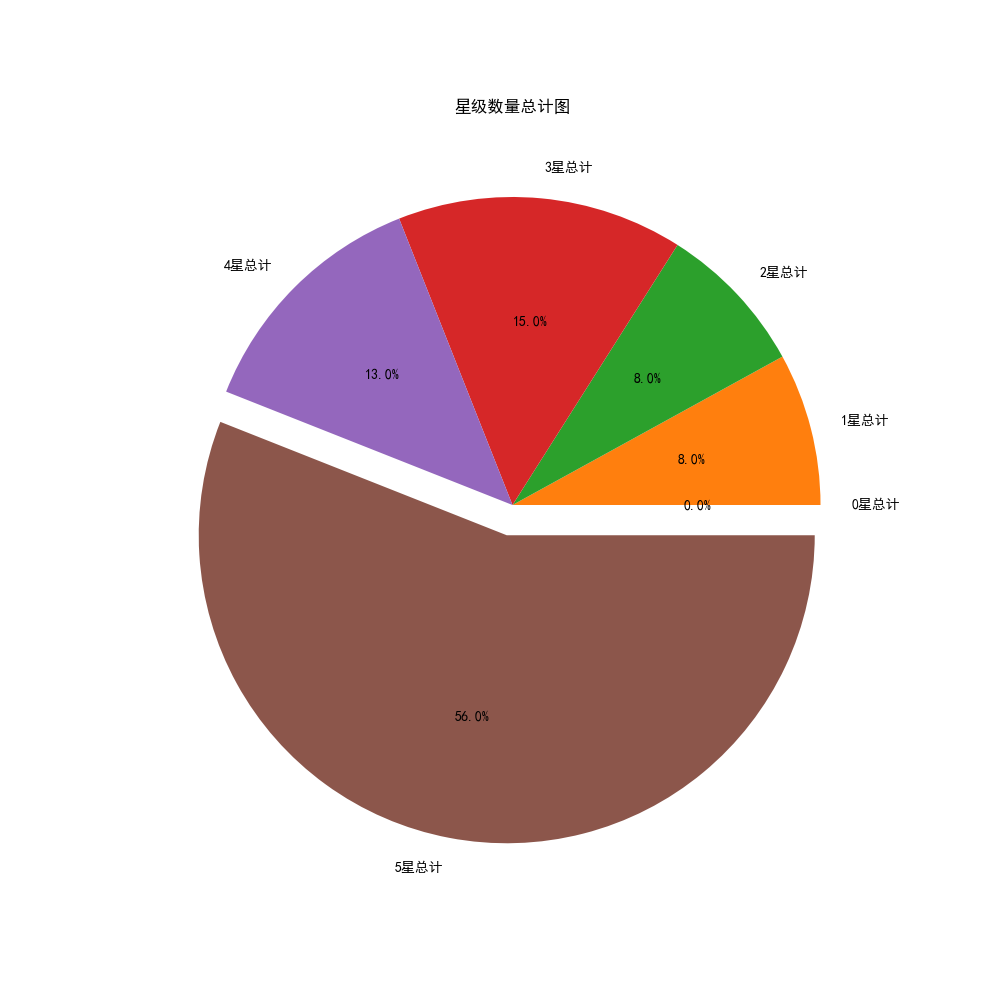
Okay, we've finished scoring and star pie charts, and you can see that this store is still good. We quit trying Q.Q. because we queued up to the curb before
Next, let's start visualizing user review data through jieba and wordcloud participle!
To make the resulting word cloud more beautiful and interesting, I used the LOGO of the recently hot Ruichen coffee!!
#Next we'll clean up the commentary data and remove all the special symbols
#So that we can better separate words and present data


#Here we define a clearSen function that deletes all special symbols

def clearSen(comment):
    comment = comment.strip()
    comment = comment.replace(',', '')
    comment = comment.replace(',', '. ')
    comment = comment.replace('<', '. ')
    comment = comment.replace('>', '. ')
    comment = comment.replace('~', '')
    comment = comment.replace('...', '')
    comment = comment.replace('\r', '')
    comment = comment.replace('\t', ' ')
    comment = comment.replace('\f', ' ')
    comment = comment.replace('/', '')
    comment = comment.replace(',', ' ')
    comment = comment.replace('/', '')
    comment = comment.replace('. ', '')
    comment = comment.replace('(', '')
    comment = comment.replace(')', '')
    comment = comment.replace('_', '')
    comment = comment.replace('?', ' ')
    comment = comment.replace('?', ' ')
    comment = comment.replace('Yes', '')
    comment = comment.replace('➕', '')
    comment = comment.replace(': ', '')
    return comment


#Open the data file for jieba.cut processing so that it generates a generator
text = (open('Comment Text.txt','r',encoding='utf-8')).read()
segs=jieba.cut(text)

#Define a new array to hold the cleaned data
mytext_list=[]

#Clean it with text
for x in segs:
    cs=clearSen(x)
    mytext_list.append(cs)


#Put the cleaned data in the word cloud that will be used to generate it
cloud_text=",".join(mytext_list)


#To make the resulting cloud more beautiful and interesting, I used the LOGO of the recently hot Rachel coffee


#Load Background Picture
cloud_mask = np.array(Image.open("Fortunately.jpg"))


#Set up the generated cloud image
wc = WordCloud(
    background_color="white", #background color
    mask=cloud_mask,
    max_words=100000, #Show maximum number of words
    font_path="simhei.ttf",  #With fonts, I use bold
    min_font_size=10, #Minimum font size
    max_font_size=50, #Maximum font size
    width=1000,  #Sheet width
	height=1000
    #Sheet Height
    )


#Call term cloud data
wc.generate(cloud_text)
#Generate a Word Cloud Picture with the name 2.jpg
wc.to_file("Word Cloud.jpg")
The code runs as follows:
Successful----- Prove successful generation!!
Let's go to the folder and see the image we generated for the word cloud:
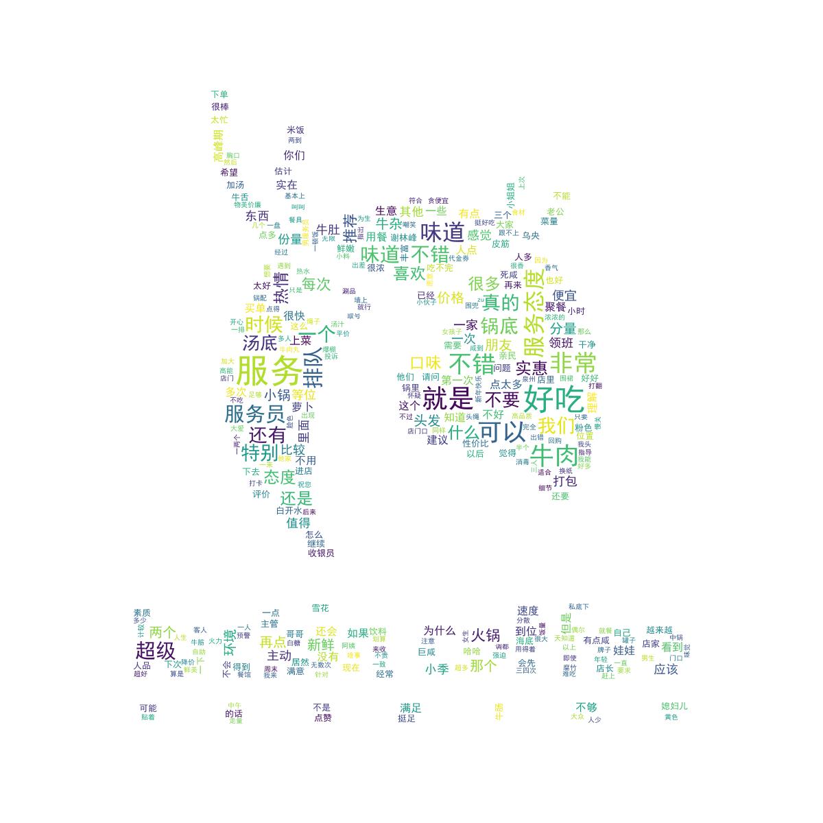
The word cloud is very beautiful!Next, we start to clean up and analyze the rating and star data for visualization.
#After analyzing and presenting text data through jieba and wordcloud word breakers, we started to analyze the data relationship between ratings and star ratings
#Read pl.xlsx to mt variable
mt=pd.read_excel('F:\\python\\PL//pl.xlsx')
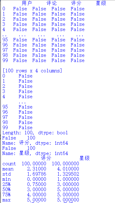
#Here we define a function of shujuqingli for data cleanup of ratings and star ratings
def shujuqingli(mt):
#View Statistical Null Values
print(mt.isnull())
#View duplicate values
print(mt.duplicated())
#View null values
print(mt['score'].isnull().value_counts())
print(mt['Stars'].isnull().value_counts())
#View exception handling
print(mt.describe())
#Clean up mt in shujuqingli function
shujuqingli(mt)
#No data abnormalities found after checking
#Next, we analyze and visualize it (for example, data column, histogram, scatterplot, box, distribution)
plt.rcParams['font.sans-serif'] = ['SimHei'] # Used for normal display of Chinese labels
plt.rcParams['axes.unicode_minus']=False
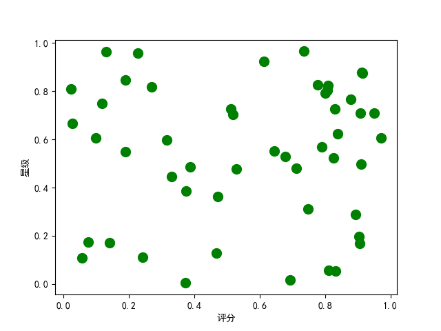
#The random.rand function in numpy is used to return a set of random sample values that follow a standard normal distribution.
x=np.random.rand(50)
y=np.random.rand(50)
#Set label text for x-axis
plt.xlabel("score")
#Set label text for y-axis
plt.ylabel("Stars")
#Draw scatterplot
plt.scatter(x,y,100,color='g',alpha=1)
#Here we use the sns.jointplot function
#kind values must be'scatter','reg','resid','kde', or'hex'types
#Scatter + Distribution
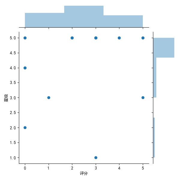
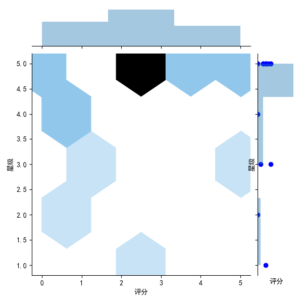
sns.jointplot(x="score",y="Stars",data=mt,kind='scatter')
#Joint Distribution Map
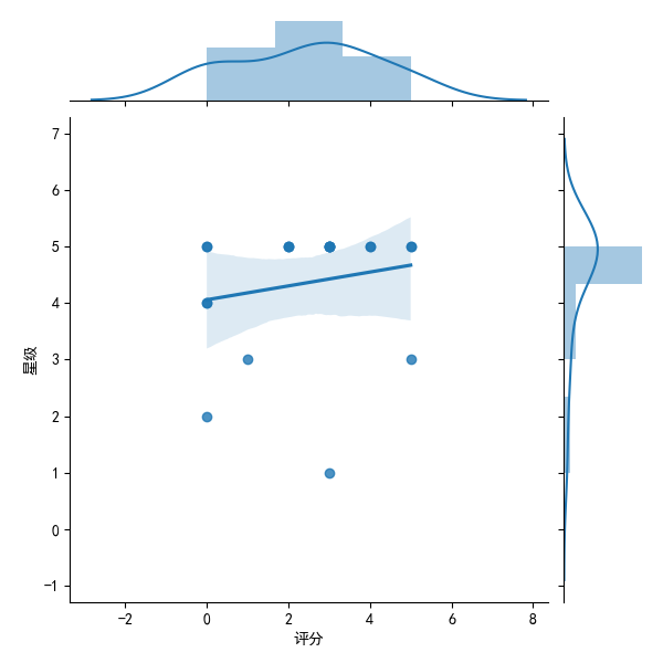
sns.jointplot(x="score",y="Stars",data=mt,kind='reg')
#Density Map
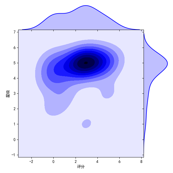
sns.jointplot(x="score",y="Stars",data=mt,kind="kde",space=0,color='b')
#Residual Module Diagram
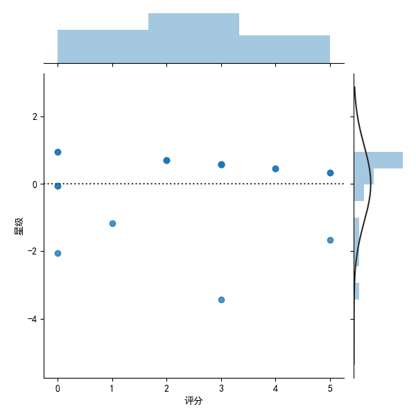
sns.jointplot(x="score",y="Stars",data=mt,kind='resid')
#Hexagonal graph
sns.jointplot(x="score",y="Stars",data=mt,kind='hex')
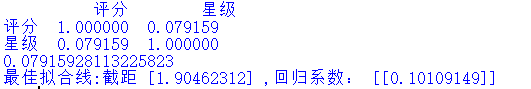
#Call the corr method to calculate the similarity between each column
print(mt.corr())
#Call the corr method to calculate the correlation between the sequence and the incoming sequence
print(mt['score'].corr(mt['Stars']))
#Start here to analyze and visualize rating and star data
pldict={'score':pf,'Stars':xj}
#Data format converted to DataFrame
pldf = DataFrame(pldict)
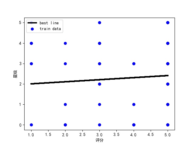
#Plot scatterplots
plt.scatter(pldf.score,pldf.Stars,color = 'b',label = "Exam Data")
#Add a label to the graph (x-axis, y-axis)
plt.xlabel("score")
plt.ylabel("Stars")
#Display Image
plt.savefig("pldf.jpg")
plt.show()
#We use the regression equation y = a + b*x (to model the best fit)
#Display the index using the pandas loc function and assign it to exam_X, csY
csX = pldf.loc[:,'Stars']
csY = pldf.loc[:,'score']
#Instantiate a linear regression model
model = LinearRegression()
#Change the number of rows and columns of data using values.reshape(-1,1)
zzX = csX.values.reshape(-1,1)
zzY = csY.values.reshape(-1,1)
#Establish model fit
model.fit(zzX,zzY)
jieju = model.intercept_#intercept
xishu = model.coef_#regression coefficient
print("Best Fit Line:intercept",jieju,",Regression coefficient:",xishu)
plt.scatter(zzX, zzY, color='blue', label="train data")
#Predictive value of training data
xunlian = model.predict(zzX)
#Draw the best fit line
plt.plot(zzX, xunlian, color='black', linewidth=3, label="best line")
#Add Icon Label
plt.legend(loc=2)
plt.xlabel("score")
plt.ylabel("Stars")
#Display Image
plt.savefig("Final.jpg")
plt.show()
There are a lot of pictures when the code runs, and we can save them one by one for data persistence
The code runs as follows:
The pictures we draw are as follows:
This is the final picture we get from the regression equation
Finally, the source code and file screenshots of this program are attached:
  1 import requests
  2 import json
  3 import time
  4 import jieba
  5 import pandas as pd
  6 from wordcloud import WordCloud
  7 import matplotlib.pyplot as plt
  8 import matplotlib
  9 import numpy as np
 10 import seaborn as sns
 11 import jieba.analyse
 12 from PIL import Image
 13 from pandas import DataFrame,Series
 14 from sklearn.model_selection import train_test_split
 15 from sklearn.linear_model import LinearRegression
 16 import collections
 17
 18 #Create four new arrays to store crawled comments, ratings, users, stars
 19
 20 pl=[]
 21 pf=[]
 22 yh=[]
 23 xj=[]
 24
 25 #Set Request Header
 26 #cookie Sometimes timeliness, need to be replaced when crawling is needed
 27
 28
 29
 30 headers={
 31         'Cookie': '_lx_utm=utm_source%3DBaidu%26utm_medium%3Dorganic; _lxsdk_cuid=1713f23471ec8-0fff7149bdd69c-3f6b4f04-144000-1713f23471ec8; __mta=147731336.1585902209621.1585902209621.1585902209621.1; ci=110; rvct=110%2C1; client-id=68720d01-7956-4aa6-8c0e-ed3ee9ae6295; _hc.v=51b2d328-c63b-23ed-f950-4af49bde68ee.1585902347; _lxsdk=1713f23471ec8-0fff7149bdd69c-3f6b4f04-144000-1713f23471ec8; uuid=0bb11f415036498cae5a.1585902206.1.0.0',
 32         'user-agent':'Mozilla/5.0 (Windows NT 10.0; WOW64) AppleWebKit/537.36 (KHTML, like Gecko) Chrome/80.0.3987.122 Safari/537.36',
 33         'Host': 'qz.meituan.com',
 34         'Referer': 'https://qz.meituan.com/s/%E6%B3%89%E5%B7%9E%E4%BF%A1%E6%81%AF%E5%AD%A6%E9%99%A2/'
 35
 36     }
 37
 38
 39 #Start stitching url
 40
 41 url1='https://www.meituan.com/meishi/api/poi/getMerchantComment?uuid=0bb11f415036498cae5a.1585902206.1.0.0&platform=1&partner=126&originUrl=https%3A%2F%2Fwww.meituan.com%2Fmeishi%2F114865734%2F&riskLevel=1&optimusCode=10&id=114865734&userId=&offset='
 42 url2='&pageSize=10&sortType=1'
 43
 44 #We might as well split it into two parts and offset=xx The numeric part is taken out separately and passed through for After the loop changes, it will url1 and url2 Stitching
 45
 46
 47 #We crawled the first 10 pages of data for analysis
 48
 49 for set in range(10):
 50     url=url1+str(set*10)+url2
 51
 52     #Note to use str Turn numbers into characters and stitch them together
 53
 54     print('Crawling #{}Page Data'.format(set+1))
 55     #print(url),inspect url Is it stitched correctly
 56     html=requests.get(url=url,headers=headers)
 57
 58     #Use json.loads Functions make data processable json format
 59     a=json.loads(html.text)
 60
 61
 62     #You can find the users, reviews, ratings, stars we want in this data["data"]["comments"]in
 63     #So we can use it for Loop through this json data
 64     for x in a["data"]["comments"]:
 65         #Assign all the data we want to a variable
 66         o=x["comment"]
 67         p=x["userLevel"]
 68         q=x["userName"]
 69         s=int(x["star"]/10) #Divide by 10 because star ratings are only 0~5 Stars,Reuse int Make it shaping
 70
 71
 72         #Add data to all four arrays we previously generated
 73         pl.append(o)
 74         pf.append(p)
 75         yh.append(q)
 76         xj.append(s)
 77         #print('user:'+str(q)+'score:'+str(p)+'branch'+'Stars'+str(s)+'Stars')
 78         #Check here if the extraction is correct
 79
 80         #Use pandas Of DataFrame Function creates matching column names and stores data
 81         df = pd.DataFrame({'user':yh,'comment':pl,'score':pf,'Stars':xj})
 82
 83         #Save data as excel Files, stored in F:\\python\\PL Medium and named pl.xlsx
 84         df.to_excel('F:\\python\\PL//pl.xlsx',index=False)
 85
 86
 87
 88 #Save Out excel After the file, the comment data is extracted separately and saved as a text
 89
 90 #Because we need to pass jieba,wordcloud Word segmentation to analyze and present text data
 91
 92
 93
 94 fos = open("Comment Text.txt", "w", encoding="utf-8")
 95 for i in pl:
 96     fos.write(str(i))
 97 fos.close()
 98
 99 #Save completed
100
101 #Before word breaking, in order to give us a more intuitive view of the proportion of user ratings and user ratings
102
103 #We chart pies by aggregating score scores and number of stars to see the proportion of 5 and 5 stars
104
105 #Number of points 0, 1, 2, 3, 4, 5 out of all ratings
106 m=collections.Counter(pf)
107
108 #Total number of 0, 1, 2, 3, 4, 5 stars out of all stars
109 x=collections.Counter(xj)
110
111
112 #First see how many of them are
113
114 print('=========The total score is as follows=========')
115 print('The total score of 0 is:',m[0],'\n'
116       'The total of score 1 is:',m[1],'\n'
117       'The total of 2 points is:',m[2],'\n'
118       'The total of score 3 is:',m[3],'\n'
119       'The total of 4 points is:',m[4],'\n'
120       'The total score of 5 is:',m[5],'\n'
121       )
122
123
124
125
126 print('=========The total number of stars is as follows=========')
127 print('The total score of 0 points is:',x[0],'\n'
128       'The total score of Score 1 is:',x[1],'\n'
129       'The total score of 2 points is:',x[2],'\n'
130       'The total score of 3 points is:',x[3],'\n'
131       'The total score of 4 points is:',x[4],'\n'
132       'The total score of 5 points is:',x[5],'\n'
133       )
134
135 plt.rcParams['font.sans-serif']=['SimHei']  # Used for normal display of Chinese labels
136 plt.rcParams['axes.unicode_minus'] = False
137
138
139
140 #At will dict To DataFrame When an error occurs, a parameter needs to be added at the end: index = [0]
141
142 #We keep the statistical score data in one excel in
143 df = pd.DataFrame({'0 Total Score':m[0],'1 Total Score':m[1],'2 Total Score':m[2],'3 Total Score':m[3],'4 Total Score':m[4],'5 Total Score':m[5]},index = [0])
144 df.to_excel('pfzj.xlsx',index=False)
145
146
147
148 #We started drawing pie charts for the total score
149 plt.figure(figsize=(10,10))#If you set the canvas to a square, the pie chart you draw is a square circle
150 label=['0 Total Score','1 Total Score','2 Total Score','3 Total Score','4 Total Score','5 Total Score']#Define the label of the pie chart, the label is a list
151 explode=[0,0,0,0,0,0.1]    #Set each distance Center n Radius
152 #Draw pie chart
153 values=[m[0],m[1],m[2],m[3],m[4],m[5]] #Add value
154 plt.pie(values,explode=explode,labels=label,autopct='%1.1f%%')#Parameters for drawing pie charts
155 plt.title('Total Score Chart')
156 plt.savefig('./Total Score Chart')
157 plt.show()
158
159
160
161 #We'll save the stated star data in another excel in
162 dm = pd.DataFrame({'0 Total Stars':x[0],'1 Total Stars':x[1],'2 Total Stars':x[2],'3 Total Stars':x[3],'4 Total Stars':x[4],'5 Total Stars':x[5]},index = [0])
163 dm.to_excel('xjzj.xlsx',index=False)
164
165
166
167 #We started drawing pie charts for the total number of stars
168 plt.figure(figsize=(10,10))#If you set the canvas to a square, the pie chart you draw is a square circle
169 label=['0 Total Stars','1 Total Stars','2 Total Stars','3 Total Stars','4 Total Stars','5 Total Stars']#Define the label of the pie chart, the label is a list
170 explode=[0,0,0,0,0,0.1]#Set each distance Center n Radius
171 #Draw pie chart
172 values=[x[0],x[1],x[2],x[3],x[4],x[5]]#Add value
173 plt.pie(values,explode=explode,labels=label,autopct='%1.1f%%')#Parameters for drawing pie charts
174 plt.title('Total Star Quantity Map')
175 plt.savefig('Total Star Quantity Map')
176 plt.show()
177
178
179
180
181
182
183
184
185
186
187
188
189 #Next we'll clean up the commentary data and remove all the special symbols
190 #So that we can better separate words and present data
191
192
193 #Here we define a clearSen Function to delete all special symbols
194
195 def clearSen(comment):
196     comment = comment.strip()
197     comment = comment.replace(',', '')
198     comment = comment.replace(',', '. ')
199     comment = comment.replace('<', '. ')
200     comment = comment.replace('>', '. ')
201     comment = comment.replace('~', '')
202     comment = comment.replace('...', '')
203     comment = comment.replace('\r', '')
204     comment = comment.replace('\t', ' ')
205     comment = comment.replace('\f', ' ')
206     comment = comment.replace('/', '')
207     comment = comment.replace(',', ' ')
208     comment = comment.replace('/', '')
209     comment = comment.replace('. ', '')
210     comment = comment.replace('(', '')
211     comment = comment.replace(')', '')
212     comment = comment.replace('_', '')
213     comment = comment.replace('?', ' ')
214     comment = comment.replace('?', ' ')
215     comment = comment.replace('Yes', '')
216     comment = comment.replace('➕', '')
217     comment = comment.replace(': ', '')
218     return comment
219
220
221 #Open data file to proceed jieba.cut Process to make it generate a generator
222 text = (open('Comment Text.txt','r',encoding='utf-8')).read()
223 segs=jieba.cut(text)
224
225 #Define a new array to hold the cleaned data
226 mytext_list=[]
227
228 #Clean it with text
229 for x in segs:
230     cs=clearSen(x)
231     mytext_list.append(cs)
232
233
234 #Put the cleaned data in the word cloud that will be used to generate it
235 cloud_text=",".join(mytext_list)
236
237
238 #To make the resulting word cloud more beautiful and interesting, I used the recently hot Rachel coffee LOGO
239
240
241 #Load Background Picture
242 cloud_mask = np.array(Image.open("Fortunately.jpg"))
243
244
245 #Set up the generated cloud image
246 wc = WordCloud(
247     background_color="white", #background color
248     mask=cloud_mask,
249     max_words=100000, #Show maximum number of words
250     font_path="simhei.ttf",  #With fonts, I use bold
251     min_font_size=10, #Minimum font size
252     max_font_size=50, #Maximum font size
253     width=1000,  #Sheet width
254     height=1000
255     #Sheet Height
256     )
257
258
259 #Call term cloud data
260 wc.generate(cloud_text)
261 #Generate Word Cloud Picture with Name 2.jpg
262 wc.to_file("Word Cloud.jpg")
263
264
265
266
267
268
269
270 #adopt jieba,wordcloud After analyzing and presenting the text data with word segmentation, we begin to analyze the data relationship between ratings and star ratings.
271
272
273 #take pl.xlsx Read to mt variable
274
275 mt=pd.read_excel('F:\\python\\PL//pl.xlsx')
276
277 #Here we define a shujuqingli Function to clean up rating and star rating data
278 def shujuqingli(mt):
279
280     #View Statistical Null Values
281     print(mt.isnull())
282     #View duplicate values
283     print(mt.duplicated())
284     #View null values
285     print(mt['score'].isnull().value_counts())
286     print(mt['Stars'].isnull().value_counts())
287     #View exception handling
288     print(mt.describe())
289
290 #take mt Put in shujuqingli Clean up in functions
291 shujuqingli(mt)
292
293 #No data abnormalities found after checking
294
295
296 #Next, we analyze and visualize it (for example, data column, histogram, scatterplot, box, distribution)
297 plt.rcParams['font.sans-serif'] = ['SimHei']  # Used for normal display of Chinese labels
298 plt.rcParams['axes.unicode_minus']=False
299
300
301 #Use numpy In random.rand The function returns a set of random sample values that follow a standard normal distribution.
302 x=np.random.rand(50)
303 y=np.random.rand(50)
304
305 #Set up x Axis label text
306 plt.xlabel("score")
307 #Set up y Axis label text
308 plt.ylabel("Stars")
309
310
311
312 #Draw scatterplot
313 plt.scatter(x,y,100,color='g',alpha=1)
314
315 #Here we use sns.jointplot function
316 #kind The value of must be 'scatter', 'reg', 'resid', 'kde', perhaps 'hex'type
317
318
319
320 #Scatter plot + Distribution Map
321
322 sns.jointplot(x="score",y="Stars",data=mt,kind='scatter')
323
324 #Joint Distribution Map
325
326 sns.jointplot(x="score",y="Stars",data=mt,kind='reg')
327
328 #Density Map
329
330 sns.jointplot(x="score",y="Stars",data=mt,kind="kde",space=0,color='b')
331
332 #Residual Module Diagram
333
334 sns.jointplot(x="score",y="Stars",data=mt,kind='resid')
335
336 #Hexagonal graph
337
338 sns.jointplot(x="score",y="Stars",data=mt,kind='hex')
339
340
341 #call corr Method,Calculate the similarity between two columns
342
343 print(mt.corr())
344
345 #call corr Method to calculate the correlation between the sequence and the incoming sequence
346
347 print(mt['score'].corr(mt['Stars']))
348
349
350
351
352
353
354
355
356
357 #Start here to analyze and visualize rating and star data
358 pldict={'score':pf,'Stars':xj}
359
360
361 #Convert to DataFrame Data Format
362 pldf = DataFrame(pldict)
363
364 #Plot scatterplots
365 plt.scatter(pldf.score,pldf.Stars,color = 'b',label = "Exam Data")
366
367 #Add a label to the diagram ( x Axis, y Axis)
368 plt.xlabel("score")
369 plt.ylabel("Stars")
370 #Display Image
371 plt.savefig("pldf.jpg")
372 plt.show()
373
374
375
376
377 #We use regression equation y = a + b*x (Model building best fit line)
378
379
380 #Use pandas Of loc The function displays the index and assigns it to exam_X,csY
381 csX  =  pldf.loc[:,'Stars']
382 csY  =  pldf.loc[:,'score']
383
384
385 #Instantiate a linear regression model
386 model = LinearRegression()
387
388
389
390 #Use values.reshape(-1,1)Change the number of rows and columns of data
391 zzX = csX.values.reshape(-1,1)
392 zzY = csY.values.reshape(-1,1)
393
394
395 #Establish model fit
396 model.fit(zzX,zzY)
397
398 jieju  = model.intercept_#intercept
399
400 xishu = model.coef_#regression coefficient
401
402 print("Best Fit Line:intercept",jieju,",Regression coefficient:",xishu)
403
404
405
406 plt.scatter(zzX, zzY, color='blue', label="train data")
407
408 #Predictive value of training data
409 xunlian = model.predict(zzX)
410
411
412 #Draw the best fit line
413 plt.plot(zzX, xunlian, color='black', linewidth=3, label="best line")
414
415
416
417 #Add Icon Label
418 plt.legend(loc=2)
419 plt.xlabel("score")
420 plt.ylabel("Stars")
421 #Display Image
422 plt.savefig("Final.jpg")
423 plt.show()
424
V. Summary
Conclusion: Through the analysis and visualization of the data, it can be seen from the different data groups and fitted curves that there is not too much relationship between user ratings and user ratings. From the comments, user experience is affected by many factors, but overall, user ratings of this store are good, there is a chance to taste Quanzhou's delicious food.
Summary: In this analysis of the data of the American Orchestra Cola Cow Fragrance, not only consolidated some knowledge previously learned, but also expanded their understanding and application of Python library.Through the introduction of official documents, combined with actual cases, I master the use of python's various powerful third-party libraries, become more fond of Python as a language, and enhance the individual's ability to analyze and visualize data. If life is short, I use python!