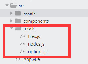
To facilitate code reading, the test data has been separated and placed in the mock Directory:
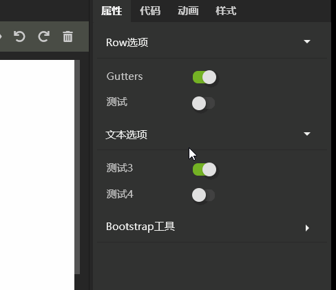
If you read the code, just pay a little attention. This time, the most important part of RXEditor interface is attribute input component, which can display whether data has been modified or reset to default value in batch. The effect is as follows:
This interface is built dynamically. According to the JSON data, the input interface is built dynamically. I've done a PHP Raven + vuetify framework before, which is also based on this principle. PHP segment code constructs JSON data, and VUE code constructs input interface dynamically according to data. I used that framework to build several websites and the company's own order management system, but the code needs to be optimized. It's very convenient for me to use, and there's still some distance from the source release. The name of the framework is Vular, GIthub address: https://github.com/vularsoft/vular. You can have a look at it if you are interested. After completing RXEditor, continue this framework and add it to yourself Too much work, not enough time.
The implementation of this framework is much simpler and the principle is the same. To understand the code, you need to understand the structure and naming of page elements:
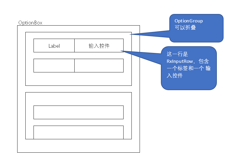
The whole input component is called OptionBox. This control can input various properties. The OptionBox contains several optiongroups. Each OptionGroup is a sub item of accordion folding. The OptionBox is an accordion folding control (see the previous article for the implementation of the control). The OptionGroup contains multiple rxinputrows. Each RxInputRow contains an input control and a label. The OptionBox is dynamically built according to the Json data and the Json data structure As follows:
[
  {
    label:'Row option',
    rows:[
      {
        label:'Gutters',
        value:'no-gutters',
        defaultValue:'no-gutters',
        inputName:'RxSwitch',
        props:{
          onValue:'no-gutters',
          offValue:'',
        },
      },
      {
        label:'test',
        value:'off',
        defaultValue:'off',
        inputName:'RxSwitch',
        props:{
          onValue:'on',
          offValue:'off',
        },
      },
    ],
  },

  {
    label:'Text options',
    rows:[
      {
        label:'Test 3',
        value:'no-gutters',
        defaultValue:'no-gutters',
        inputName:'RxSwitch',
        props:{
          onValue:'no-gutters',
          offValue:'',
        },
      },
      {
        label:'Test 4',
        value:'off',
        defaultValue:'off',
        inputName:'RxSwitch',
        props:{
          onValue:'on',
          offValue:'off',
        },
      },
    ],
  },
  {
    label:'Bootstrap tool',
  },
]
So far, we have only implemented one input control: RxSwitch, so there is only one control in the test data. Later, we will gradually add other controls such as drop-down list, and then we will update the test data.
Code directory structure:
RXSwitch.vue in the Inputs directory was previously implemented. RXSelect.vue is just a note file, which will be implemented next time. Accordion directory is the accordion folding component that was implemented before, this time it will be used. The rest of the files are implemented this time.
Old habits, first look at the calling code of OptionBox to see how to use this component:
<OptionBox v-model="options"></OptionBox>
It's very simple to pass in a json data in the form of a v-model. Its implementation code:
<template>
  <SimpleAccordion>
    <OptionGroup v-for="(optionGroup, i) in inputValue" :key="i" v-model="inputValue[i]">
    </OptionGroup>
  </SimpleAccordion>
</template>

<script>
import SimpleAccordion from '../accordion/SimpleAccordion.vue'
import OptionGroup from './OptionGroup.vue'

export default {
  name: 'OptionBox',
  components:{
    SimpleAccordion,
    OptionGroup
  },
  props:{
    value:{ default:[] },
  },
  computed:{
    inputValue: {
      get:function() {
        return this.value;
      },
      set:function(val) {
        this.$emit('input', val);
      },
    },
  },
  methods: {
  },
}
</script>
Using a simple accordion (accordion folding component) implementation, the internal loop calls OptionGroup. The v-model passed in to OptionGroup is a row data list. Its implementation code:
<template>
  <CollapsibleItem class="option-item" @itemClick = "itemClick">
    <template #heading>
      {{inputValue.label}}
      <div v-if="changed" class="reset-button" @click="resetAll">{{$t('widgets.reset')}}</div>
    </template>
    <template #body>
      <RxInputRow
        v-for="(row, i) in inputValue.rows"
        :key="i"
        :label = "row.label"
        :inputName = "row.inputName"
        :inputProps = "row.props"
        :defaultValue = "row.defaultValue"
        v-model = "row.value"
      >
      </RxInputRow>
    </template>
  </CollapsibleItem>
</template>

<script>
import CollapsibleItem from '../accordion/CollapsibleItem.vue'
import RxInputRow from '../inputs/RxInputRow.vue'

export default {
  name: 'OptionGroup',
  components:{
    CollapsibleItem,
    RxInputRow
  },
  props:{
    value:{ default:{} },
  },
  computed:{
    inputValue: {
      get:function() {
        return this.value;
      },
      set:function(val) {
        this.$emit('input', val);
      },
    },

    changed(){
      for(var i in this.inputValue.rows){
        let row = this.inputValue.rows[i]
        if(row.value !== row.defaultValue){
          return true
        }
      }
      return false
    }
  },
  methods: {
    itemClick(item){
      this.$emit('itemClick', item)
    },

    resetAll(event){
      for(var i in this.inputValue.rows){
        this.inputValue.rows[i].value = this.inputValue.rows[i].defaultValue
      }
      event.stopPropagation()
    }
  },
}
</script>

<style>
.option-item.collapsible-item .item-heading{
  display: flex;
  flex-flow: row;
  justify-content: space-between;
}

.reset-button{
  margin-right:20px;
  color: #bbb;
}
</style>
It is implemented with CollapsibleItem, so you need to forward the events of CollapsibleItem to the parent component through the $emit method, otherwise the accordion will not fold properly.
According to the calculation attribute changed, determine whether to display the reset button. If there is data different from the default value, checked is true, otherwise false.
Reset button handles the event resetAll, which sets all values to the default values. I have to lament the power of VUE bidirectional data binding. The first version of RXEditor did not use VUE, but used native JS. Similar functions are very complex to implement.
The style changes with the state. Please refer to CSS for details.
This component circularly calls RxInputRow, paying attention to its incoming parameters.
RxInputRow Code:
<template>
  <div class="rx-input-row" :class = "changed ? 'changed' :''">
    <div class="label">{{label}}</div>
    <component
      :is = "inputName"
      v-bind = "inputProps"
      v-model = "inputValue"
    ></component>
  </div>
</template>

<script>
import RxSwitch from './RxSwitch.vue'

export default {
  name: 'RxInputRow',
  props:{
    label:{ default:'' },
    defaultValue:{ default:'' },
    value:{ default:'' },
    inputProps:{ default:'' },
    inputName:{defalut:'input'},
  },
  components:{
    RxSwitch,
  },
  data () {
    return {
    }
  },
  computed:{
    changed(){
      return this.inputValue !== this.defaultValue
    },

    inputValue: {
      get:function() {
        return this.value;
      },
      set:function(val) {
        this.$emit('input', val);
      },
    },
  },
  methods: {
  },
}
</script>

<style>
  .rx-input-row{
    display: flex;
    flex-flow: row;
    align-items: center;
  }

  .rx-input-row .label{
    display: flex;
    height: 30px;
    align-items: center;
    padding-left: 6px;
    color:#c2c2c2;
    font-size: 12px;
    width: 100px;
  }
  .rx-input-row.changed .label{
    color:#7c9161;
  }
</style>
If there is a change in the input value, it is also notified through the changed calculation property interface. CSS displays the label in green font.
Through the dynamic binding component of VUE, you can save a lot of code. Remember that the components it uses should be registered.
This Code:
<component
  :is = "inputName"
  v-bind = "inputProps"
  v-model = "inputValue"
></component>
Equivalent to
<RxSwitch
  v-if = "inputName === 'RxSwitch'"
  onValue= "inputProps.onValue"
  offValue= "inputProps.offValue"
  v-model = "inputValue"
></RxSwitch>
<RxSelect
  v-if = "inputName === 'RxSelect'"
  list= "inputProps.list"
  v-model = "inputValue"
></RxSelect>
  ......
In this way, a lot of if judgment is needed, and the code is not good-looking. I am in the Vular framework, because it is inconvenient to control every Vuetify detail and component dynamic component through PHP code. I have made a custom component directly, which is implemented by rewriting the render method, which is too deep into the bottom layer. Here, it's very happy to be able to achieve it perfectly in this way.
Today's composition is written here. Thank you for your patience. For detailed code, please refer to Github: https://github.com/vularsoft/studio-ui
If you have any questions, please leave a message.