Insert picture
openpyxl.drawing.image/sheet.add_image()
import os
os.chdir('D:\\python_major\\auto_office9')
from openpyxl import load_workbook
from openpyxl.drawing.image import Image
workbook = load_workbook(filename = 'This is a form.xlsx')
sheet = workbook.active

photo = Image('1.jpg')
photo.height = 100
photo.width = 220

sheet.add_image(photo,'C1')
workbook.save(filename='This is a form.xlsx')
- > the output result is: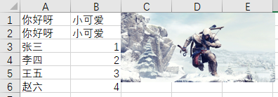
Generating charts
Insert BarChart()/Reference()
from openpyxl import load_workbook
from openpyxl.chart import BarChart, Reference

workbook = load_workbook(filename = 'Simple data.xlsx')
sheet = workbook.active

chart = BarChart()
data = Reference(worksheet=sheet, min_row=1, max_row=7,min_col=2,max_col=3)
categories = Reference(sheet, min_col=1,min_row=2,max_row=9)

chart.add_data(data,titles_from_data=True)
chart.set_categories(categories)
sheet.add_chart(chart,'E2')
workbook.save('Simple data.xlsx')
- > the output result is:
Insert line chart ()
from openpyxl import load_workbook
from openpyxl.chart import LineChart, Reference

workbook = load_workbook(filename = 'Simple data.xlsx')
sheet = workbook.active

chart = LineChart()
data = Reference(worksheet=sheet, min_row=20, max_row=21,min_col=1,max_col=13)
categories = Reference(sheet, min_row=19,min_col=2,max_col=13)

chart.add_data(data,from_rows=True,titles_from_data=True)
chart.set_categories(categories)
sheet.add_chart(chart,'B23')
workbook.save('Simple data.xlsx')
- > the output result is:
Comprehensive application
Writing a Python program requires
(1) Open the file Alibaba cloud Tianchi e-commerce baby user data.xlsx
(2) Statistics of buy mount data
(3) Draw a histogram and pie chart according to the number of buy mount
(4) Save the Excel file
Step 1: preparation
import os
os.chdir('D:\\python_major\\auto_office9')
from openpyxl import Workbook
from openpyxl import load_workbook
from openpyxl.chart import BarChart, Reference
from openpyxl.chart import PieChart
workbook = load_workbook(filename = 'Alibaba cloud Tianchi e-commerce baby user data.xlsx')
sheet = workbook.active
workbook_1 = Workbook()
sheet_1 = workbook_1.active
The functions of this part of code are: setting the program running path, importing related libraries, loading the original file data and creating new file forms
Step 2: make data statistics (by quantity) for the specified column and enter the statistical data into the new file
cells = sheet['F']#In this case, the column index is used directly, and the encapsulated function is no longer called
d = {}
for cell in cells:
	if isinstance(cell.value,int):
		d[cell.value] = d.get(cell.value,0) + 1
ls = list(d.items())
ls.sort(key = lambda x:x[1], reverse=True)#From big to small
print(ls) #There is no way to write this data format. Here, you can review python Automation Office (7), and write line data with python list
data = []
for row in ls:
	data.append(list(row))
print(data)#It can be converted to this format
for row in data:
	sheet_1.append(row)
workbook_1.save(filename='Table after data processing.xlsx')
print('Data written successfully!')
Note in this part: the dictionary has a counting function. For example, a list whose ls is [1,1,1,1,2,2,2,3,3,4,5,6,6,7,8,9]. Now the only requirement is to count the values in this list several times, and then you can use the counting function of the dictionary. The code is as follows:
ls = [1,1,1,1,2,2,2,3,3,4,5,6,6,7,8,9]
d = {}
for k in ls:
    d[k] = d.get(k,0) + 1
print(d)
- > the output result is: {1:4, 2:3, 3:2, 4:1, 5:1, 6:2, 7:1, 8:1, 9:1}
The next step is to write the corresponding statistical data. Obviously, there is no contact with the writing of dictionary data to Excel. At present, we know that the style of data that can be written to Excel file is like this (review python Automation Office (7), write line data with python list): [['zhang San ', 1], ['li Si', 2], ['wang Wu ', 3], ['zhao Liu', 4]], so the first step is to count the data According to the colon in the middle, turn it into ',', and then turn the bracket into the bracket (bracket – > ancestor, bracket – > list). These two steps correspond to the two print outputs of the above code
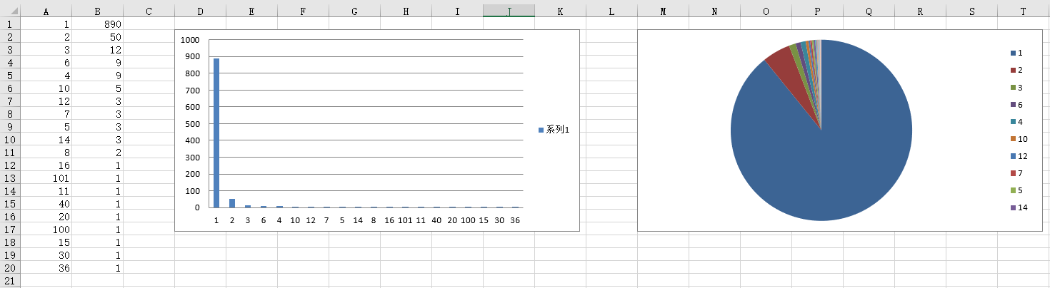
Step 3: load the processed data, draw histogram and pie chart
Step 1: reload the processed data
workbook_2 = load_workbook(filename='Table after data processing.xlsx')
sheet_2 = workbook_2.active
Step 2: draw histogram
chart = BarChart()
data = Reference(worksheet=sheet_2, min_row=1, max_row=20,min_col=2,max_col=2)
categories = Reference(sheet_2, min_col=1,min_row=1,max_row=20)

chart.add_data(data,titles_from_data=False)
chart.set_categories(categories)
sheet_2.add_chart(chart,'D2')
print('Histogram drawing succeeded!')
The difficulty lies in which row and column the data is taken from, and whether the title is to be displayed by default. These are fine tuning
Step 3: draw pie chart
Reference website: https://www.osgeo.cn/openpyxl/charts/pie.html
pie = PieChart()
labels = Reference(sheet_2, min_col=1, min_row=1, max_row=20)
data = Reference(sheet_2, min_col=2, min_row=1, max_row=20)

pie.add_data(data, titles_from_data=False)
pie.set_categories(labels)
sheet_2.add_chart(pie,'M2')
workbook_2.save(filename='Table after data processing.xlsx')
print('\n Pie chart drawing succeeded!')
We should be good at finding relevant documents and materials by ourselves, and look at how to use a certain method or module. The advantage of python is that it can quickly call the completed package or module, and when necessary, it can carry out systematic learning for a certain package or some packages. This comprehensive exercise is also intended to exercise our own ability
All codes and running results of integrated application
import os
os.chdir('D:\\python_major\\auto_office9')
from openpyxl import Workbook
from openpyxl import load_workbook
from openpyxl.chart import BarChart, Reference
from openpyxl.chart import PieChart
workbook = load_workbook(filename = 'Alibaba cloud Tianchi e-commerce baby user data.xlsx')
sheet = workbook.active
workbook_1 = Workbook()
sheet_1 = workbook_1.active

cells = sheet['F']
d = {}
for cell in cells:
	if isinstance(cell.value,int):
		d[cell.value] = d.get(cell.value,0) + 1
ls = list(d.items())
ls.sort(key = lambda x:x[1], reverse=True)#From big to small
print(ls) #There is no way to write this data format
data = []
for row in ls:
	data.append(list(row))
print(data)#It can be converted to this format
for row in data:
	sheet_1.append(row)
workbook_1.save(filename='Table after data processing.xlsx')
print('Data written successfully!')

workbook_2 = load_workbook(filename='Table after data processing.xlsx')
sheet_2 = workbook_2.active


chart = BarChart()
data = Reference(worksheet=sheet_2, min_row=1, max_row=20,min_col=2,max_col=2)
categories = Reference(sheet_2, min_col=1,min_row=1,max_row=20)

chart.add_data(data,titles_from_data=False)
chart.set_categories(categories)
sheet_2.add_chart(chart,'D2')
print('Histogram drawing succeeded!')


pie = PieChart()
labels = Reference(sheet_2, min_col=1, min_row=1, max_row=20)
data = Reference(sheet_2, min_col=2, min_row=1, max_row=20)

pie.add_data(data, titles_from_data=False)
pie.set_categories(labels)
sheet_2.add_chart(pie,'M2')
workbook_2.save(filename='Table after data processing.xlsx')
print('\n Pie chart drawing succeeded!')
- > the output result is: