Yun Qi Hao: https://yqh.aliyun.com
The first-hand cloud information, the selected cloud enterprise case base of different industries, and the best practices extracted from many successful cases help you to make cloud decision!
Introduction: do you really understand the line chart often used in data analysis? What data relationships can be used to present? What problems can be solved in the process of data analysis? How to draw line graph in Python? This article answers for you one by one.
Author: Qu Xifeng, senior Python engineer, knows more than one columnist
Source: big data DT (ID: hzdashuju)

01 overview
Line is a line shape formed by drawing data arranged in columns or rows of a worksheet. Line chart can display continuous data changing with time (according to the common scale setting), which is very suitable for displaying the trend of data at the same time interval.
In a line chart, the characteristics of data increase or decrease, the rate of increase or decrease, the law of increase or decrease (periodicity, helicity, etc.), and the peak value can be clearly reflected. Therefore, line chart is often used to analyze the trend of data change with time, and also to analyze the interaction and interaction of multiple groups of data change with time.
For example, it can be used to analyze the sales of a certain kind of goods or related goods over time, so as to further predict the future sales. In a line graph, the horizontal axis (x-axis) is generally used to represent the passage of time with the same interval, while the vertical axis (y-axis) represents the size of data at different times. As shown in figure 0.
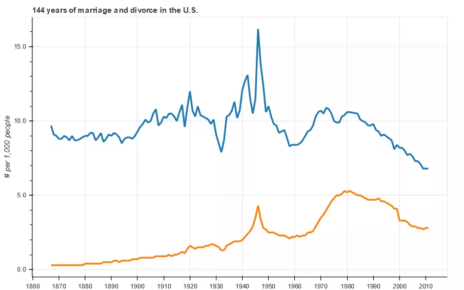
Figure 0 line chart
02 examples
An example line chart code is shown below.
- Code example 1
1# data
2x = [1, 2, 3, 4, 5, 6, 7]
3y = [6, 7, 2, 4, 5, 10, 4]
4# Canvas: axis labels, canvas size
5p = figure(title="line example", x_axis_label='x', y_axis_label='y', width=400, height=400)
6# Drawing: data, legend, lineweight
7p.line(x, y, legend="Temp.", line_width=2)  # Broken line
8# display
9show(p)
The operation result is shown in Figure 1.
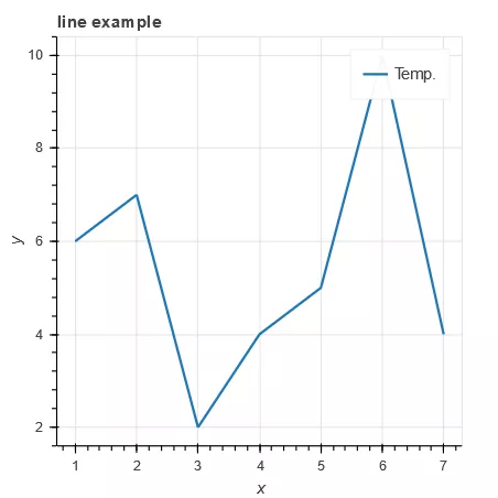
Figure 1 code example 1 running results
Code example 1 still draws the first line graph in the simplest way. The parameters of the line() method are described below.
- p.line(x, y, **kwargs) parameter description
1. X (: Class: ~ bokeh. Core. Properties. Numberspec): X coordinate.
2. Y (: Class: ~ bokeh. Core. Properties. Numberspec): Y coordinate.
3. Line menu alpha (: Class: ~ bokeh. Core. Properties. Numberspec): (default: 1.0) transparency of contour line.
4. Line cap (: Class: ~ bokeh. Core. Enums. Linecap): (default: 'but') line end.
5. Line [color (: Class: ~ bokeh. Core. Properties. Colorspec): (default: 'Black') contour color, default: black.
6. Line dash (: Class: ~ bokeh. Core. Properties. Dashpattern): (default: []) dotted line. The type can be sequence, or string ('solid ',' dashed ',' dotted ',' dotash ',' dashdot ').
7. Line ABCD offset (: Class: ~ bokeh. Core. Properties. Int): (default: 0) dotted line offset.
8.line_join (:class:~bokeh.core.enums.LineJoin ) : (default: 'bevel').
9. Line width (: Class: ~ bokeh. Core. Properties. Numberspec): (default: 1) line width.
10.name (:class:~bokeh.core.properties.String): element name.
11.tags (:class:~bokeh.core.properties.Any): element label.
12.alpha (float): set the transparency of all lines at once.
13. Color: set the color of all lines at once.
14. Source (columndatasource): bokeh specific data format (similar to Panda dataframe).
15.legend (str): Legend of the element.
16. X? Range? Name (STR): X-axis range name.
17. Y? Range? Name (STR): the name of the y-axis range.
18.level (Enum): element rendering level.
- Code example 2
1p = figure(plot_width=400, plot_height=400)
2# The position points of line segment x and y are all lists; the color, transparency and lineweight of the two lines
3p.multi_line([[1, 3, 2], [3, 4, 6, 6]], [[2, 1, 4], [4, 7, 8, 5]],
4color=["firebrick", "navy"], alpha=[0.8, 0.3], line_width=4)  # Multiple fold (curve) lines
5show(p)
The operation result is shown in Figure 2.
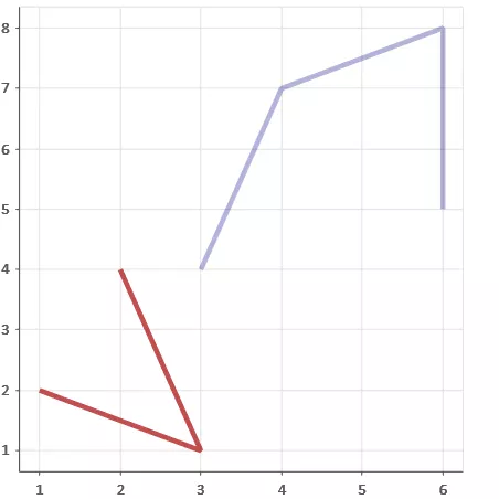
Figure 2 code example 2 running results
In the third line of code example 2, the multi line() method is used to draw two polylines at one time. At the same time, the colors of different polylines are defined in the parameters. If you use Pandas Dataframe, you can draw data for different columns at the same time. The parameters of the multi line() method are described below.
- p. Multi line (XS, ys, * * kwargs) parameter description
1. XS (: Class: ~ bokeh. Core. Properties. Numberspec): X coordinate, list.
2. Ys (: Class: ~ bokeh. Core. Properties. Numberspec): Y coordinate, list.
Other parameters are the same as line.
- Code example 3
1# Preparation data
 2x = [0.1, 0.5, 1.0, 1.5, 2.0, 2.5, 3.0]
 3y0 = [i**2 for i in x]
 4y1 = [10**i for i in x]
 5y2 = [10**(i**2) for i in x]
 6# Create canvas
 7p = figure(
 8      tools="pan,box_zoom,reset,save",
 9      y_axis_type="log", title="log axis example",
10      x_axis_label='sections', y_axis_label='particles',
11      width=700, height=350)
12# Adding layers, drawing
13p.line(x, x, legend="y=x")
14p.circle(x, x, legend="y=x", fill_color="white", size=8)
15p.line(x, y0, legend="y=x^2", line_width=3)
16p.line(x, y1, legend="y=10^x", line_color="red")
17p.circle(x, y1, legend="y=10^x", fill_color="red", line_color="red", size=6)
18p.line(x, y2, legend="y=10^x^2", line_color="orange", line_dash="4 4")
19# display
20show(p)
The operation result is shown in Figure 3.
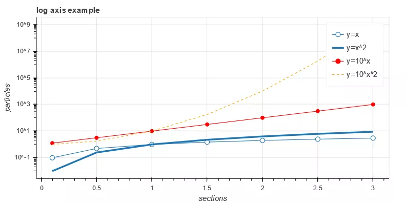
Figure 3 code example 3 running results
Lines 13, 15 and 16 of code example 3 use line () method to draw polylines one by one. The advantage of this method is that the basic data is clear, and legends can be directly defined in different line drawing processes. You can also draw three polylines at a time by using the multi line() method, and then draw the data points on the polyline. Similarly, you can predefine the legend in the function or define it separately with the legend method. The legend will be explained in detail later.
- Code example 4
1p.legend.location = "top_left"  # Legend on top left
2p.legend.click_policy="hide" # Click the legend to display and hide the figure
3show(p)  # Self test effect
The operation result is shown in Figure 4.
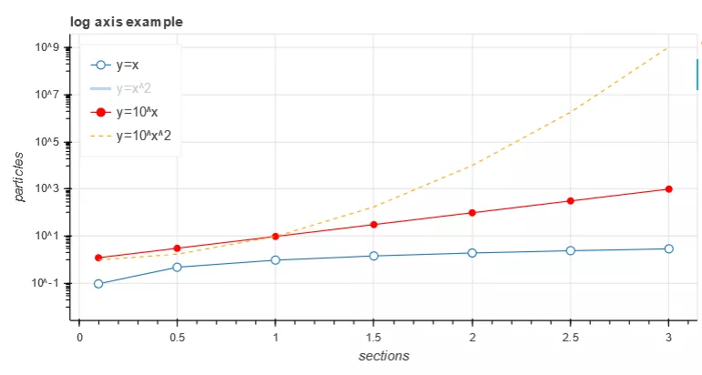
Figure 4 code example 4 running results
Code example 4 adds the location, display or hide graph attribute of the legend on the basis of code example 3. Click the legend to display or hide the graph. When the number of polylines is large or the color interferes with reading, this method can be used to focus on a certain polyline data. This visual way of realizing data human-computer interaction through legends, toolbars and controls is exactly the reason why Bokeh is so hot in GitHub. It is suggested to use it for reference in work practice.
- Code example 5
1# data
 2import numpy as np
 3x = np.linspace(0, 4*np.pi, 200)
 4y1 = np.sin(x)
 5y2 = np.cos(x)
 6# Set the data outside the range of y1 + - 0.9 to infinity
 7y1[y1>+0.9] = +np.inf
 8y1[y1<-0.9] = -np.inf
 9# Replace the data beyond y2 + - 0.9 with mask array or NAN value
10y2 = np.ma.masked_array(y2, y2<-0.9)
11y2[y2>0.9] = np.nan
12# layer
13p = figure(title="lines with missing/inf values")
14# Drawing x,y1
15p.line(x, y1, color="firebrick", line_width=2)  # Brick red
16# Drawing x, y2
17p.line(x, y2, color="blue", line_width=2)  # blue
18show(p)
The operation result is shown in Figure 5.
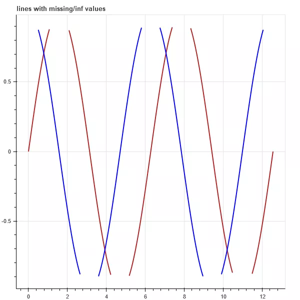
Figure 5 code example 5 running results
Lines 15 and 16 of code example 5 use the line() method to draw two sets of curves with different colors.
- Code example 6
1import numpy as np
 2from collections import defaultdict
 3from scipy.stats import norm
 4from bokeh.models import HoverTool, TapTool
 5from bokeh.layouts import gridplot
 6from bokeh.palettes import Viridis6
 7# data
 8mass_spec = defaultdict(list)  #The initialization function of the defaultdict class takes a list type as a parameter. When the accessed key does not exist, a value can be instantiated as the default value
 9RT_x = np.linspace(118, 123, num=50)
10norm_dist = norm(loc=120.4).pdf(RT_x)  # loc mean; pdf input x, return probability density function
11
12# Generate six sets of Gaussian distribution curves
13for scale, mz in [(1.0, 83), (0.9, 55), (0.6, 98), (0.4, 43), (0.2, 39), (0.12, 29)]:
14       mass_spec["RT"].append(RT_x)
15       mass_spec["RT_intensity"].append(norm_dist * scale)
16       mass_spec["MZ"].append([mz, mz])
17       mass_spec["MZ_intensity"].append([0, scale])
18       mass_spec['MZ_tip'].append(mz)
19       mass_spec['Intensity_tip'].append(scale)
20# line color
21mass_spec['color'] = Viridis6
22# Canvas parameters
23figure_opts = dict(plot_width=450, plot_height=300)
24hover_opts = dict(
25    tooltips=[('MZ', '@MZ_tip'), ('Rel Intensity', '@Intensity_tip')],  # Mouse over curve to dynamically display data
26    show_arrow=False,
27    line_policy='next'
28)
29line_opts = dict(
30    line_width=5, line_color='color', line_alpha=0.6,
31    hover_line_color='color', hover_line_alpha=1.0,
32    source=mass_spec  # Line data
33)
34# Canvas 1
35rt_plot = figure(tools=[HoverTool(**hover_opts), TapTool()], **figure_opts)
36# Draw multiple fold (curve) lines at the same time
37rt_plot.multi_line(xs='RT', ys='RT_intensity', legend="Intensity_tip", **line_opts)
38# x,y axis label
39rt_plot.xaxis.axis_label = "Retention Time (sec)"
40rt_plot.yaxis.axis_label = "Intensity"
41# Canvas 2
42mz_plot = figure(tools=[HoverTool(**hover_opts), TapTool()], **figure_opts)
43mz_plot.multi_line(xs='MZ', ys='MZ_intensity', legend="Intensity_tip", **line_opts)
44mz_plot.legend.location = "top_center"
45mz_plot.xaxis.axis_label = "MZ"
46mz_plot.yaxis.axis_label = "Intensity"
47# display
48show(gridplot([[rt_plot, mz_plot]]))
The operation result is shown in Figure 6.
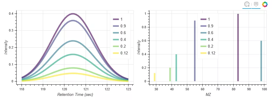
Figure 6 code example 6 running results
In line 19 of code example 6, when the drawing data is generated, the legend name list is generated at the same time; lines 37 and 43 use the multi line() method to draw six curves at one time, and predefine the legend.
- Code example 7
1import numpy as np
 2# data
 3x = np.linspace(0.1, 5, 80)
 4# canvas
 5p = figure(title="log axis example", y_axis_type="log",
 6                    x_range=(0, 5), y_range=(0.001, 10**22),
 7                    background_fill_color="#fafafa")
 8# Mapping
 9p.line(x, np.sqrt(x), legend="y=sqrt(x)",
10            line_color="tomato", line_dash="dashed")
11p.line(x, x, legend="y=x")
12p.circle(x, x, legend="y=x")
13p.line(x, x**2, legend="y=x**2")
14p.circle(x, x**2, legend="y=x**2",
15            fill_color=None, line_color="olivedrab")
16p.line(x, 10**x, legend="y=10^x",
17            line_color="gold", line_width=2)
18p.line(x, x**x, legend="y=x^x",
19            line_dash="dotted", line_color="indigo", line_width=2)
20p.line(x, 10**(x**2), legend="y=10^(x^2)",
21            line_color="coral", line_dash="dotdash", line_width=2)
22# Other
23p.legend.location = "top_left"
24# display
25show(p)
The operation result is shown in Figure 7.
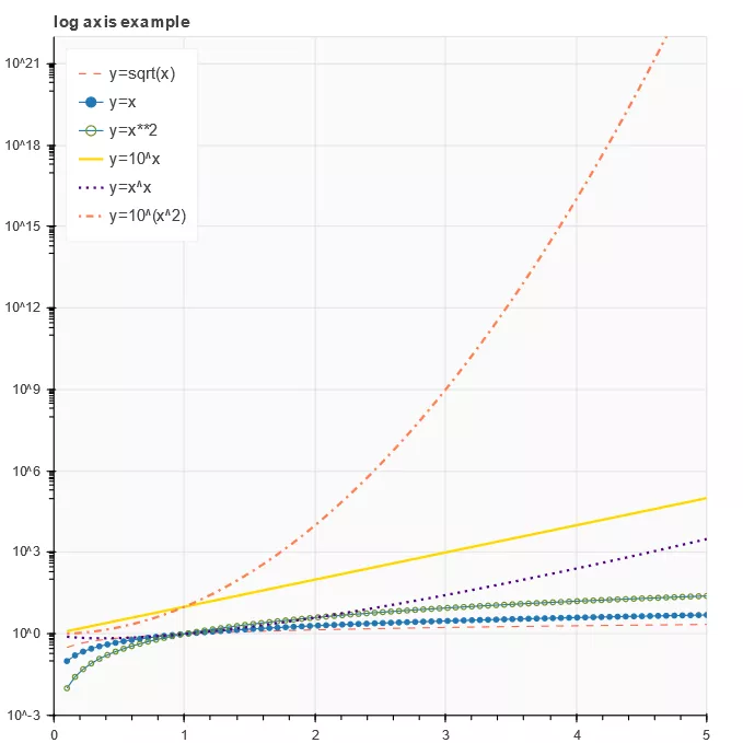
Figure 7 code example 7 running results
Code example 7 is similar to code example 3. Lines 10, 19 and 21 define the attributes of the curve. Pay attention to several forms of dashed lines ('solid ',' dashed ',' dotted ',' dotash ',' dashdot '). You can replace the test by yourself.
- Code example 8
1from bokeh.models import ColumnDataSource, NumeralTickFormatter, SingleIntervalTicker
 2from bokeh.sampledata.us_marriages_divorces import data
 3# data
 4data = data.interpolate(method='linear', axis=0).ffill().bfill()
 5source = ColumnDataSource(data=dict(
 6       year=data.Year.values,
 7       marriages=data.Marriages_per_1000.values,
 8       divorces=data.Divorces_per_1000.values,
 9))
10# Toolbar
11TOOLS = 'pan,wheel_zoom,box_zoom,reset,save'
12# canvas
13p = figure(tools=TOOLS, plot_width=800, plot_height=500,
14              tooltips='<font face="Arial" size="3">@$name{0.0} $name per 1,000 people in @year</font>')
15# Other custom properties
16p.hover.mode = 'vline'
17p.xaxis.ticker = SingleIntervalTicker(interval=10, num_minor_ticks=0)
18p.yaxis.formatter = NumeralTickFormatter(format='0.0a')
19p.yaxis.axis_label = '# per 1,000 people'
20p.title.text = '144 years of marriage and divorce in the U.S.'
21# Mapping
22p.line('year', 'marriages', color='#1f77b4', line_width=3, source=source, name="marriages")
23p.line('year', 'divorces', color='#ff7f0e', line_width=3, source=source, name="divorces")
24# display
25show(p)
The operation result is shown in Figure 8.

Figure 8 code example 8 running results
In line 22 and line 23 of code example 8, two curves are drawn by line() method. Strictly speaking, these two curves are not the standard drawing method of Bokeh time series. Line 17 defines the interval of the x-axis scale and the number of intermediate scales. The reader can try to compare the display effect of num ﹣ minor ﹣ ticks = 10 with figure 8; line 18 defines the data display format of the y-axis.
- Code example 9
1import numpy as np
 2from scipy.integrate import odeint
 3# data
 4sigma = 10
 5rho = 28
 6beta = 8.0/3
 7theta = 3 * np.pi / 4
 8# Vector point generating function in Lorentz space
 9def lorenz(xyz, t):
10      x, y, z = xyz
11      x_dot = sigma * (y - x)
12      y_dot = x * rho - x * z - y
13      z_dot = x * y - beta* z
14      return [x_dot, y_dot, z_dot]
15initial = (-10, -7, 35)
16t = np.arange(0, 100, 0.006)
17solution = odeint(lorenz, initial, t)
18x = solution[:, 0]
19y = solution[:, 1]
20z = solution[:, 2]
21xprime = np.cos(theta) * x - np.sin(theta) * y
22# Color matching
23colors = ["#C6DBEF", "#9ECAE1", "#6BAED6", "#4292C6", "#2171B5", "#08519C", "#08306B",]
24# canvas
25p = figure(title="Lorenz attractor example", background_fill_color="#fafafa")
26# Drawing Lorentz space vector
27p.multi_line(np.array_split(xprime, 7), np.array_split(z, 7),
28             line_color=colors, line_alpha=0.8, line_width=1.5)
29# display
30show(p)
The operation result is shown in Figure 9.
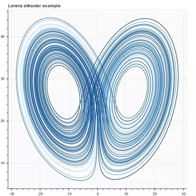
Figure 9 code example 9 running results
In code example 9, the Lorentz space vector is displayed in two-dimensional space by using multi inline() method. The data generation in the example is a little complicated, which can intuitively feel the beauty of the data under visualization. Interested readers can have a deep understanding.
- Code 10
1import numpy as np
 2from bokeh.layouts import row
 3from bokeh.palettes import Viridis3
 4from bokeh.models import CheckboxGroup, CustomJS
 5# data
 6x = np.linspace(0, 4 * np.pi, 100)
 7# canvas
 8p = figure()
 9# Broken line attribute
10props = dict(line_width=4, line_alpha=0.7)
11# Mapping
12l0 = p.line(x, np.sin(x), color=Viridis3[0], legend="Line 0", **props)
13l1 = p.line(x, 4 * np.cos(x), color=Viridis3[1], legend="Line 1", **props)
14l2 = p.line(x, np.tan(x), color=Viridis3[2], legend="Line 2", **props)
15# Check box to activate display
16checkbox = CheckboxGroup(labels=["Line 0", "Line 1", "Line 2"],
17                         active=[0, 1, 2], width=100)
18checkbox.callback = CustomJS(args=dict(l0=l0, l1=l1, l2=l2, checkbox=checkbox), code="""
19l0.visible = 0 in checkbox.active;
20l1.visible = 1 in checkbox.active;
21l2.visible = 2 in checkbox.active;
22""")
23# Add layers
24layout = row(checkbox, p)
25# display
26show(layout)
The operation result is shown in Figure 10.
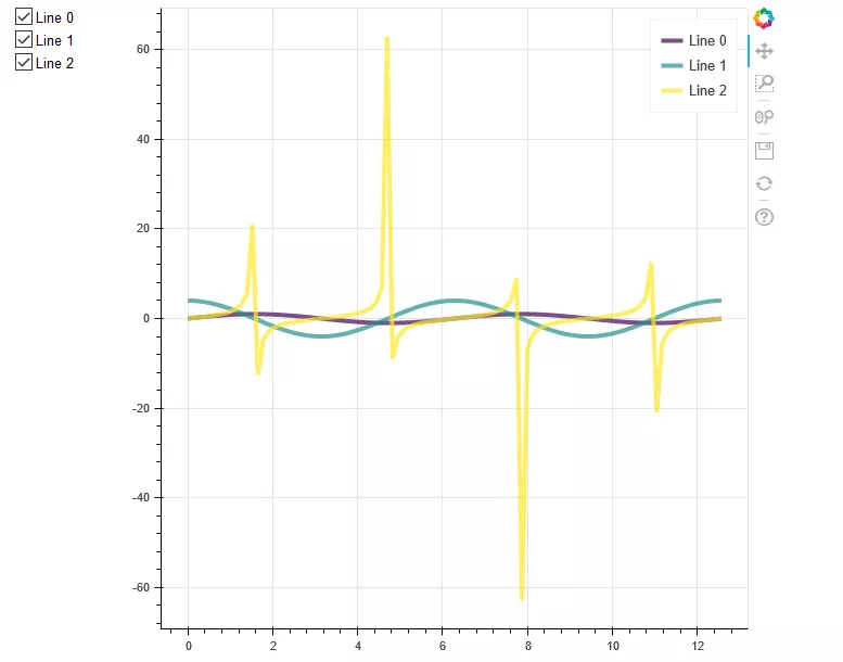
Figure 10 code shows 10 operation results
In code example 10, the Bokeh control check box is added, and lines 12, 13 and 14 use the line() method to draw three curves; line 16 defines the check box, and defines the callback function in line 18, through which the visual state of the three curves can be controlled; line 24 displays the check box, drawing and display in one line.
- Code example 11
1from bokeh.models import TapTool, CustomJS, ColumnDataSource
 2# data
 3t = np.linspace(0, 0.1, 100)
 4# Callback function
 5code = """
 6// cb_data = {geometries: ..., source: ...}
 7const view = cb_data.source.selected.get_view();
 8const data = source.data;
 9if (view) {
10      const color = view.model.line_color;
11      data['text'] = ['Selected the ' + color + ' line'];
12      data['text_color'] = [color];
13      source.change.emit();
14}
15"""
16source = ColumnDataSource(data=dict(text=['No line selected'], text_color=['black']))
17# canvas
18p = figure(width=600, height=500)
19# Mapping
20l1 = p.line(t, 100*np.sin(t*50), color='goldenrod', line_width=30)
21l2 = p.line(t, 100*np.sin(t*50+1), color='lightcoral', line_width=20)
22l3 = p.line(t, 100*np.sin(t*50+2), color='royalblue', line_width=10)
23# Text, pay attention to the text changes when selecting lines
24p.text(0, -100, text_color='text_color', source=source)
25# Call callback function for dynamic interaction
26p.add_tools(TapTool(callback=CustomJS(code=code, args=dict(source=source))))
27# display
28show(p)
The operation result is shown in Figure 11.
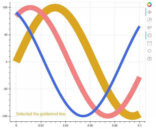
Figure 11 code example 11 running results
Code example 11 increases the interaction effect of clicking curve. Lines 20, 21 and 22 use line() method to draw three curves; line 26 defines the effect when the curve is clicked again: the bottom left of Figure 11 will dynamically display which color curve is currently selected.
- Code example 12
1import numpy as np
 2from bokeh.models import ColumnDataSource, Plot, LinearAxis, Grid
 3from bokeh.models.glyphs import Line
 4# data
 5N = 30
 6x = np.linspace(-2, 2, N)
 7y = x**2
 8source = ColumnDataSource(dict(x=x, y=y))
 9# canvas
10plot = Plot(
11       title=None, plot_width=300, plot_height=300,
12#         min_border=0,
13#         toolbar_location=None
14)
15# Mapping
16glyph = Line(x="x", y="y", line_color="#f46d43", line_width=6, line_alpha=0.6)
17plot.add_glyph(source, glyph)
18# x-axis set separately (default)
19xaxis = LinearAxis()
20plot.add_layout(xaxis, 'below')
21# y-axis set separately (default)
22yaxis = LinearAxis()
23plot.add_layout(yaxis, 'left')
24# Axis scale
25plot.add_layout(Grid(dimension=0, ticker=xaxis.ticker))
26plot.add_layout(Grid(dimension=1, ticker=yaxis.ticker))
27# display
28show(plot)
The operation result is shown in Figure 12.
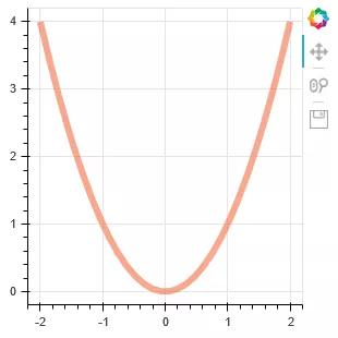
Figure 12 code example 12 run results
Code example 12 uses the models interface to draw the curve. Pay attention to the drawing method of lines 10, 17 and 20. This drawing method is rarely used in practice, only for understanding.
Original release time: January 6, 2020
Author: Qu Xifeng
This article is from Alibaba cloud Qihao partner“ Big data DT ”, you can pay attention to“ Big data DT"
Yun Qi Hao: https://yqh.aliyun.com
The first-hand cloud information, the selected cloud enterprise case base of different industries, and the best practices extracted from many successful cases help you to make cloud decision!