The styles of radio and multi-choice checkbox es in the applet only provide color change, which is obviously not enough for the needs of the actual project, so I simulated and implemented one myself.
Pit: the applet does not support dom operation
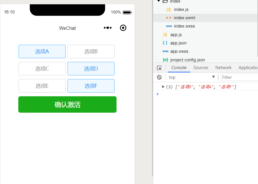
1. Simulate the implementation of multi selection box:
Implementation idea: the idea is very simple. Bind the checked attribute to each option. The type is Boolean value. Click negate
<!--wxml-->
<view class='wrap'>
  <view class='checkbox-con'>
    <checkbox-group bindchange="checkboxChange">
      <label class="{{item.checked?'checkbox checked':'checkbox'}}" wx:for="{{checkboxArr}}" bindtap='checkbox' data-index="{{index}}" wx:key="item.name">
        <checkbox value="{{item.name}}" checked="{{item.checked}}"/>{{item.name}}
      </label>
    </checkbox-group>
     <button type='primary' bindtap='confirm'>Confirm activation</button>
  </view>
</view>
/* wxss */
.wrap{
  width: 550rpx;
  margin: 50rpx auto
}

.checkbox-con{
  margin-top: 40rpx;
  text-align: center
}
.checkbox{
  width: 260rpx;
  height: 72rpx;
  line-height: 72rpx;
  font-size: 28rpx;
  color: #888888;
  border: 1rpx solid #CECECE;
  border-radius: 5rpx;
  display: inline-block;
  margin: 0 10rpx 20rpx 0;
  position: relative
}
.checked{
  color: #1A92EC;
  background: rgba(49,165,253,0.08);
  border: 1rpx solid #31A5FD;
}
.checkbox checkbox{
  display: none
}
.checked-img{
  width: 28rpx;
  height: 28rpx;
  position: absolute;
  top: 0;
  right: 0
}
Page({
  data: {
    checkboxArr: [{
      name: 'option A',
      checked: false
    }, {
      name: 'option B',
      checked: false
    }, {
      name: 'option C',
      checked: false
    }, {
      name: 'option D',
      checked: false
    }, {
      name: 'option E',
      checked: false
    }, {
      name: 'option F',
      checked: false
    }],
  },
  checkbox: function (e) {
    var index = e.currentTarget.dataset.index;//Get the subscript of the current Click
    var checkboxArr = this.data.checkboxArr;//Option set
    checkboxArr[index].checked = !checkboxArr[index].checked;//Change the currently selected checked value
    this.setData({
      checkboxArr: checkboxArr
    });
  },
  checkboxChange: function (e) {
    var checkValue = e.detail.value;
    this.setData({
      checkValue: checkValue
    });
  },
  confirm: function() {// Submission
    console.log(this.data.checkValue)//value of all selected items
  },
})
Get it done.
2. Simulate the realization of radio box
Idea: This is similar to multi selection. The difference is that you need to clear the selection status of other items when clicking, and then set the current item to the selected status
The code is almost the same
For wxml, change the check group label to radio group; for JS, add more judgment when clicking
<!--wxml-->
<view class='wrap'>
  <view class='checkbox-con'>
    <radio-group bindchange="radioChange">
      <label class="{{item.checked?'checkbox checked':'checkbox'}}" wx:for="{{checkboxArr}}" bindtap='radio' data-index="{{index}}" wx:key="item.name">
        <checkbox value="{{item.name}}" checked="{{item.checked}}"/>{{item.name}}
      </label>
    </radio-group>
     <button type='primary' bindtap='confirm'>Confirm activation</button>
  </view>
</view>
Page({
  data: {
    checkboxArr: [{
      name: 'option A',
      checked: false
    }, {
      name: 'option B',
      checked: false
    }, {
      name: 'option C',
      checked: false
    }, {
      name: 'option D',
      checked: false
    }, {
      name: 'option E',
      checked: false
    }, {
      name: 'option F',
      checked: false
    }],
  },
  radio: function (e) {
    var index = e.currentTarget.dataset.index;//Get the subscript of the current Click
    var checkboxArr = this.data.checkboxArr;//Option set
    if (checkboxArr[index].checked) return;//If the clicked current is selected, return to
    checkboxArr.forEach(item => {
      item.checked = false
    })
    checkboxArr[index].checked = true;//Change the currently selected checked value
    this.setData({
      checkboxArr: checkboxArr
    });
  },
  radioChange: function (e) {
    var checkValue = e.detail.value;
    this.setData({
      checkValue: checkValue
    });
  },
  confirm: function() {// Submission
    console.log(this.data.checkValue)//value of all selected items
  },
})
Last screenshot