I haven't been with the new blog for a long time. I have nothing to record today. Hahaha
Today, little sister of the product came to tell me to change the style of the product activity page. I looked at it and found that there was a carousel style, which was big on both sides and big in the middle. I had never written this before and wanted to implement it in the small program. I thought it would not be very simple. I wanted to record it. Actually, it was not as hard to implement as I thought
The applet has a component called swiper, which can be used directly. Moreover, it provides two properties that are very practical
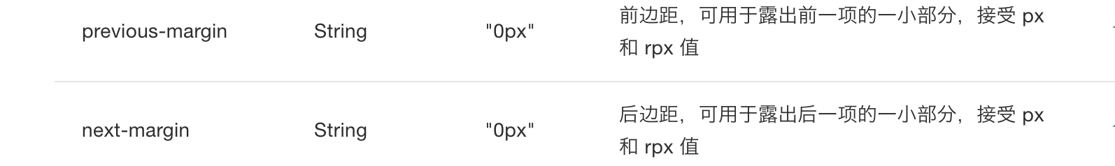
This can help to realize the function of displaying picture information on both sides
My main idea is to give a logo to make his style in a large picture state when sliding to a picture. His last picture is to shrink and show the left part. The next one is to shrink and show the right part. So I will change the cyclic picture data to this way
imgUrls: [
      {
        url: 'http://img02.tooopen.com/images/20150928/tooopen_sy_143912755726.jpg',
        isChange:1,
      },
      {
        url: 'http://img06.tooopen.com/images/20160818/tooopen_sy_175866434296.jpg',
        isChange: 2,
      },
      {
        url: 'http://img06.tooopen.com/images/20160818/tooopen_sy_175833047715.jpg',
        isChange: 3,
      },
    ],
The field isChange is used to determine the image style
Page code
 <swiper indicator-dots="{{false}}" autoplay="{{false}}" previous-margin='80rpx' next-margin='80rpx' bindchange='swiperChange'>
  <block wx:for="{{imgUrls}}" wx:for-item='item' wx:key=''>
    <swiper-item>
      <view class="shuffing-item {{item.isChange==2?'shuffing-item-next':item.isChange==0?'shuffing-item-preo':''}}">
        <image src="{{item.url}}"></image>
        <view class='shuffing-mask'>
          <text>Open the old fairy tale</text>
          <text>></text>
        </view>
      </view>
    </swiper-item>
  </block>
</swiper>
Style code
swiper{
  height:520rpx;
  margin:20rpx 30rpx;
}

.shuffing{
  text-align: center;
  width:100%;
  position: relative;
}
.shuffing-item{
  position: absolute;
  width:100%;
  left:50%;
  top:50%;
  transform: translateX(-50%) translateY(-50%);
  height:520rpx;
  transition: all 0.3s;
}
.shuffing-item-next{
  width:85%;
  height:85%;
  transform:translateX(-100%) translateY(-50%);
  transition: all 0.3s;
}
.shuffing-item-preo{
  width:85%;
  height:85%;
  transform:translateX(40%) translateY(-50%);
  transition: all 0.3s;
}
.shuffing-item>image{
  width:100%;
  height:100%;
}
.shuffing-mask{
  position: absolute;
  bottom: 0;
  width:100%;
  line-height: 60rpx;
  background: rgba(0,0,0,0.6);
  color:#fff;
  display: flex;
  justify-content: space-between;
  padding:0 20rpx;
}
I think it's easy to implement a swiper component in an applet. It's not as hard as I thought at first