This paper mainly refers to the courseware content of Li Ding, a teacher of the people's Congress, and fork s the map file of Li on github
For Mr. Ding's courseware, please refer to https://github.com/lidingruc/2017R/commit/30a14cc9c77b69dfd8252b7aa425afc87566c786
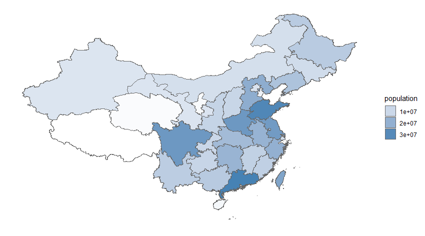
The South China Sea is a vast area. Generally, after the map of the whole country includes the South China Sea area, the area occupied by the mainland area is relatively small, so it is better to have a small map of the South China Sea Islands on the right side to avoid political mistakes.
After searching the network, we found that ggplot seems to be a good way to draw a map. Mr. Li's courseware used three methods. The first two used direct mapping, which had a great difference in style and was not perfect. The last one used low-level mapping function, which was added directly. The effect was good, but it was more complicated. So the author combined with ggplot2 package and referred to http://blog.sina.com.cn/s/blog ec9e85e20102vvst.html, and thought that nested map seems to be feasible. The main codes are as follows:
Map data files are mainly national basic geographic information1: 400Ten thousand data packets can be downloaded on the Internet, but we don't know the time. We are just examples. Regardless of this difference, the main packages needed are
library(maptools)#It is the basic package of many spatial analysis, which needs to be loaded first
library(rgdal)#Read vector boundary to use in this package
library(ggplot2)
library(sp)
#Nine sections from fork to
l9<-rgdal::readOGR("./chinaadm/BASIC/Nine segment line.shp")
#
#data reading
china_map = readOGR("./china","bou2_4p")   # Read provincial map file
xdata<-china_map@data #Read map data
xs<-data.frame(xdata,id=seq(0:924)-1) #Get provincial data
china_map1 <- fortify(china_map) #Convert to data box
china_map_data<-join(china_map1, xs, type = "full") #
dat_pop<-read.csv("./china/data_pop.csv",T) #Read provincial population data
china_data <- join(china_map_data, dat_pop, type="full") #Matrix merging
#
#Plotting thermodynamic diagram

p1<-ggplot(china_data,aes(long,lat,group=group))+
  geom_polygon(aes(fill=pop),color="grey40")+
  scale_fill_gradient(low="white",high="steelblue",guide=guide_legend("population"))+
  scale_x_continuous(limits = range(china_data$long))+
  scale_y_continuous(limits=c(min(china_data$lat)+10,max(china_data$lat)))+
  #coord_map("albers",lat0=27,lat1=45)+
  xlab("Longitude")+
  ylab("Latitude")+
  theme(
    axis.text = element_blank(),
    axis.ticks = element_blank(),
    axis.title = element_blank(),
    panel.grid = element_blank(),
    panel.background = element_blank()
  )
p1
l91<-l9%>%fortify()
#Small drawing
p2<-ggplot()+
  geom_polygon(data=china_data,aes(x=long,y=lat,group=group),color="grey40",fill="white")+ #Drawing provincial map
  geom_line(data=l91,aes(x=long,y=lat,group=group),color="red",size=1)+ #9Segment line
  coord_cartesian(xlim=c(105,125),ylim=c(3,30))+ #Zoom out to the South
  theme(
    aspect.ratio = 1.25, #Adjust aspect ratio
    axis.text = element_blank(),
    axis.ticks = element_blank(),
    axis.title = element_blank(),
    panel.grid = element_blank(),
    panel.background = element_blank(),
    panel.border = element_rect(fill=NA,color="grey20",linetype=1,size=0.8),
    plot.margin=unit(c(0,0,0,0),"mm")
    p2
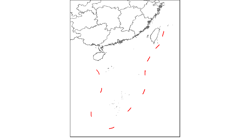
#Chimerism2Map
library(grid) #ggplot is also grid
vie <- viewport(width=0.45,height=0.3,x=0.78,y=0.25) #Define the drawing area of a small graph
p1 #Draw a larger picture
print(p2,vp=vie) #Add a small graph in p1 according to the above format

This article's method code is significantly reduced and easier to understand. Besides, ggplot2 package is currently equipped with R-painted icons.