We can see that our view in the picture is divided into three parts, namely the head, the left part and the right part.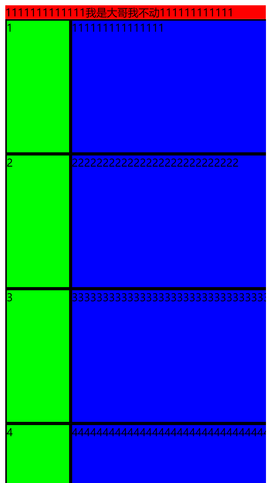 As you can see in the picture, no matter we click the left block or the right block, there will be no cutting, because I give the same height and inner margin.
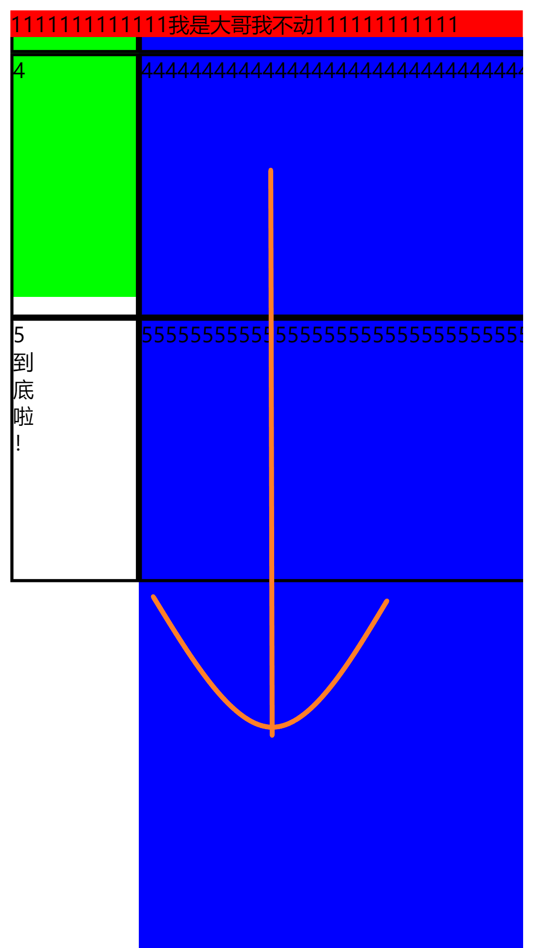 As you can see in the picture, we slide the blue block on the right, and the green area on the left is not covered. I left a large padding at the bottom because there are usually modules (bottom columns) at the bottom of the development. In some long devices (iPhone x), the data will be covered. In addition, if there is a bottom column below, please remember to add a background color, otherwise the scroll bar will not be covered.
HTML:
  <div class="hello">
    <div class="top">1111111111111 I'm the big brother. I don't move 111111111.</div>
    <div class="mid">
      <div class="mid-child">
        <div class="mid-child-left">
          <div class="content">1</div>
          <div class="content">2</div>
          <div class="content">3</div>
          <div class="content">4</div>
          <div class="content">5<br>reach<br>bottom<br>La<br>!</div>
        </div>
        <div class="mid-child-right">
          <div class="mid-child-right-div">
            <div class="content">111111111111111</div>
            <div class="content">222222222222222222222222222</div>
            <div class="content">33333333333333333333333333333333333333333</div>
            <div class="content">4444444444444444444444444444444444444444444444444</div>
            <div class="content">5555555555555555555555555555555555555555555555555555 After all!</div>
          </div>
        </div>
      </div>
    </div>
  </div>
CSS: (Note: in the CSS attribute, you must turn off the overflow of html as a global attribute, which is on by default. If you don't change it to hidden, you will find that even the head swings together.)
html {
  overflow: hidden;
}
.top {
  background: #f00;
}
.content {
  height: 200px;
  border-style: solid;
  border-width: 2px;
  border-color: black;
}
.mid {
  overflow-y: auto;
  height: 800px;
}
.mid-child {
  display: flex;
  justify-content: flex-start;
  padding-bottom: 250px;
}
.mid-child-left {
  width: 200px;
  background: #0f0;
}
.mid-child-right {
  overflow-y: hidden;
  overflow-x: auto;
  width: 600px;
  background: #00f;
  padding-bottom: 250px;

}
.mid-child-right-div {
  width: 600px;
  padding-right: 100px;

}