Catalog
Tooltipster is a simple, easy-to-use and powerful jQuery prompt box plug-in. It is used to provide cool prompt boxes for mouse events or other keyboard events such as dragging, moving, clicking of HTML elements. It helps to enrich the prompt function of the system. This article mainly records how to use ToolTipster to build your own prompt box component in a webpack project.
Official address: http://down.admin5.com/demo/code_pop/28/72/
Official website example: https://vuejsexamples.com/vuejs-2-x-tooltip-component-based-tooltipster-js/
Install ToolTipster
Before we start installing ToolTipster, we need to install JQuery and Bootstrap 4.x.
"Introducing Bootstrap 4.x into Webpack Project"
"Introducing jQuery into Vue Components"
Lodash is also used in this example to merge ToolTipster's parameter options, and NPM is used for installation:
npm install tooltipster --save // Install ToolTipster
npm install lodash --save // Install Lodash
Create prompt box components
Create a prompt box component named V-ToolTip.vue with the following template:
<template>
  <div class="v-tooltip">
    <div ref="tooltipster">
      <slot></slot>
    </div>
    <div class="hidden p-xs">
      <div ref="content">
        <slot name="content"></slot>
      </div>
    </div>
  </div>
</template>

<script>
import "tooltipster/dist/css/tooltipster.bundle.min.css";
import "tooltipster/dist/css/plugins/tooltipster/sideTip/themes/tooltipster-sideTip-borderless.min.css";
// import 'tooltipster/dist/css/plugins/tooltipster/sideTip/themes/tooltipster-sideTip-light.min.css'
// import 'tooltipster/dist/css/plugins/tooltipster/sideTip/themes/tooltipster-sideTip-noir.min.css';
// import 'tooltipster/dist/css/plugins/tooltipster/sideTip/themes/tooltipster-sideTip-punk.min.css'
// import 'tooltipster/dist/css/plugins/tooltipster/sideTip/themes/tooltipster-sideTip-shadow.min.css'
import $ from "jquery";
import "tooltipster";
import _ from "lodash";

export default {
  name: "tooltip",
  props: {
    label: {
      default: ""
    },
    tooltipsterOptions: {
      type: Object,
      default: function() {
        return {};
      }
    }
  },
  data: function() {
    return {
      defaultOptions: {
        animationDuration: 500,
        animation: "fade",
        contentAsHtml: true,
        delay: 0,
        minWidth: 100,
        interactive: true,
        distance: 10,
        theme: "tooltipster-borderless", // tooltipster-shadow, tooltipster-light, tooltipster-borderless, tooltipster-punk, , tooltipster-noir
        multiple: true,
        respositionOnScroll: true,
        trigger: "custom",
        trackTooltip: false,
        triggerOpen: {
          mouseenter: true,
          touchstart: true
        },
        triggerClose: {
          mouseleave: true,
          originClick: false,
          touchleave: true
        }
      }
    };
  },
  methods: {
    beforeDestroy: function() {
      this.tooltipsterInstance.close();
    }
  },
  mounted: function() {
    let self = this;
    this.tooltipsterInstance = $(this.$refs.tooltipster.children[0])
      .tooltipster(
        _.merge(this.defaultOptions, this.tooltipsterOptions, {
          content: this.label ? this.label : this.$refs.content
        })
      )
      .tooltipster("instance");
    this.tooltipsterInstance.on("close", function(event) {
      console.log("close"); // Later extended standby
    });

    this.tooltipsterInstance.on("before", function(event) {
      console.log("before"); // Later extended standby
    });

    this.tooltipsterInstance.on("after", function(event) {
      console.log("after"); // Later extended standby
    });
  },
  watch: {
    label: function(newLabel) {
      // if label change need to wath in order to update content to tooltipster!
      if (newLabel) {
        $(this.$refs.tooltipster.children[0]).tooltipster({
          content: newLabel
        });
      } else {
        $(this.$refs.tooltipster.children[0]).tooltipster({
          content: _.get(this.$slots, "content[0].elm")
        });
      }
    }
  }
};
</script>
<style scoped>
.hidden {
  display: none;
}
.p-xs {
  padding: 5px;
}
</style>
Use the prompt box component
Import the prompt box component (V-ToolTip.vue) in other VUE components (Hello.vue) for use:
<template>
<div class="demo">
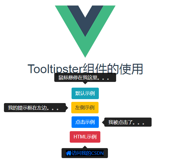
<h1>Tooltipster Use of components</h1>
<br />
<div>
<vue-tooltipster label="The mouse hovered over me...">
<span class="btn btn-small btn-info" style="margin:5px;">Default example</span>
</vue-tooltipster>
<vue-tooltipster label="My prompt box is on the left..." :tooltipsterOptions="{side: 'left'}">
<span class="btn btn-small btn-warning" style="margin:5px;">Left example</span>
</vue-tooltipster>
<vue-tooltipster label="I was clicked..." :tooltipsterOptions="{trigger: 'click',side:'right'}">
<span class="btn btn-small btn-primary" style="margin:5px;">Click sample</span>
</vue-tooltipster>
<vue-tooltipster :tooltipsterOptions="{side:'bottom'}">
<span class="btn btn-small btn-danger" style="margin:5px;">HTML Example</span>
<div slot="content" style="background-color: black">
<a href="https://blog.csdn.net/pengjunlee">
<i class="icon-home icon-large"></i>Visit me CSDN
</a>
</div>
</vue-tooltipster>
</div>
</div>
</template>
<script>
import VueTooltipster from "./V-ToolTip.vue";
export default {
name: "Hello",
data() {},
components: {
VueTooltipster
}
};
</script>
<style scoped>
</style>
The effect of accessing Hello components on the browser side is as follows:
Reference articles
http://iamceege.github.io/tooltipster/