Preface
Transitional animation is indispensable in modern development, and rigidity and cool are closely related to it.
ng2.x animation-related api is incorporated into the core module @angular/core, which is independent after angular 4.
However, there is little difference in the way of writing, but the introduction has changed. Please refer to my article for the way of introduction.
Question 2: Animation has a dedicated module
# Brief Introduction to Angular 2 + Transition Animation
Angular animation is a standard-based Web animation API( Web Animations API ) Constructed,
This API is relatively new and only newer browsers can support it (as follows)
Can I Use : Web Animations API
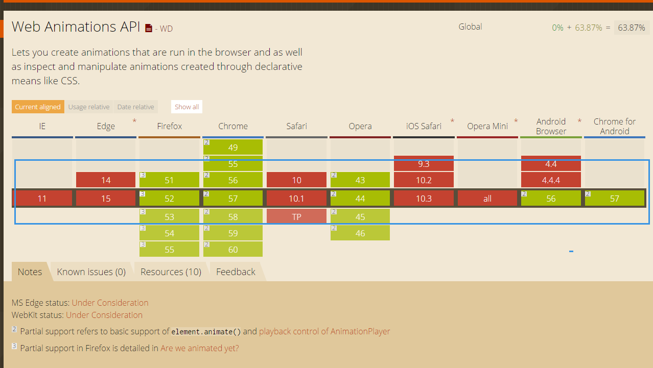
Essentially, it's css2.1-3, but it's only in the encapsulated object of api, that is to say, the foundation of CSS 3 must be good!!
# Relevant Theory of Transitional Animation
To sum up in general, there are several points.
- The transition of animation is used between transitions, and the state of transitions can be customized.
- Default transitions include the following (the validity of the state style can be effected by passing the corresponding state value)
- Inactive = > active: to be activated to activate
- Void =>*: Entry can also be written as: enter, * matches any animation state, *=>* does not trigger transit animation.
- *=> Void: Departure can also be written as: leave, void represents a special state when the element is not attached to the view
actual combat
Here's a simple gradient transition to illustrate, as shown in Figure 1
Gradual Modern Code
import {
  trigger, // Animation package trigger, external trigger
  state, // Transition state control
  style, // Used to write basic styles
  transition, // transition for css3
  animate, // animations used to implement css3
  keyframes // Used to implement css3 keyframes
} from '@angular/animations';


export const fadeIn = trigger('fadeIn', [
  state('in', style({ display: 'none' })), // The Default element does not expand
  transition('void => *', [ // Entry animation
    animate(200, keyframes([
      style({ height: '0', opacity: 0, offset: 0 }), // Element Height 0, Element Hiding (Transparency 0), Animation Frame 0%
      style({ height: '*', opacity: 1, offset: 1 }) // Highly adaptive expansion after 200ms, element expansion (transparency 1), animation frame at 100%.
    ]))
  ]),
  transition('* => void', [
    animate(200, keyframes([
      style({ height: '*', opacity: 1, offset: 0 }), // Correspondingly, let elements transit from display to hiding
      style({ height: '0', opacity: 0, offset: 1 })
    ]))
  ]),
]);
How to use animation?
Usage is very simple, can be called in the component;
There are two kinds.
1. Write animations directly in animations, and animations accept an array.
2. Encapsulation and Introducing= Recommendation
- components.ts
// This is Writing 2; I encapsulate the animation effect independently into the corresponding ts file for easy reuse.
import { fadeIn } from '../../../../../animation/fadeIn';
import { bounceIn } from '../../../../../animation/bounceIn';
@Component({
  selector: 'app-list',
  templateUrl: './list.component.html',
  styleUrls: ['./list.component.scss'],
  animations: [fadeIn, bounceIn]
})

// Some people say why not write it directly in code, such as the following
// This writing is recommended in a separate component or module, which is used by third parties to achieve a transitional effect within the component itself.
// If it's the corresponding system, it's easier for us to maintain by reducing coupling, that's why I recommend the above way of writing.
@Component({
  selector: 'app-list',
  templateUrl: './list.component.html',
  styleUrls: ['./list.component.scss'],
  animations: [
    trigger('fadeIn', [
      state('in', style({ display: 'none' })), // The Default element does not expand
      transition('void => *', [ // Entry animation
        animate(200, keyframes([
          style({ height: '0', opacity: 0, offset: 0 }), // Element Height 0, Element Hiding (Transparency 0), Animation Frame 0%
          style({ height: '*', opacity: 1, offset: 1 }) // Highly adaptive expansion after 200ms, element expansion (transparency 1), animation frame at 100%.
        ]))
      ]),
      transition('* => void', [
        animate(200, keyframes([
          style({ height: '*', opacity: 1, offset: 0 }), // Correspondingly, let elements transit from display to hiding
          style({ height: '0', opacity: 0, offset: 1 })
        ]))
      ]),
    ])]
})
- html
<! - Call directly without passing status, and use the @ symbol to refer to the corresponding animation - >.
<h3*ngIf="list & list.length=== 0" class="text-center text-muted"@fadeIn> no relevant data information yet!!!</h3>
  </div>


<! - Transfer status, consistent with regular binding
 <h3*ngIf= "list & list.length=== 0" class= "text-center text-muted" [@bounceIn]= "list.state"> no relevant data information yet!!!</h3>
summary
- Animation should be maximized reuse, or too many animations, although the effect is dazzling, that packaging volume is relatively large.
- For browsers that do not support the web-animations API, the corresponding polyfill s should be introduced for compatibility. [web-animations] Of course, compatibility is not so bad, and only supports newer browsers, IE10+