Preface
- EditText is very common in Android development
- This article will teach you how to make a SuperEditText control with one-click deletion function, which is rich in custom style. I hope you will like it.
Open source in Github: Super_EditText Welcome to Star!
Catalog
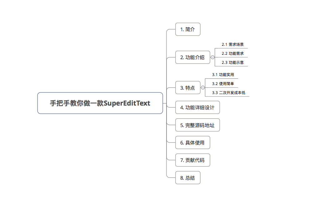
1. introduction
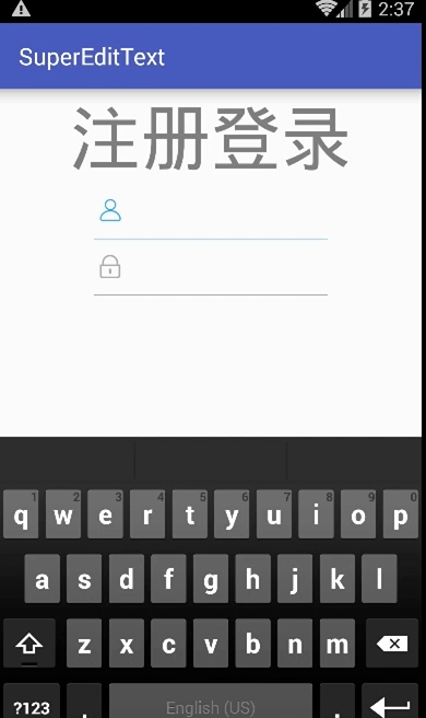
A SuperEditText control with one-click deletion function
Open source in Github: Super_EditText Welcome to Star!
2. Functional introduction
2.1 Requirement scenario
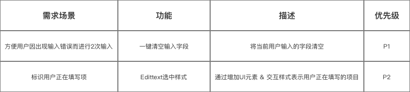
For EditText, the general requirements are:
- Facilitate users to enter twice due to input errors
- Identify the user filling in the item
- Adding UI elements to specific scenarios
2.2 Functional Requirements
According to the requirement scenario, the functions of EditText are as follows:
- One key deletion
- Rich custom style: left icon, delete function icon, split line & cursor style change. Specifically as follows:
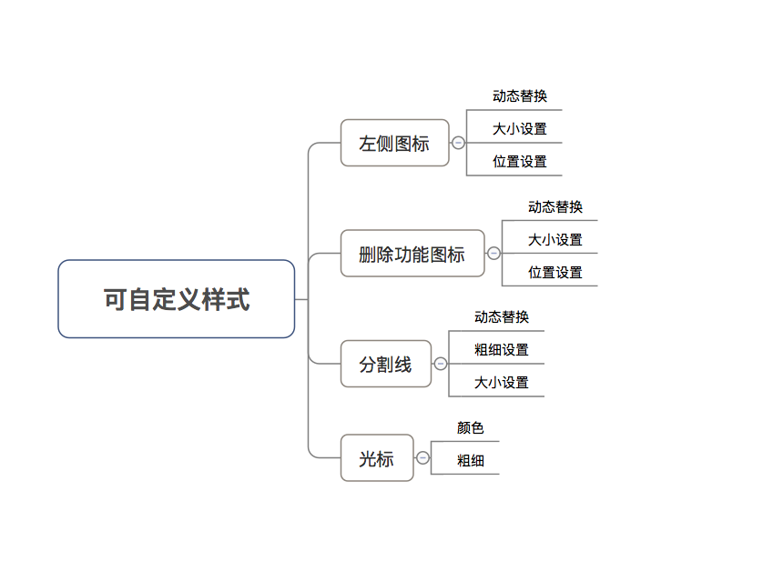
Note: The settings of this style are not available in the API that comes with the system.
- Function list
2.3 Functional Indications
3. characteristics
Contrast the EditText control on the market, the control Super_EditText It is characterized by:
3.1 Function Practical
- One-click deletion function is very common in demand, and now it is more convenient to use after encapsulation.
- Highly customizable styles (more powerful and convenient than their own), less complex but able to meet general EditText usage requirements
Customizable styles are as follows: (Note: The style settings are not available in the API that comes with the system)
3.2 Easy to use
- Simple xml attribute configuration is required
- See the article specifically: Android Custom View: You need a simple and practical SuperEditText.
3.3 Low cost of secondary development
- This project has been open source on Github: Super_EditText
- Have detailed source code analysis documentation (that is, this article)
So the cost of customization is very low.
4. Detailed design of functions
Detailed functional logic is given below.
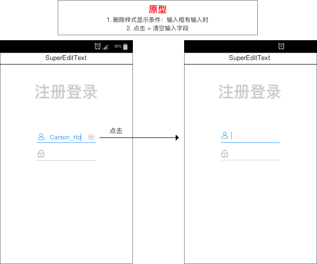
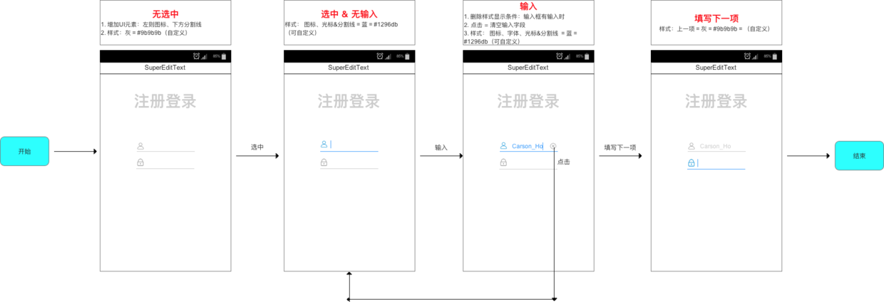
4.1 One key clears the input field
- Description: Clear the fields entered by the current user
- Requirement scenario: Convenient for users to enter twice due to input errors
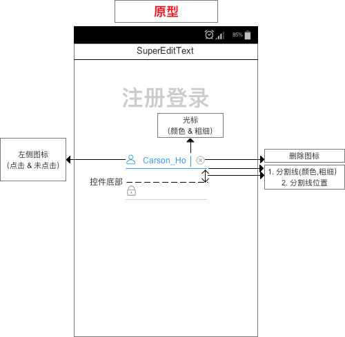
- Prototype map
- Source code analysis
   /*
    * Step 1: Define attributes
    * */

    private int  ic_deleteResID; // Delete icon resource ID
    private Drawable  ic_delete; // delete icon
    private int delete_x,delete_y,delete_width,delete_height; // Delete icon starting point (x,y), delete icon width and height (px)

    /*
    * Step 2: Initialize properties
    * */
   private void init(Context context, AttributeSet attrs) {

        // Get control resources
        TypedArray typedArray = context.obtainStyledAttributes(attrs, R.styleable.SuperEditText);
       /**
         * Initialize Delete Icon
         */
         // 1. Get the resource ID
         ic_deleteResID = typedArray.getResourceId(R.styleable.SuperEditText_ic_delete,R.drawable.delete);
         // 2. Obtain icon resources according to resource ID (converted into Drawable objects)
         ic_delete =  getResources().getDrawable(ic_deleteResID);
         // 3. Setting icon size
         // Starting point (x, y), width = left_width, height = left_height
         delete_x = typedArray.getInteger(R.styleable.SuperEditText_delete_x, 0);
         delete_y = typedArray.getInteger(R.styleable.SuperEditText_delete_y, 0);
         delete_width = typedArray.getInteger(R.styleable.SuperEditText_delete_width, 60);
         delete_height = typedArray.getInteger(R.styleable.SuperEditText_delete_height, 60);
         ic_delete.setBounds(delete_x, delete_y, delete_width, delete_height);

   /**
     * Step 3: Determine whether to display the deleted icon by listening for copying EditText itself
     * Monitoring method: onTextChanged () & onFocusChanged ()
     * Call time: when the content of the input box changes - when the focus changes
     */
    @Override
    protected void onTextChanged(CharSequence text, int start, int lengthBefore, int lengthAfter) {
        super.onTextChanged(text, start, lengthBefore, lengthAfter);
        setDeleteIconVisible(hasFocus() && text.length() > 0,hasFocus());
        // hasFocus() returns whether to get the focus of EditTEXT, that is, whether to select
        // setDeleteIconVisible ()= Judging whether to display deletion icon based on whether the input is selected or not - > Concern 1
    }

    @Override
    protected void onFocusChanged(boolean focused, int direction, Rect previouslyFocusedRect) {
        super.onFocusChanged(focused, direction, previouslyFocusedRect);
        setDeleteIconVisible(focused && length() > 0,focused);
        // Focus = whether to get the focus
        // Also, according to setDeleteIconVisible (), judge whether to display deletion icon - > Concern 1
    }

   /**
     * Focus on 1
     * Function: Determine whether deletion icons are displayed or not
     */
    private void setDeleteIconVisible(boolean deleteVisible,boolean leftVisible) {
        setCompoundDrawables(leftVisible ?  ic_left_click :  ic_left_unclick, null,
                deleteVisible ?  ic_delete: null, null);

    // Introduction to setCompound Drawables (Drawable left, Drawable top, Drawable right, Drawable bottom)
        // Function: Set icons on top, bottom, left and right of EditText (equivalent to android: drawableLeft="" android: drawableRight=")
        // Note: The incoming Drawable object must have setBounds(x,y,width,height), i.e. it must have set the initial location, width, and higher information.
        // X: Starting Point y of Component on Container X Axis: Starting Point width of Component on Container Y Axis: Length height of Component: height of Component
        // If you don't want to display it somewhere, set it to null

        // Another similar approach: set Compound Drawables Within Intrinsic Bounds (Drawable left, Drawable top, Drawable right, Drawable bottom)
        // Function: Set icons on top, bottom, left and right of EditText
        // The difference from setCompound Drawables is that the width of the incoming Drawables from setCompound Drawables Within Intrinsic Bounds () is equal to the inherent width (automatically obtained through getIntrinsicWidth () & getIntrinsicHeight ())
        // setBounds(x,y,width,height) need not be set
    }


   /**
     * Step 4: Set the click event for the deleted icon area, that is, "click = empty the search box content"
     * Principle: When the finger is raised in the deleted icon area, it is regarded as clicking the deleted icon = emptying the search box content.
     */
    @Override
    public boolean onTouchEvent(MotionEvent event) {

        // Principle: When the finger is raised in the deleted icon area, it is regarded as clicking the deleted icon = emptying the search box content.
        switch (event.getAction()) {
            // Judgment action = when the finger is raised
            case MotionEvent.ACTION_UP:
                Drawable drawable =  ic_delete;

                if (drawable != null && event.getX() <= (getWidth() - getPaddingRight())
                        && event.getX() >= (getWidth() - getPaddingRight() - drawable.getBounds().width())) {

                    // Description of Judgment Conditions
                    // event.getX(): Positional coordinates when lifted
                    // getWidth(): Width of the control
                    // getPaddingRight(): Delete the distance from the right edge of the icon icon to the right edge of the EditText control
                    // That is, getWidth() - getPaddingRight() = the right edge coordinate of the deleted icon = X1
                        // getWidth() - getPaddingRight() - drawable.getBounds().width() = coordinates of the left edge of the deleted icon = X2
                    // So the area between X1 and X2 = the area where the icon is deleted
                    // When the finger is raised in the deleted icon area (X2=<event.getX()<=X1), it is considered that the deleted icon is clicked to empty the search box.
                    setText("");

                }
                break;
        }
        return super.onTouchEvent(event);
    }

4.2 Select Style
- Description: By adding UI elements - interactive style, the user is filling in the project.
- Requirement scenario: Identify the user filling in the item
- Style description
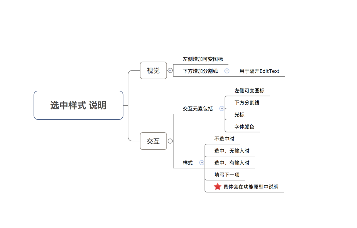
- Prototype map
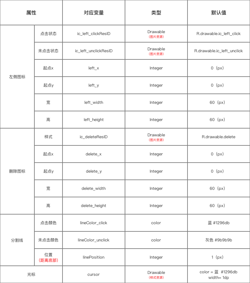
- Attribute specification
- Source code analysis
   /*
    * Step 1: Define attributes
    * */
    private Paint mPaint; // Paint brush
    private int  ic_left_clickResID,ic_left_unclickResID;    // Icon Resource ID on the left (click & no click)
    private Drawable  ic_left_click,ic_left_unclick; // Icon on the left (click & click)
    private int left_x,left_y,left_width,left_height; // Starting point of left Icon (x,y), width and height of left Icon (px)

    private int cursor; // cursor

    // Segmentation line variable
    private int lineColor_click,lineColor_unclick;// Click - Click No Color
    private int color;
    private int linePosition; // Splitting line position

   /*
    * Step 2: Initialize properties
    * */
private void init(Context context, AttributeSet attrs) {

        // Get control resources
        TypedArray typedArray = context.obtainStyledAttributes(attrs, R.styleable.SuperEditText);

        /**
         * Initialize the left Icon (click & click)
         */

        // a. Click on the left icon of the status
         // 1. Get the resource ID
         ic_left_clickResID = typedArray.getResourceId(R.styleable.SuperEditText_ic_left_click, R.drawable.ic_left_click);
         // 2. Obtain icon resources according to resource ID (converted into Drawable objects)
         ic_left_click =  getResources().getDrawable(ic_left_clickResID);
         // 3. Setting icon size
         // Starting point (x, y), width = left_width, height = left_height
         left_x = typedArray.getInteger(R.styleable.SuperEditText_left_x, 0);
         left_y = typedArray.getInteger(R.styleable.SuperEditText_left_y, 0);
         left_width = typedArray.getInteger(R.styleable.SuperEditText_left_width, 60);
         left_height = typedArray.getInteger(R.styleable.SuperEditText_left_height, 60);

         ic_left_click.setBounds(left_x, left_y,left_width, left_height);
         // Drawable.setBounds(x,y,width,height) = Sets the initial location, width, and higher information of Drawable
         // X = the starting point of the component on the container X axis, y = the starting point of the component on the container Y axis, width = the length of the component, height = the height of the component

        // b. Unclicked left Icon
         // 1. Get the resource ID
         ic_left_unclickResID = typedArray.getResourceId(R.styleable.SuperEditText_ic_left_unclick, R.drawable.ic_left_unclick);
         // 2. Obtain icon resources according to resource ID (converted into Drawable objects)
         // 3. Set the icon size (the default left Icon punctuation here is the same size as the unchecked state)
         ic_left_unclick =  getResources().getDrawable(ic_left_unclickResID);
         ic_left_unclick.setBounds(left_x, left_y,left_width, left_height);

        /**
         * Set the left image of EditText (only the left image in the initial state)
         */
        setCompoundDrawables( ic_left_unclick, null,
                null, null);

        // Introduction to setCompound Drawables (Drawable left, Drawable top, Drawable right, Drawable bottom)
        // Function: Set icons on top, bottom, left and right of EditText (equivalent to android: drawableLeft="" android: drawableRight=")
        // Note: The incoming Drawable object must have setBounds(x,y,width,height), i.e. it must have set the initial location, width, and higher information.
        // X: Starting Point y of Component on Container X Axis: Starting Point width of Component on Container Y Axis: Length height of Component: height of Component
        // If you don't want to display it somewhere, set it to null

        // Another similar approach: set Compound Drawables Within Intrinsic Bounds (Drawable left, Drawable top, Drawable right, Drawable bottom)
        // Function: Set icons on top, bottom, left and right of EditText
        // The difference from setCompound Drawables is that the width of the incoming Drawables from setCompound Drawables Within Intrinsic Bounds () is equal to the inherent width (automatically obtained through getIntrinsicWidth () & getIntrinsicHeight ())
        // setBounds(x,y,width,height) need not be set

        /**
         * Initialization cursor (color & thickness)
         */
         // Principle: Setting cursor dynamically through reflection mechanism
         // 1. Get the resource ID
         cursor = typedArray.getResourceId(R.styleable.SuperEditText_cursor, R.drawable.cursor);
         try {

            // 2. Acquiring cursor attributes by reflection
            Field f = TextView.class.getDeclaredField("mCursorDrawableRes");
            f.setAccessible(true);
            // 3. Input resource ID
            f.set(this, cursor);

         } catch (Exception e) {
            e.printStackTrace();
         }

        /**
         * Initialize partition lines (color, thickness, location)
         */
         // 1. Setting Brushes
         mPaint = new Paint();
         mPaint.setStrokeWidth(2.0f); // Thickness of partition line

         // 2. Setting the color of the partition line (using hexadecimal code, such as # 333, # 8e8e)
         int lineColorClick_default = context.getResources().getColor(R.color.lineColor_click); // Default = blue_db
         int lineColorunClick_default = context.getResources().getColor(R.color.lineColor_unclick); // Default = gray # 9b9b
         lineColor_click = typedArray.getColor(R.styleable.SuperEditText_lineColor_click, lineColorClick_default);
         lineColor_unclick = typedArray.getColor(R.styleable.SuperEditText_lineColor_unclick, lineColorunClick_default);
         color = lineColor_unclick;

         mPaint.setColor(lineColor_unclick); // Split line default color = gray
         setTextColor(color); // Default font color = gray

         // 3. Splitting line position
         linePosition = typedArray.getInteger(R.styleable.SuperEditText_linePosition, 5);
         // Eliminate self-underlining
         setBackground(null);


   /**
     * Step 3: Set all styles by listening for copying EditText itself
     * Monitoring method: onTextChanged () & onFocusChanged ()
     * Call time: when the content of the input box changes - when the focus changes
     */
      @Override
    protected void onTextChanged(CharSequence text, int start, int lengthBefore, int lengthAfter) {
        super.onTextChanged(text, start, lengthBefore, lengthAfter);
        setDeleteIconVisible(hasFocus() && text.length() > 0,hasFocus());
        // hasFocus() returns whether to get the focus of EditTEXT, that is, whether to select
        // setDeleteIconVisible ()= Judging whether to display deletion icon based on whether the input is selected or not - > Concern 1
    }

    @Override
    protected void onFocusChanged(boolean focused, int direction, Rect previouslyFocusedRect) {
        super.onFocusChanged(focused, direction, previouslyFocusedRect);
        setDeleteIconVisible(focused && length() > 0,focused);
        // Focus = whether to get the focus
        // Also, according to setDeleteIconVisible (), judge whether to display deletion icon - > Concern 1
    }

    /**
     * Focus on 1
     * Function: Set the color of the partition line
     */
    private void setDeleteIconVisible(boolean deleteVisible,boolean leftVisible) {
        color = leftVisible ? lineColor_click : lineColor_unclick;
        setTextColor(color);
        invalidate();
    }

   /**
     * Step 4: Draw a partition line
     */
    @Override
    protected void onDraw(Canvas canvas) {
        super.onDraw(canvas);
        mPaint.setColor(color);
        setTextColor(color);
        // Drawing partition lines
        // Consideration: When the input length exceeds the input box, the lines drawn need to follow the extension.
        // Solution: Line length = control length + extended length
        int x=this.getScrollX(); // Get the extended length
        int w=this.getMeasuredWidth(); // Get control length

        // When passing in parameters, the length of the line = control length + extended length
                canvas.drawLine(0, this.getMeasuredHeight()- linePosition, w+x,
                        this.getMeasuredHeight() - linePosition, mPaint);

    }
}
attrs.xml
<?xml version="1.0" encoding="utf-8"?>
<resources>
    <declare-styleable name="SuperEditText">

        <attr name="ic_delete" format="reference" />
        <attr name="delete_x" format="integer"  />
        <attr name="delete_y" format="integer"  />
        <attr name="delete_width" format="integer"  />
        <attr name="delete_height" format="integer"  />

        <attr name="ic_left_click" format="reference" />
        <attr name="ic_left_unclick" format="reference" />
        <attr name="left_x" format="integer"  />
        <attr name="left_y" format="integer"  />
        <attr name="left_width" format="integer"  />
        <attr name="left_height" format="integer"  />

        <attr name="lineColor_click" format="color"  />
        <attr name="lineColor_unclick" format="color"  />
        <attr name="linePosition" format="integer"  />

        <attr name="cursor" format="reference" />

    </declare-styleable>
</resources>
cursor.xml
<?xml version="1.0" encoding="utf-8"?>
<shape xmlns:android="http://schemas.android.com/apk/res/android"
    android:shape="rectangle" >

    <solid android:color="@color/lineColor_click" />
    <size android:width="1dp" />

</shape>
5. Full source address
Github address of Carson_Ho: Super_EditText
6. Specific use
See the article specifically: Android Custom View: You need a simple and practical SuperEditText.
7. Contribution code
- I hope you can work with me to improve this simple and easy-to-use SuperEditText control, see specifically: Contribution Code Description
- Suggestions on the open source project can be made on Issue. Welcome to Star!
8. summary
- I'm sure you'll like this simple & easy-to-use SuperEditText control
Open source on Github: Super_EditText Welcome to Star!
- In the next article, I'll continue with some simple and practical ex amp les of customized View s, which I'm interested in continuing to focus on. Carson_Ho's Notes on Android Development
Please praise! Because your encouragement is my greatest motivation to write!
Reading Related Articles
Android development: the most comprehensive and understandable Android screen adaptation solution
Android Event Distribution Mechanisms: The Most Comprehensive and Easiest to Understand in History
Android Development: The Most Complete Android Message Push Solution in History
Android development: the most comprehensive and understandable Web view in detail
Android development: JSON profile and the most comprehensive parsing method!
Four components of Android: the most comprehensive analysis in Service history
Four components of Android: the most comprehensive analysis in the history of Broadcast Receiver
Welcome to your attention. Carson_Ho The short book!
Share dried products about Android development from time to time, in the pursuit of short, flat and fast, but without lack of depth.