About the use of positioning page bottom blank and height can not be propped up
The effect map of the page should be like this. section will cover up some banner s and footer is located at the bottom of the document (no need to be located at the bottom of the screen).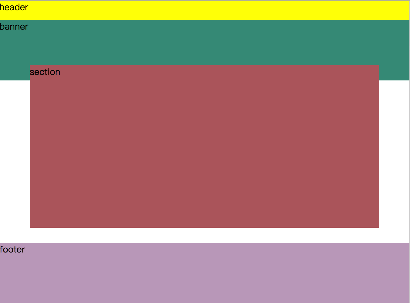
So at first I put section footer in an element, adding position: relative to its parent element, and position:aboslute to each of them, but there is a blank at the bottom of the page because absolute is out of the flow of documents and cannot fully support the height of the parent element.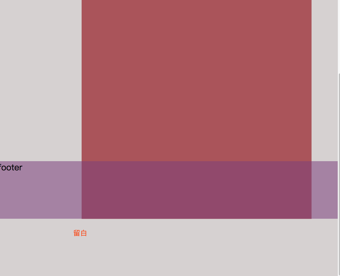
 body,html{
            padding:0;
            margin: 0;
            height:100%;
            font-size: 30px;
        }
        .container{
            height:100%;
        }
        header{
            background: #ff0;
            height:64px;
        }
        .banner{
           background: #3c9480;
           height:200px;
        }
        .content {
          position: relative;
          height: 100%;
          margin-top: -50px;
        }
        section{
            position: absolute;
            top: 50%;
            left: 50%;
            transform:translate(-50%,-50%);
            background: rgb(179, 95, 101);
            min-width: 800px;
            min-height: 100%;
            margin:0 100px 200px 100px;
        }
        footer{
            position: absolute;
            width: 100%;
            bottom: 0;
            left: 0;
            background: #8748878a;
            height:200px;
            margin-top:-200px;
        }
    </style>

<body>
    <div class="container">
        <header>header</header>
        <div class="banner">banner</div>
        <div class="content">
            <section>
                section
              </section>
              <footer>footer</footer>
        </div>
    </div>
</body>
In order not to be separated from the document flow, I move the footer and add relative to the two elements, so that when the document content is enough, the page will look fine, but when the document content is not high enough, there will still be a blank situation at the bottom of the page.
Through observation, we found that the height of the outer element (container) in the page is not 100%, not full of a screen, and calculated again that the height of section is not the height of the screen-header-section-footer.
Solution 1:
critical code
Set the height of body, html, and container to 100%, and then the height of section to 100%-header-banner-footer
body,html{
     height:100%;
 }
.container{
     height:100%;
}
 .section{
 	  min-height:calc(100% - 64px - 200px - 200px);
 }
html:
  <div class="container">
        <header>header</header>
        <div class="banner">banner</div>
        <section>
          section
        </section>
        <footer>footer</footer>
    </div>
Complete css:
body,html{
            padding:0;
            margin: 0;
            height:100%;
            font-size: 30px;
        }
        .container{
            height:100%;
        }
        header{
            background: #ff0;
            height:64px;

        }
        .banner{
           background: #3c9480;
           height:200px;
        }
        section{
            position: relative;
            top:-50px;
            background: rgb(179, 95, 101);
            min-height:calc(100% - 64px - 200px - 200px);
            flex:1;
            margin:0 100px 200px 100px;
        }
        footer{
            position: relative;
            background: #8748878a;
            height:200px;
            margin-top:-200px;
        }
Solution 2:
critical code
Set the body to 100% HTML height, use flex to center the outer box vertically (column means like a column), and then the section element is 100%.
body,html{
     height:100%;
 }
.container{
     display: flex;
     flex-direction: column;
}
 .section{
 	  height: 100%;
 }
Complete css
   body,html{
            padding:0;
            margin: 0;
            height:100%;
            font-size: 30px;
        }
        .container{
            display: flex;
            flex-direction: column;
        }
        header{
            background: #ff0;
            height:64px;

        }
        .banner{
           background: #3c9480;
           height:200px;
        }
        section{
            position: relative;
            top:-50px;
            background: rgb(179, 95, 101);
            height: 100%;
            flex:1;
            margin:0 100px 200px 100px;
        }
        footer{
            position: relative;
            background: #8748878a;
            height:200px;
            margin-top:-200px;
        }