Main contents:
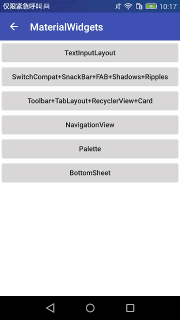
This article will introduce Material design and Supportlibrary controls, including TextInputLayout, SwitchCompat, SnackBar, Floating Action Button, Shadows, Ripples, TabLayout, RecyclerView, Card, Navigation View, Bottom Sheet, Palette controls.
Reprinted please indicate the source, thank you!!
http://blog.csdn.net/johnny901114/article/details/51918436
Let's see the effect first.
1. TextInputLayout:
TextInput Layout is used to enhance EditText and is also used to wrap a layer of layout in EditText, such as:
<android.support.design.widget.TextInputLayout
    android:id="@+id/til_username"
    android:layout_width="match_parent"
    android:layout_height="wrap_content"
    android:layout_margin="10dp">

    <EditText
        android:id="@+id/et_name"
        android:layout_width="match_parent"
        android:layout_height="wrap_content"
        android:hint="UserName"/>
</android.support.design.widget.TextInputLayout>- 1
- 2
- 3
- 4
- 5
- 6
- 7
- 8
- 9
- 10
- 11
- 12

- 1
- 2
- 3
- 4
- 5
- 6
- 7
- 8
- 9
- 10
- 11
- 12
1 > Main functional features:
When the EditText inside gets the focus, the hint text of EditText will move to the top of EditText to do Label, prompting the user. As you can see from the gif diagram above, I won't go into details.
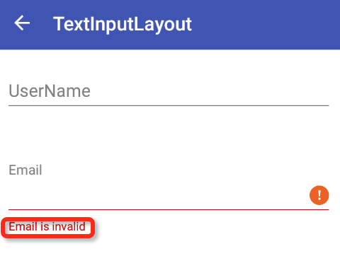
(2) There is an error prompting mechanism, when the user input content does not meet the requirements, can prompt the user, we used to use toast way, the experience is very poor. Setting app:errorEnabled= "true" in the layout and calling the textInputLayout.setError(tip) method in the code can display the error content below EditText.
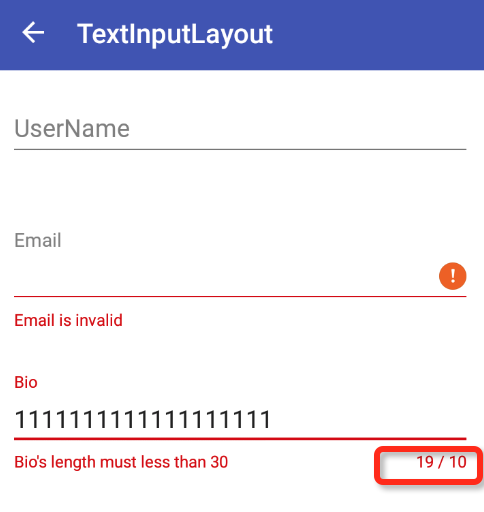
(3) It has the function of counting the number of words. In many cases, the input text has the limitation of the number of words, such as input feedback, description and so on. We used to do it ourselves, but now we have system controls to help us achieve it. Enable this function with the following configuration
app:counterEnabled="true"
app:counterMaxLength="50"
app:errorEnabled="true"- 1
- 2
- 3

- 1
- 2
- 3
2 > Detailed usage
Because of the length, the following explanation, I do not change every attribute value, and then post pictures, so there is no need, I hope the students need to try. The code will have a github link at the end.
You never know what you're going to do, but you never know what you're going to do.
How to change the color of the horizontal line below EditText? As shown in the following figure:
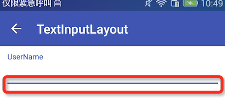
This color control is set in the style file, through
<item name="colorAccent">@color/colorAccent</item>- 1
- 1
(2) How to change the color/size of the Label above after getting the focus. As shown in the following figure:
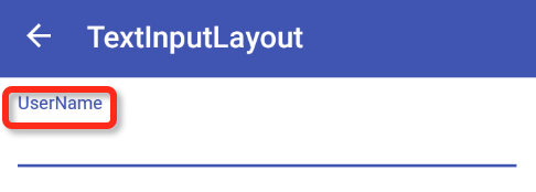
The color size and other attributes are modified by
app:hintTextAppearance="@style/HintAppearance"- 1
- 1
The style of this project is as follows:
<style name="HintAppearance" parent="TextAppearance.AppCompat">
    <item name="android:textSize">14sp</item>
    <item name="android:textColor">#8bc34a</item>
</style>
- 1
- 2
- 3
- 4
- 5
- 1
- 2
- 3
- 4
- 5
(3) How to modify the color of the error prompt, as shown in the following figure:
The wrong style is modified as follows:
app:errorTextAppearance="@style/ErrorAppearance"- 1
- 1
<style name="ErrorAppearance" parent="TextAppearance.AppCompat">
    <item name="android:textSize">14sp</item>
    <item name="android:textColor">#a2ced1</item>
</style>
- 1
- 2
- 3
- 4
- 5
- 1
- 2
- 3
- 4
- 5
It should be noted that this property not only changes the color and size of the wrong text, but also changes the color of the horizontal line of EditText.
If you don't want to set up all the TextInputLayout layouts when you write them, you can also use style files to unify the settings, such as:
<item name="textColorError">@color/textColorError</item>- 1
- 1
Of course, if you set errorTextAppearance and textColorError, TextInput Layout will give preference to errorTextAppearance.
(4) Character counting function, correcting errors have the same color as above. How to modify the style of statistical words. The following picture:
There are two situations, one is that there is no more than one, the other is that there is more than one word.
//No more than the maximum number of words
app:counterTextAppearance="@style/CounterAppearance"
//Over the maximum number of words
app:counterOverflowTextAppearance="@style/CounterOverflowAppearance"- 1
- 2
- 3
- 4
- 1
- 2
- 3
- 4
Some pits encountered using TextInput Layout:
(1) If you add word count, you need to add text ErrorColor to your style, otherwise it will flicker if you exceed the word count.
(2) If word count is not required and error mechanism (set Error Enabled (true)) is enabled, a default error color will be provided without textErrorColor (no flicker).
Of course, you can customize the error color by textErrorColor.
More powerful errorTextAppearance can be used to define attributes such as error color, font size, and so on. If TextInputLayout sets both textErrorColor and errorTextAppearance, only errorTextAppearance takes effect.
(3) If word count is added, textErrorColor and errorTextAppearance are set at the same time.
At this point, a strange effect occurs. The color of Label and statistics is textErrorColor.
EditText's crossbar and error text prompt set the effect for errorTextAppearance. So why not add textErrorColor to flip back, because TextInputLayout needs the color set by the textErrorColor property when it exceeds the number of words.
2 SwitchCompat
I won't be able to get the effect map. I already have it at the beginning of the article. This control is also very simple to use. Here are some other related uses:
//SwitchCompat is separated by vertical lines
switchCompat.setSplitTrack(false);

//An error message appears on the right side of SwitchCompat
switchCompat.setError("error");

//Whether to display text [default to open/close] (of course, you can also customize text)
switchCompat.setShowText(true);

//Custom Text
switchCompat.setTextOff("Off");
switchCompat.setTextOn("On");

//Set the distance between the left text and the right button
switchCompat.setSwitchPadding(20);

//Setting Close and Open
switchCompat.setChecked(true/false);


//Monitor switchCompat on and off changes
switchCompat.setOnCheckedChangeListener();

//Setting Track Icon
switchCompat.setTrackResource(R.mipmap.ic_back_gray);

//switchCompat Settings Indicator icon [but both open and close are icons that can be dynamically set in setOn Checked ChangeListener]
switchCompat.setThumbResource(R.mipmap.ic_back_gray);- 1
- 2
- 3
- 4
- 5
- 6
- 7
- 8
- 9
- 10
- 11
- 12
- 13
- 14
- 15
- 16
- 17
- 18
- 19
- 20
- 21
- 22
- 23
- 24
- 25
- 26
- 27
- 28
- 1
- 2
- 3
- 4
- 5
- 6
- 7
- 8
- 9
- 10
- 11
- 12
- 13
- 14
- 15
- 16
- 17
- 18
- 19
- 20
- 21
- 22
- 23
- 24
- 25
- 26
- 27
- 28
Hope that the students in need, download the project on github, and then open these methods, run to see the effect. I won't map here.
3. SnackBar,FloatingActionButton,Shadows,Ripples
Because these are relatively simple, I put them together.
1 > SnackBar is easy to use [similar to Toast], as follows:
//Button
Snackbar.make(container, "Snackbar with action", Snackbar.LENGTH_SHORT)
        .setAction("Action", new View.OnClickListener() {
            @Override
            public void onClick(View view) {
                Toast.makeText(v.getContext(), "Snackbar Action pressed",Toast.LENGTH_SHORT).show();
            }
        }).show();


//Plain text
Snackbar.make(container, "This is Snackbar", Snackbar.LENGTH_SHORT).show();- 1
- 2
- 3
- 4
- 5
- 6
- 7
- 8
- 9
- 10
- 11
- 12
- 13
- 1
- 2
- 3
- 4
- 5
- 6
- 7
- 8
- 9
- 10
- 11
- 12
- 13
2> FloatingActionButton
Usage method:
<android.support.design.widget.FloatingActionButton
    android:layout_width="wrap_content"
    android:layout_height="wrap_content"
    android:layout_gravity="bottom|end"
    android:layout_margin="16dp"
    android:clickable="true"
    android:src="@null"
    app:backgroundTint="#0091eb"
app:fabSize="normal"/>- 1
- 2
- 3
- 4
- 5
- 6
- 7
- 8
- 9
- 10
- 1
- 2
- 3
- 4
- 5
- 6
- 7
- 8
- 9
- 10
adopt Android src Modify Pictures
Modify the background color by app:backgroundTint
Set the size by app:fabSize, with only two options, normal and mini
3> Shadows
Setting Shadows in Layout
android:elevation="2dp"
app:elevation="2dp" //If you have controls such as Toolbar, you must add this sentence, otherwise the settings are invalid.- 1
- 2
- 1
- 2
4 > Ripple effect
Create a new drawable-v21 under the res directory. Then create a resource file as follows:
<?xml version="1.0" encoding="utf-8"?>
<ripple xmlns:android="http://schemas.android.com/apk/res/android"
    android:color="#dcdcdc"> //Android: The effect of color pressing
    <item> //Default effect
        <shape>
            <solid android:color="#0091eb" />
            <corners android:radius="2dp" />
        </shape>
    </item>
</ripple>- 1
- 2
- 3
- 4
- 5
- 6
- 7
- 8
- 9
- 10
- 1
- 2
- 3
- 4
- 5
- 6
- 7
- 8
- 9
- 10
It is important to note that you need to create a new resource file with the same name in the drawable directory, otherwise run to flip back on the lower version, because the file can not be found, and drawable-v21 is only valid on Android 5.0 or above systems.
4 Toolbar+TabLayout+RecyclerView+Card
1 > Use of Toolbar
In the layout:
<android.support.v7.widget.Toolbar
    android:id="@+id/toolbar"
    xmlns:android="http://schemas.android.com/apk/res/android"
    xmlns:app="http://schemas.android.com/apk/res-auto"
    android:layout_width="match_parent"
    android:layout_height="?attr/actionBarSize"
    android:background="?attr/colorPrimary"
app:title="@string/app_name"/>- 1
- 2
- 3
- 4
- 5
- 6
- 7
- 8
- 1
- 2
- 3
- 4
- 5
- 6
- 7
- 8
stay Java Setting Toolbar-related properties in code
Toolbar toolbar = (Toolbar) view.findViewById(R.id.toolbar);
if (toolbar != null) {
    toolbar.setNavigationIcon(R.mipmap.ic_back_white);//Setting icon of return button
    if (title != null) {
        toolbar.setTitle(title);//Set title
    }
    AppCompatActivity activity = (AppCompatActivity) getActivity();
    activity.setSupportActionBar(toolbar);
    toolbar.setNavigationOnClickListener(new View.OnClickListener() { //Click event of return button
        @Override
        public void onClick(View v) {
            finish();
        }
    });
activity.getSupportActionBar().setDisplayHomeAsUpEnabled(true);//Display the Return Button
}
- 1
- 2
- 3
- 4
- 5
- 6
- 7
- 8
- 9
- 10
- 11
- 12
- 13
- 14
- 15
- 16
- 17
- 1
- 2
- 3
- 4
- 5
- 6
- 7
- 8
- 9
- 10
- 11
- 12
- 13
- 14
- 15
- 16
- 17
How to Set Toolbar Button
First, create a new menu file person under the menu folder, such as:
<?xml version="1.0" encoding="utf-8"?>
<menu xmlns:android="http://schemas.android.com/apk/res/android">
    <item
        android:id="@+id/fixed"
        android:title="Fixed"/>
    <item
        android:id="@+id/scroll"
        android:title="Scrollable"/>
</menu>
- 1
- 2
- 3
- 4
- 5
- 6
- 7
- 8
- 9
- 10
- 1
- 2
- 3
- 4
- 5
- 6
- 7
- 8
- 9
- 10
//Setup menu
@Override
public void onCreateOptionsMenu(Menu menu, MenuInflater inflater) {
    inflater.inflate(R.menu.tab_menu, menu);
    super.onCreateOptionsMenu(menu, inflater);
}


//Handling click events on menus
@Override
public boolean onOptionsItemSelected(MenuItem menuItem) {
    switch (menuItem.getItemId()) {
        case R.id.fixed:
            tabLayout.setTabMode(TabLayout.MODE_FIXED);
            break;
        case R.id.scroll:
            tabLayout.setTabMode(TabLayout.MODE_SCROLLABLE);
            break;
    }
    return super.onOptionsItemSelected(menuItem);
}
- 1
- 2
- 3
- 4
- 5
- 6
- 7
- 8
- 9
- 10
- 11
- 12
- 13
- 14
- 15
- 16
- 17
- 18
- 19
- 20
- 21
- 22
- 23
- 1
- 2
- 3
- 4
- 5
- 6
- 7
- 8
- 9
- 10
- 11
- 12
- 13
- 14
- 15
- 16
- 17
- 18
- 19
- 20
- 21
- 22
- 23
If you use menu in fragment, you need to call setHasOptionsMenu(true) in the onCreate method.
    @Override
    public void onCreate(@Nullable Bundle savedInstanceState) {
        super.onCreate(savedInstanceState);
        setHasOptionsMenu(true);
    }
- 1
- 2
- 3
- 4
- 5
- 6
- 1
- 2
- 3
- 4
- 5
- 6
2> TabLayout
TabLayout belongs to the design support package, so you need to load the configuration in gradle:
compile 'com.android.support:design:23.4.0'- 1
- 1
TabLayout is commonly used in conjunction with ViewPager:
<android.support.design.widget.TabLayout
    android:id="@+id/tab_layout"
    style="@style/TabLayoutStyle"
    android:layout_width="match_parent"
    android:layout_height="wrap_content"
    android:background="@color/colorPrimary"
    app:tabContentStart="50dp"
    app:tabMode="scrollable"/>

<android.support.v4.view.ViewPager
    android:id="@+id/view_pager"
    android:layout_width="match_parent"
    android:layout_height="match_parent"/>
- 1
- 2
- 3
- 4
- 5
- 6
- 7
- 8
- 9
- 10
- 11
- 12
- 13
- 14
- 1
- 2
- 3
- 4
- 5
- 6
- 7
- 8
- 9
- 10
- 11
- 12
- 13
- 14
In fact, it is very simple to use, the key is a method:
tabLayout.setupWithViewPager(viewPager);- 1
- 1
The complete code is as follows:
viewPager.setAdapter(new ViewPagerAdapter(
        Arrays.asList("Tab1", "Tab2", "Tab3", "Tab4", "Tab5", "Tab6"),
        Arrays.asList(new RecyclerViewFragment(), new RecyclerViewFragment(),
                new RecyclerViewFragment(), new RecyclerViewFragment(),
                new RecyclerViewFragment(), new RecyclerViewFragment()

        )));
tabLayout.setupWithViewPager(viewPager);- 1
- 2
- 3
- 4
- 5
- 6
- 7
- 8
- 1
- 2
- 3
- 4
- 5
- 6
- 7
- 8
TabLayout can also set scrolling and screen filling.
It can be set up by the following two methods:
tabLayout.setTabMode(TabLayout.MODE_FIXED);
tabLayout.setTabMode(TabLayout.MODE_SCROLLABLE);- 1
- 2
- 1
- 2
I won't post the effect.
In TabLayout.MODE_SCROLLABLE mode, padding on the left can also be set:
app:tabContentStart="50dp"
Here's the Adapter code
class ViewPagerAdapter extends FragmentStatePagerAdapter {
private List<String> list;
private List<? extends Fragment> fs;

public ViewPagerAdapter(List<String> list, List<? extends Fragment> fs) {
    super(getChildFragmentManager());
    this.list = list;
    this.fs = fs;
}


@Override
public int getCount() {
    return list.size();
}


@Override
public Fragment getItem(int position) {
    return fs.get(position);
}


@Override

public Object instantiateItem(ViewGroup container, int position) {
    return super.instantiateItem(container, position);
}


@Override
public CharSequence getPageTitle(int position) {
    return list.get(position);
}
}- 1
- 2
- 3
- 4
- 5
- 6
- 7
- 8
- 9
- 10
- 11
- 12
- 13
- 14
- 15
- 16
- 17
- 18
- 19
- 20
- 21
- 22
- 23
- 24
- 25
- 26
- 27
- 28
- 29
- 30
- 31
- 32
- 33
- 34
- 35
- 36
- 37
- 38
- 39
- 1
- 2
- 3
- 4
- 5
- 6
- 7
- 8
- 9
- 10
- 11
- 12
- 13
- 14
- 15
- 16
- 17
- 18
- 19
- 20
- 21
- 22
- 23
- 24
- 25
- 26
- 27
- 28
- 29
- 30
- 31
- 32
- 33
- 34
- 35
- 36
- 37
- 38
- 39
3> RecyclerView
RecyclerView is an alternative to ListView, and its usage is similar, except that the method names are standardized for us.
RecyclerView is more powerful than ListView in terms of functionality. For example, animation, horizontal rolling, waterfall flow and so on.
From a usage point of view, RecyclerView not only sets up adapter, but also layoutManager, which is powerful relative to listView.
The Layout Manager built in the system has:
LinearLayoutManager,GridLayoutManager,StaggeredGridLayoutManager
The following specific usage:
recyclerView recyclerView = (RecyclerView) view.findViewById(R.id.recycler_view);

LinearLayoutManager linearLayoutManager = new LinearLayoutManager(recyclerView.getContext());

linearLayoutManager.setOrientation(LinearLayoutManager.VERTICAL);

recyclerView.setHasFixedSize(true);

recyclerView.setLayoutManager(linearLayoutManager);

recyclerView.setAdapter(new RecyclerAdapter(list));
- 1
- 2
- 3
- 4
- 5
- 6
- 7
- 8
- 9
- 10
- 11
- 12
- 13
- 1
- 2
- 3
- 4
- 5
- 6
- 7
- 8
- 9
- 10
- 11
- 12
- 13
Here's adapter
public class RecyclerAdapter extends RecyclerView.Adapter {
    private List<String> list;
    public RecyclerAdapter(List<String> list) {
        this.list = list;
    }
    //Create Holder as in ListView.
    @Override
    public RecyclerView.ViewHolder onCreateViewHolder(ViewGroup parent, int viewType) {
        return new ItemViewHolder(LayoutInflater.from(parent.getContext())
                .inflate(R.layout.item_card_view, parent, false));
    }
    //Binding data
    @Override
    public void onBindViewHolder(RecyclerView.ViewHolder holder, int position) {
        ItemViewHolder itemViewHolder = (ItemViewHolder) holder;
        itemViewHolder.tvTitle.setText(list.get(position));
        itemViewHolder.tvDesc.setText(list.get(position) + " this is description");
    }

    @Override
    public int getItemCount() {
        return list.size();
    }


    static class ItemViewHolder extends RecyclerView.ViewHolder {
        TextView tvTitle, tvDesc;
        public ItemViewHolder(View itemView) {
            super(itemView);
            tvTitle = (TextView) itemView.findViewById(R.id.tv_vibrant);
            tvDesc = (TextView) itemView.findViewById(R.id.title_desc);
        }
    }
}
- 1
- 2
- 3
- 4
- 5
- 6
- 7
- 8
- 9
- 10
- 11
- 12
- 13
- 14
- 15
- 16
- 17
- 18
- 19
- 20
- 21
- 22
- 23
- 24
- 25
- 26
- 27
- 28
- 29
- 30
- 31
- 32
- 33
- 34
- 35
- 36
- 1
- 2
- 3
- 4
- 5
- 6
- 7
- 8
- 9
- 10
- 11
- 12
- 13
- 14
- 15
- 16
- 17
- 18
- 19
- 20
- 21
- 22
- 23
- 24
- 25
- 26
- 27
- 28
- 29
- 30
- 31
- 32
- 33
- 34
- 35
- 36
Need to explain the place has been annotated, do not go into details!
4> CardView
CardView belongs to the V7 package, so you need to add the following configuration:
compile 'com.android.support:cardview-v7:23.4.0'- 1
- 1
CardView is very simple to use and can be configured as follows:
<android.support.v7.widget.CardView
    android:id="@+id/card_view"
    xmlns:android="http://schemas.android.com/apk/res/android"
    xmlns:app="http://schemas.android.com/apk/res-auto"
    android:layout_width="match_parent"
    android:layout_height="wrap_content"
    android:background="#ffffff"
    app:cardCornerRadius="2dp"
app:cardElevation="3dp"/>- 1
- 2
- 3
- 4
- 5
- 6
- 7
- 8
- 9
- 1
- 2
- 3
- 4
- 5
- 6
- 7
- 8
- 9
Two important attributes:
App: card Corner Radius = "2dp" setting rounded corners
app:cardElevation= "3dp" Set Shadow
5 NavigationView
Navigation View is mainly used in conjunction with Drawer Layout.
Look at the layout.
<android.support.v4.widget.DrawerLayout
    android:id="@+id/drawer_layout"
    xmlns:android="http://schemas.android.com/apk/res/android"
    xmlns:app="http://schemas.android.com/apk/res-auto"
    android:layout_width="match_parent"
    android:layout_height="match_parent"
    android:fitsSystemWindows="true">

    <include layout="@layout/navigation_container_view"/>
    <android.support.design.widget.NavigationView
        android:id="@+id/nav_view"
        android:layout_width="wrap_content"
        android:layout_height="match_parent"
        android:layout_gravity="start"
        app:headerLayout="@layout/app_header"
        app:insetForeground="@color/colorPrimaryDark"
        app:menu="@menu/navigation_menu"/>
</android.support.v4.widget.DrawerLayout>- 1
- 2
- 3
- 4
- 5
- 6
- 7
- 8
- 9
- 10
- 11
- 12
- 13
- 14
- 15
- 16
- 17
- 18
- 1
- 2
- 3
- 4
- 5
- 6
- 7
- 8
- 9
- 10
- 11
- 12
- 13
- 14
- 15
- 16
- 17
- 18
From the above layout, we can see that Navigation View is divided into two parts, one is header, the other is menu.
How to modify the color of icon and text
From the GIF at the beginning of the article, we can see that the background is blue, menu buttons and text are black, how to modify it?
Modifications can be made through the following configuration:
app:itemIconTint="#2196f3"  to icon To color
app:itemTextColor="#009688" menu Text color
app:itemBackground="@drawable/my_ripple" Set up menu item Background- 1
- 2
- 3
- 1
- 2
- 3
The results are as follows: 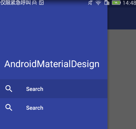
How to modify the color of the hamburger icon on the left of Toolbar
As you can see from the GIF chart at the beginning, the icon on the left of Toolbar is black. This icon is also called hamburger icon on the internet. It looks like hamburger icon, so many people on the Internet are called hamburger icon.
It can be modified by a style:
<style name="DrawerArrowStyle" parent="@style/Widget.AppCompat.DrawerArrowToggle">
    <item name="spinBars">true</item>
    <item name="color">@android:color/white</item> //custom color
</style>

//Then add it to style.
<item name="drawerArrowStyle">@style/DrawerArrowStyle</item>- 1
- 2
- 3
- 4
- 5
- 6
- 7
- 1
- 2
- 3
- 4
- 5
- 6
- 7
The following is the complete menu layout:
    <group android:checkableBehavior="single">
        <item
            android:id="@+id/nav_search1"
            android:checked="true"
            android:icon="@mipmap/ic_search_black"
            android:title="Search1"/>
        <item
            android:id="@+id/nav_search2"
            android:checked="true"
            android:icon="@mipmap/ic_search_black"
            android:title="Search2"/>
        <item
            android:id="@+id/nav_search3"
            android:icon="@mipmap/ic_search_black"
            android:title="Search3"
            app:actionLayout="@layout/menu_action_layout"/>
        <item
            android:id="@+id/nav_search4"
            android:icon="@mipmap/ic_search_black"
            android:title="Search4"/>
        <item
            android:id="@+id/nav_search5"
            android:icon="@mipmap/ic_search_black"
            android:title="Search5"
            android:visible="false"/>
    </group>
    <item
        android:id="@+id/navigation_subheader"
        android:title="SubHeader">
        <menu>
            <item
                android:id="@+id/nav_search6"
                android:checked="true"
                android:icon="@mipmap/ic_search_black"
                android:title="Search6"/>
            <item
                android:id="@+id/nav_search7"
                android:checked="true"
                android:icon="@mipmap/ic_search_black"
                android:title="Search7"/>
        </menu>
    </item>
    <group android:id="@+id/aligned_items">
        <item
            android:id="@+id/nav_search8"
            android:icon="@mipmap/ic_search_black"
            android:title="Search8"/>
        <item
            android:id="@+id/nav_search9"
            android:icon="@mipmap/ic_search_black"
            android:title="Search9"/>
    </group>
</menu>- 1
- 2
- 3
- 4
- 5
- 6
- 7
- 8
- 9
- 10
- 11
- 12
- 13
- 14
- 15
- 16
- 17
- 18
- 19
- 20
- 21
- 22
- 23
- 24
- 25
- 26
- 27
- 28
- 29
- 30
- 31
- 32
- 33
- 34
- 35
- 36
- 37
- 38
- 39
- 40
- 41
- 42
- 43
- 44
- 45
- 46
- 47
- 48
- 49
- 50
- 51
- 52
- 53
- 1
- 2
- 3
- 4
- 5
- 6
- 7
- 8
- 9
- 10
- 11
- 12
- 13
- 14
- 15
- 16
- 17
- 18
- 19
- 20
- 21
- 22
- 23
- 24
- 25
- 26
- 27
- 28
- 29
- 30
- 31
- 32
- 33
- 34
- 35
- 36
- 37
- 38
- 39
- 40
- 41
- 42
- 43
- 44
- 45
- 46
- 47
- 48
- 49
- 50
- 51
- 52
- 53
The results are as follows: 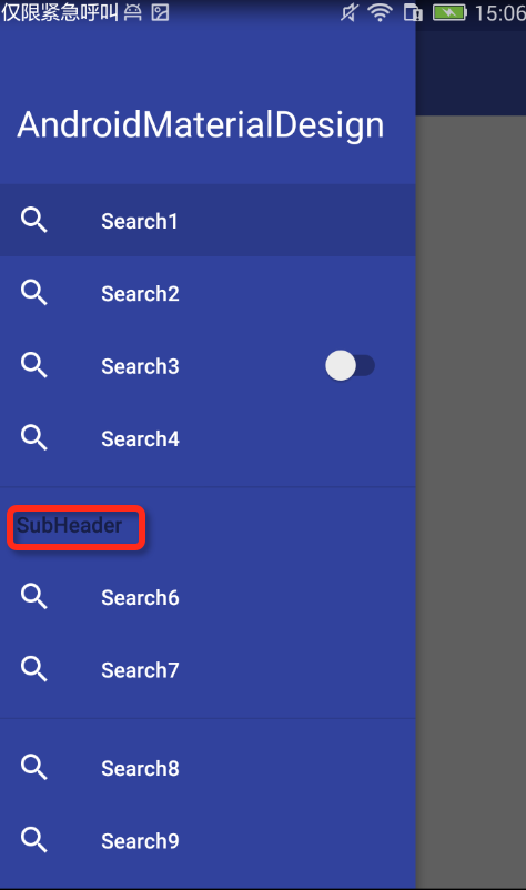
(3) Modify the SubHeader color in menu
From the above figure, we find that SubHeader is black. How to modify the color, add the following configuration to it?
<item name="android:textColorSecondary">#ffffff</item>- 1
- 1
BottomSheet
Bottom Sheet is actually a Behavior, and this Behavior is built-in, without self-definition, very simple to use, just need to configure the Behavior in the layout. From this, we can see that the Behavior is powerful. Later, we have time to study the self-defined Behavior, and then come to discuss and share with you.
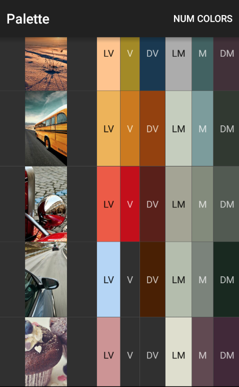
Palette
Palette. It's when you give it a picture that you can get all kinds of colors through palette.
In fact, the official Google has given a good example, in google demo has made a very detailed use of examples, I only do here to attract the role of a brick, students can go to github to download google demo. Here's a map of Google's effects: