Meterial Design Best Experience (1):
Use Toolbar, Coordinator Layout, AppBarLayout, etc. to implement a beautiful title bar
|
Author: |
Jiang Dongguo |
|
Time: |
Friday, 10 March 2017 |
|
Sources of application: |
Lu Chibao v1.2 (Samsung C9 Pro) |
|
Blog address: |
http://blog.csdn.net/andrexpert/article/details/61236581 |
Scenario Reproduction: "Material Design is a new set of interface design language proposed by Google at the I/O conference in 2014. It contains visual, motion, interactive effects and other features. Its purpose is to solve the problem of the interface style of Android platform is not uniform. Although Material Design is a set of interface design language, in order to facilitate the development of APP, Google provides a Design Support library, which encapsulates some common controls and effects so that development engineers do not understand Material. In the case of Design, you can Material ize your own application.
Material Design's unique design style and concept gives people exquisite beauty and good experience. Since the launch of Android 5.0, not only does Google use Material Design style for all system apps, but also more and more apps are Materialized in the software market. Material Design style will be the inevitable trend for Android Apps to pursue good experience in the future. In order to make our APP Materialized, Google has made several suggestions:
(1) Complying with Material Design principles, the deployment platform is higher than Android 5.0;
(2) Use Material topics;
(3) Use Material style components such as Desugn Support Library, such as Recycler View, CardView, etc.
(4) Use custom shadows and animation... Wait.
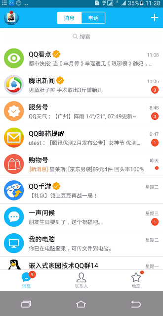
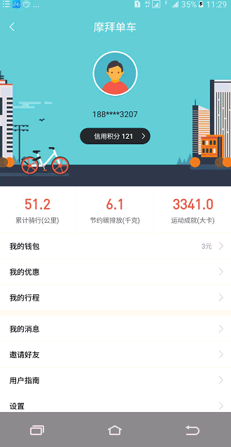
Of course, before learning about Material Design, we borrowed several pictures from the latest version of QQ(v6.6.9) and Moby Bike to feel the same charm of Material Design style - the sideslip menu, the intrusive retractable Title bar.
Well, after knowing what Material Design is, it's time to dry up. Today, I mainly explain how to use Toolbar, AppBarLayout, Coordinater, Collapsing Toolbar Layout controls to implement an intrusive and foldable title bar like a Moby bike. They come from SDK's own libraries appcompat-v7-24.2.1 and design-24.2.1, respectively. For the Android Studio development environment, we just need to add the following code to the dependencies of the buid.gradle file:
    compile'com.android.support:appcompat-v7:24.+'
    compile'com.android.support:design:24.2.1'
1. Create custom Material topics
Since a new Android project project specifies a default theme, the theme does not have Material effect and has a default ActionBar. To do this, we need to replace the default theme with the theme without ActionBar provided by Material. The new Material theme will bring us such effects as Activity switching animation, rendering specified colors for system components, adding animation for system components and so on.
(1) res/values/style.xml: Create a custom Material style theme App, which inherits the Material style theme defined in the Support-v7 library. The code is as follows:
<resources>
    <!-- application materialdesign theme. -->
    <style name="CustomAppTheme"parent="android:Theme.Material.Light.NoActionBar">
        <!—The following attribute definitions(color palette)-->
        <item name=" android: colorPrimary">@color/colorPrimary</item>
        <item name="android:colorPrimaryDark">@color/colorPrimaryDark</item>
        <item name="android:colorAccent">@color/colorAccent</item>
        <item name="android:textColorPrimary">@color/textColorPrimary</item>
        <item name="android:windowBackground">@color/windowBackground</item>
        <item name="android:navigationBarColor">@color/navigationBarColor</item>
</style>
</resources>
colorPrimary is used to specify the background color of the title bar; colorPrimary Dark is used to specify the background color of the status bar; colorAccent is used to specify such things as chexkboxes, text Click effects; textColorPrimary is used to specify the font color of the title bar; Windows Background is used to specify the background color of the content area; Navigation BarColor is used to specify the background color of the navigation bar. Color... (See sdk/docs/preview/material/theme.html for details). Of course, there are many attributes that are not listed and can be customized in depth according to their own needs. It should be noted that the series of Material topics provided by the Support-v7 library must be greater than 5.0 in minSdkVersion (API21) based on the use. Of course, we can also inherit CustomAppTheme from "Theme.AppCompat.Light.NoActionBar", and the custom color style is still valid.
(2) Android Manifest. xml: Using custom Material style themes
<application
android:icon="@mipmap/ic_launcher"
android:label="@string/app_name"
android:theme="@style/ CustomAppTheme ">
…….
</application>
2. Implementation of self-defined hidden title bar
Look at the operation effect:

So let's look at the roles of Toolbar, AppBarLayout and Coordinator Layout in detail.
(1) android.support.v7.widget.Toolbar
Toolbar is a Material control provided by the android-support-v7 library. It not only inherits all the functions of ActionBar, but also can only be fixed at the top. Toolbar can move freely, and can achieve some Material Design effects with other controls. After a brief introduction to the Toolbar control, the next step is how to use the Toolbar as the title bar of Activity. First, add the Toolbar control to the activity_main.xml file:
<FrameLayout
        xmlns:android="http://schemas.android.com/apk/res/android"
   xmlns:app="http://schemas.android.com/apk/res-auto"
   android:layout_width="match_parent"
    android:layout_height="match_parent">
    <android.support.v7.widget.Toolbar
       android:id="@+id/main_toolbar"
      android:layout_width="match_parent"
      android:layout_height="?attr/actionBarSize"
      android:background="@color/colorPrimary"
       android:theme="@style/ThemeOverlay.AppCompat.Dark.ActionBar"
      app:popupTheme="@style/ThemeOverlay.AppCompat.Light" />
</ FrameLayout>
Among them, the android: layout_height="? Attr/action BarSize" attribute specifies the height of the Toolbar Title bar; android:theme is used to specify the theme style of the elements on the Toolbar, where the Dark dark style is used to distinguish from the Light light color style of the Toolbar theme; and app: popup Theme attribute is used to specify the theme style of the pop-up menu item. Then, we can use the defined Toolbar in MainActivity with the following code:
Toolbar mToolbar = (Toolbar)findViewById(R.id.main_toolbar);
//Set the title bar ActionBar of Activity to Toolbar
setSupportActionBar(mToolbar);
//Enabling Home key
ActionBaractionBar = getSupportActionBar();
if(actionBar!= null){
   actionBar.setDisplayHomeAsUpEnabled(true);
   actionBar.setHomeButtonEnabled(true);
}
Of course, we can also add menu items to the title bar like the ActionBar that comes with the system, that is, create menu_toolbar.xml in the res/menu directory, and use the app: show As Action attribute to specify where each item button is displayed. Among them, always means always displayed on the title bar; ifRoom means that buttons are displayed on the title bar when there is enough space, otherwise hidden in the menu bar; and never means always hidden in the menu bar. The specific configuration code is as follows:
<?xmlversion="1.0" encoding="utf-8"?>
<menu
   xmlns:android="http://schemas.android.com/apk/res/android"
   xmlns:app="http://schemas.android.com/apk/res-auto">
    <itemandroid:id="@+id/menu_personal"
        android:title="Personal homepage"
       android:icon="@drawable/ic_personal"
       app:showAsAction="always"/>
    <itemandroid:id="@+id/menu_clear"
        android:title="empty"
       android:icon="@drawable/ic_clear"
       app:showAsAction="ifRoom"/>
    <itemandroid:id="@+id/menu_more"
        android:title="More"
       android:icon="@drawable/ic_more"
        app:showAsAction="never"/>
</menu>
(2) android.support.design.widget.CoordinatorLayout
After step (1), we have successfully replaced the ActionBar with the Toolbar, but it would be meaningless to just replace it. Now that you want to achieve a Materialized Title bar, you should try to use controls with Material features. Obviously, FramLayout is the object of the "knife" and we use Coordinator Layout in the support-design library to replace it. Coordinator Layout can be said to be an enhanced version of FrameLayout, which is functionally identical to FrameLayout in general. Because the Coordinator Layout control is designed by Design Support library provides Material Design style naturally, and it can also monitor various events of all its child controls, and then automatically make reasonable response according to the current layout. To demonstrate the power of Coordinator Layout, Floating Action Button and Snackbar controls provided by the Support-design library are used for demonstration. Snackbar is similar to Toast, but it allows an interactive button to be added on the basis of prompting the user; Floating Action Button is a suspension button that defaults to the color Accent defined in the Custom AppTheme theme as the color of the button.
<?xml version="1.0"encoding="utf-8"?>
<android.support.design.widget.CoordinatorLayoutxmlns:android="http://schemas.android.com/apk/res/android"
xmlns:app="http://schemas.android.com/apk/res-auto"
android:layout_width="match_parent"
android:layout_height="match_parent">
<android.support.v7.widget.Toolbar
android:id="@+id/main_toolbar"
……/>
<android.support.design.widget.FloatingActionButton
android:id="@+id/main_delete_float_btn"
android:layout_width="wrap_content"
android:layout_height="wrap_content"
android:layout_gravity="bottom|end"
android:layout_marginBottom="13dp"
android:layout_marginRight="13dp"
android:scaleType="centerCrop"
android:src="@drawable/ic_choose"
app:elevation="10dp" />
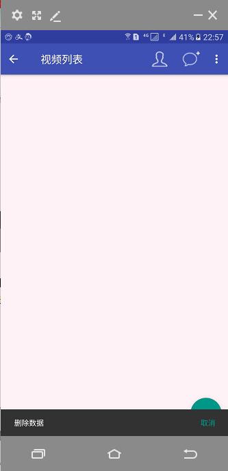
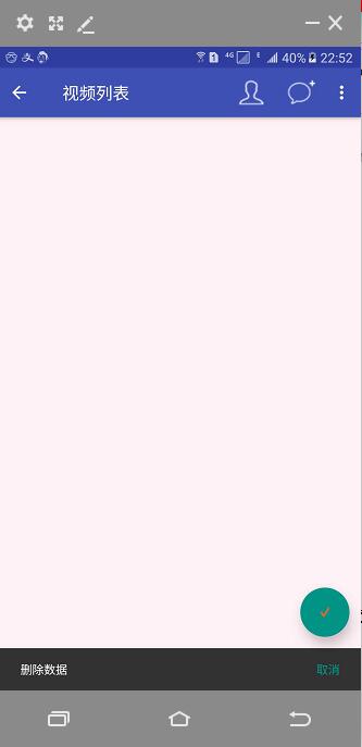
</android.support.design.widget.CoordinatorLayout>Among them, the app:elevation="10dp" attribute is used to set the height of the Floating Action Button control, and the larger the height value, the larger the projection range. When we click the suspension button, a Snackbar prompt pops up. The effect before and after using Coordinator Layout is shown in the following figures (a), (b). Figure (a) shows that the Snackbar prompt covers the suspended menu, which is determined by the layout characteristics of FrameLayout. For Figure (b), when Snackbar pops up, Floating Action Button automatically moves up the same distance from the edge of the layout, because Coordinator Layout automatically responds reasonably to all the sub-controls according to the current layout. Related code in MainActivity:
FloatingActionButton mBtnDeleteData =(FloatingActionButton)
findViewById(R.id.main_delete_float_btn);
mBtnDeleteData.setOnClickListener(newView.OnClickListener() {
   @Override
   public voidonClick(View view) {
      Snackbar.make(view, "Delete data", Snackbar.LENGTH_SHORT).setAction("cancel",
      new View.OnClickListener() {
        @Override
        public void onClick(View v) {

        }
       }).show();
    }
});
(3) android.support.design.widget.AppBarLayout
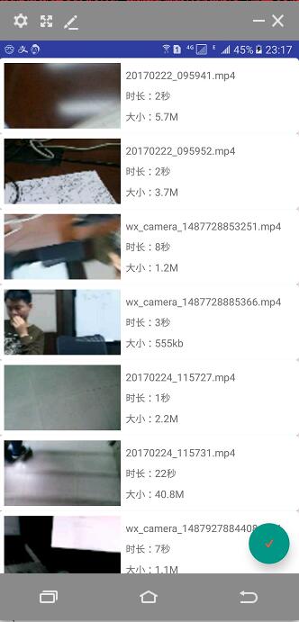
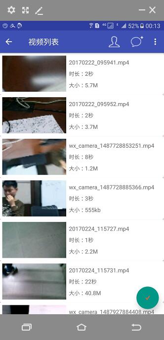
At this point, a delicate Material style title bar seems to have been implemented, so let's fill the content area of Activity with data. We use RecyclerView and CardView to enumerate all video lists in internal memory. For space reasons, the implementation will be introduced in the next blog post. From the effect of figure (a), the video list completely covers the title bar. This is because Coordinator Layout itself is an enhanced version of FrameLayout. FrameLayout will be placed in the upper left corner of the layout by default without explicit positioning. To solve this problem, we use AppBarLayout provided in the Support-design library. AppBarLayout is actually a vertical Linear Layout that does a lot of scrolling time encapsulation internally and uses some Material. Design concept. The method of use is as follows:
<android.support.design.widget.CoordinatorLayout
xmlns:android="http://schemas.android.com/apk/res/android"
   xmlns:app="http://schemas.android.com/apk/res-auto"
   android:layout_width="match_parent"
   android:layout_height="match_parent">

   <android.support.design.widget.AppBarLayout
       android:layout_width="match_parent"
       android:layout_height="wrap_content">
               <!—Toolbar Add to app: layout_scrollFlags -->
       <android.support.v7.widget.Toolbar
            …..
            app:layout_scrollFlags="scroll|snap|enterAlways"
            …../>
</android.support.design.widget.AppBarLayout>

       <!—RecyclerView Add to app:layout_behavior -->
   <android.support.v7.widget.RecyclerView
       android:id="@+id/main_pic_list"
        android:layout_width="match_parent"
       android:layout_height="match_parent"
       app:layout_behavior="@string/appbar_scrolling_view_behavior"/>

   <android.support.design.widget.FloatingActionButton
       android:id="@+id/main_delete_float_btn"
        ….. />
</android.support.design.widget.CoordinatorLayout>
By defining an AppBarLayout and placing the Toolbar in the AppBarLayout, we can solve the problem that the Toolbar is blocked by RecyclerView. However, it is not possible to make the Toolbar change as RecyclerView scrolls. In fact, when you add the app:layout_behavior="@string/appbar_scrolling_view_behavior" attribute to RecyclerView, the RecyclerView notifies AppBarLayout of all the rolling events when it scrolls, but we haven't processed them yet, so we need to add app for Toolbar: The layout_scrollFlags attribute, which is used to implement how the child controls inside AppBarLayout react to RecyclerView scrolling events when they receive them. scroll indicates that when RecyclerView scrolls up, the Toolbar scrolls up and hides together; enterAlways indicates that when RecyclerView scrolls down, the Toolbar scrolls down and displays together; snap indicates that when the Toolbar is not completely hidden or displayed, it automatically selects whether to hide or display according to the current scrolling distance.
3. Collapsible title bar implementation
Demonstration of operation effect: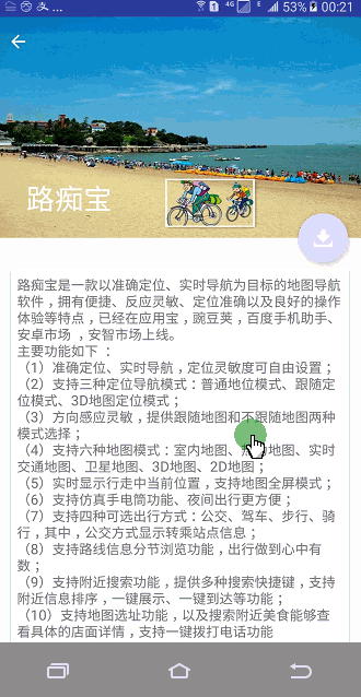
The title bar implemented with Toolbar does not seem to be much different from the traditional ActionBar, except that Toolbar can hide and display scrolling events corresponding to RecyclerView. To implement a collapsible Title bar, the Collapsing Toolbar Layout control provided by the support-design library is used here. Collapsing Toolbar Layout is a layout that functions on the basis of Toolbar. It can not only display a title, but also enrich the effect of Toolbar. It should be noted that Collapsing Toolbar Layout can not be used alone. It can only be used as a direct sub-layout of AppBarLayout at design time, while AppBarLayout must be a sub-layout of Coordinator Layout.
(1) Collapsible title bar interface code
<android.support.design.widget.CoordinatorLayout xmlns:android="http://schemas.android.com/apk/res/android"
    xmlns:app="http://schemas.android.com/apk/res-auto"
    android:layout_width="match_parent"
    android:layout_height="match_parent">
    <!--Collapsible title bar-->
    <android.support.design.widget.AppBarLayout
        android:id="@+id/personal_info_appBar"
        android:layout_width="match_parent"
        android:layout_height="250dp">

        <android.support.design.widget.CollapsingToolbarLayout
            android:id="@+id/personal_info_collapsingbar_layout"
            android:layout_width="match_parent"
            android:layout_height="match_parent"
            android:theme="@style/ThemeOverlay.AppCompat.Dark.ActionBar"
            app:contentScrim="@color/colorPrimary"
            app:layout_scrollFlags="scroll|exitUntilCollapsed">

            <ImageView
                android:id="@+id/personal_info_bar_background"
                android:layout_width="match_parent"
                android:layout_height="match_parent"
                android:scaleType="fitXY"
                app:layout_collapseMode="parallax" />

            <android.support.v7.widget.Toolbar
                android:id="@+id/personal_info_toolbar"
                android:layout_width="match_parent"
                android:layout_height="?attr/actionBarSize"
                app:layout_collapseMode="pin" />
        </android.support.design.widget.CollapsingToolbarLayout>
    </android.support.design.widget.AppBarLayout>
</android.support.design.widget.CoordinatorLayout>
Among them, the android:layout_height="250dp" is used in the AppBarLayout tag to set the extensible height of the title bar; the app: content Scrim attribute is used in the Collapsing ToolbarLayout tag to specify the background color of the Collapsing ToolbarLayout, and the app:layout_scrollFlags attribute is used to specify the scrolling event received by NestedScrollView. What should be done afterwards, where scoll indicates that Collapsing Toolbar Layout will scroll along with the roll of NestedScrollView? Existent Until Collapsed means that when Collapsing Toolbar Layout is folded, it will remain on the interface and will not remove the screen. ImageView tag is the background picture of foldable tab bar, and Toolbar tag is the title bar after folding. They all use the same property - app:layout_collapseMode, which specifies the folding mode of the current control in the folding process of the Collapsing Toolbar Layout control, where the Toolbar is designated as pin, indicating that the position is always inconvenient during the folding process, and the ImageView is designated as parallax, indicating that some offset occurs during the folding process.
(2) Content Details Interface Code
The outermost layout of the content details interface uses a NestedScrollView, which is a level-to-level sub-control of AppBarLayout and belongs to Coordinator Layout. NestedScrollView is an extension of ScrollView, which not only allows scrolling to view data outside the screen, but also adds nested response to scrolling events. Since Coordinator Layout itself can already respond to scrolling events, we need to use NestedScrollView or RecyclerView to generate scrolling events within it, specifying a layout behavior through the app:layout_behavior attribute, where appbar is specified to execute the scrolling events generated in response to NestedScrollView.
 <android.support.v4.widget.NestedScrollView
        android:layout_width="match_parent"
        android:layout_height="match_parent"
        app:layout_behavior="@string/appbar_scrolling_view_behavior">

       <LinearLayout
            android:layout_width="match_parent"
            android:layout_height="wrap_content">

            <android.support.v7.widget.CardView
                android:layout_width="match_parent"
                android:layout_height="wrap_content"
                android:layout_marginBottom="15dp"
                android:layout_marginLeft="15dp"
                android:layout_marginRight="15dp"
                android:layout_marginTop="35dp"
                app:cardCornerRadius="4dp">

                <TextView
                    android:id="@+id/personal_info_detail_tv"
                    android:layout_width="match_parent"
                    android:layout_height="wrap_content"
                    android:textSize="16sp"
                    android:layout_margin="7dp" />
            </android.support.v7.widget.CardView>
       </LinearLayout>
</android.support.v4.widget.NestedScrollView>
(3) Suspension button
According to the running effect gif chart, there will be a suspension button in the lower right corner of the title bar to jump to the download interface of Luzhibao. Floating Action Button is also level with AppBarLayout and NestedScrollView and belongs to the sub-control of Coordinator Layout. Floating Action Button uses the app:layout_anchor attribute to specify an anchor, and we set the anchor to the ID of AppBarLayout so that the suspension button appears in the area of the title bar; the suspension button is positioned in the right corner of the title bar area using the app:layout_anchorGravity attribute.
<!--Buttons suspended in the title bar-->
 <android.support.design.widget.FloatingActionButton
      android:id="@+id/personal_info_float_btn"
      android:layout_width="wrap_content"
      android:layout_height="wrap_content"
      android:layout_margin="16dp"
      android:src="@mipmap/download"
      app:layout_anchor="@id/personal_info_appBar"
      app:layout_anchorGravity="bottom|end" />
The codeword is not easy to reproduce, please declare the source: http://blog.csdn.net/andrexpert/article/details/61236581
Finally: "This article gives a brief introduction to Material Design, and elaborates on Coordinator Layout, AppBarLayout, Toolbar, Collapsing Toolbar Layout in support-v7, support-design libraries.
Material style controls such as NestedScrollView, Floating Action Button and their features and usage methods. Because the length of the article can not be too long, the references to RecyclerView, CardView, video thumbnail acquisition and Demo will be given in "Meterial Design Best Experience (2) RecyleView, CardView, Swipe RefreshLayout to implement Meterial Style drop-down refresh list". "
About Demo: Part 3 Demo - Implementation of Foldable Title Bar