background
I habitually log in to Apex at home at the weekend and prepare to play some games. In the process of landing the accelerator, it was found that the accelerator expired.
I have been using Tencent online game accelerator, but click the recharge button to prompt that the client has been upgraded recently and does not support recharge (this operation shocked me ~). You can only turn around and download Netease UU accelerator.
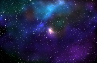
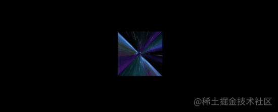
When you open the homepage of UU accelerator, you will see such a picture:

Instantly, I was attracted by the background picture.
Out of the sensitivity to CSS, I guessed blindly that this is implemented with CSS, at least Canvas. Open the console. I'm a little disappointed. It's actually an. mp4 file:

Look at the Network panel. This. mp4 file actually needs 3.5M?

emm, I don't want to play games for a moment. Can't CSS handle such a background picture?
Use CSS 3D to realize interstellar 3D shuttle effect
This technique, I'm in Fancy CSS 3D animation | what amazing animation can you make with CSS alone? It has also been mentioned. You can take a look at it if you are interested.
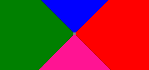
Suppose we have such a graph:
Keep this picture for future use. Before using this figure, we will draw such a figure:
<div class="g-container">
  <div class="g-group">
      <div class="item item-right"></div>
      <div class="item item-left"></div>
      <div class="item item-top"></div>
      <div class="item item-bottom"></div>
      <div class="item item-middle"></div>
  </div>
</div>
body {
background: #000;
}
.g-container {
position: relative;
}
.g-group {
position: absolute;
width: 100px;
height: 100px;
left: -50px;
top: -50px;
transform-style: preserve-3d;
}
.item {
position: absolute;
width: 100%;
height: 100%;
background: rgba(255, 255, 255, .5);
}
.item-right {
background: red;
transform: rotateY(90deg) translateZ(50px);
}
.item-left {
background: green;
transform: rotateY(-90deg) translateZ(50px);
}
.item-top {
background: blue;
transform: rotateX(90deg) translateZ(50px);
}
.item-bottom {
background: deeppink;
transform: rotateX(-90deg) translateZ(50px);
}
.item-middle {
background: rgba(255, 255, 255, 0.5);
transform: rotateX(180deg) translateZ(50px);
}A total of 5 sub elements are set, but look carefully at the CSS code. Among them, 4 sub elements are set with rotateX/Y(90deg/-90deg), that is, rotate 90 ° around the X-axis or y-axis. Visually, it is a plane perpendicular to the screen, so we can't see it visually. We can only see one plane. Item middle.
I set different background colors for 5 sub item s, and the results are as follows:
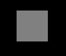
Now, it seems to be ordinary, indeed.
However, it's time to witness the miracle. At this time, we set a minimal perspective for the parent element. g-container. For example, set a perspective: 4px to see the effect:
.g-container {
  position: relative;
+ perspective: 4px;
}
// ... the rest of the styles remain the same
At this point, the painting style changes suddenly, and the whole effect becomes like this:
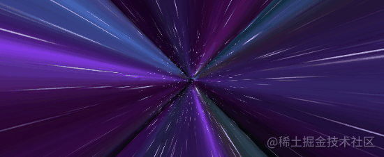
Due to the perspective effect, the original plane effect becomes a 3D effect. Next, we use the star chart prepared above to replace the background color above. All of them are replaced with the same picture. A magical thing happened:
Because the perspective is very low, and the transform: translateZ(50px) of each item is relatively large, the picture is visually stretched very much. But the whole is full of the whole screen.
Next, we just need to move the perspective, add an animation to the parent element, and change it by controlling the translateZ() of the parent element:
.g-container{
position: relative;
perspective: 4px;
perspective-origin: 50% 50%;
}
.g-group{
position: absolute;
// ... some positioning height and width codes
transform-style: preserve-3d;
+ animation: move 8s infinite linear;
}
@keyframes move {
0%{
transform: translateZ(-50px) rotate(0deg);
}
100%{
transform: translateZ(50px) rotate(0deg);
}
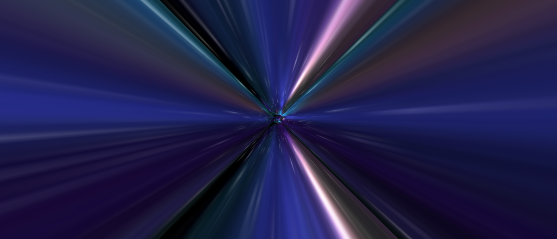
}Look, the magical and wonderful star shuttle effect comes out. Amazing:
The drawback is that the animation can not connect infinitely, and there are great problems at the beginning and end.
Of course, this is not difficult for us. We can:
- By superimposing the same effects of two groups, one group moves ahead of the other through negative animation delay to connect the two groups of animation (when one group ends, the other group is still moving)
- Then, through the change of transparency, the abrupt feeling of item middle flying head-on is hidden
- Finally, you can control the color change of the picture through the hue rotate filter of the parent element
We try to modify the HTML structure as follows:
<div class="g-container">
  <div class="g-group">
      <div class="item item-right"></div>
      <div class="item item-left"></div>
      <div class="item item-top"></div>
      <div class="item item-bottom"></div>
      <div class="item item-middle"></div>
  </div>
  <!-- Add a set of animation -->
  <div class="g-group">
      <div class="item item-right"></div>
      <div class="item item-left"></div>
      <div class="item item-top"></div>
      <div class="item item-bottom"></div>
      <div class="item item-middle"></div>
  </div>
</div>
The modified core CSS is as follows:
.g-container{
perspective: 4px;
position: relative;
// Hue rotate change animation can make the picture color change all the time
animation: hueRotate 21s infinite linear;
}
.g-group{
transform-style: preserve-3d;
animation: move 12s infinite linear;
}
// Set the negative animation delay to advance the second set of animation
.g-group:nth-child(2){
animation: move 12s infinite linear;
animation-delay: -6s;
}
.item {
background: url(https://z3.ax1x.com/2021/08/20/fLwuMd.jpg);
background-size: cover;
opacity: 1;
// The transparency of sub elements changes to reduce the abrupt feeling of animation connection
animation: fade 12s infinite linear;
animation-delay: 0;
}
.g-group:nth-child(2) .item {
animation-delay: -6s;
}
@keyframes move {
0%{
transform: translateZ(-500px) rotate(0deg);
}
100%{
transform: translateZ(500px) rotate(0deg);
}
}
@keyframes fade {
0%{
opacity: 0;
}
25%,
60%{
opacity: 1;
}
100%{
opacity: 0;
}
}
@keyframes hueRotate {
0% {
filter: hue-rotate(0);
}
100% {
filter: hue-rotate(360deg);
}
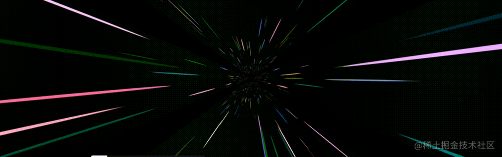
}The final complete effect is as follows. The star shuttle effect, the whole animation connected end to end, can go on indefinitely, with almost no flaws. It's very good:
For the complete code above, you can click here: CSS inspiration -- 3D space-time shuttle effect
In this way, we basically restored the dynamic background of the home page of Netease UU accelerator we saw above.
Further, I don't want to use any picture
Of course, there will still be readers make complaints about it. Do you use a picture resource here? Can we do without that star map? I'm too lazy to look for this picture.
Of course, CSS YYDS. Here, we try to use box shadow to replace the actual star map, which is also implemented in a div tag with the help of SASS's loop function:
<div></div>
@function randomNum($max, $min: 0, $u: 1) {
@return ($min + random($max)) * $u;
}
@function randomColor() {
@return rgb(randomNum(255), randomNum(255), randomNum(255));
}
@function shadowSet($maxWidth, $maxHeight, $count) {
$shadow : 0 0 0 0 randomColor();
@for $i from 0 through $count {
$x: #{random(10000) / 10000 * $maxWidth};
$y: #{random(10000) / 10000 * $maxHeight};
$shadow: $shadow, #{$x} #{$y} 0 #{random(5)}px randomColor();
}
@return $shadow;
}
body {
background: #000;
}
div {
width: 1px;
height: 1px;
border-radius: 50%;
box-shadow: shadowSet(100vw, 100vh, 500);
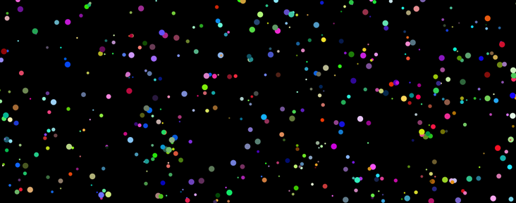
}Here, we encapsulate a function with SASS to generate the number of incoming points within the height and width of the incoming size by using the characteristics of multiple box shadow.
In this way, we can get such a picture to replace the actual star map:
Let's replace the above figure with the actual star chart, mainly replacing the class. item, and only list the modified parts:
// The original CSS uses a star chart
.item {
  position: absolute;
  width: 100%;
  height: 100%;
  background: url(https://z3.ax1x.com/2021/08/20/fLwuMd.jpg);
  background-size: cover;
  animation: fade 12s infinite linear;
}

// Modified CSS code
.item {
  position: absolute;
  width: 100%;
  height: 100%;
  background: #000;
  animation: fade 12s infinite linear;
}
.item::after {
  content: "";
  position: absolute;
  top: 0;
  left: 0;
  right: 0;
  bottom: 0;
  width: 1px;
  height: 1px;
  border-radius: 50%;
  box-shadow: shadowSet(100vw, 100vh, 500);
}
In this way, we have achieved such an effect by using pure CSS without the help of additional resources:
CodePen Demo -- Pure CSS Galaxy Shuttle 2
By adjusting the time of animation, the value of perspective and the change distance of translateZ() of each group of elements, you can get a variety of different impressions and effects. Interested readers can try it on their own based on the DEMO I gave above.
last
Well, this article ends here. I hope this article will help you:)
If you want Get to get the most interesting CSS information, don't miss my official account -- iCSS front end interesting news. 😄
More wonderful CSS technical articles are summarized in my Github -- iCSS , continuously updated. Welcome to a star subscription collection.
If you have any questions or suggestions, you can communicate more. The original articles have limited writing style and shallow talents. If there is anything wrong in the article, please let me know.