It is almost impossible to collect all CSS code fragments in one article, but we have listed some more useful code fragments than others. Don't be frightened by the length of these codes, because they are easy to implement and have good documents. In addition to solving common annoying problems, it also includes some new technologies to solve new problems.
1. Vertical alignment
If you have encountered this problem before, you should know how annoying it is. Fortunately, now you can use CSS3 transformation to solve this problem:
.vc{
    position: relative;
    top: 50%;
    -webkit-transform: translateY(-50%);
    -o-transform: translateY(-50%);
    transform: translateY(-50%);
}
2. Projection on one or both sides only
.box-shadow {
    background-color: #AC92EC;
    width: 160px;
    height: 90px;
    margin-top: -45px;
    margin-left: -80px;
    position: absolute;
    top: 50%;
    left: 50%;
}
.box-shadow:after {
    content: "";
    width: 150px;
    height: 1px;
    margin-top: 88px;
    margin-left: -75px;
    display: block;
    position: absolute;
    left: 50%;
    z-index: -1;
    -webkit-box-shadow: 0px 0px 8px 2px #000000;
       -moz-box-shadow: 0px 0px 8px 2px #000000;
            box-shadow: 0px 0px 8px 2px #000000;
}
3. Gradient background animation effect
Since CSS3, animation has become very cool, but don't use them too much. The following technique skillfully moves the background position to make it look like animation:
button {
    padding: 15px;
    background-image: linear-gradient(#FC6E51, #FFF);
    background-size: auto 200%;
    background-position: 0 100%;
    transition: background-position 0.5s;
}
button:hover {
    background-position: 0 0;
}
4. Break text into columns
div
{
    -moz-column-count:3; /* Firefox */
    -webkit-column-count:3; /* Safari and Chrome */
    column-count:3;
}
5. Table automatic width
td {
    white-space: nowrap;
}
6. Like publications, the first word becomes larger
p:first-child::first-letter{
  font-family: "papyrus";
  font-size: 28px;
  font-weight: bold;
}
seven A complete list of CSS Hacks for a specific browser
Sometimes solving cross browser compatibility can be tricky, but these browser specific skills may help you solve the problem.
/***** Selector Hacks ******/

/* IE6 and below */
* html #uno  { color: red }

/* IE7 */
*:first-child+html #dos { color: red }

/* IE7, FF, Saf, Opera  */
html>body #tres { color: red }

/* IE8, FF, Saf, Opera (Everything but IE 6,7) */
html>/**/body #cuatro { color: red }

/* Opera 9.27 and below, safari 2 */
html:first-child #cinco { color: red }

/* Safari 2-3 */
html[xmlns*=""] body:last-child #seis { color: red }

/* safari 3+, chrome 1+, opera9+, ff 3.5+ */
body:nth-of-type(1) #siete { color: red }

/* safari 3+, chrome 1+, opera9+, ff 3.5+ */
body:first-of-type #ocho {  color: red }

/* saf3+, chrome1+ */
@media screen and (-webkit-min-device-pixel-ratio:0) {
 #diez  { color: red  }
}

/* iPhone / mobile webkit */
@media screen and (max-device-width: 480px) {
 #veintiseis { color: red  }
}


/* Safari 2 - 3.1 */
html[xmlns*=""]:root #trece  { color: red  }

/* Safari 2 - 3.1, Opera 9.25 */
*|html[xmlns*=""] #catorce { color: red  }

/* Everything but IE6-8 */
:root *> #quince { color: red  }

/* IE7 */
*+html #dieciocho {  color: red }

/* Firefox only. 1+ */
#veinticuatro,  x:-moz-any-link  { color: red }

/* Firefox 3.0+ */
#veinticinco,  x:-moz-any-link, x:default  { color: red  }


/***** Attribute Hacks ******/

/* IE6 */
#once { _color: blue }

/* IE6, IE7 */
#doce { *color: blue; /* or #color: blue */ }

/* Everything but IE6 */
#diecisiete { color/**/: blue }

/* IE6, IE7, IE8 */
#diecinueve { color: blue\9; }

/* IE7, IE8 */
#veinte { color/*\**/: blue\9; }

/* IE6, IE7 -- acts as an !important */
#veintesiete { color: blue !ie; } /* string after ! can be anything */
8. Create fuzzy text
.blurry-text {
   color: transparent;
   text-shadow: 0 0 5px rgba(0,0,0,0.5);
}
9. Cross browser vertical and horizontal centering of pictures without using tables
This code can center a picture of unknown size vertically and horizontally in a container with known width and height. This is a hack of IE:
<figure class='logo'>
    <span></span>
    <img class='photo'/>
</figure>
.logo {
  display: block;
  text-align: center;
  display: block;
  text-align: center;
  vertical-align: middle;
  border: 4px solid #dddddd;
  padding: 4px;
  height: 74px;
  width: 74px; }
  .logo * {
    display: inline-block;
    height: 100%;
    vertical-align: middle; }
    .logo .photo {
    height: auto;
    width: auto;
    max-width: 100%;
    max-height: 100%; }
10. Highlight the selected input
// HTML
<input id="mycheck1" type="checkbox" />
<label for="mycheck1">Check box label here</label>
<br />
<input id="mycheck2" type="checkbox" checked/>
<label for="mycheck2">Check box label here</label>
<br />
<input id="mycheck3" type="checkbox" />
<label for="mycheck3">Check box label here</label>

// CSS
input:checked + label{
    background: yellow;
}
11. Cross browser transparency
selector {
    filter: alpha(opacity=50); /* internet explorer */
    -khtml-opacity: 0.5;      /* khtml, old safari */
    -moz-opacity: 0.5;       /* mozilla, netscape */
    opacity: 0.5;           /* fx, safari, opera */
}
12. CSS projection
// External projection
.shadow {
  -moz-box-shadow: 5px 5px 5px #ccc;
  -webkit-box-shadow: 5px 5px 5px #ccc;
  box-shadow: 5px 5px 5px #ccc;
}

// Internal projection
.shadow {
   -moz-box-shadow:inset 0 0 10px #000000;
   -webkit-box-shadow:inset 0 0 10px #000000;
   box-shadow:inset 0 0 10px #000000;
}
13. Minimum cross browser height
#div {
   min-height: 500px;
   height:auto !important;
   height: 500px;
}
14. Fix Footer
#footer {
   position:fixed;
   left:0px;
   bottom:0px;
   height:30px;
   width:100%;
   background:#999;
}

/* IE 6 */
* html #footer {
   position:absolute;
   top:expression((0-(footer.offsetHeight)+(document.documentElement.clientHeight ? document.documentElement.clientHeight : document.body.clientHeight)+(ignoreMe = document.documentElement.scrollTop ? document.documentElement.scrollTop : document.body.scrollTop))+'px');
}
15. Clear floating Clearfix
/* slightly enhanced, universal clearfix hack */
.clearfix:after {
     visibility: hidden;
     display: block;
     font-size: 0;
     content: " ";
     clear: both;
     height: 0;
     }
.clearfix { display: inline-block; }
/* start commented backslash hack \*/
* html .clearfix { height: 1%; }
.clearfix { display: block; }
/* close commented backslash hack */
16. Add a hand cursor to the clickable element
a[href], input[type='submit'], input[type='image'], label[for], select, button, .pointer {
       cursor: pointer;
}
17. iPad orientation CSS
<!-- css -->
@media only screen and (max-device-width: 1024px) and (orientation:portrait) {
    .landscape { display: none; }
}
@media only screen and (max-device-width: 1024px) and (orientation:landscape) {
    .portrait { display: none; }
}

<!-- example markup -->
<h1 class="portrait">Your device orientation is "portrait"<h1>
<h1 class="landscape">Your device orientation is "landscape"<h1>
18. Text wrapping in pre tag
pre{
height: 120px;
overflow: auto;
font-family: "Consolas",monospace;
font-size: 9pt;
text-align:left;
background-color: #FCF7EC;
overflow-x: auto; /* Use horizontal scroller if needed; for Firefox 2, not
white-space: pre-wrap; /* css-3 */
white-space: -moz-pre-wrap !important; /* Mozilla, since 1999 */
word-wrap: break-word; /* Internet Explorer 5.5+ */
margin: 0px 0px 0px 0px;
padding:5px 5px 3px 5px;
white-space : normal; /* crucial for IE 6, maybe 7? */
}
19. CSS3 media query
/* Smartphones (portrait and landscape) ----------- */
@media only screen
and (min-device-width : 320px)
and (max-device-width : 480px) {
/* Styles */
}

/* Smartphones (landscape) ----------- */
@media only screen
and (min-width : 321px) {
/* Styles */
}

/* Smartphones (portrait) ----------- */
@media only screen
and (max-width : 320px) {
/* Styles */
}

/* iPads (portrait and landscape) ----------- */
@media only screen
and (min-device-width : 768px)
and (max-device-width : 1024px) {
/* Styles */
}

/* iPads (landscape) ----------- */
@media only screen
and (min-device-width : 768px)
and (max-device-width : 1024px)
and (orientation : landscape) {
/* Styles */
}

/* iPads (portrait) ----------- */
@media only screen
and (min-device-width : 768px)
and (max-device-width : 1024px)
and (orientation : portrait) {
/* Styles */
}

/* Desktops and laptops ----------- */
@media only screen
and (min-width : 1224px) {
/* Styles */
}

/* Large screens ----------- */
@media only screen
and (min-width : 1824px) {
/* Styles */
}

/* iPhone 4 ----------- */
@media
only screen and (-webkit-min-device-pixel-ratio : 1.5),
only screen and (min-device-pixel-ratio : 1.5) {
/* Styles */
}
20. Reset loading
html, body, div, span, applet, object, iframe,
h1, h2, h3, h4, h5, h6, p, blockquote, pre,
a, abbr, acronym, address, big, cite, code,
del, dfn, em, font, img, ins, kbd, q, s, samp,
small, strike, strong, sub, sup, tt, var,
dl, dt, dd, ol, ul, li,
fieldset, form, label, legend,
table, caption, tbody, tfoot, thead, tr, th, td {
    margin: 0;
    padding: 0;
    border: 0;
    outline: 0;
    font-weight: inherit;
    font-style: inherit;
    font-size: 100%;
    font-family: inherit;
    vertical-align: baseline;
}
/* remember to define focus styles! */
:focus {
    outline: 0;
}
body {
    line-height: 1;
    color: black;
    background: white;
}
ol, ul {
    list-style: none;
}
/* tables still need 'cellspacing="0"' in the markup */
table {
    border-collapse: separate;
    border-spacing: 0;
}
caption, th, td {
    text-align: left;
    font-weight: normal;
}
blockquote:before, blockquote:after,
q:before, q:after {
    content: "";
}
blockquote, q {
    quotes: "" "";
}
21. Multi border
Elements must be relatively positioned and have enough padding to display extra borders:
#borders {
   position:relative;
   z-index:1;
   padding:30px;
   border:5px solid #f00;
   background:#ff9600;
}
#borders:before {
   content:"";
   position:absolute;
   z-index:-1;
   top:5px;
   left:5px;
   right:5px;
   bottom:5px;
   border:5px solid #ffea00;
   background:#4aa929;
}

#borders:after {
   content:"";
   position:absolute;
   z-index:-1;
   top:15px;
   left:15px;
   right:15px;
   bottom:15px;
   border:5px solid #00b4ff;
   background:#fff;
}
22. Remove the scroll bar of textarea in IE
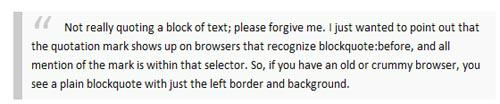
textarea { overflow: auto; }23. Simple but nice reference style
blockquote {
    background:#f9f9f9;
    border-left:10px solid #ccc;
    margin:1.5em 10px;
    padding:.5em 10px;
    quotes:"\201C""\201D""\2018""\2019";
}
blockquote:before {
    color:#ccc;
    content:open-quote;
    font-size:4em;
    line-height:.1em;
    margin-right:.25em;
    vertical-align:-.4em;
}
blockquote p {
    display:inline;
}
24. :-moz-placeholder
<!doctype html>
<html>
<head>
  <title>Placeholder demo</title>
  <style type="text/css">
    input:-moz-placeholder {
      color: green;
    }
  </style>
</head>
<body>
  <input id="test" placeholder="Placeholder text!">
</body>
</html>
25. Another way to fix the footer
* { margin:0; padding:0; }

html, body, #wrap { height: 100%; }

body > #wrap {height: auto; min-height: 100%;}

#main { padding-bottom: 150px; }  /* must be same height as the footer */

#footer {
        position: relative;
        margin-top: -150px; /* negative value of footer height */
        height: 150px;
        clear:both;}

/* CLEAR FIX*/
.clearfix:after {content: ".";
        display: block;
        height: 0;
        clear: both;
        visibility: hidden;}
.clearfix {display: inline-block;}
/* Hides from IE-mac \*/
* html .clearfix { height: 1%;}
.clearfix {display: block;}
/* End hide from IE-mac */
<div id="wrap">

        <div id="main" class="clearfix">

        </div>

</div>

<div id="footer">

</div>
26. Transparent background
.rgba {
  background-color: transparent;
  background-color: rgba(200,200,200,0.8);
  filter:progid:DXImageTransform.Microsoft.gradient(startColorstr=#99dddddd,endColorstr=#99dddddd);
  -ms-filter: "progid:DXImageTransform.Microsoft.gradient(startColorstr=#99dddddd,endColorstr=#99dddddd)";
}
27. Center DIV elements of unknown width
.content {
    margin: 0 auto 8px;
    display: table;
    }

.content div {
    display: table-cell;
    }

<!--[if IE]>
.content {
    display: block;
    text-align: center;
    }
.content div {
    display: inline;
    zoom: 1;
}
<![endif]-->
28. Set the style according to the file type
/* external links */
a[href^="http://"]
{
padding-right: 13px;
background: url(external.gif) no-repeat center right;
}

/* emails */
a[href^="mailto:"]
{
padding-right: 20px;
background: url(email.png) no-repeat center right;
}

/* pdfs */
a[href$=".pdf"]
{
padding-right: 18px;
background: url(acrobat.png) no-repeat center right;
}
29. Solve the IE6/7 double margin/padding problem
ul li
{
  float: right;
  margin-right: 10px;
  *display: inline; /*Target IE7 and bellow*/
  _display: inline; /*Target IE6 and bellow*/
}
/* This example fixes the double right margin bug */
30. Change the style of the selected text
::selection
{
color: white;
background-color: red;
}

::-moz-selection  /* Firefox needs an extra attention for this */
{
color: white;
background-color: red;
}
31. Initial sinking
p:first-letter{
        display:block;
        margin:5px 0 0 5px;
        float:left;
        color:#FF3366;
        font-size:60px;
        font-family:Georgia;
    }