3,flex-direction
The flex direction attribute specifies the direction of the main axis. By default, the child elements are arranged according to the main axis. Therefore, flex direction also specifies the arrangement of elastic child elements in the elastic container. It has the following four values:
- row: (default) arranged horizontally from left to right.
- Row reverse: as the name suggests, it is arranged horizontally from right to left and in reverse.
- column: vertically arranged from top to bottom.
- Column reverse: vertically arranged from bottom to top.
The following uses the value row to manipulate the attribute flex direction:
<head>
    <meta charset="UTF-8">
    <title>Title</title>
    <style>
        .container {
            display: flex;
            flex-direction: row; /*((default) arranged horizontally from left to right.*/
            width: 400px;
            height: 450px;
            background-color: green;
        }
        .item {
            background-color: red;
            width: 100px;
            height: 100px;
            margin: 20px;
        }
    </style>
</head>
<body>
    <div class="container">
        <div class="item">item1</div>
        <div class="item">item2</div>
        <div class="item">item3</div>
    </div>
</body>
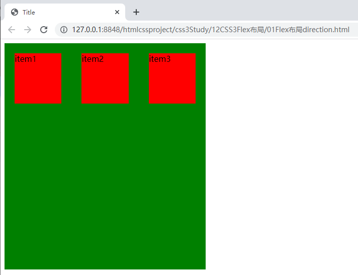
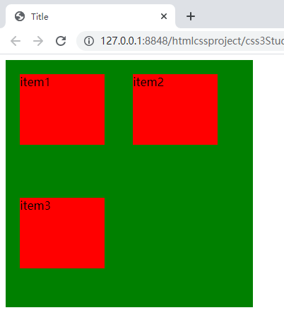
As shown in the figure, the three child elements are arranged from left to right in the horizontal direction of the container according to the value row.
When we change the flex direction to column, it is arranged vertically from top to bottom in the container.
4,flex-wrap
By default, all child elements of the elastic box are arranged on one line, but the container size is limited. It is likely that the child elements will be truncated. At this time, line wrapping is required. Flex wrap is the attribute used to operate the line wrapping of child elements. Flex wrap has the following three values:
- nowrap: (default) no line breaks.
- Wrap: wrap line. When the first line is full, it will automatically change to the second line.
- Wrap reverse: line break. Unlike wrap, if a line break occurs, the element after the line break is above the first line.
The following uses the value wrap to manipulate the attribute flex Wrap:
<head>
    <meta charset="UTF-8">
    <title>Title</title>
    <style>
        .container {
            display: flex;
            flex-wrap: wrap-reverse;
            width: 350px;
            height: 450px;
            background-color: green;
        }
        .item {
            background-color: red;
            width: 120px;
            height: 100px;
            margin: 20px;
        }
    </style>
</head>
<body>
    <div class="container">
        <div class="item">item1</div>
        <div class="item">item2</div>
        <div class="item">item3</div>
    </div>
</body>
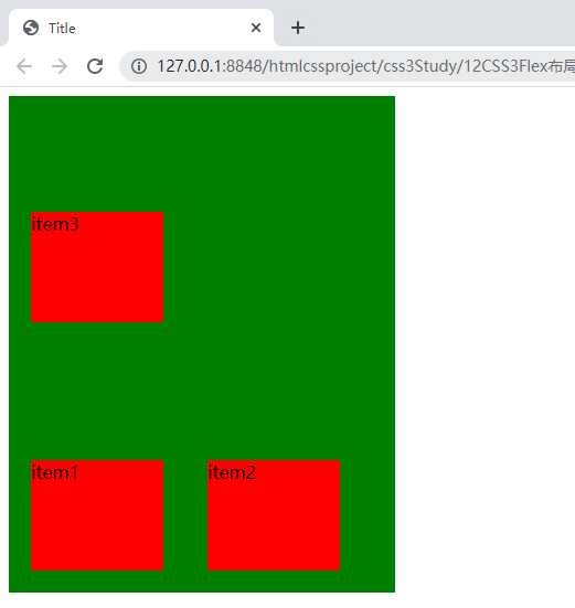
When there are no more than three boxes in a row of the parent element, setting the wrap attribute can wrap the line. When the first row is full, it will automatically change to the second row.
The modification code is as follows:
flex-wrap: wrap;
If we force no line breaks, set the nowrap attribute value:
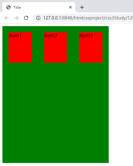
The width of the child elements will be automatically reduced and squeezed into one line.
5,flex-flow
Flex flow is a short form of flex direction and flex wrap. The default value is row nowrap.
<head>
    <meta charset="UTF-8">
    <title>Title</title>
    <style>
        .container {
            display: flex;
            /*Wrap left to right*/
            flex-flow: row wrap;
            width: 350px;
            height: 350px;
            background-color: green;
        }
        .item {
            background-color: red;
            width: 120px;
            height: 100px;
            margin: 20px;
        }
    </style>
</head>
<body>
    <div class="container">
        <div class="item">item1</div>
        <div class="item">item2</div>
        <div class="item">item3</div>
    </div>
</body>
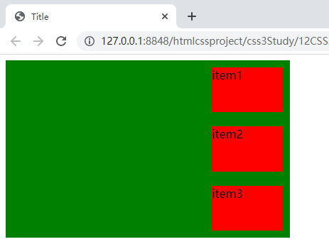
6,justify-content
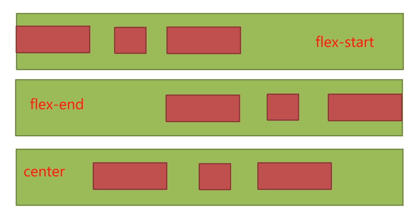
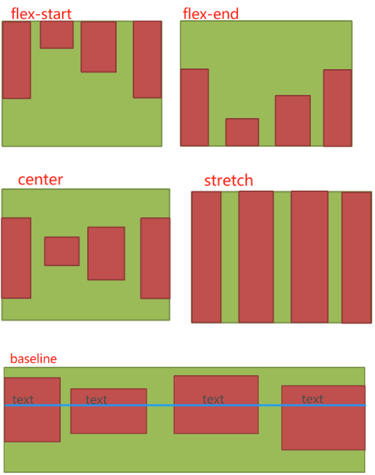
By default, child elements are arranged on the spindle line in a left aligned layout in the container. The attribute justify content is used to adjust the alignment of child elements on the spindle line. It has the following five values:
- Flex start: align left
- Flex end: right justified
- center: center
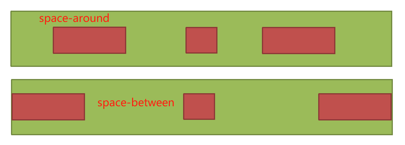
- Space between: both ends are aligned, and the spacing between items is equal.
- Space around: the space on both sides of each item is equal. Therefore, the interval between items is twice as large as that between items and borders.
<style>
        .container {
            display: flex;
            justify-content: space-around;
            width: 400px;
            height: 250px;
            background-color: green;
        }
        .item {
            background-color: red;
            height: 100px;
            margin: 10px;
			}
    </style>
</head>
<body>
	<div class="container">
	    <div class="item">item1</div>
	    <div class="item">item2</div>
	    <div class="item">item3</div>
	</div>
</body>
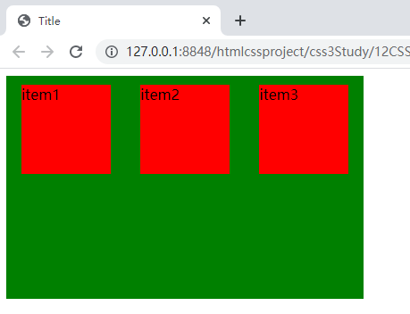
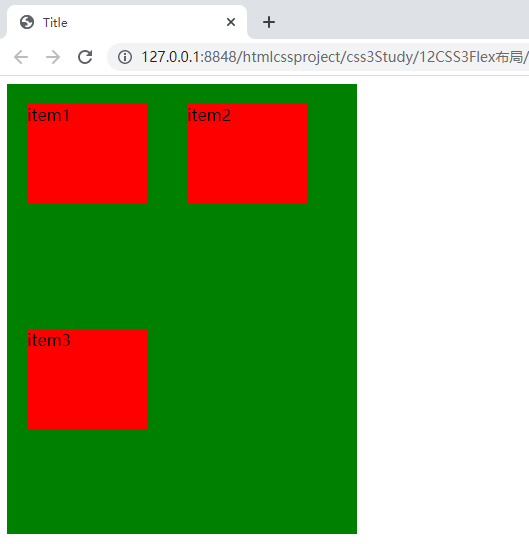
The width of the container is 400px, and the sum of the width of the three child elements plus their borders is less than 400px, so there will be no newline.
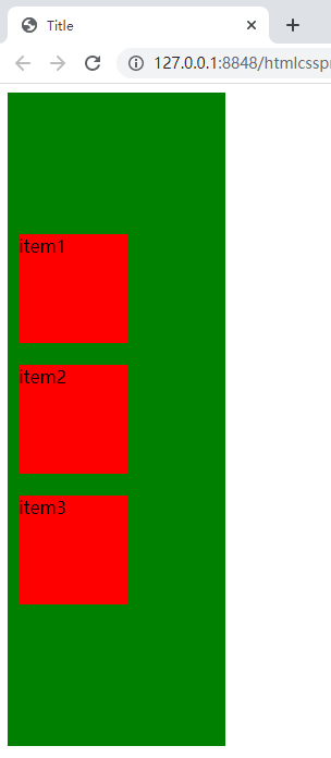
7,align-items
The axis perpendicular to the main axis is called the cross axis. The attribute align items is used to define the arrangement of child elements on the cross axis. It has the following five values:
- Flex start: align the start point of the cross axis.
- Flex end: align the ends of the cross axes.
- center: align the midpoint of the cross axis.
- Baseline: the baseline alignment of the first line of text of the project.
- stretch: if the child element is not set to height or set to auto, the child element will occupy the entire container height.
The following uses the value flex end to manipulate the attribute align items:
<head>
    <meta charset="UTF-8">
    <title>Title</title>
    <style>
        .container {
            display: flex;
            flex-direction: column; /**/
            align-items: flex-end;
            width: 400px;
            height: 250px;
            background-color: green;
        }
        .item {
            background-color: red;
            width: 100px;
            height: 100px;
            margin: 10px;
        }
    </style>
</head>
<body>
    <div class="container">
        <div class="item">item1</div>
        <div class="item">item2</div>
        <div class="item">item3</div>
    </div>
</body>
Note: the flex direction here is set to column, that is, the direction of the main axis is vertical, that is, the direction of the cross axis is horizontal; Align items is set to flex end, that is, the boundary of the child elements at the end of the cross axis is aligned, and the end of the cross axis is on the right, so the three child elements are aligned on the right boundary.
8,align-content
The align content attribute defines the alignment of multiple axes. This property has no effect if the project has only one axis. Align content has the following six values:
- Flex start: align with the start point of the cross axis.
- Flex end: align with the end of the cross axis.
- center: align with the midpoint of the cross axis.
- Space between: align with both ends of the cross axis, and the spacing between the axes is evenly distributed.
- Space around: the spacing on both sides of each axis is equal. Therefore, the spacing between the axes is twice as large as that between the axis and the frame.
- stretch: the axis occupies the entire cross axis.
The following uses the value center to operate the attribute align content:
<head>
    <meta charset="UTF-8">
    <title>Title</title>
    <style>
        .container {
            display: flex;
            flex-wrap: wrap;
            align-content: center;
            width: 200px;
            height: 600px;
            background-color: green;
        }
        .item {
            background-color: red;
            width: 100px;
            height: 100px;
            margin: 10px;
        }
    </style>
</head>
<body>
    <div class="container">
        <div class="item">item1</div>
        <div class="item">item2</div>
        <div class="item">item3</div>
    </div>
</body>
Note: the flex wrap line feed attribute is set to wrap here, and line feed is allowed. The align content attribute has no effect when there is no line feed in the container, so we set the width of the container to 200px, and only one child element can be placed in a line. Align content: center means that each row is centered on the cross axis, and the three sub elements are only centered on the cross axis, because we have not set the alignment of the main axis. If we modify the CSS code as shown below and the other codes remain unchanged, the arrangement effect of the sub elements will change.
<head>
    <meta charset="UTF-8">
    <title>Title</title>
    <style>
        .container {
            display: flex;
            flex-wrap: wrap;
            align-content: center;
            justify-content: center;
            width: 200px;
            height: 600px;
            background-color: green;
        }
        .item {
            background-color: red;
            width: 100px;
            height: 100px;
            margin: 10px;
        }
    </style>
</head>
<body>
    <div class="container">
        <div class="item">item1</div>
        <div class="item">item2</div>
        <div class="item">item3</div>
    </div>
</body>
As you can see, the arrangement of the three child elements has been completely centered.