New Flutter Project
-
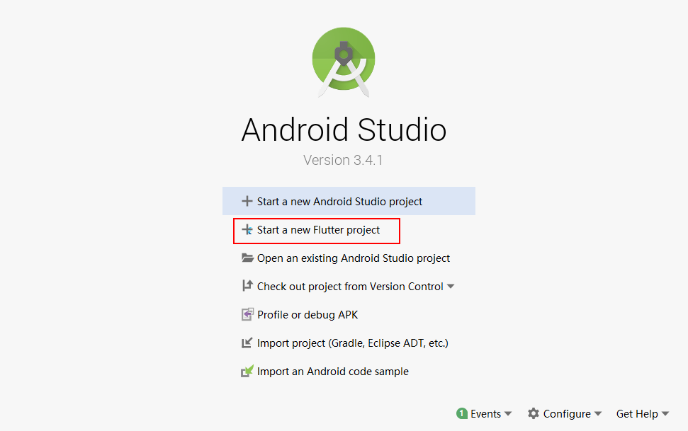
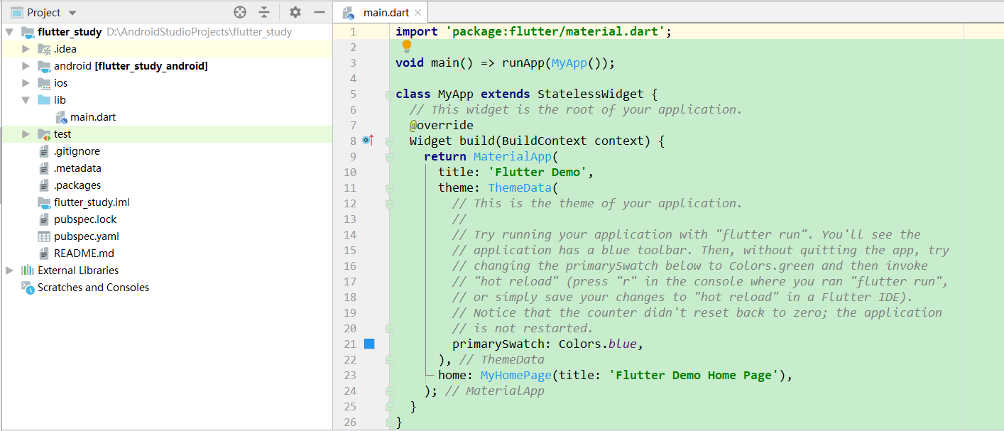
Open Andorid Studio, appear the following interface, select the second option, and create a new Flutter project.
-
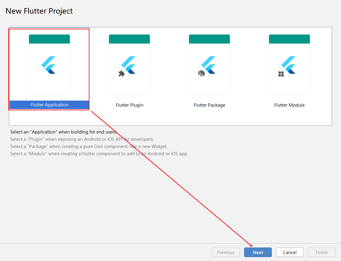
After opening the second window, select the first option, Flutter Application, and click Next.
-
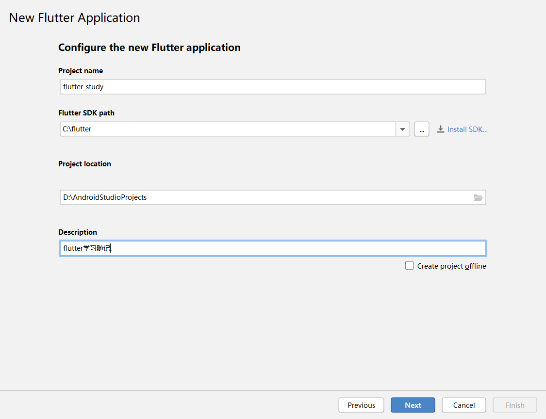
Fill in or select the project name, Flutter SDK installation path, project save path and project description respectively, then click Next.
-
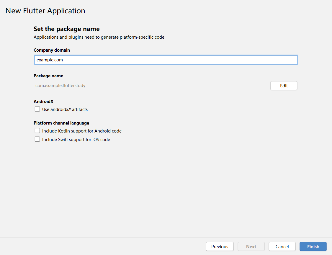
Set the package name, Finish.
-
When this step is completed, the system will automatically create a Flutter project for us.
Use of Text Widget Text Components
Be sure to give yourself a hint before you start: Flutter is a component. Below is the Hello Wold code implemented using the simplest Text component.
import 'package:flutter/material.dart';

void main() => runApp(MyApp());

/*void main(){
  //runApp Function to display the root component on the screen
  runApp(MyApp());
}*/

/**
 * Root components
 */
class MyApp extends StatelessWidget {
  @override
  Widget build(BuildContext context) {
    return MaterialApp(
      title: "MaterialApp title",
      home: ScaffoldWidget(),
    );
  }
}
Scaffold implementation code:
/**
 * Scaffold
 */
class ScaffoldWidget extends StatelessWidget {
  @override
  Widget build(BuildContext context) {
    //Scaffold: The main layout component in Material
    return Scaffold(
      //appBar: Displays an application bar at the top of its Scaffold
      appBar: AppBar(
        title: Text("Scaffold AppBar"),
      ),
      //body: Display the main content, Center: Make its subcomponents in the middle
      body: Center(child: TextWidget()),
    );
  }
}
TextWidget implementation code:
/**
 * Text assembly
 */
class TextWidget extends StatelessWidget {
  @override
  Widget build(BuildContext context) {
    //Text component
    return Text(
        "2019 October 1, 2001 is the 70th anniversary of the founding of the People's Republic of China. The Congress to celebrate the 70th anniversary of the founding of the People's Republic of China was held on October 1. President Xi will make an important speech. After the celebration meeting",
        //text alignment
        textAlign: TextAlign.center,
        //Maximum number of rows displayed
        maxLines: 2,
        //Beyond Text Processing
        overflow: TextOverflow.ellipsis,
        //Text style
        style: TextStyle(
            //font size
            fontSize: 25.0,
            //Font color
            //color: Color.fromARGB(255, 255, 0, 0),
            color: Colors.red,
            //Modifier
            decoration: TextDecoration.underline,
            //Modified style
            decorationStyle: TextDecorationStyle.dashed));
  }
}
The results are as follows:
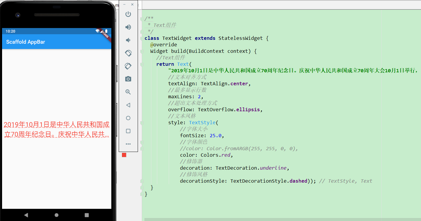
Common attributes used include TextAlign, maxLines, overflow, and style.
- TextAlign property, text alignment, its attribute values are as follows:
- center: The text is aligned in the middle (default).
- Left and right: Left (right) alignment, often used to align text to the left (right).
- start and end: Align the beginning (end) position of the text, similar to left (right) alignment.
- The maxLines property sets the maximum number of rows displayed.
- The overflow property is used to set how to handle text overflow. There are several commonly used values as follows:
- clip: Cut it off and the rest of the text is gone (default).
- Ellipsis: The ellipsis is displayed at the back.
- Fade: The overflow will have a gradual fade effect.
- There are many attributes in style. Here is the setting: the font size is 25.0, the color is red, and there is an underline, the underline effect is dashed.
- fontSize: Font size.
- Color: font color.
- decoration: how to decorate.
- Decoration Style: Decorative style.