Using bootstrap to create a table is also very simple, and can be a beautiful enough design
Code display
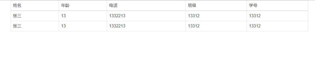
    <div class="container">
    <div class="table-responsive">
        <table class="table table-bordered table-hover">
            <thead>
                <tr>
                    <td>Full name</td>
                    <td>Age</td>
                    <td>Telephone</td>
                    <td>class</td>
                    <td>Student ID</td>
                </tr>
            </thead>
            <tbody>
                <tr>
                    <td>Zhang San</td>
                    <td>13</td>
                    <td>1332213</td>
                    <td>13312</td>
                    <td>13312</td>
                </tr>
                <tr>
                    <td>Zhang San</td>
                    <td>13</td>
                    <td>1332213</td>
                    <td>13312</td>
                    <td>13312</td>
                </tr>
            </tbody>
        </table>
    </div>
    </div>
In fact, bootstrap will automatically modify the generated table after the table class = "table" is named after the class. Other places still write the same as before
Several parameters in table tag
1. Compact table class = "table table condensed"
2. Mouse over effect only needs to add table hover to the table
3. Zebra crossing table class = "table table striped"
4. Table bordered - all the above non conflicting parameters can be written to several parameters on the tr label in a class, which are mainly used to control the color and status class = active. For other parameters, please refer to the specific tutorial above runoob
< div class = "table responsive" >
Effect display